开始使用compose了之后才发现一些以前需要自定义的view,洋洋洒洒几十上百行的代码,需要自定义布局属性,需要继承View,需要使用Paint,如果使用Compose,直接一个方法二十行即可解决。
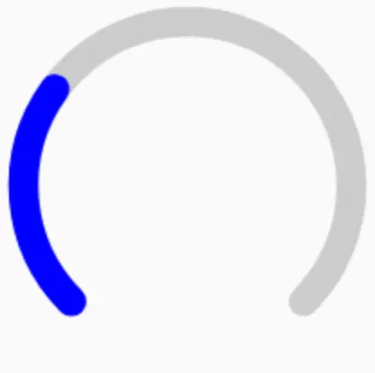
来实现下图所示一个自定义圆弧进度条:
使用Kotlin实现
早期有写过这么一个小demo
完整代码见:https://github.com/yaoxiawen/CircleProgressBar
自定义布局属性
在attrs.xml(如没有则创建)中定义需要的属性
    <!--圆环形进度条-->
    <declare-styleable name="CircleProgressBar">
        <attr name="ringMax" format="integer" />
        <attr name="progress" format="integer" />
        <attr name="startAngle" format="float" />
        <attr name="endAngle" format="float" />
        <attr name="reverse" format="boolean" />
        <attr name="roundCap" format="boolean" />
        <attr name="ringWidth" format="dimension" />
        <attr name="ringColor" format="color" />
        <attr name="ringBackgroundColor" format="color" />
    </declare-styleable>
自定义View
创建CircleProgressBar继承View
class CircleProgressBar @JvmOverloads constructor(
    context: Context, attrs: AttributeSet? = null, @AttrRes defStyleAttr: Int = 0
) : View(context, attrs, defStyleAttr)
通过AttributeSet解析属性
通过构造函数中AttributeSet参数解析布局中传入的属性值,所有属性都需要有默认值
        val ta = context.obtainStyledAttributes(attrs, R.styleable.CircleProgressBar)
        max = ta.getInt(R.styleable.CircleProgressBar_ringMax, DEFAULT_MAX)
        if (max <= 0) {
            max = DEFAULT_MAX
        }
        startAngle = ta.getFloat(R.styleable.CircleProgressBar_startAngle, DEFAULT_START_ANGLE)
        endAngle = ta.getFloat(R.styleable.CircleProgressBar_endAngle, DEFAULT_END_ANGLE)
        reverse = ta.getBoolean(R.styleable.CircleProgressBar_reverse, DEFAULT_REVERSE)
        roundCap = ta.getBoolean(R.styleable.CircleProgressBar_roundCap, DEFAULT_ROUND_CAP)
        progress = ta.getInt(R.styleable.CircleProgressBar_progress, DEFAULT_PROGRESS)
        ringWidth =
            ta.getDimension(R.styleable.CircleProgressBar_ringWidth, DEFAULT_RING_WIDTH)
        ringColor = ta.getColor(R.styleable.CircleProgressBar_ringColor, DEFAULT_RING_COLOR)
        ringBackgroungColor = ta.getColor(
            R.styleable.CircleProgressBar_ringBackgroundColor,
            DEFAULT_RING_BACKGROUND_COLOR
        )
        ta.recycle()
初始化Paint
自定义view使用canvas进行绘制,自然是需要有Paint
        mArcPaint = Paint()
        mArcPaint.isAntiAlias = true
onDraw中绘制圆弧
使用canvas的drawArc绘制圆弧,Paint设置strokeCap为Paint.Cap.ROUND可画出圆帽的效果。
        with(mArcPaint) {
            color = ringBackgroungColor
            style = Paint.Style.STROKE
            strokeWidth = ringWidth
            if (roundCap) {
                strokeCap = Paint.Cap.ROUND
            }
        }
        //绘制圆环背景
        canvas.drawArc(mRectF, startAngle, endAngle - startAngle, false, mArcPaint)
        with(mArcPaint) {
            color = ringColor
            if (roundCap) {
                strokeCap = Paint.Cap.ROUND
            }
        }
        var sweepAngle = progress.toFloat() / max * (endAngle - startAngle)
        if (reverse) {
            sweepAngle = -sweepAngle  //逆时针滚动
        }
        canvas.drawArc(mRectF, startAngle, sweepAngle, false, mArcPaint)
xml布局中使用
    <com.example.circleprogressbar.CircleProgressBar
        android:layout_width="200dp"
        android:layout_height="200dp"
        app:progress="30"
        app:startAngle="-225"
        app:endAngle="45"
        app:ringWidth="10dp" />
使用Compose实现
类似的一些API,使用Canvas的drawArc绘制圆弧,设置cap = StrokeCap.Round可以达到圆帽的效果。
@Composable
fun CircleProgress(
    modifier: Modifier = Modifier,
    progress: Int,
    startAngle: Float,
    endAngle: Float,
    progressBgColor: Color,
    progressColor: Color,
) {
    Canvas(
        modifier = modifier,
        onDraw = {
            drawArc(
                color = progressBgColor,
                startAngle = startAngle,
                sweepAngle = endAngle - startAngle,
                useCenter = false,
                style = Stroke(size.width / 11, cap = StrokeCap.Round)
            )
            drawArc(
                color = progressColor,
                startAngle = startAngle,
                sweepAngle = (endAngle - startAngle) * progress / 100,
                useCenter = false,
                style = Stroke(size.width / 11, cap = StrokeCap.Round)
            )
        }
    )
}
调用方法传入相应的一些参数,参数也可直接设置有默认值。
        CircleProgress(
            modifier = Modifier.padding(5.dp).size(66.dp),
            startAngle = -225f,
            endAngle = 45f,
            progress = 30,
            progressBgColor = Color.LightGray,
            progressColor = Color.Blue
        )