CSS三栏布局的几种方式,主要有 float、position、flex实现。
对红色、蓝色 box 设置 float,绿色不设。
<style>
* {
margin: 0;
padding: 0;
}
.left {
width: 200px;
height: 300px;
background-color: red;
float:left;
}
.right {
width: 200px;
height: 300px;
background-color: blue;
float:right
}
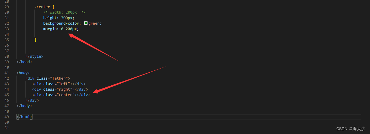
.center {
width: 200px;
height: 300px;
background-color: green;
}
</style>
<body>
<div class="father">
<div class="left"></div>
<div class="center"></div>
<div class="right"></div>
</div>
</body>
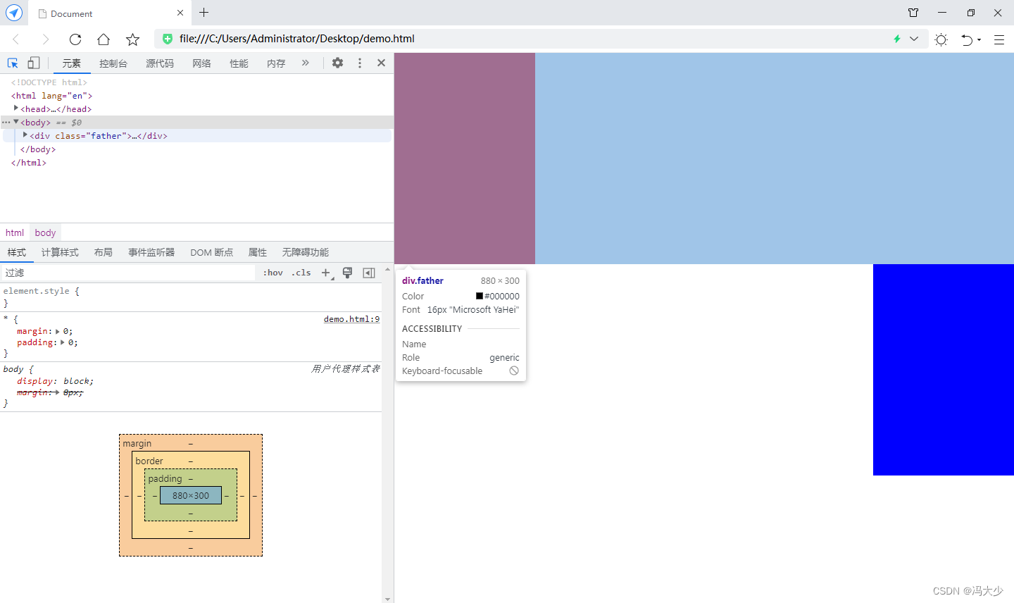
可见,结果绿色box好像消失了,其实是由于没有设置 float的情况下,它依然保持块级元素的属性。因此蓝色box在绿色box的元素下排列。
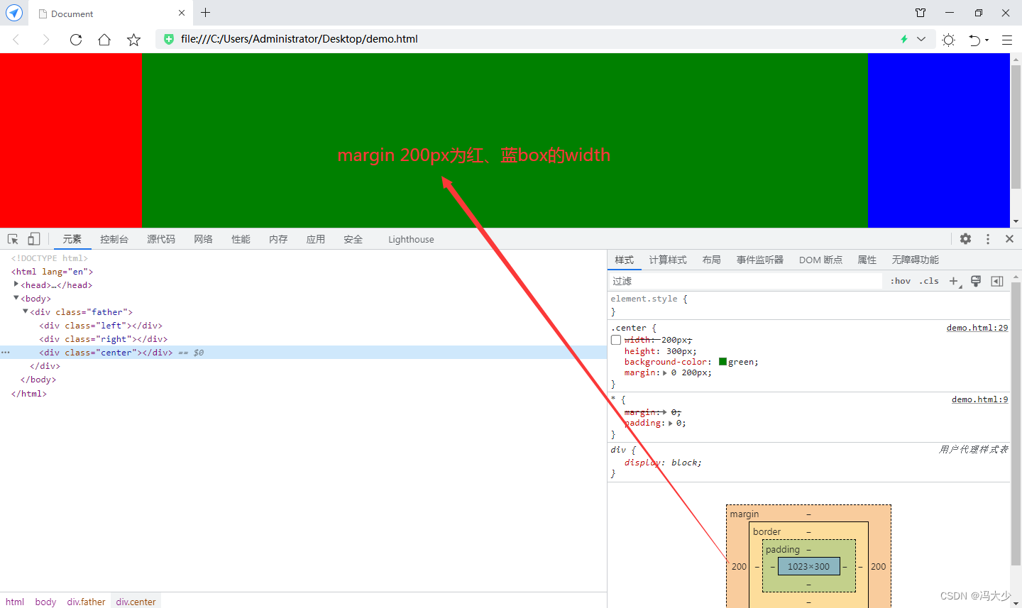
把绿色块元素移到最后,给它配置 margin 0 200px
可见绿色box刚好自动填充在红、蓝box之间。浏览器缩放时,也是3个box互相紧挨的效果。
position实现
<style>
* {
margin: 0;
padding: 0;
}
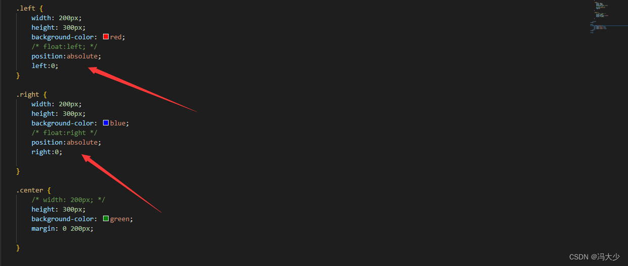
.left {
width: 200px;
height: 300px;
background-color: red;
/* float:left; */
position:absolute;
left:0;
}
.right {
width: 200px;
height: 300px;
background-color: blue;
/* float:right */
position:absolute;
right:0;
}
.center {
/* width: 200px; */
height: 300px;
background-color: green;
margin: 0 200px;
}
</style>
<body>
<div class="father">
<div class="left"></div>
<div class="right"></div>
<div class="center"></div>
</div>
</body>
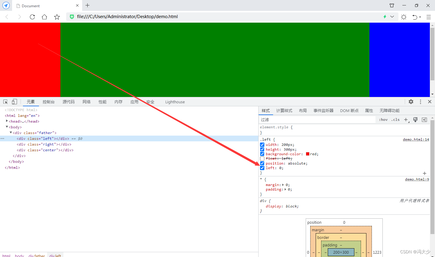
对红、蓝box设置绝对定位的方式固定位置
flex实现 (最方便的一种)
<style>
* {
margin: 0;
padding: 0;
}
.left {
width: 200px;
height: 300px;
background-color: red;
/* float:left; */
/* position:absolute;
/* left:0; */
}
.right {
width: 200px;
height: 300px;
background-color: blue;
/* float:right */
/* position:absolute;
right:0;
*/
}
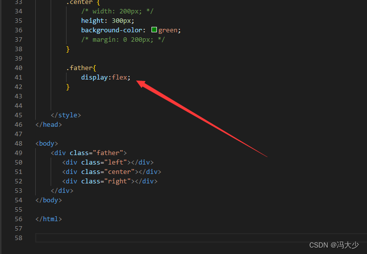
.center {
/* width: 200px; */
height: 300px;
background-color: green;
/* margin: 0 200px; */
}
.father{
display:flex;
}
</style>
<body>
<div class="father">
<div class="left"></div>
<div class="center"></div>
<div class="right"></div>
</div>
</body>
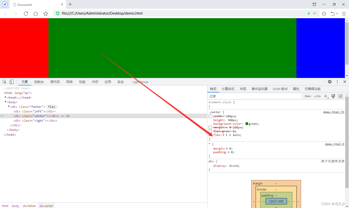
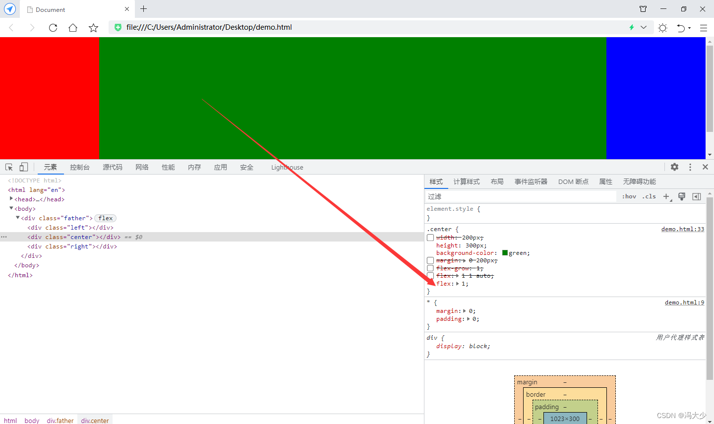
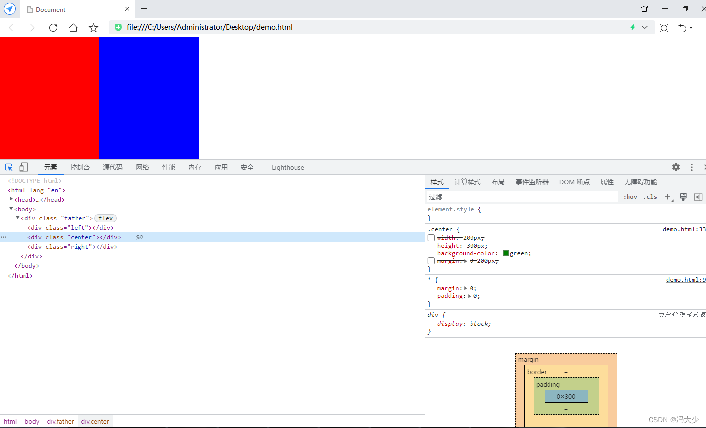
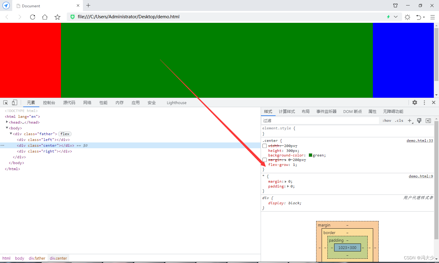
设置 father 父元素的样式 display: flex;
可见绿色box又好像消失了,是因为绿色box没有设置宽度,当 father 元素设置 flex 后, 它里面的块级元素就不能继承 father的宽度。
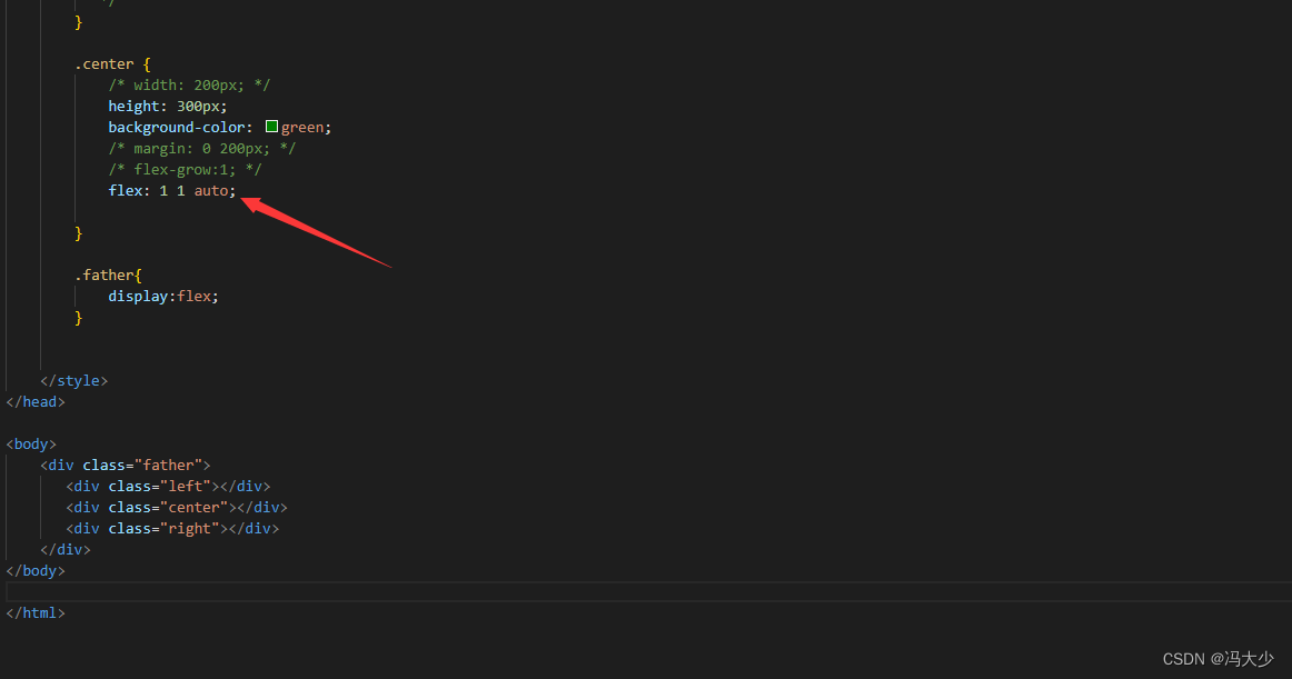
给绿色 box 加设 flex-grow : 1 去自动填补剩余的空间。
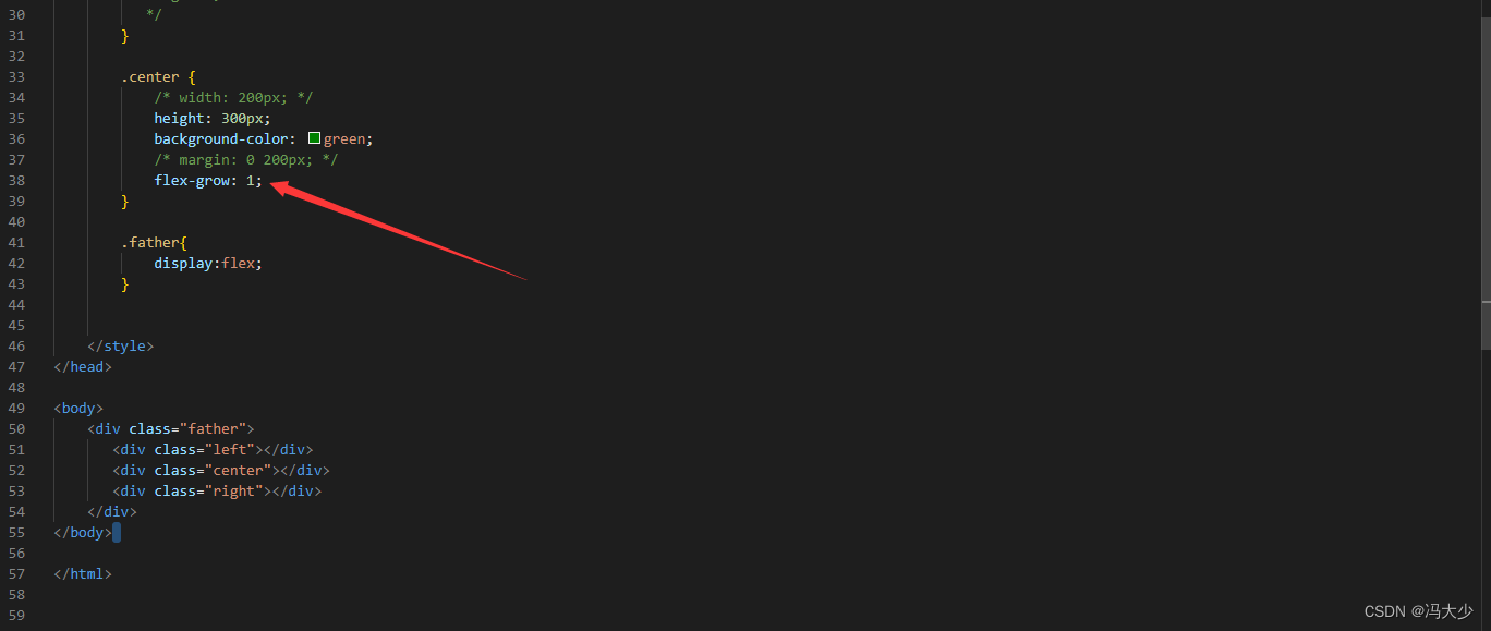
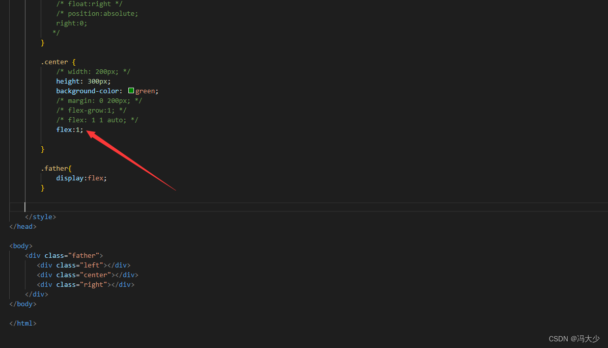
最后补充一点,flex-grow: 1 其实也可以写为 flex: 1 1 auto; 或者更简写的 flex:1; 这个知识点,大家可以再参考关于flex布局这方面。