tips:
css中“>”是:
css3特有的选择器,A>B 表示选择A元素的所有子B元素。
与A B的区别在于,A B选择所有后代元素,而A>B只选择一代。
.a,.b{逗号指相同的css样式};.a .b{空格指后代元素};.a>.b{大于号指子代元素};
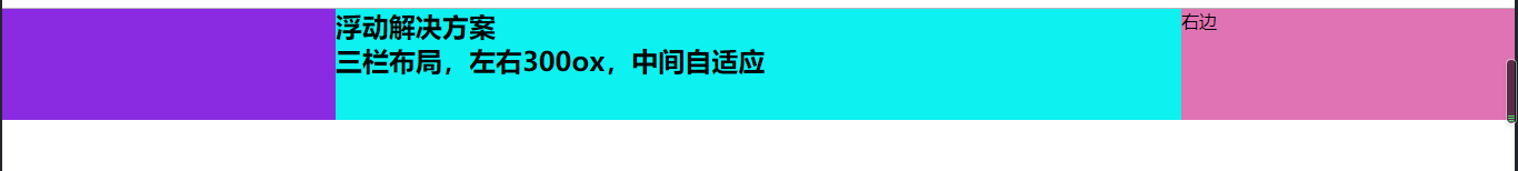
一、浮动解决方案
代码:
<!DOCTYPE html>
<html lang="en">
<head>
	<meta charset="UTF-8">
	<meta name="viewport" content="width=device-width, initial-scale=1.0">
	<meta http-equiv="X-UA-Compatible" content="ie=edge">
	<title>Document</title>
	<style type="text/css">
		* {
			margin: 0;
			padding: 0;
		}
        .container>div {
            min-height: 100px;
        }
        .left {
            float: left;
            width: 300px;
            background: blueviolet;
        }
        .right {
            float: right;
            width: 300px;
            background: rgb(224, 115, 179);
        }
        .center {
            background: rgb(14, 241, 241);
        }
	</style>
</head>
<body>
	<div class="container">
		<!-- 因为这个方法是知道左右栏都是300px固定的,中间自适应,所以是left、right、center,
        如果是left、center、right,那么右侧的一列会掉下来 -->
		<div class="left"></div>
		<div class="right">右边</div>
		<div class="center">
			<h2>浮动解决方案</h2>
			<h2>三栏布局,左右300px,中间自适应</h2>
		</div>
	</div>
</body>
</html>
二、绝对定位解决方案
代码:
<!DOCTYPE html>
<html lang="en">
<head>
	<meta charset="UTF-8">
	<meta name="viewport" content="width=device-width, initial-scale=1.0">
	<meta http-equiv="X-UA-Compatible" content="ie=edge">
	<title>Document</title>
	<style type="text/css">
		* {
			margin: 0;
			padding: 0;
		}
        .container>div {
			min-height: 100px;
			position: absolute;
        }
        .left {
			left: 0;
            width: 300px;
            background: blueviolet;
		}
		.center {
			left: 300px;
			right: 300px;
            background: rgb(14, 241, 241);
        }
        .right {
			right: 0;
            width: 300px;
            background: rgb(224, 115, 179);
        }

	</style>
</head>
<body>
	<div class="container">
		<div class="left"></div>
		<div class="center">
			<h2>绝对定位解决方案</h2>
			<h2>三栏布局,左右300px,中间自适应</h2>
		</div>
		<div class="right"></div>
	</div>
</body>
</html>

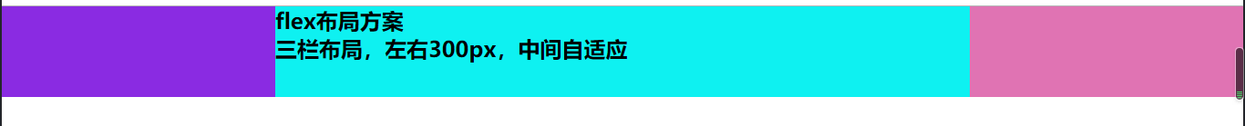
三、flex解决方案
代码:
<!DOCTYPE html>
<html lang="en">
<head>
	<meta charset="UTF-8">
	<meta name="viewport" content="width=device-width, initial-scale=1.0">
	<meta http-equiv="X-UA-Compatible" content="ie=edge">
	<title>Document</title>
	<style type="text/css">
		* {
			margin: 0;
			padding: 0;
		}
		/* 将容器设置为flex布局 */
        .container {
			display: flex;
			min-height: 100px;
        }
        .left {
            width: 300px;
            background: blueviolet;
		}
		/*中间自适应的原理,让flex=1*/
		.center {
			flex: 1;
            background: rgb(14, 241, 241);
        }
        .right {
            width: 300px;
            background: rgb(224, 115, 179);
        }

	</style>
</head>
<body>
	<div class="container">
		<div class="left"></div>
		<div class="center">
			<h2>flex布局方案</h2>
			<h2>三栏布局,左右300px,中间自适应</h2>
		</div>
		<div class="right"></div>
	</div>
</body>
</html>
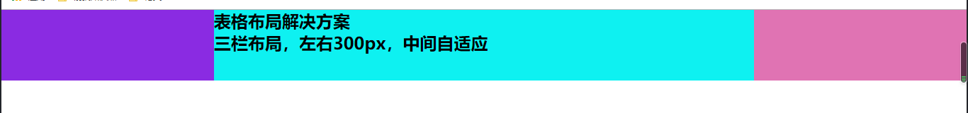
四、表格布局解决方案
代码:
<!DOCTYPE html>
<html lang="en">
<head>
	<meta charset="UTF-8">
	<meta name="viewport" content="width=device-width, initial-scale=1.0">
	<meta http-equiv="X-UA-Compatible" content="ie=edge">
	<title>Document</title>
	<style type="text/css">
		* {
			margin: 0;
			padding: 0;
		}
		/* 将容器设置为table布局 */
        .container {
			display: table;
			min-height: 100px;
			width: 100%;
		}
		.container>div {
			display: table-cell;
		}
        .left {
            width: 300px;
            background: blueviolet;
		}
		.center {
            background: rgb(14, 241, 241);
        }
        .right {
            width: 300px;
            background: rgb(224, 115, 179);
        }

	</style>
</head>
<body>
	<div class="container">
		<div class="left"></div>
		<div class="center">
			<h2>表格布局解决方案</h2>
			<h2>三栏布局,左右300px,中间自适应</h2>
		</div>
		<div class="right"></div>
	</div>
</body>
</html>
五、网格布局解决方案
代码:
<!DOCTYPE html>
<html lang="en">
<head>
	<meta charset="UTF-8">
	<meta name="viewport" content="width=device-width, initial-scale=1.0">
	<meta http-equiv="X-UA-Compatible" content="ie=edge">
	<title>Document</title>
	<style type="text/css">
		* {
			margin: 0;
			padding: 0;
		}
		/* 将容器声明为网格布局 网格有行有列
           这里设置行高为100px,设为3列,左右侧300px,中间自适应
        */
        .container {
			display: grid;
			min-height: 100px;
			width: 100%;
			grid-template-columns: 300px auto 300px;
		}
        .left {
            background: blueviolet;
		}
		.center {
            background: rgb(14, 241, 241);
        }
        .right {
            background: rgb(224, 115, 179);
        }

	</style>
</head>
<body>
	<div class="container">
		<div class="left"></div>
		<div class="center">
			<h2>网格布局解决方案</h2>
			<h2>三栏布局,左右300px,中间自适应</h2>
		</div>
		<div class="right"></div>
	</div>
</body>
</html>