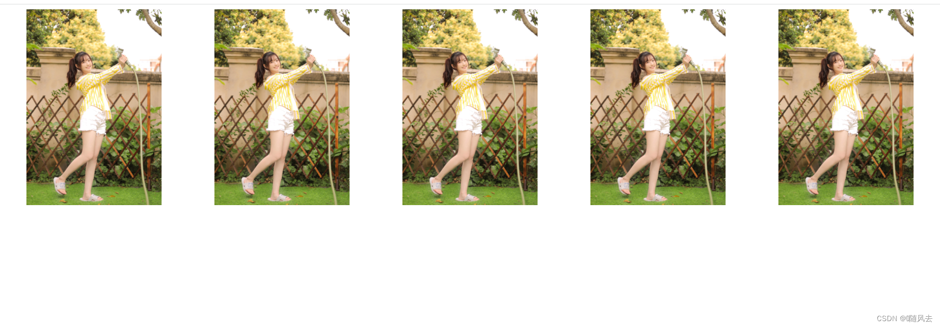
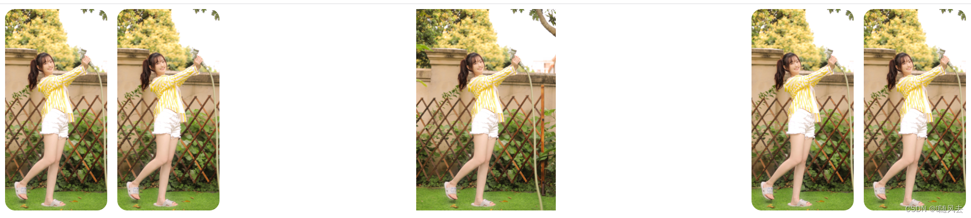
实现效果如下:
代码如下:
<!DOCTYPE html>
<html>
	<head>
		<meta charset="utf-8" />
		<title></title>
		<style>
			.k{
				display: flex;
				height: 20rem;
				gap: 1rem;
			}
			.k>div{
				flex: 1;
				border-radius: 1rem;
				background-position: center;
				background-repeat: no-repeat;
				background-size: auto 100%;
				 transition: all .8s cubic-bezier(.25, .4, .45, 1.4);
			}
			.k>div:hover{
				flex: 5;
			}
		</style>
	</head>
	<body>
		<div class="k">
			<div style="background-image: url(img/1.jpg);"></div>
			<div style="background-image: url(img/1.jpg);"></div>
			<div style="background-image: url(img/1.jpg);"></div>
			<div style="background-image: url(img/1.jpg);"></div>
			<div style="background-image: url(img/1.jpg);"></div>
		</div>
	</body>
</html>