目录
在不知道子元素宽高的情况下,水平垂直居中的六种方式:
在实际使用最好测试下最低版本是否支持对应的实现方式,尽量选各个浏览器支持比较好的,或者最常见的实现方式。
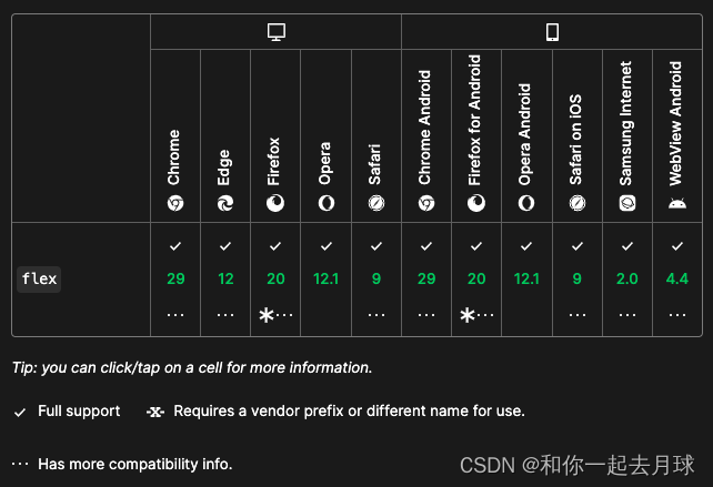
1、弹性盒子布局方式来实现(flex)。
<!DOCTYPE html>
<html lang="en">

<head>
    <meta charset="UTF-8">
    <meta http-equiv="X-UA-Compatible" content="IE=edge">
    <meta name="viewport" content="width=device-width, initial-scale=1.0">
    <title>水平垂直居中</title>
</head>
<style>
    html,
    body {
        width: 100%;
        height: 100%;
        padding: 0;
        margin: 0;
    }

    .box {
        display: flex;
        align-items: center;
        justify-content: center;
        width: 100%;
        height: 100%;
        background: #00affc;
    }

    .box1 {
        background: pink;

    }
</style>

<body>
    <div class="box">
        <div class="box1">
            中间盒子水平垂直居中了
        </div>
    </div>
</body>

</html>
浏览器兼容性:
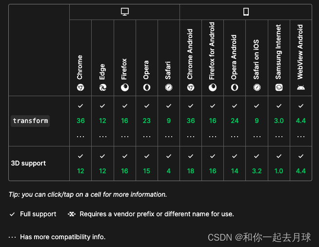
2、绝对定位 + transform
<!DOCTYPE html>
<html lang="en">

<head>
    <meta charset="UTF-8">
    <meta http-equiv="X-UA-Compatible" content="IE=edge">
    <meta name="viewport" content="width=device-width, initial-scale=1.0">
    <title>水平垂直居中</title>
</head>
<style>
    html,
    body {
        width: 100%;
        height: 100%;
        padding: 0;
        margin: 0;
    }

    .box {
        width: 100%;
        height: 100%;
        background: #00affc;
    }

    .box1 {
        background: pink;
        transform: translate(-50%, -50%);
        position: absolute;
        top: 50%;
        left: 50%;

    }
</style>

<body>
    <div class="box">
        <div class="box1">
            中间盒子水平垂直居中了
        </div>
    </div>
</body>

</html>
浏览器兼容性:
3、table标签
<!DOCTYPE html>
<html lang="en">

<head>
    <meta charset="UTF-8">
    <meta http-equiv="X-UA-Compatible" content="IE=edge">
    <meta name="viewport" content="width=device-width, initial-scale=1.0">
    <title>水平垂直居中</title>
</head>
<style>
    html,
    body {
        width: 100%;
        height: 100%;
        padding: 0;
        margin: 0;
    }
    table {
        width: 100%;
        height: 100%;
    }

    .box {
        background: #00affc;
    }

    .box1 {
        text-align: center;
    }
</style>

<body>
    <table>
        <tbody>
            <tr>
                <td class="box">
                    <div class="box1">中间盒子水平垂直居中了</div>
                </td>
            </tr>
        </tbody>
    </table>
</body>

</html>
兼容性:基本都支持,只是书写起来比较繁琐,多层嵌套。
4、display:table-cell
<!DOCTYPE html>
<html lang="en">

<head>
    <meta charset="UTF-8">
    <meta http-equiv="X-UA-Compatible" content="IE=edge">
    <meta name="viewport" content="width=device-width, initial-scale=1.0">
    <title>水平垂直居中</title>
</head>
<style>
    html,
    body {
        width: 100%;
        height: 100%;
        padding: 0;
        margin: 0;
    }

    .box {
        width: 300px;
        height: 300px;
        background: red;
        display: table-cell;
        text-align: center;
        vertical-align: middle;
    }

    .box1 {
        display: inline-block;
    }
</style>

<body>
    <div class="box">
        <div class="box1">中间盒子水平垂直居中了</div>
    </div>
</body>

</html>
浏览器兼容性:主流浏览器基本上都支持的。
5、display: grid
<!DOCTYPE html>
<html lang="en">

<head>
    <meta charset="UTF-8">
    <meta http-equiv="X-UA-Compatible" content="IE=edge">
    <meta name="viewport" content="width=device-width, initial-scale=1.0">
    <title>水平垂直居中</title>
</head>
<style>
    html,
    body,
    .box {
        width: 100%;
        height: 100%;
    }

    .box {
        display: grid;
    }

    .box1 {
        align-self: center;
        justify-self: center;
    }
</style>

<body>
    <div class="box">
        <div class="box1">123123</div>
    </div>

</body>

</html>
浏览器兼容性:最新主流浏览器基本上兼容,对于老版本浏览器可能会有兼容性问题。
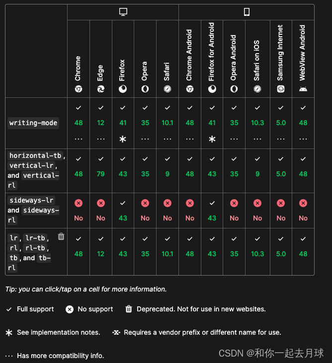
6、writing-mode 属性
<!DOCTYPE html>
<html lang="en">

<head>
    <meta charset="UTF-8">
    <meta http-equiv="X-UA-Compatible" content="IE=edge">
    <meta name="viewport" content="width=device-width, initial-scale=1.0">
    <title>水平垂直居中</title>
</head>
<style>
    html,
    body,
    .content {
        width: 100%;
        height: 100%;
    }

    .content {
        writing-mode: vertical-lr;
        text-align: center;
    }

    .box {
        writing-mode: horizontal-tb;
        display: inline-block;
        text-align: center;
        width: 100%;
    }

    .box1 {
        display: inline-block;
        margin: auto;
        text-align: left;
    }
</style>

<body>
    <div class="content">
        <div class="box">
            <div class="box1">123123</div>
        </div>
    </div>

</body>

</html>
浏览器兼容性问题: