- 常用居中方式
- 水平居中
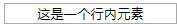
a:行内元素:text-align:center;
代码:
<input type="text" value="这是一个行内元素" style="text-align: center"/>
效果图:
已知宽度的块级元素:
b:使用margin+auto来实现水平居中
实现原理:margin: 0 auto:上下边界为0,左右根据宽度自适应。
为什么margin:0 auto可以水平居中?
根据盒子模型来说:我们假设margin-left和 margin-right的宽度为(x),就有margin-left(x) + border-left-width(0) + padding-left-width(0) +width(我们假设为300px) + padding-right-width(0) + border-left-width(0) +margin-right(x) = contain width(假设为800px),我们可以得到左右margin宽度为250,块级元素刚好水平居中。
css代码:
<style>
.box {
width: 300px;
height: 300px;
margin: 0 auto;
background-color: aqua;
}
</style>
Html代码:
<div class="box">
</div>
效果图:

注意的地方:需要设置width宽度,否则无效;
并且只对block元素有效;
C:绝对定位和margin-left: -(宽度值/2)实现水平居中
Css代码:
.box {
width: 300px;
height: 300px;
position: absolute;
left: 50%;
margin-left: -150px;//为元素宽度的一半
background-color: plum;
}
效果图:

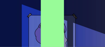
D:position:absolute + (left=0+top=0+right=0+bottom=0) + margin:auto
Css代码:
.box {
width: 300px;
/*height: 300px;*/
position: absolute;
top: 0;
left: 0;
right: 0;
bottom: 0;
margin: auto;
background-color: palegreen;
}
效果图:
未知宽度的块级元素:
A:table标签配合margin左右auto实现水平居中
B:inline-block实现水平居中方法
C:绝对定位实现水平居中
Css代码:
.box{
position: absolute;
left: 50%;
transform: translateX(-50%); /* 移动元素本身50% */
background: aqua;
}
Html代码:
<div class="box">
<ul>
<li>1</li>
<li>2</li>
<li>3</li>
</ul>
</div>
效果图:

D:CSS3的flex实现水平居中方法
Css代码:
.parent{
display: flex;
}
.son{
margin: auto;
}
E:CSS3的fit-content配合左右margin为auto实现水平居中方法
Css代码:
.son{
width: fit-content;
margin-left: auto;
margin-right: auto;
background-color: #DF654A;
}
代码效果图:

- 垂直居中
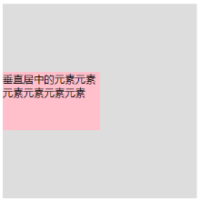
A:使用绝对定位和负外边距对块级元素进行垂直居中
Css代码:
#box {
width: 300px;
height: 300px;
background: #ddd;
position: relative;
}
#child {
width: 150px;
height: 100px;
background: plum;
position: absolute;
top: 50%;
margin: -50px 0 0 0;
line-height: 100px;
}
Html代码:
<div id="box">
<div id="child">要被垂直居中的元素</div>
</div>
效果图:

B:使用绝对定位和transform
Css代码:
#box {
width: 300px;
height: 300px;
background: #ddd;
position: relative;
}
#child {
background: plum;
position: absolute;
top: 50%;
transform: translate(0, -50%);
}
代码结果图:

注:不需要了解元素的宽度,因为transform中translate偏移的百分比就是相对于元素自身的尺寸而言的。
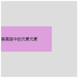
C:另外一种使用绝对定位和负外边距进行垂直居中的方式
只需要将children改变一下:
Css代码:
#child {
width: 50%;
height: 30%;
background: pink;
position: absolute;
top: 50%;
margin: -15% 0 0 0;
}
效果图:
D:绝对定位+margin:auto来实现垂直居中
Css代码:
#child {
width: 200px;
height: 100px;
background:plum;
position: absolute;
top: 0;
bottom: 0;
margin: auto;
line-height: 100px;
}
代码效果图:
注:
这种实现方式的两个核心是:把要垂直居中的元素相对于父元素绝对定位,top和bottom设为相等的值,我这里设成了0,当然你也可以设为99999px或者-99999px无论什么,只要两者相等就行,这一步做完之后再将要居中元素的margin设为auto,这样便可以实现垂直居中了。
被居中元素的宽高也可以不设置,但不设置的话就必须是图片这种自身就包含尺寸的元素,否则无法实现。
E:使用padding实现子元素的垂直居中
Css代码:
#box {
width: 300px;
padding: 100px 0;
background: #ddd;
}
#child {
width: 200px;
height: 100px;
background:purple;
line-height: 50px;
}
效果图:
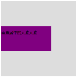
注:给父元素设置相等的上下内边距,则子元素自然是垂直居中的,当然这时候父元素是不能设置高度的,要让它自动被填充起来,除非设置了一个正好等于上内边距+子元素高度+下内边距的值,否则无法精确的垂直居中。
F:使用flex布局
Css代码:
#child {
width: 200px;
height: 200px;
background:purple;
display: flex;
align-items: center;
}
效果图:

G:使用 line-height 和 vertical-align 对图片进行垂直居中
Css代码:
#child {
width: 200px;
height: 200px;
background:paleturquoise;
line-height: 200px;
}
#children img{
vertical-align: middle;
}
H: 使用 display 和 vertical-align 对容器里的文字进行垂直居中
#box{
width: 300px;
height: 300px;
background: brown;
display: table;
}
#child {
display: table-cell;
vertical-align: middle;
}
代码效果:

<input type="text" value="这是一个行内元素" style="text-align: center"/>
<input type="text" value="这是一个行内元素" style="text-align: center"/>