目录
三、使用小程序echarts(echarts-for-wx)
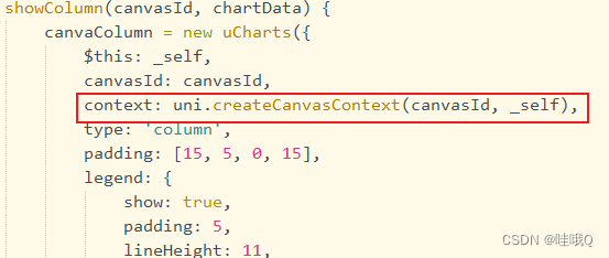
5、[uCharts] 未获取到context!注意:v2.0版本后,需要自行获取canvas的绘图上下文并传入opts.context!
一、各图表在uniapp微信小程序中的bug
秋云ucharts:
1、使用的是秋云ucharts(注意此插件和scroll-view不可以同时使用,不然会出现图表随滚动条滚动的情况)
2、开启滚动条后图表两侧有白边问题——此问题是因为组件上的 background 为默认的 rgba(0,0,0,0) 透明色或者没有指定导致,请在组件上加入background="rgba(0,0,0,1)"(您的背景色)。如果父元素为图片,尽量不要开启滚动条,此时图表是透明色,可以显示父元素背景图片。
3、没有图表标记就只有实心和空心两个,不能自定义图片
echarts:
1、tooltip使用extraCssText: 'transform: rotate(90deg)',进行旋转无效
二、使用秋云ucharts
官网地址:https://www.ucharts.cn/v2/#/
方法一:使用uni_modules版本
步骤:
1、在插件库搜索echarts,选择秋云ucharts,点击使用HBuilder导入插件
2、直接在页面使用
<qiun-data-charts type="column" :canvas2d="true" :opts="opts" :chartData="chartData" :ontouch="true" />data() {
return {
chartData: {},
opts: {
color: ["#FAC858", "#EE6666", "#FAC858", "#EE6666", "#73C0DE", "#3CA272", "#FC8452", "#9A60B4",
"#ea7ccc"
],
padding: [10, 10, 0, 5],
touchMoveLimit: 24,
enableScroll: true, //开启滚动条
legend: {},
xAxis: {
disableGrid: true,
scrollShow: false, //滚动条不显示
itemCount: 5 //图表可视区显示的X轴数据点数量,仅在启用enableScroll时有效
},
yAxis: {
data: [{
min: 0
}]
},
extra: {
column: {
type: "group",
width: 20,
activeBgColor: "#000000",
activeBgOpacity: 0.08,
linearType: "custom",
seriesGap: 3,
linearOpacity: 0.5,
barBorderCircle: true,
customColor: [
"#FA7D8D",
"#EB88E2"
]
}
}
},
};
},
onReady() {
this.getServerData();
},
methods: {
getServerData() {
//模拟从服务器获取数据时的延时
setTimeout(() => {
//模拟服务器返回数据,如果数据格式和标准格式不同,需自行按下面的格式拼接
let res = {
categories: ["2016", "2017", "2018", "2019", "2020", "2021"],
series: [{
name: "目标值",
data: [35, 36, 31, 33, 13, 34]
},
{
name: "完成量",
data: [18, 27, 21, 24, 6, 28]
}
]
};
this.chartData = JSON.parse(JSON.stringify(res));
}, 500);
},
}方法二:非uni_modules版本
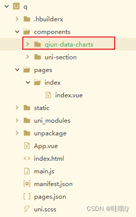
这种方式其实就是把 qiun-data-charts 当成我们自己写的组件一样,按照 定义 -》引入 -》注册 -》使用 四步走方式导入。
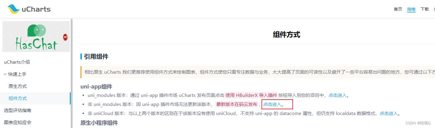
在官网——指南——组件方式——非uni_modules版本
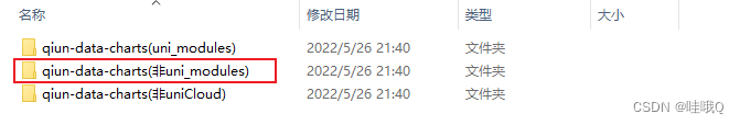
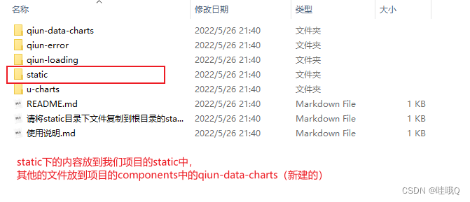
以上是已经把使用说明中的是三个文件删除了,若是不想删除,就使用示例项目——组件——非uni-modlues——components下所有文件
然后修改qiun-data-charts的vue文件中的路径

在所需页面引入组件并使用组件
<template>
	<view class="container">
		<qiun-data-charts type="column" :canvas2d="true" :opts="opts" :chartData="chartData" :ontouch="true" />
	</view>
</template>

<script>
	export default {
		data() {
			return {
				chartData: {},
				opts: {
					color: ["#FAC858", "#EE6666", "#FAC858", "#EE6666", "#73C0DE", "#3CA272", "#FC8452", "#9A60B4",
						"#ea7ccc"
					],
					padding: [10, 0, 0, 0],
					dataLabel: false,
					dataPointShapeType: 'hollow',
					touchMoveLimit: 24,
					enableScroll: true, //开启滚动条
					scrollShow: false, //滚动条不显示
					legend: {},
					xAxis: {
						disableGrid: true,
						itemCount: 5 //图表可视区显示的X轴数据点数量,仅在启用enableScroll时有效
					},
					yAxis: {
						data: [{
							min: 0
						}]
					},
					extra: {
						column: {
							type: "group",
							width: 20,
							activeBgColor: "#000000",
							activeBgOpacity: 0.08,
							linearType: "custom",
							seriesGap: 3,
							linearOpacity: 0.5,
							barBorderCircle: true,
							customColor: [
								"#FA7D8D",
								"#EB88E2"
							]
						}
					}
				},
			};
		},
		onReady() {
			this.getServerData();
		},
		methods: {
			getServerData() {
				//模拟从服务器获取数据时的延时
				setTimeout(() => {
					//模拟服务器返回数据,如果数据格式和标准格式不同,需自行按下面的格式拼接
					let res = {
						categories: ["2016", "2017", "2018", "2019", "2020", "2021"],
						series: [{
								name: "目标值",
								data: [35, 36, 31, 33, 13, 34]
							},
							{
								name: "完成量",
								data: [18, 27, 21, 24, 6, 28]
							}
						]
					};
					this.chartData = JSON.parse(JSON.stringify(res));
				}, 500);
			},
		}
	}
</script>

<style lang="scss">
	/* 请根据需求修改图表容器尺寸,如果父容器没有高度图表则会显示异常 */
    .charts-box {
      width: 100%;
      height: 320px;
    }
</style>
三、使用小程序echarts(echarts-for-wx)
压缩包 :https://github.com/WangXinYu-China/mini_program_echarts
去GitHub下载压缩包,或是插件市场下echarts-for-wx
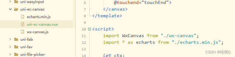
(1)插件库使用HBuilder导入,生成一个js_sdk目录,将此文件下uni-ec-canvas目录复制到components下即可
(2)在页面中引用
<template>
	<view class="container">
		<view class="tu">
			<uni-ec-canvas class="uni-ec-canvas" id="uni-ec-canvas" ref="uni-ec-canvas" canvas-id="uni-ec-canvas"
				:ec="ec"></uni-ec-canvas>
		</view>
	</view>
</template>

<script>
	import uniEcCanvas from '@/components/uni-ec-canvas/uni-ec-canvas.vue'
    export default {
		components: {
			uniEcCanvas,
		},
        data() {
			return {
				ec: {
					option: {
						grid: {
							left: '13%',
							right: '5%',
							bottom: '15%',
							top: '20%'
						},
						dataZoom: {
							start: 95,
							end: 100,
							type: "inside"
						},
						tooltip: {
							trigger: 'axis',
							axisPointer: {
								type: 'cross',
							},
							// position:[20,20]
						},
						xAxis: {
							type: 'category',
							data: [],
							axisTick: {
								show: true
							},
							boundaryGap: false,
							axisLine: {
								lineStyle: { //改变xy轴线条的颜色
									color: "#9da2af",
									width: 1 //这里是为了突出显示加上的
								}
							},
							axisLabel: {
								textStyle: { //改变xy轴上文字的颜色
									color: "#9da2af",
									fontSize: '10',
								}
							}
						},
						yAxis: {
							type: 'value',
							scale: true, //是否是脱离 0 值比例。设置成 true 后坐标刻度不会强制包含零刻度
							axisLine: {
								show: true
							},
							splitLine: { //网格线
								lineStyle: {
									color: "#9da2af",
									type: 'solid' //设置网格线类型 dotted:虚线 solid:实线
								}
							},
							axisTick: {
								show: false
							},
							axisLine: {
								lineStyle: { //改变xy轴线条的颜色
									color: "#9da2af",
									width: 1 //这里是为了突出显示加上的
								}
							},
							axisLabel: {
								textStyle: { //改变xy轴上文字的颜色
									color: "#9da2af",
									fontSize: '10',
								}
							},
						},
						series: [{
							name: '',
							data: [],
							markPoint: {
								data: [{
										name: '',
										value: '买',
										coord: [],
										itemStyle: {
											color: 'rgb(255, 1, 5)'
										}
									},
									{
										name: '',
										value: '卖',
										coord: [],
										itemStyle: {
											color: 'rgb(0, 170, 0)'
										}
									},
								],
								symbolSize: 25,
								tooltip: {
									trigger: 'item',
									formatter: function(value) {
										return value.data.coord[0] + '\n' + value.data.coord[1]
									}
								}
								// animation:false
							},
							type: 'line',
							smooth: false,
							symbol: 'none',
							itemStyle: {
								normal: {
									color: "#3bb632", //折线点的颜色
									lineStyle: {
										color: "#00f2f1", //折线的颜色
										width: 1
									}
								}
							},
						}, ]
					}, //echart 配置项
				},
			}
		},
        //onLoad主要配置ec.option.series[0].markPoint.data、ec.option.xAxis.data、ec.option.series[0].data
		onLoad: function(option) {
			const item = JSON.parse(decodeURIComponent(option.item));
			const number = JSON.parse(decodeURIComponent(option.number));
			this.number = number
			this.getreport = item;
			let buy = [];
			let mai = [];
			let orderList = this.getreport.orderList
			// 筛选符合条件的数组  放入到定义的新数组中
			for (let i = 0; i < orderList.length; i++) {
				if (orderList[i].trade_type == 1) {
					buy[buy.length] = orderList[i]
				}
				if (orderList[i].trade_type == 0) {
					mai[mai.length] = orderList[i]
				}
			}
			// 循环遍历数组,将数组加入到coord中
			for (let j = 0; j < buy.length; j++) {
				let obj = {
					name: '',
					value: '买',
					coord: [buy[j].trade_date, buy[j].trade_price],
					itemStyle: {
						color: 'rgb(255, 1, 5)'
					}
				}
				this.ec.option.series[0].markPoint.data.push(obj)
			}
			for (let r = 0; r < mai.length; r++) {
				let obj1 = {
					name: '',
					value: '卖',
					coord: [mai[r].trade_date, mai[r].trade_price],
					itemStyle: {
						color: 'rgb(0, 170, 0)'
					}
				}
				this.ec.option.series[0].markPoint.data.push(obj1)
			}
			// X轴数据
			this.ec.option.xAxis.data = this.getreport.chartsData.chartx
			// Y轴数据
			this.ec.option.series[0].data = this.getreport.chartsData.charty
			// 历史数据
			this.tabData = item.tradeList
		},
    }
</script>
<style lang="scss">
	.uni-container {
		height: 100%;
		width: 100%;
	}

	.tu {
		width: 100%;
		height: 600rpx;
		// background-color: aqua;
		background-size: 100% 100%;
		margin-top: 2%;
	}
</style>
四、各图表遇到的问题以及应用
1、解决echarts.js文件过大的问题
ECharts 在线构建 (apache.org):https://echarts.apache.org/zh/builder.html
去echarts官网自定义构建并下载文件 ,下载的是echarts.min.js文件,将项目中的echarts.js替换成echarts.min.js文件
然后修改文件uni-ec-canvas.vue ,将echarts.js修改成echarts.min.js
此时会报错,打开echarts.min.js ,搜索报错信息t.addEventListener
在搜索到之后,在 t.addEventListener后面添加 ?.
若是还是大,则使用分包
2、ucharts横屏显示(秋云原生)
注意:原生写法级别是最高的
关键的代码:rotate:true,
<template>
<view class="container">
<view class="qiun-charts-rotate">
<canvas canvas-id="canvasColumn" id="canvasColumn" class="charts-rotate" :width="cWidth2*pixelRatio"
:height="cHeight2*pixelRatio" :style="{'width':cWidth2+'px','height':cHeight2+'px'}"
@touchstart="touchColumn"></canvas>
<canvas canvas-id="canvasColumn" id="canvasColumn" class="charts-rotate" @touchstart="touchColumn"></canvas>
</view>
</view>
</template>
<script>
import uCharts from '@/uni_modules/qiun-data-charts/js_sdk/u-charts/u-charts.js'
var _self;
var canvaColumn = null;
export default {
data() {
return {
cWidth2: '',
cHeight2: '',
pixelRatio: 1,
}
},
onLoad() {
_self = this;
//#ifdef MP-ALIPAY
uni.getSystemInfo({
success: function(res) {
if (res.pixelRatio > 1) {
//正常这里给2就行,如果pixelRatio=3性能会降低一点
//_self.pixelRatio =res.pixelRatio;
_self.pixelRatio = 2;
}
}
});
//#endif
this.cWidth2 = uni.upx2px(700);
this.cHeight2 = uni.upx2px(1100);
this.getServerData();
},
methods: {
getServerData() {
// 使用接口时请将以下4行放入调用接口执行成功后的方法里,并将数据换成接口的数据
let Column = {
categories: [],
series: []
};
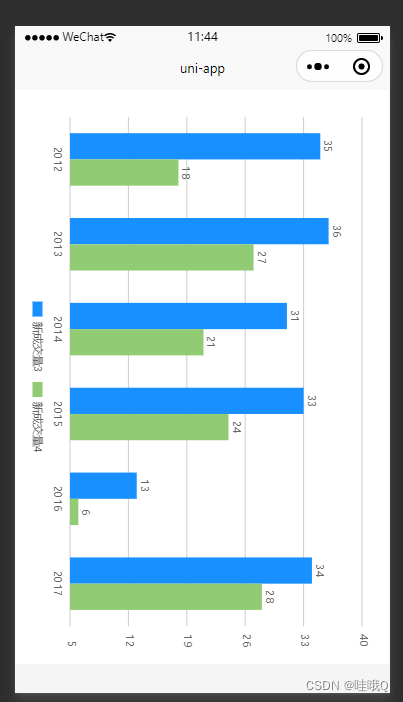
Column.categories = ['2012', '2013', '2014', '2015', '2016', '2017'];
Column.series = [{
name: '新成交量3',
data: [35, 36, 31, 33, 13, 34]
},
{
name: '新成交量4',
data: [18, 27, 21, 24, 6, 28]
}
];
_self.showColumn('canvasColumn', Column);
},
showColumn(canvasId, chartData) {
canvaColumn = new uCharts({
$this: _self,
canvasId: canvasId,
context: uni.createCanvasContext(canvasId, _self),
type: 'column',
padding: [15, 5, 0, 15],
legend: {
show: true,
padding: 5,
lineHeight: 11,
margin: 0
},
fontSize: 11,
background: '#FFFFFF',
pixelRatio: _self.pixelRatio,
animation: true,
rotate: true,
categories: chartData.categories,
series: chartData.series,
xAxis: {
disableGrid: true
},
yAxis: {
data: [{
position: 'right',
axisLine: false,
format: val => {
return val.toFixed(0) + '元';
}
}]
},
dataLabel: true,
width: _self.cWidth2 * _self.pixelRatio,
height: _self.cHeight2 * _self.pixelRatio,
extra: {
column: {
type: 'group',
width: (_self.cWidth2 * _self.pixelRatio * 0.45) / chartData.categories.length
}
}
});
},
touchColumn(e) {
canvaColumn.showToolTip(e, {
format: function(item, category) {
if (typeof item.data === 'object') {
return category + ' ' + item.name + ':' + item.data.value;
} else {
return category + ' ' + item.name + ':' + item.data;
}
}
});
canvaColumn.touchLegend(e, {
animation: true
});
},
changeData() {
if (isJSON(_self.textarea)) {
let newdata = JSON.parse(_self.textarea);
canvaColumn.updateData({
series: newdata.series,
categories: newdata.categories,
animation: true
});
} else {
uni.showToast({
title: '数据格式错误',
image: '../../../static/images/alert-warning.png'
});
}
}
}
}
</script>
<style lang="scss">
/*样式的width和height一定要与定义的cWidth和cHeight相对应*/
.qiun-charts-rotate {
width: 700upx;
height: 1100upx;
background-color: #FFFFFF;
padding: 25upx;
}
.charts-rotate {
width: 700upx;
height: 1100upx;
background-color: #FFFFFF;
}
</style>3、点击ucharts,图表横屏显示
<template>
	<view class="container">

		<!-- <qiun-data-charts type="column" :canvas2d="true" :opts="opts" :chartData="chartData" :ontouch="true" /> -->
		<button @click="show" v-if="isFull" class="btn">全屏</button>

		<view v-if="isFull">
			<qiun-data-charts type="column" :canvas2d="true" :opts="opts" :chartData="chartData" :ontouch="true" />
		</view>

		<view v-else class="big">
			<view class="qiun-charts-rotate">
				<qiun-data-charts type="column" :canvas2d="true" :opts="opt" :chartData="chartData" :ontouch="true" />
			</view>
			<view>
				<image class='img' src="../../static/c1.png" @click='close'
					style='width: 20px;height: 20px;margin-left: auto;display:block;'>
			</view>
		</view>
	</view>
</template>

<script>
	import uCharts from '@/uni_modules/qiun-data-charts/js_sdk/u-charts/u-charts.js'
	import echarts from '@/uni_modules/qiun-data-charts/static/app-plus/echarts.min.js'
	var _self;
	var canvaColumn = null;
	export default {
		data() {
			return {
				isFull: true, //遮罩层
				chartData: {},
				opts: {
					color: ["#FAC858", "#EE6666", "#FAC858", "#EE6666", "#73C0DE", "#3CA272", "#FC8452", "#9A60B4",
						"#ea7ccc"
					],
					padding: [10, 0, 0, 0],
					dataLabel: false,
					dataPointShapeType: 'hollow',
					touchMoveLimit: 24,
					enableScroll: true, //开启滚动条
					scrollShow: false, //滚动条不显示
					legend: {},
					xAxis: {
						disableGrid: true,
						itemCount: 5 //图表可视区显示的X轴数据点数量,仅在启用enableScroll时有效
					},
					yAxis: {
						data: [{
							min: 0
						}]
					},
					extra: {
						column: {
							type: "group",
							width: 20,
							activeBgColor: "#000000",
							activeBgOpacity: 0.08,
							linearType: "custom",
							seriesGap: 3,
							linearOpacity: 0.5,
							barBorderCircle: true,
							customColor: [
								"#FA7D8D",
								"#EB88E2"
							]
						}
					}
				},
				// cWidth: 750,
				// cHeight: 500,
				opt: {
					color: ["#FAC858", "#EE6666", "#FAC858", "#EE6666", "#73C0DE", "#3CA272", "#FC8452", "#9A60B4",
						"#ea7ccc"
					],
					padding: [10, 0, 0, 0],
					dataLabel: false,
					dataPointShapeType: 'hollow',
					touchMoveLimit: 24,
					rotate: true,
					enableScroll: true, //开启滚动条
					scrollShow: false, //滚动条不显示
					legend: {},
					xAxis: {
						disableGrid: true,
						itemCount: 5 //图表可视区显示的X轴数据点数量,仅在启用enableScroll时有效
					},
					yAxis: {
						data: [{
							min: 0
						}]
					},
					extra: {
						column: {
							type: "group",
							width: 20,
							activeBgColor: "#000000",
							activeBgOpacity: 0.08,
							linearType: "custom",
							seriesGap: 3,
							linearOpacity: 0.5,
							barBorderCircle: true,
							customColor: [
								"#FA7D8D",
								"#EB88E2"
							]
						}
					}
				},
			}
		},
		onReady() {
			this.ServerData();
		},
		methods: {
			ServerData() {
				//模拟从服务器获取数据时的延时
				setTimeout(() => {
					//模拟服务器返回数据,如果数据格式和标准格式不同,需自行按下面的格式拼接
					let res = {
						categories: ["2016", "2017", "2018", "2019", "2020", "2021"],
						series: [{
								name: "目标值",
								data: [35, 36, 31, 33, 13, 34]
							},
							{
								name: "完成量",
								data: [18, 27, 21, 24, 6, 28]
							}
						]
					};
					this.chartData = JSON.parse(JSON.stringify(res));
				}, 500);
			},
			show() {
				this.isFull = false
			},
			close() {
				this.isFull = true
			},
		}
	}
</script>

<style lang="scss">
	/*样式的width和height一定要与定义的cWidth和cHeight相对应*/
	.qiun-charts-rotate {
		width: 700upx;
		height: 1100upx;
		background-color: #FFFFFF;
		padding: 25upx;
	}

	.charts-rotate {
		width: 700upx;
		height: 1100upx;
		background-color: #FFFFFF;
	}


	// 按钮
	.btn {
		width: 200rpx;
		height: 50rpx;
		background-color: aquamarine;
		color: #000;
		line-height: 50rpx;
	}


	// 全屏样式
	.big {
		background-color: #FFFFFF;
	}

	.img {
		position: relative;
		right: auto;
	}
</style>4、小程序echarts横屏显示
将xAxis与yAxis里面的内容互换,可以横纵切换展示
标注旋转使用series的 symbolRotate,标注里面的字旋转使用series的markPoint的label的rotate
<template>
	<view class="container">
		<view class="tu">
			<uni-ec-canvas class="uni-ec-canvas" id="uni-ec-canvas" ref="uni-ec-canvas" canvas-id="uni-ec-canvas"
				:ec="ec"></uni-ec-canvas>
		</view>
	</view>
</template>
<script>
	import uniEcCanvas from '@/components/uni-ec-canvas/uni-ec-canvas.vue'
	export default {
		components: {
			uniEcCanvas,
		},
		data() {
			return {
				ec: {
					option: {
						tooltip: {
							trigger: 'axis',
							// extraCssText: 'transform: rotate(90deg)',
							formatter: (params) => { // 提示框浮层内容格式器 以函数的形式修改
								return tipFormatter(params) // 见最底层的函数
							}
						},
						dataZoom: [
							//在内部可以纵向拖动
							{
								type: 'inside',
								yAxisIndex: [0],
								start: 50,
								end: 100
							}
						],
						xAxis: {
							type: 'value', //数据
							position: 'top', //x 轴的位置【top bottom】
							nameRotate: -90, //坐标轴名字旋转,角度值。
							axisLabel: { //坐标轴刻度标签的相关设置。
								rotate: 90 //刻度标签旋转的角度,
							},
							// scale: true, //是否是脱离 0 值比例
						},
						yAxis: {
							type: 'category',
							data: ['2022-1-1', '2022-1-2', '2022-1-3', '2022-1-4', '2022-1-5', '2022-1-6', '2022-1-7',
								'2022-1-8', '2022-1-9',
							],
							inverse: 'true', //是否是反向坐标轴。
							splitLine: { //网格线
								lineStyle: {
									color: "#9da2af",
									type: 'solid' //设置网格线类型 dotted:虚线 solid:实线
								}
							},
							axisTick: {
								show: false
							},
							axisLine: {
								lineStyle: { //改变xy轴线条的颜色
									color: "#9da2af",
									width: 1 //这里是为了突出显示加上的
								}
							},
							axisLabel: {
								rotate: -90,
								textStyle: { //改变xy轴上文字的颜色
									color: "#9da2af",
									fontSize: '10',
								}
							},
						},
						series: [{
							name: '',
							type: 'line',
							data: [1, 1.5, 2, 5, 3, 2, 0, 2.5, 3.5],
							symbolSize: 40,
							symbol: "pin",
							symbolRotate: -90,
							markPoint: {
								label: {
									show: true
								},
								data: [{
										name: '',
										value: '买',
										coord: [5, 33.4],
										itemStyle: {
											color: 'rgb(255, 1, 5)'
										}
									},
									{
										name: '',
										value: '卖',
										coord: [5, 30.4],
										itemStyle: {
											color: 'rgb(0, 170, 0)'
										}
									},
								],
								tooltip: {
									trigger: 'item',
									formatter: function(value) {
										return value.data.coord[0] + '\n' + value.data.coord[1]
									}
								}
							},
							itemStyle: {
								normal: {
									color: "#3bb632", //折线点的颜色
									lineStyle: {
										color: "#00f2f1", //折线的颜色
										width: 1
									}
								}
							},
						}]
					}
				},
			}
		},
		methods: {
			tipFormatter(params) {
				var name = '上传时间 2019-4-19-14:59:31\n'; // 悬浮层内容,可自定义
				var name2 = '我是自定义的内容'; // 悬浮层内容,可自定义
				var divWarp = $('<div style="width: 100px;"/>'); // 使用JQ(或原生js) 生成一个dom 外盒子
				var divContent = $(
					'<view style = "backgroundColor: #696969; box-shadow: 0 0 5px rgba(0, 0, 0, 0.3); padding: 2px 5px; transform:rotate(90deg);">'
				); // 承载内容的盒子,并给盒子样式
				var p = $('<p>').text(name); // 内容标签, 可以有多个
				var p2 = $('<p>').text(name2); // 内容标签, 可以有多个
				var divFirst = divContent.append(p); // 将 p 加到 divContent
				var divSecond = divContent.append(p2); // 将 p2 加到 divContent
				var view = divWarp.append(divFirst).append(divSecond); // 将内容盒子加到外盒子上
				return view.html(); // 渲染到html 并将结果返回
			}
		}
	}
</script>
<style lang="scss">
	/* 请根据需求修改图表容器尺寸,如果父容器没有高度图表则会显示异常 */
	.tu {
		width: 100%;
		height: 1100upx;
		// background-color: aqua;
		// background-color: aquamarine;
		// background-image: url(@/static/rowbj.png);
		background-size: 100% 100%;
		margin-top: 2%;
	}

	.uni-ec-canvas {
		transform: rotate(90);
	}
</style>
5、[uCharts] 未获取到context!注意:v2.0版本后,需要自行获取canvas的绘图上下文并传入opts.context!
使用uniapp引入ucharts图表时控制台报错
直接添加一句context:uni.createCanvasContext(canvasId, _self)