1、background 属性设置渐变色
1、源码示例:
.text {


	background-image: linear-gradient(to right, pink, purple);
	color: transparent;
	-webkit-background-clip: text;
}

2、实现原理:
(1)background-image :为该文字区域设置渐变背景色。
语法:background-image: linear-gradient(direction, color-stop1, color-stop2, …);
参数:渐变方向、开始颜色、结束颜色
linear-gradient(blue, red);/* 默认从上到下,蓝色渐变到红色 */
linear-gradient(to left top, blue, red);/* 从右下到左上、从蓝色渐变到红色 */
linear-gradient(45deg, blue, red);/* 渐变轴为45度,从蓝色渐变到红色 */
linear-gradient(0deg, blue, green 40%, red);/* 从下到上,从蓝色开始渐变、到高度40%位置是绿色渐变开始、最后以红色结束 */
(2)color:transparent :将文字颜色设置成透明色。
(3)background-clip:text 将背景裁剪成文字前景色。
⚠️注:background-clip:text 不支持ie
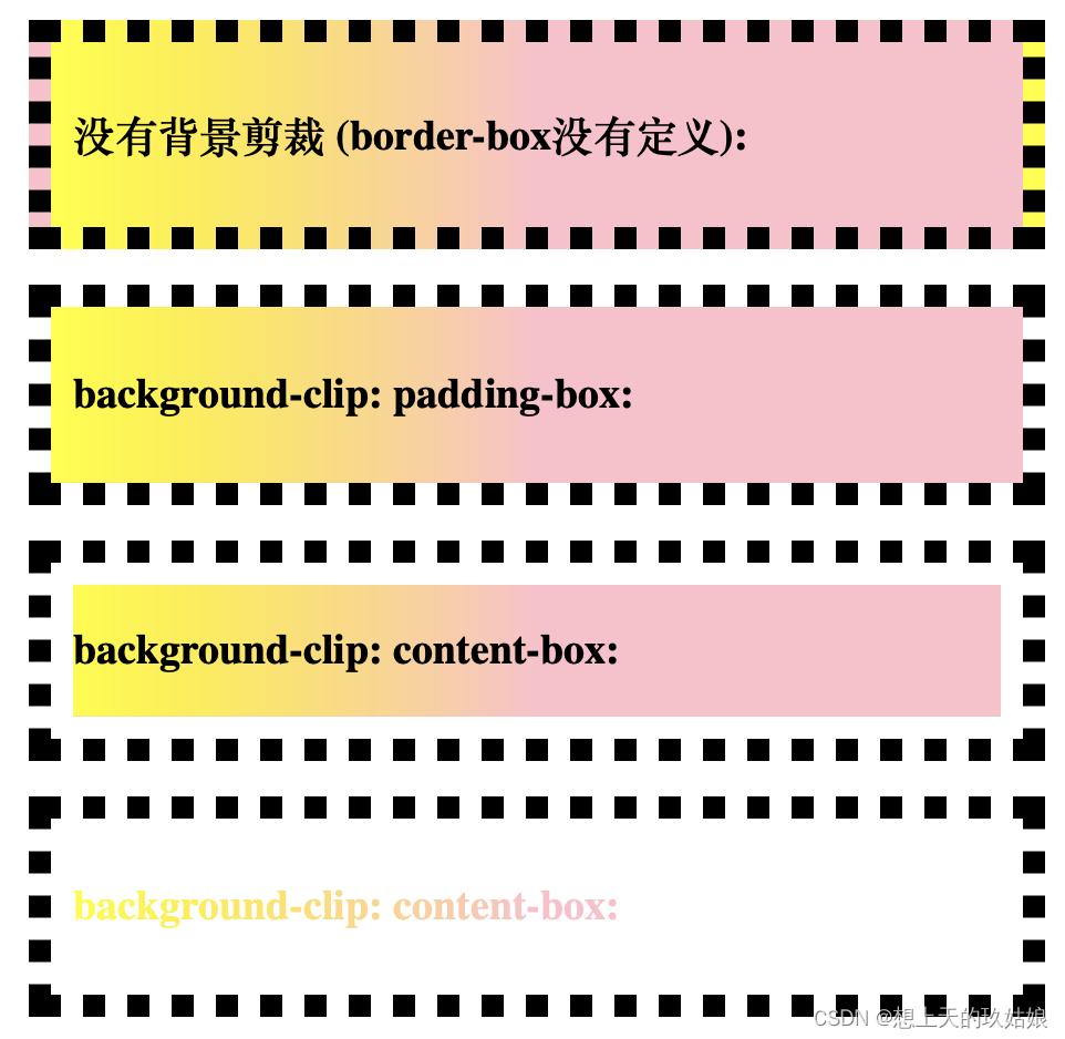
属性:
border-box(默认值。背景绘制在边框方框)
padding-box (背景绘制在衬距方框)
content-box (背景绘制在内容方框)
text(背景绘制在文字里)
#example1 {


    border: 10px dotted black;
    padding:10px;
	background-image: linear-gradient(to right, yellow, pink 50%)
}
#example2 {


    border: 10px dotted black;
    padding:10px;
    background-clip: padding-box;
	background-image: linear-gradient(to right, yellow, pink 50%)
}
#example3 {


    border: 10px dotted black;
    padding:10px;
    background-clip: content-box;
	background-image: linear-gradient(to right, yellow, pink 50%)
}
#example4 {


    border: 10px dotted black;
    padding:10px;
    background-clip: text;
	-webkit-background-clip:text;
	color: transparent;
	background-image: linear-gradient(to right, yellow, pink 50%)
}
2、-webkit-mask图片蒙版效果制作渐变色
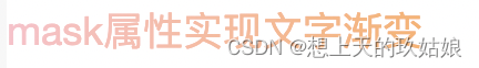
.text-gradient {
position: relative;
color: pink;
font-size: 20px;
}
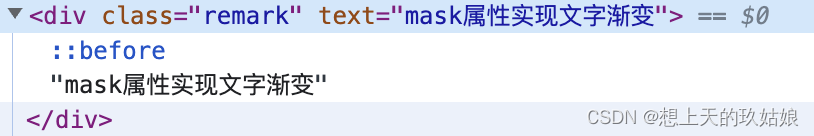
.text-gradient:before {
content: attr(text);
position: absolute;
z-index: 10;
color: orange;
-webkit-mask: linear-gradient(to right, transparent, orange);
}
<div text="文字渐变" class="text-gradient">文字渐变
实现原理:
(1).text-gradient:before :生成一个新元素。
(2)content:attr(text): 让新元素的内容与原文本的内容相同,
(3)color:orange 将新元素文本设置为橙色
(4)-webkit-mask: linear-gradient(to right, transparent, orange):为新元素添加了一个从左到右,透明到橙色的渐变遮罩,before 元素中与mask的 transparent 的重叠部分变成了透明色。
before 新元素与原 div 蓝色文本叠加,形成了从左至右从蓝色到橙色的渐变效果
⚠️注:mask 不支持IE,目前仅有-webkit-前缀的谷歌及safari浏览器
-webkit-mask属性:
demo1 {


    background : url("images/logo.png") no-repeat;
    -webkit-mask : url("images/mask.png");
}