昨天,我简单的介绍了一下过渡和动画,这些主要是对一些属性的理解和运用,今天我们就来练练,实操检验成果,一起来看看吧!
前言
今天都是一些实操练习,有什么不清楚的可以发私信给我呀~内附源码,
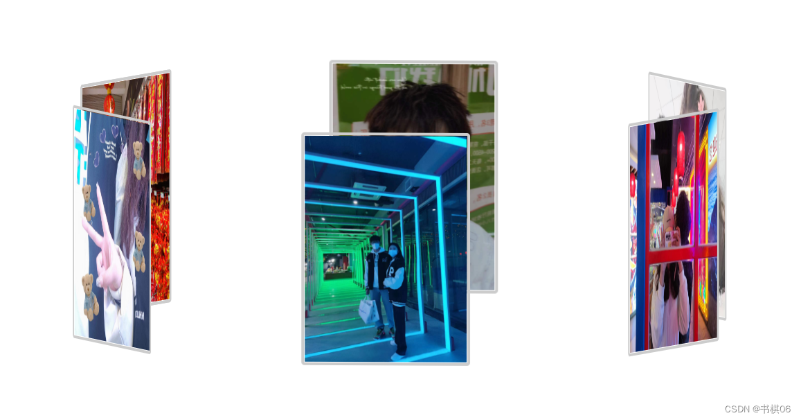
一、旋转相册
1.运行效果
代码如下(示例):
<!DOCTYPE html>
<html lang="en">
	<head>
		<meta charset="UTF-8">
		<meta http-equiv="X-UA-Compatible" content="IE=edge">
		<meta name="viewport" content="width=device-width, initial-scale=1.0">
		<title>照片墙</title>
		<style>
			body {
				margin: 0px;
			}

			#div {
				background-image: url(w3.jpeg);
				position: fixed;
				top: 0;
				left: 0;
				width: 100%;
				height: 100%;
				min-width: 1000px;
				z-index: -10;
				zoom: 1;
				background-color: #fff;
				background-repeat: no-repeat;
				background-size: cover;
				background-position: center 0;

			}

			#photo_box {
				width: 280px;
				height: 400px;
				position: fixed;
				left: 0;
				right: 0;
				top: 0;
				bottom: 0;
				margin: 200px auto;
				transform-style: preserve-3d;
				transform: rotateX(-5deg) rotateY(0deg);
				animation: run 30s linear infinite;
			}

			#photo_box img {
				width: 250px;
				height: 350px;
				border: 5px solid #ccc;
				border-radius: 5px;
				position: absolute;
				left: 0;
				top: 0;
			}

			#photo_box img:nth-child(1) {
				transform: rotateY(0deg) translateZ(500px);
			}

			#photo_box img:nth-child(2) {
				transform: rotateY(60deg) translateZ(500px);
			}

			#photo_box img:nth-child(3) {
				transform: rotateY(120deg) translateZ(500px);
			}

			#photo_box img:nth-child(4) {
				transform: rotateY(180deg) translateZ(500px);
			}

			#photo_box img:nth-child(5) {
				transform: rotateY(240deg) translateZ(500px);
			}

			#photo_box img:nth-child(6) {
				transform: rotateY(300deg) translateZ(500px);
			}

			#photo_box img:nth-child(7) {
				transform: rotateY(360deg) translateZ(500px);
			}


			@keyframes run {
				0% {
					transform: rotateX(0deg) rotateY(0deg);
				}

				25% {
					transform: rotateX(10deg) rotateY(90deg);
				}

				50% {
					transform: rotateX(0deg) rotateY(180deg);
				}

				75% {
					transform: rotateX(-10deg) rotateY(270deg);

				}

				100% {
					transform: rotateX(0deg) rotateY(360deg);
				}
			}
		</style>
	</head>
	<body>
		<div>

			<div id="photo_box">
				<img src="./img/1.jpg">
				<img src="./img/2.jpg">
				<img src="./img/3.jpg">
				<img src="./img/4.jpg">
				<img src="./img/5.jpg">
				<img src="./img/6.jpg">
				<img src="./img/7.jpg">

			</div>
		</div>
	</body>
</html>
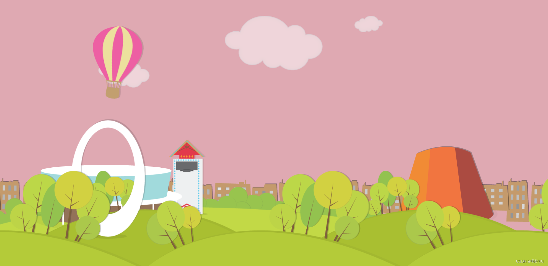
二、城市动画
运行效果:

<!DOCTYPE html>
<html lang="en">
	<head>
		<meta charset="UTF-8">
		<title></title>
		<style>
			* {
				margin: 0;
				padding: 0;
			}

			body {
				background: pink;
				overflow: hidden;
				animation: bg 20s linear infinite;
			}

			@keyframes bg {
				0% {
					background: pink;
				}

				25% {
					background: pink;
				}

				65% {
					background: #111;
				}

				85% {
					background: #111;
				}

				100% {
					background: pink;
				}
			}

			.wrap {
				width: 100%;
				height: 100%;
			}

			/*草坪*/
			.ground-front {
				position: absolute;
				bottom: 0;
				width: 100%;
				height: 300px;
				background: url(images/groundFront.png);
				background-repeat: repeat-x;
				background-position: center;
				z-index: 9;
			}

			.ground-mid {
				position: absolute;
				bottom: 0;
				width: 100%;
				height: 300px;
				background: url(images/groundMid.png);
				z-index: 7;
			}

			.ground-back {
				position: absolute;
				bottom: 0;
				width: 100%;
				height: 250px;
				background: url(images/groundBack.png) no-repeat;
				z-index: 4;
			}

			/*建筑*/
			.bulid .skyline {
				position: absolute;
				bottom: 78px;
				width: 100%;
				height: 250px;
				background: url(images/skyline.png) repeat-x;
				background-position: center;
			}

			.bulid .frendship-shell img {
				position: absolute;
				left: 222px;
				bottom: 90px;
				z-index: 8;
			}

			.bulid .dowEvenCenter img {
				position: absolute;
				left: 70px;
				bottom: 100px;
				z-index: 6;
				transform: scale(0.9);
			}

			.bulid .glokenspiel img {
				position: absolute;
				left: 515px;
				bottom: 147px;
				z-index: 5;
				transform: scale(0.9);
			}

			.bulid .plantarium img {
				position: absolute;
				right: 150px;
				bottom: 105px;
				z-index: 5;
				transform: scale(0.9);
			}

			.cloud img {
				position: absolute;
				top: 50px;
				opacity: 0.6;
			}

			.cloud-large img {
				z-index: 2;
				left: 500px;
				animation: cloud-move 80s linear infinite alternate;
			}

			.cloud-midium img {
				top: 180px;
				z-index: 1;
				left: 100px;
				animation: cloud-move 100s linear infinite alternate;
			}

			.cloud-small img {
				left: 1000px;
				animation: cloud-move 100s linear infinite alternate;
			}

			@keyframes cloud-move {
				0% {}

				50% {
					left: 105%
				}

				100% {
					left: -100px
				}
			}
			.balloon img {
				position: absolute;
				animation: balloon-move 50s linear infinite;
				left: -200px;
				top: 80px;
				z-index: 3;
			}

			@keyframes balloon-move {

				10% {
					transform: rotate(0deg);
				}

				25% {
					transform: rotate(45deg);
				}

				50% {
					left: 105%;
					transform: rotate(0deg);
				}

				60% {
					transform: rotate(0deg);
				}

				75% {
					transform: rotate(-45deg);
				}

				100% {
					left: -200px
				}
			}


		</style>
	</head>
	<body>
		<div class="wrap">
			<div class="ground-front"></div>
			<div class="ground-mid"></div>
			<div class="ground-back"></div>
			<div class="bulid">
				<div class="skyline"></div>
				<div class="frendship-shell">
					<img src="images/friendshipShell.png">
				</div>
				<div class="dowEvenCenter">
					<img src="images/dowEventCenter.png">
				</div>
				<div class="glokenspiel">
					<img src="images/Glockenspiel.png">
				</div>
				<div class="plantarium">
					<img src="images/Planetarium.png">
				</div>
			</div>
			<div class="cloud">
				<div class="cloud-large"><img src="images/cloudLarge.png"></div>
				<div class="cloud-midium"><img src="images/cloudMedium.png"></div>
				<div class="cloud-small"><img src="images/cloudSmall.png"></div>
			</div>
			<div class="balloon">
				<img src="images/balloon.png">
			</div>

		</div>
	</body>
</html>
三、wc3导航条

<!DOCTYPE html>
<html>
	<head>
		<meta charset="utf-8">
		<title>导航条</title>
		<link rel="stylesheet" type="text/css" href="css/reset.css" />
		<style type="text/css">
			* {
		 	margin: 0;
				padding: 0;
				text-decoration: none;
				list-style: none;
			}

			.nav {
				display: flex;
				width: 1200px;
				height: 50px;
				line-height: 50px;
				margin: 50px auto;
				background-color: #e8e7e3;
			}

			.nav li {
				flex-grow: 1;
			}

			.nav a {
				display: block;
				color: #808080;
				font-size: 16px;
				text-align: center;
			}

			.nav a:hover {
				color: #FFF;
				background-color: #636363;
			}
		</style>
	</head>
	<body>
		<ul class="nav">
			<li><a href="#">HTML/CSS</a></li>
			<li><a href="#">Browser Side</a></li>
			<li><a href="#">Server Side</a></li>
			<li><a href="#">Programming</a></li>
			<li><a href="#">XML</a></li>
			<li><a href="#">Web Building</a></li>
			<li><a href="#">Reference</a></li>
		</ul>
	</body>
</html>
四.骰子

<!DOCTYPE html>
<html>
	<head>
		<meta charset="utf-8">
		<title>骰子</title>
		<style>
			body {
				display: flex;
				background-color: white;
			}

			ul,
			li {
				margin: 0;
				padding: 0;
				list-style: none;
			}

			.one {
				display: flex;
				width: 100px;
				height: 100px;
				margin: 10px;
				background: #333;
				border-radius: 10px;

			}

			.one li {
				height: 30px;
				width: 30px;
				background: #FFF;
				border-radius: 50px;
			}

			.er {

				display: flex;
				justify-content: space-between;
				align-items: center;
			}


			.two {
				display: flex;
				justify-content: space-between;
			}

			.two li:nth-child(2) {
				align-self: center;
			}

			.two li:nth-child(3) {
				align-self: flex-end;
			}

			.three {
				display: flex;
				flex-wrap: wrap;
				align-content: space-around;
			}

			.three ul {
				width: 100%;
				display: flex;
				justify-content: space-around;
			}

			.five {
				display: flex;
				flex-wrap: wrap;
				align-content: space-between;
			}

			.five ul {
				width: 100%;
				display: flex;
				justify-content: space-between;
			}

			.five ul:nth-child(2) {
				justify-content: center;
			}
		</style>
	</head>
	<body>
		<ul class="one first">
			<li></li>
		</ul>
		<ul class="one er">
			<li></li>
			<li></li>
		</ul>

		<ul class="one two">
			<li></li>
			<li></li>
			<li></li>
		</ul>
		<div class="one three">
			<ul>
				<li></li>
				<li></li>
			</ul>
			<ul>
				<li></li>
				<li></li>
			</ul>
		</div>
		<div class="one five">
			<ul>
				<li></li>
				<li></li>
			</ul>
			<ul>

				<li></li>
			</ul>
			<ul>
				<li></li>
				<li></li>
			</ul>
	</body>
</html>
总结
旋转transform: rotate();
1. 默认情况下是绕着中⼼点进⾏转动的; 2. 默认的单位是deg,⽐如rotate(45deg) 3. 如果这个值为正值,则是元素对原点中⼼顺时针旋转;
从过渡到动画再到弹性盒子,主要就是一些属性的运用,掌握这些属性,这些简单的效果非常 容易就写出来了,反之如果这个值为负值,元素对原点中⼼进⾏逆时针旋转。
可以单独对x轴y轴z轴进⾏设置:这⾥的X/Y/Z也是是需要⼤写的。
rotateX() ,指元素围绕其 X 轴以设定的度数进⾏旋转
rotateY() ,元素围绕其 Y 轴以设定的度数进⾏旋转
rotateZ() ,元素围绕其 Y 轴以设定的度数进⾏旋转
主要就是一些属性的运用,好啦,今天的分享就到这里啦,明天就周五啦,这周又要过完啦,又是很充实的一周呀!最后,祝愿屏幕前的你,生活愉快呀~