这篇文章只有一些代码,分析的内容很多,但是没有进行必要的解释
我也是第一次做,不是很懂股票,可能有一些错误。
# 导包
import numpy as np
import matplotlib.pyplot as plt
from pandas_datareader import data
from scipy.signal import find_peaks
from scipy.stats import norm
import pandas_datareader.data as web
import pandas_datareader.data as webdata
import datetime
import pandas as pd
import seaborn as sns # pip install seaborn
import matplotlib.patches as mpatches
from pyfinance import TSeries # pip install pyfinance
from empyrical import sharpe_ratio,omega_ratio,alpha_beta,stats # pip install empyrical
import warnings
warnings.filterwarnings('ignore')
tickers = ['F','TSLA','FSR','GM','NEE','SO','BYD','NIO','SOL','JKS']
startDate = '2019-06-01'
endDate = '2022-06-01'

F = webdata.get_data_stooq('F',startDate,endDate) # 福特
TSLA = webdata.get_data_stooq('TSLA',startDate,endDate) # 特斯拉
FSR = webdata.get_data_stooq('FSR',startDate,endDate)  # 杜克能源公司
GM = webdata.get_data_stooq('GM',startDate,endDate) # 通用汽车
NEE = webdata.get_data_stooq('NEE',startDate,endDate) # NextEra能源公司
SO = webdata.get_data_stooq('SO',startDate,endDate)# 南方公司
BYD = webdata.get_data_stooq('BYD',startDate,endDate)# 比亚迪
NIO = webdata.get_data_stooq('NIO',startDate,endDate) # 蔚来
SOL = webdata.get_data_stooq('SOL',startDate,endDate) # 瑞能新能源
JKS = webdata.get_data_stooq('JKS',startDate,endDate) # 法拉第未来

stocks = pd.DataFrame({

    "F": F["Close"],
                      "TSLA": TSLA["Close"],
                      "FSR": FSR["Close"],
                      "GM": GM["Close"],
                       "NEE": NEE["Close"],
                       "SO": SO["Close"],
                       "BYD": BYD["Close"],
                       "NIO": NIO["Close"],
                       "SOL": SOL["Close"],
                        "JKS": JKS["Close"],
                      })

stocks

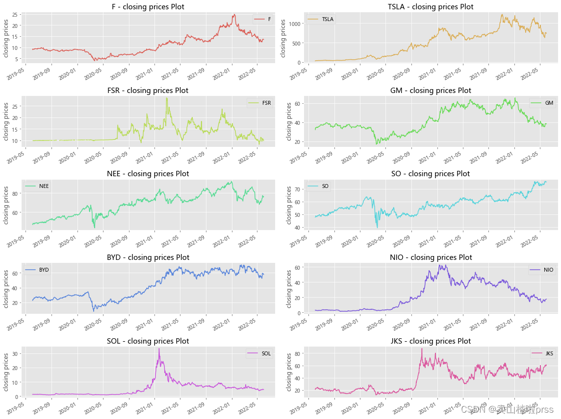
Plot the closing prices of the stocks
# 收盘价走势
plt.style.use('ggplot') # 样式
color_palette=sns.color_palette("hls",10) # 颜色
plt.rcParams['font.sans-serif']=['Microsoft YaHei']
fig = plt.figure(figsize = (16,12))
for i,j in enumerate(tickers):
    plt.subplot(5,2,i+1)
    stocks[j].plot(kind='line', style=['-'],color=color_palette[i],label=j)
    plt.xlabel('')
    plt.ylabel('closing prices')
    plt.title('{} - closing prices Plot'.format(j))
    plt.legend()
plt.tight_layout()
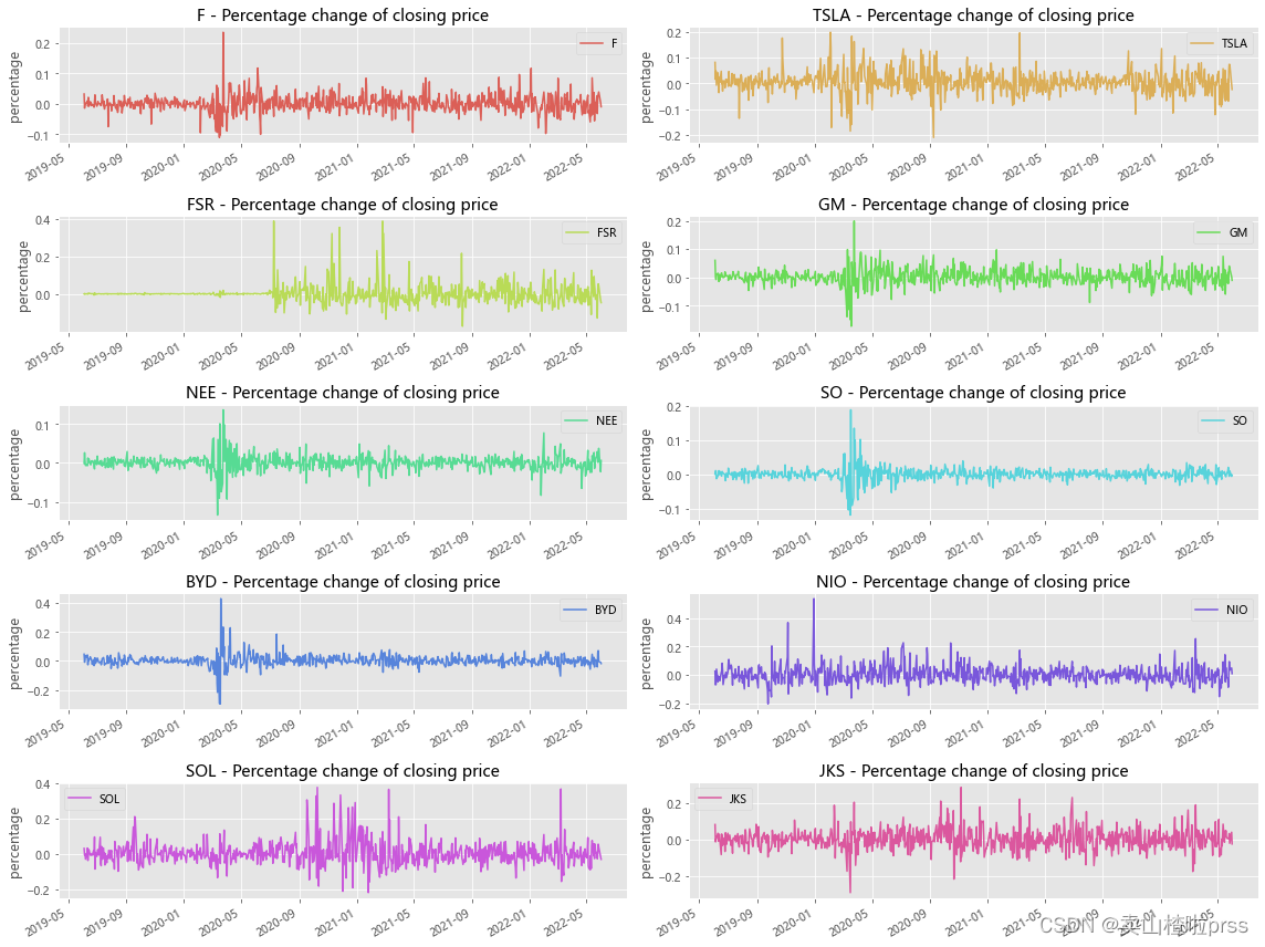
Percentage change of closing price(day)
# 每日的收益率走势
# 通过上图可以看到,整体呈上下波动趋势,个别时间点波动性较大。
plt.style.use('ggplot')
color_palette=sns.color_palette("hls",10)
plt.rcParams['font.sans-serif']=['Microsoft YaHei']
fig = plt.figure(figsize = (16,12))
for i,j in enumerate(tickers):
    plt.subplot(5,2,i+1)
    stocks[j].pct_change().plot(kind='line', style=['-'],color=color_palette[i],label=j)
    plt.xlabel('')
    plt.ylabel('percentage')
    plt.title('{} - Percentage change of closing price'.format(j))
    plt.legend()
plt.tight_layout()
Average daily return of closing price
# 日平均收益
for i in tickers:
    r_daily_mean = ((1+stocks[i].pct_change()).prod())**(1/stocks[i].shape[0])-1
    #print("%s - Average daily return:%f"%(i,r_daily_mean))
    print("%s - Average daily return is:%s"%(i,str(round(r_daily_mean*100,2))+"%"))
F - Average daily return is:0.05%
TSLA - Average daily return is:0.4%
FSR - Average daily return is:0.0%
GM - Average daily return is:0.02%
NEE - Average daily return is:0.06%
SO - Average daily return is:0.06%
BYD - Average daily return is:0.12%
NIO - Average daily return is:0.24%
SOL - Average daily return is:0.17%
JKS - Average daily return is:0.14%
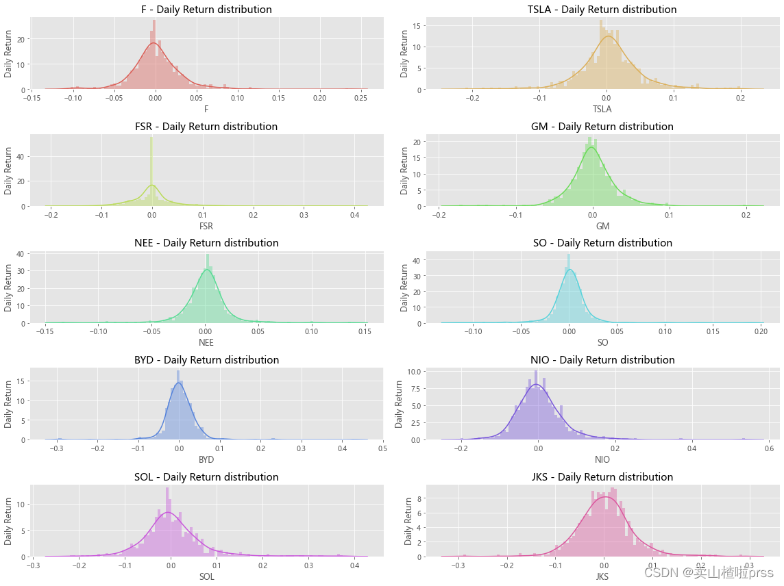
# 日收益率的概率分布图
# 查看分布情况
plt.style.use('ggplot')
plt.rcParams['font.sans-serif']=['Microsoft YaHei']
fig = plt.figure(figsize = (16,12))
for i,j in enumerate(tickers):
    plt.subplot(5,2,i+1)
    sns.distplot(stocks[j].pct_change(), bins=100, color=color_palette[i])
    plt.ylabel('Daily Return')
    plt.title('{} - Daily Return distribution'.format(j))
plt.tight_layout();
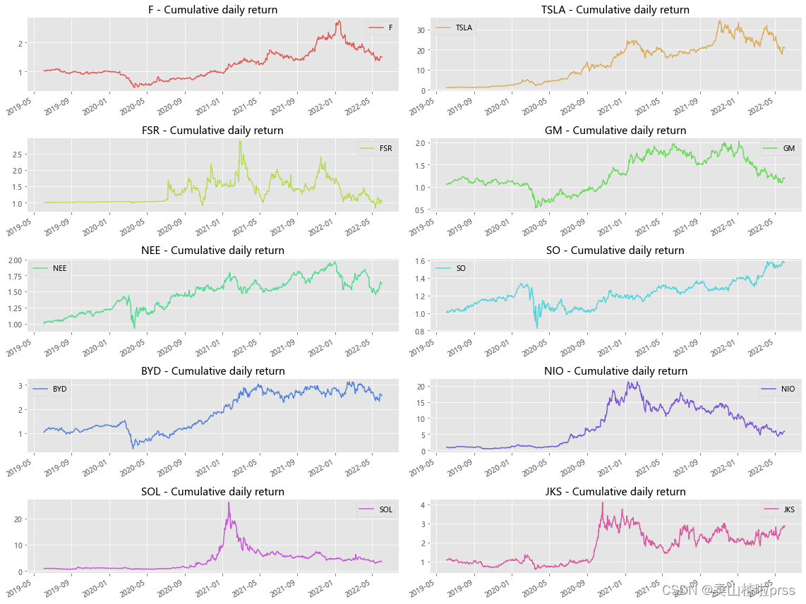
# 累积日收益率
# 累积日收益率有助于定期确定投资价值。可以使用每日百分比变化的数值来计算累积日收益率,只需将其加上1并计算累积的乘积。
# 累积日收益率是相对于投资计算的。如果累积日收益率超过1,就是在盈利,否则就是亏损。
plt.style.use('ggplot')
plt.rcParams['font.sans-serif']=['Microsoft YaHei']
fig = plt.figure(figsize = (16,12))
for i,j in enumerate(tickers):
    plt.subplot(5,2,i+1)
    cc = (1+stocks[j].pct_change()).cumprod()
    cc.plot(kind='line', style=['-'],color=color_palette[i],label=j)
    plt.xlabel('')
    plt.title('{} - Cumulative daily return'.format(j))
    plt.legend()
plt.tight_layout()
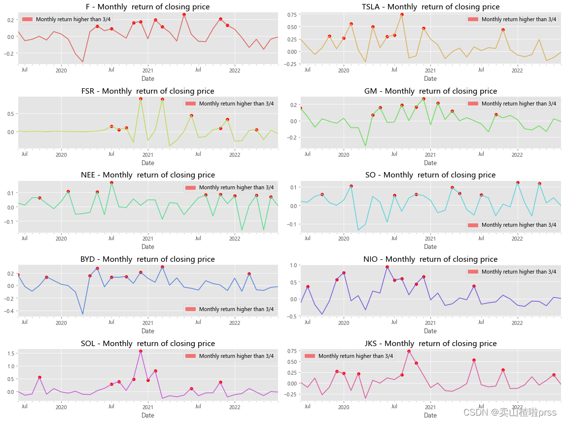
Monthly return of closing price
# 月收益率
# 对月收益率进行可视化分析,标注收益率高于四分之三分位数的点。
# 月收益率围绕均线上下波动
fig = plt.figure(figsize = (16,12))
for i,j in enumerate(tickers):
    plt.subplot(5,2,i+1)
    daily_ret = stocks[j].pct_change()
    mnthly_ret = daily_ret.resample('M').apply(lambda x : ((1+x).prod()-1))
    mnthly_ret.plot(color=color_palette[i]) # Monthly return
    start_date=mnthly_ret.index[0]
    end_date=mnthly_ret.index[-1]
    plt.xticks(pd.date_range(start_date,end_date,freq='Y'),[str(y) for y in range(start_date.year+1,end_date.year+1)])
    # Show points with monthly yield greater than 3/4 quantile
    dates=mnthly_ret[mnthly_ret>mnthly_ret.quantile(0.75)].index
    for i in range(0,len(dates)):
        plt.scatter(dates[i], mnthly_ret[dates[i]],color='r')
    labs = mpatches.Patch(color='red',alpha=.5, label="Monthly return higher than 3/4")
    plt.title('%s - Monthly  return of closing price'%j,size=15)
    plt.legend(handles=[labs])
plt.tight_layout()
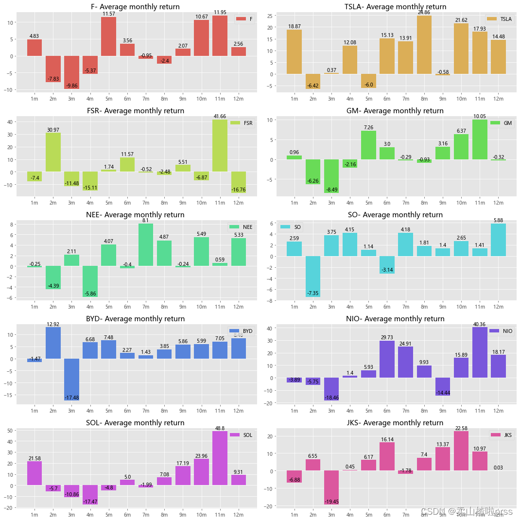
Average monthly return
# 月平均收益
plt.style.use('ggplot')
plt.rcParams['font.sans-serif']=['Microsoft YaHei']
fig = plt.figure(figsize = (15,15))
for i,j in enumerate(tickers):
    plt.subplot(5,2,i+1)
    daily_ret = stocks[j].pct_change()
    mnthly_ret = daily_ret.resample('M').apply(lambda x : ((1+x).prod()-1))
    mrets=(mnthly_ret.groupby(mnthly_ret.index.month).mean()*100).round(2)
    attr=[str(i)+'m' for i in range(1,13)]
    v=list(mrets)
    plt.bar(attr, v,color=color_palette[i],label=j)
    for a, b in enumerate(v):
        plt.text(a, b+0.08,b,ha='center',va='bottom')
    plt.title('{}- Average monthly return '.format(j))
    plt.legend()
plt.tight_layout()

# 图中显示某些月份具有正的收益率均值,而某些月份具有负的收益率均值,
Three year compound annual growth rate (CAGR)
复合年增长率(Compound Annual Growth Rate,CAGR)是一项投资在特定时期内的年度增长率
CAGR=(现有价值/基础价值)^(1/年数) - 1 或 (end/start)^(1/# years)-1

它是一段时间内的恒定回报率。换言之,该比率告诉你在投资期结束时,你真正获得的收益。它的目的是描述一个投资回报率转变成一个较稳定的投资回报所得到的预想值。
 # 复合年增长率(CAGR)
for i in tickers:
    days = (stocks[i].index[0] - stocks[i].index[-1]).days
    CAGR_3 = (stocks[i][-1]/ stocks[i][0])** (365.0/days) - 1
    print("%s (CAGR):%s"%(i,str(round(CAGR_3*100,2))+"%"))
F (CAGR):-12.74%
TSLA (CAGR):-63.6%
FSR (CAGR):-0.03%
GM (CAGR):-5.53%
NEE (CAGR):-14.94%
SO (CAGR):-14.14%
BYD (CAGR):-26.77%
NIO (CAGR):-44.8%
SOL (CAGR):-34.81%
JKS (CAGR):-29.16%
Annualized rate of return
# 年化收益率
# 年化收益率,是判断一只股票是否具备投资价值的重要标准!
# 年化收益率,即每年每股分红除以股价
for i in tickers:
    r_daily_mean = ((1+stocks[i].pct_change()).prod())**(1/stocks[i].shape[0])-1
    annual_rets = (1+r_daily_mean)**252-1
    print("%s'annualized rate of return is:%s"%(i,str(round(annual_rets*100,2))+"%"))
F’annualized rate of return is:14.56%
TSLA’annualized rate of return is:174.14%
FSR’annualized rate of return is:0.03%
GM’annualized rate of return is:5.84%
NEE’annualized rate of return is:17.53%
SO’annualized rate of return is:16.43%
BYD’annualized rate of return is:36.45%
NIO’annualized rate of return is:80.92%
SOL’annualized rate of return is:53.24%
JKS’annualized rate of return is:41.06%
maximum drawdowns
最大回撤率(Maximum Drawdown),它用于测量在投资组合价值中,在下一次峰值来到之前,最高点和最低点之间的最大单次下降。换言之,该值代表了基于某个策略的投资组合风险。
“最大回撤率是指在选定周期内任一历史时点往后推,产品净值走到最低点时的收益率回撤幅度的最大值。最大回撤用来描述买入产品后可能出现的最糟糕的情况。最大回撤是一个重要的风险指标,对于对冲基金和数量化策略交易,该指标比波动率还重要。”
最大回撤率超过了自己的风险承受范围,建议谨慎选择。
# 最大回撤率
def getMaxDrawdown(x):
    j = np.argmax((np.maximum.accumulate(x) - x) / x)
    if j == 0:
        return 0
    i = np.argmax(x[:j])
    d = (x[i] - x[j]) / x[i] * 100
    return d
for i in tickers:
    MaxDrawdown = getMaxDrawdown(stocks[i])
    print("%s maximum drawdowns:%s"%(i,str(round(MaxDrawdown,2))+"%"))
F maximum drawdowns:59.97%
TSLA maximum drawdowns:60.63%
FSR maximum drawdowns:0%
GM maximum drawdowns:57.53%
NEE maximum drawdowns:35.63%
SO maximum drawdowns:38.43%
BYD maximum drawdowns:77.43%
NIO maximum drawdowns:79.77%
SOL maximum drawdowns:88.88%
JKS maximum drawdowns:65.44%
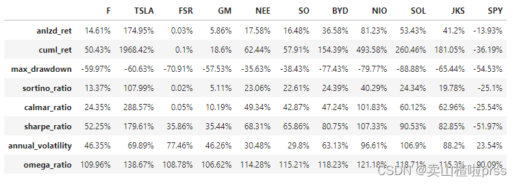
calmer ratios for the top performers
# calmar率
# Calmar比率(Calmar Ratio) 描述的是收益和最大回撤之间的关系。计算方式为年化收益率与历史最大回撤之间的比率。
# Calmar比率数值越大,股票表现越好。
def performance(i):
    a = stocks[i].pct_change()
    s = a.values
    idx = a.index
    tss = TSeries(s, index=idx)
    dd={

    }
    dd['anlzd_ret']=str(round(tss.anlzd_ret()*100,2))+"%"
    dd['cuml_ret']=str(round(tss.cuml_ret()*100,2))+"%"
    dd['max_drawdown']=str(round(tss.max_drawdown()*100,2))+"%"
    dd['sortino_ratio']=str(round(tss.sortino_ratio(freq=250),2))+"%"
    dd['calmar_ratio']=str(round(tss.calmar_ratio()*100,2))+"%"
    dd['sharpe_ratio'] = str(round(sharpe_ratio(tss)*100,2))+"%" # 夏普比率(Sharpe Ratio):风险调整后的收益率.计算投资组合每承受一单位总风险,会产生多少的超额报酬。
    dd['annual_volatility'] = str(round(stats.annual_volatility(tss)*100,2))+"%" # 波动率
    dd['omega_ratio'] = str(round(omega_ratio(tss)*100,2))+"%" # omega_ratio
    df=pd.DataFrame(dd.values(),index=dd.keys(),columns = [i])
    return df
dff = pd.DataFrame()
for i in tickers:
    dd = performance(i)
    dff = pd.concat([dff,dd],axis=1)
dff
Volatility
# 日收益率的年度波动率(滚动)

fig = plt.figure(figsize = (16,15))
for ii,jj in enumerate(tickers):
    plt.subplot(5,2,ii+1)
    vol = stocks[jj].pct_change()[::-1].rolling(window=252,center=False).std()* np.sqrt(252)
    plt.plot(vol,color=color_palette[ii],label=jj)
    plt.legend()
plt.tight_layout()
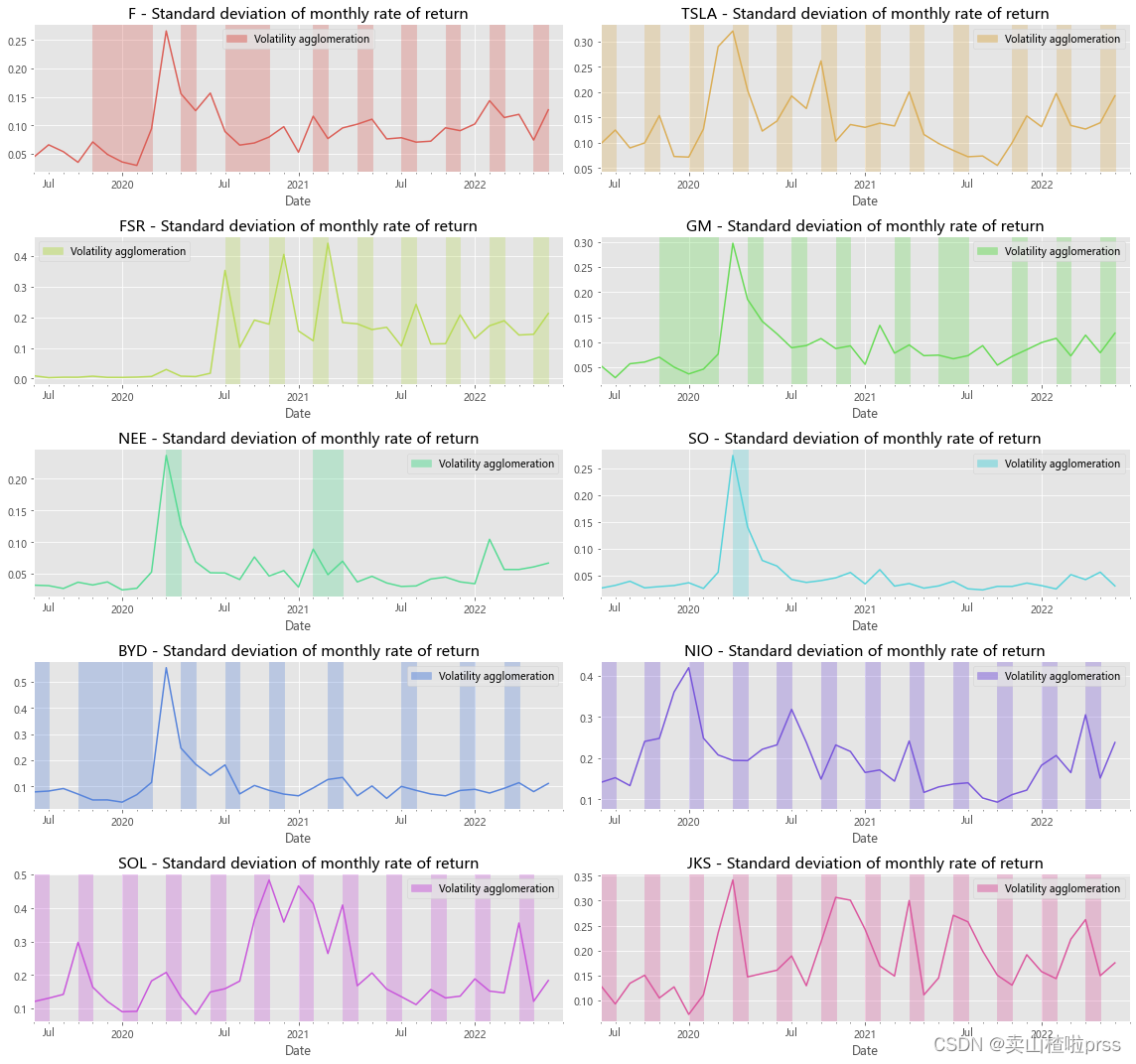
# Annualized standard deviation (volatility) of monthly return
# 月收益率的年化标准差(波动率)
# 实证研究表明,收益率标准差(波动率)存在一定的集聚现象,
# 即高波动率和低波动率往往会各自聚集在一起,并且高波动率和低波动率聚集的时期是交替出现的。
# 红色部门显示出,所有股票均存在一定的波动集聚现象。
fig = plt.figure(figsize = (16,15))
for ii,jj in enumerate(tickers):
    plt.subplot(5,2,ii+1)
    daily_ret=stocks[jj].pct_change()
    mnthly_annu = daily_ret.resample('M').std()* np.sqrt(12)
    #plt.rcParams['figure.figsize']=[20,5]
    mnthly_annu.plot(color=color_palette[ii],label=jj)
    start_date=mnthly_annu.index[0]
    end_date=mnthly_annu.index[-1]
    plt.xticks(pd.date_range(start_date,end_date,freq='Y'),[str(y) for y in range(start_date.year+1,end_date.year+1)])
    dates=mnthly_annu[mnthly_annu>0.07].index
    for i in range(0,len(dates)-1,3):
        plt.axvspan(dates[i],dates[i+1],color=color_palette[ii],alpha=.3)
    plt.title('%s - Standard deviation of monthly rate of return'%jj,size=15)
    labs = mpatches.Patch(color=color_palette[ii],alpha=.5, label="Volatility agglomeration")
    plt.legend(handles=[labs])
plt.tight_layout()
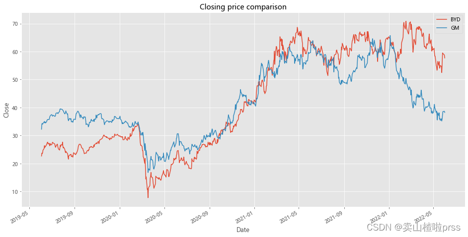
Pairs Trading
# 配对策略
# Analysis object:BYD&GM
# Comparison of closing price line chart
ax1 = BYD.plot(y='Close',label='BYD',figsize=(16,8))
GM.plot(ax=ax1,y='Close',label='GM')
plt.title('Closing price comparison')
plt.xlabel('Date')
plt.ylabel('Close')
plt.grid(True)
# Price difference and its mean value
# 收盘价价差及其均值
BYD['diff'] =BYD['Close']-GM['Close']
BYD['diff'].plot(figsize=(16,10))
plt.title('Price difference between BYD and GM')
plt.xlabel('Dtae')
plt.ylabel('Price difference')
plt.axhline(BYD['diff'].mean(),color='blue')
plt.grid(True)
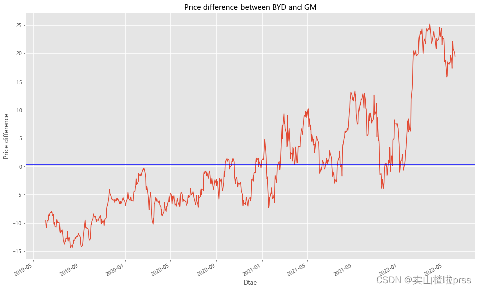
# Maximum deviation point
# 最大收盘价差值
BYD['diff'][BYD['diff']==max(BYD['diff'])]
Date
2022-03-25 25.214
Name: diff, dtype: float64
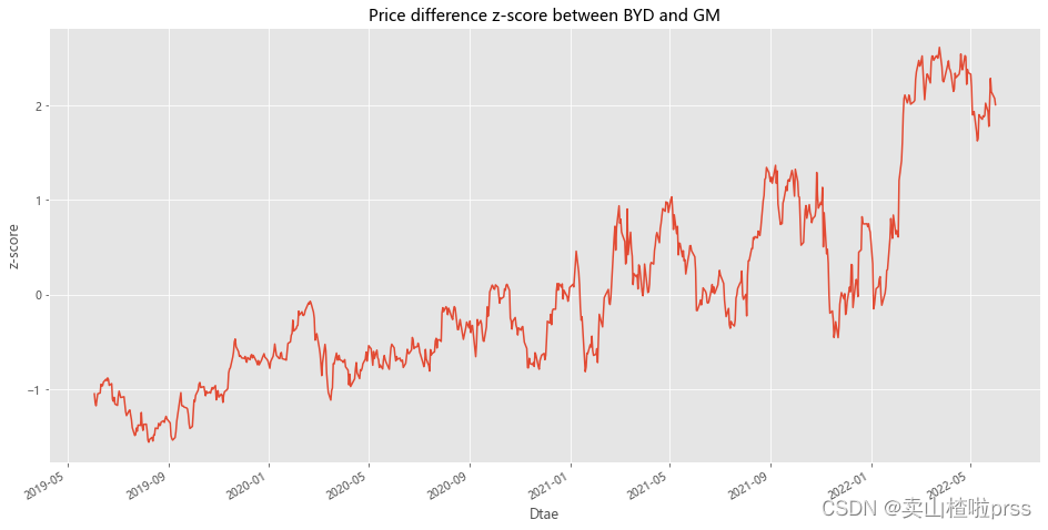
# Measure how far the series deviates from the mean
# 测量BYD和GM两只股票收盘价差值 偏离平均值的程度
# 对价差进行标准化
BYD['zscore'] =(BYD['diff']-np.mean(BYD['diff']))/np.std(BYD['diff'])
BYD['zscore'].plot(figsize=(16,8))
plt.title('Price difference z-score between BYD and GM')
plt.xlabel('Dtae')
plt.ylabel('z-score')
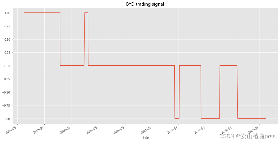
# BYD trading signal
# BYD 股票买卖交易信号
BYD['position1'] = np.where(BYD['zscore']>1,-1,np.nan) # Greater than 1, long
BYD['position1'] = np.where(BYD['zscore']<-1,1,BYD['position1']) # Less than -1, short
BYD['position1'] = np.where(abs(BYD['zscore'])<0.5,0,BYD['position1']) # Close positions within 0.5 range
BYD['position1'] = BYD['position1'].ffill().fillna(0)
BYD['position1'].plot(ylim=[-1.1,1.1],title='BYD trading signal',xlabel='Date',figsize=(16,8))
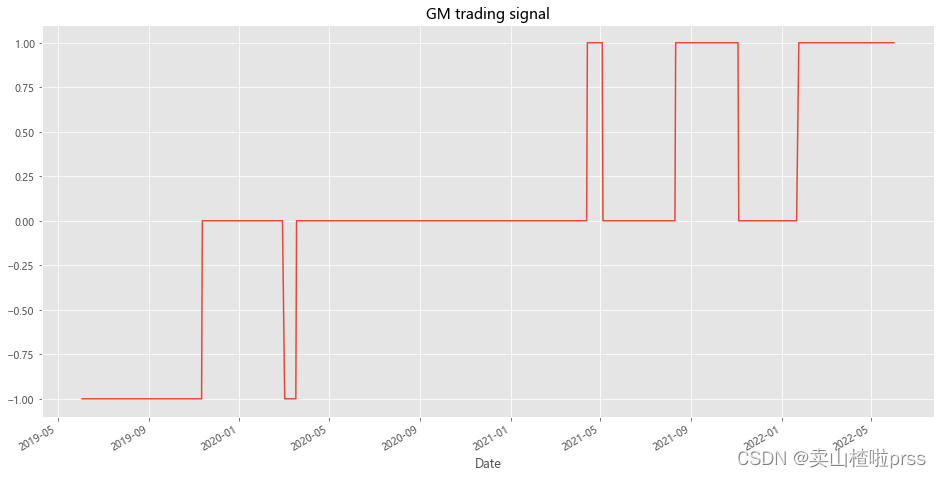
# GM trading signal
# GM 股票买卖交易信号
BYD['position2'] = -np.sign(BYD['position1']) # Opposite to BYD
BYD['position2'].plot(ylim=[-1.1,1.1],title='GM trading signal',xlabel='Date',figsize=(16,8))
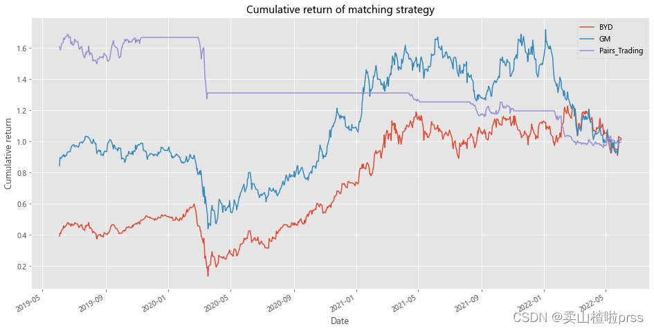
# Cumulative return of strategy
# 配对策略累计收益率

BYD['BYD']=(np.log(BYD['Close']/BYD['Close'].shift(1))).fillna(0)
BYD['GM']=(np.log(GM['Close']/GM['Close'].shift(1))).fillna(0)
BYD['Pairs_Trading']=0.5*(BYD['position1'].shift(1)*BYD['BYD'])+0.5*(BYD['position2'].shift(1)*BYD['GM'])
BYD[['BYD','GM','Pairs_Trading']].dropna().cumsum().apply(np.exp).plot(figsize=(16,8))
plt.title('Cumulative return of matching strategy')
plt.xlabel('Date')
plt.ylabel('Cumulative return')
plt.grid(True)
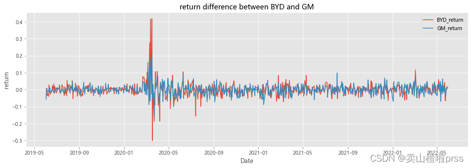
涨跌幅分析
BYD_return = BYD['Close'].pct_change()
GM_return = GM['Close'].pct_change()

BYD['diff_return'] = BYD_return - GM_return
cr = BYD['diff_return'][BYD['diff_return']==BYD['diff_return'].max()]
print('最大收益率差',cr.values[0])
# 最大收益率差 0.2384556461576477
fig = plt.figure(figsize = (16,5))
plt.plot(BYD_return.index,BYD_return,label='BYD_return')
plt.plot(GM_return.index,GM_return,label='GM_return')
plt.title('return difference between BYD and GM')
plt.xlabel('Date')
plt.ylabel('return')
plt.legend()
plt.grid(True)
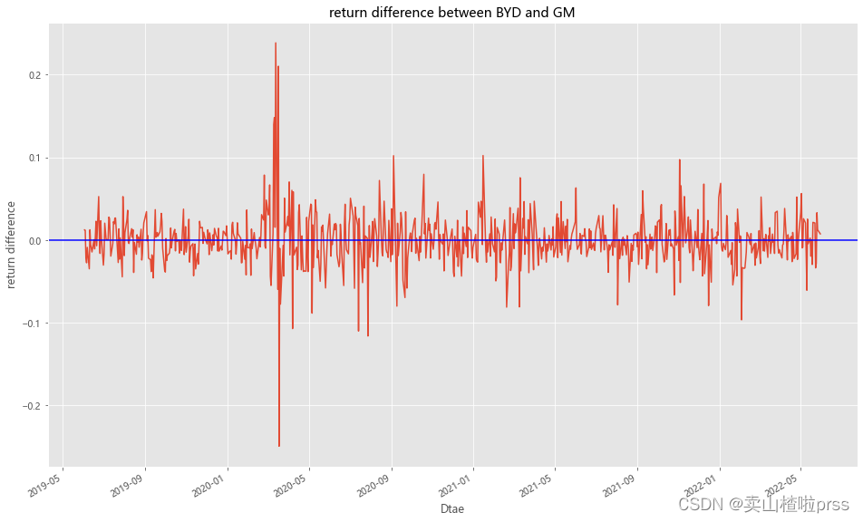
# 涨跌幅差异
BYD['diff_updown'] =BYD_return-GM_return
BYD['diff_updown'].plot(figsize=(16,10))
plt.title('return difference between BYD and GM')
plt.xlabel('Dtae')
plt.ylabel('return difference')
plt.axhline(BYD['diff_updown'].mean(),color='blue')
plt.grid(True)
# 累计涨跌幅
def profit(closeCol):
    try:
        p=(closeCol.iloc[-1]-closeCol.iloc[0])/closeCol.iloc[0]*100.00
    except Exception:
        return None
    return round(p,2)


for i in ['BYD','GM']:
    closeCol=stocks1[i] # 获取收盘价Close这一列的数据
    babaChange=profit(closeCol)# 调用函数,获取涨跌幅
    print(i,str(babaChange)+'%')
BYD 154.39%
GM 18.6%
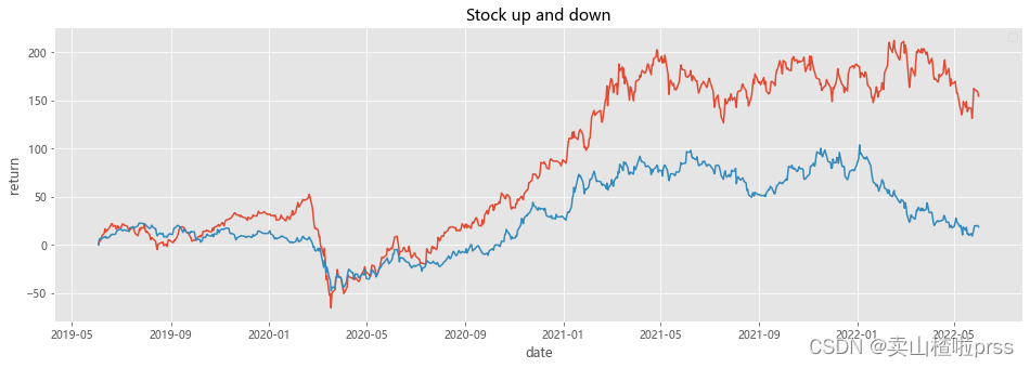
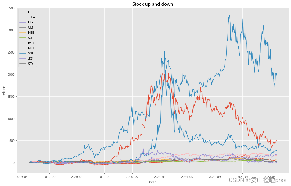
# Analysis of stock fluctuation
# 定基涨幅变化对比
def show(stocks, axs=None):
    n = []
    drawer = plt if axs is None else axs
    for i in stocks.columns:
        drawer.plot(100*(stocks[i]/stocks[i].iloc[0]-1))  # 归一化处理
    drawer.grid(True)
    drawer.legend(n, loc='best')


plt.figure(figsize = (16,5))
show(stocks[['BYD','GM']])
plt.title('Stock up and down')
plt.xlabel('date')
plt.ylabel('return')
plt.show()
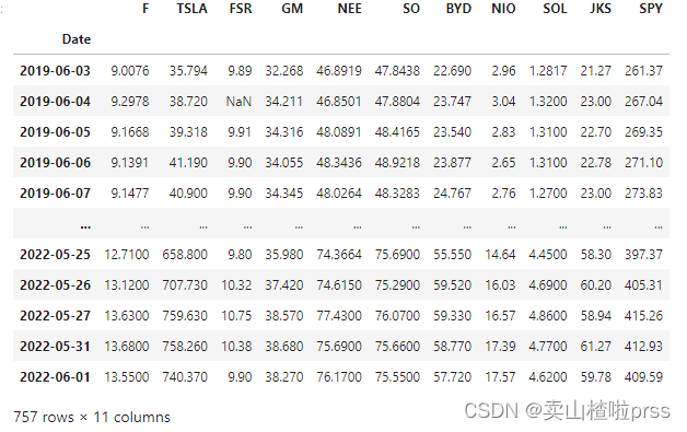
Compare them against two major indices like the S&P 500
# 标准普尔500指数 作比较
SPY = webdata.get_data_stooq('SPY',startDate,endDate)
stocks1 = pd.concat([stocks,SPY['Close']],axis=1)
stocks1.columns = ['F','TSLA','FSR','GM','NEE','SO','BYD','NIO','SOL','JKS','SPY']
stocks1
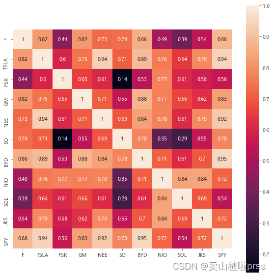
# 相关性矩阵
# SPY与其他股票(价格)相关性——最后一排
plt.figure(figsize = (10,10))
sns.heatmap(stocks1.corr(), annot=True, vmax=1, square=True)  # 绘制df_corr的矩阵热力图
plt.show()  # 显示图片
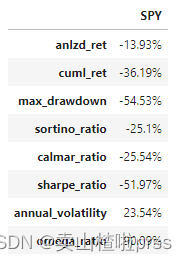
benchmark = TSeries(SPY['Close'].pct_change()[::-1])
dd={

    }
dd['anlzd_ret']=str(round(benchmark.anlzd_ret()*100,2))+"%"
dd['cuml_ret']=str(round(benchmark.cuml_ret()*100,2))+"%"
dd['max_drawdown']=str(round(benchmark.max_drawdown()*100,2))+"%"
dd['sortino_ratio']=str(round(benchmark.sortino_ratio(freq=250),2))+"%"
dd['calmar_ratio']=str(round(benchmark.calmar_ratio()*100,2))+"%"
dd['sharpe_ratio'] = str(round(sharpe_ratio(benchmark)*100,2))+"%" # 夏普比率(Sharpe Ratio):风险调整后的收益率.计算投资组合每承受一单位总风险,会产生多少的超额报酬。
dd['annual_volatility'] = str(round(stats.annual_volatility(benchmark)*100,2))+"%" # 波动率
dd['omega_ratio'] = str(round(omega_ratio(benchmark)*100,2))+"%" # omega_ratio

df_benchmark =pd.DataFrame(dd.values(),index=dd.keys(),columns = ['SPY'])
df_benchmark
dff = pd.concat([dff,df_benchmark],axis=1)
dff

# 可对比每只股票的年化收益、累计收益、最大回撤率、索提诺比率(投资组合的向下波动率,)、calmar率等
# Analysis of stock fluctuation
def show(stocks, axs=None):
    n = []
    drawer = plt if axs is None else axs
    for i in stocks.columns:
        if i != '日期':
            n.append(i)
            drawer.plot(100*(stocks[i]/stocks[i].iloc[0]-1))  # 归一化处理
    drawer.grid(True)
    drawer.legend(n, loc='best')


plt.figure(figsize = (16,10))
show(stocks)
plt.title('Stock up and down')
plt.xlabel('date')
plt.ylabel('return')
plt.show()
# 计算股票涨跌幅=(现在股价-买入价格)/买入价格
def profit(closeCol):
    try:
        p=(closeCol.iloc[0]-closeCol.iloc[-1])/closeCol.iloc[-1]*100.00
    except Exception:
        return None
    return round(p,2)


for i in tickers+['SPY']:
    closeCol=stocks1[i] # 获取收盘价Close这一列的数据
    babaChange=profit(closeCol)# 调用函数,获取涨跌幅
    print(i,str(babaChange)+'%')
F -33.52%
TSLA -95.17%
FSR -0.1%
GM -15.68%
NEE -38.44%
SO -36.67%
BYD -60.69%
NIO -83.15%
SOL -72.26%
JKS -64.42%
SPY -36.19%
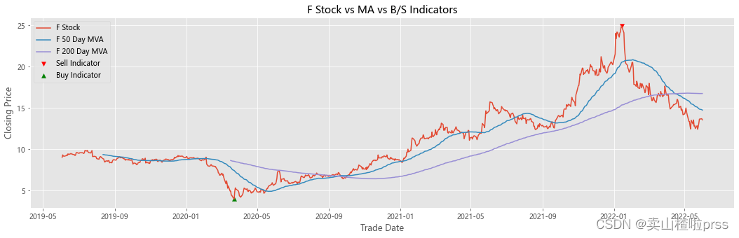
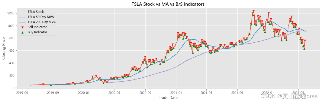
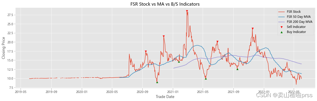
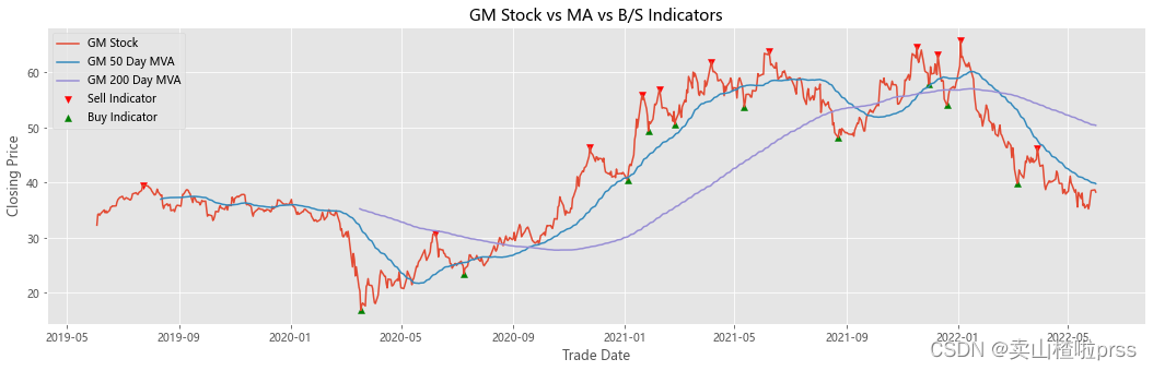
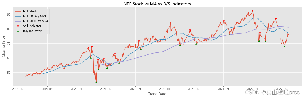
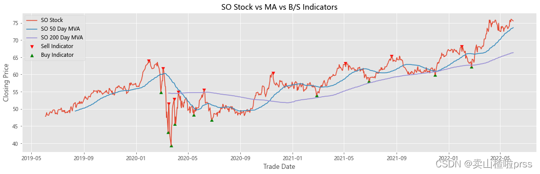
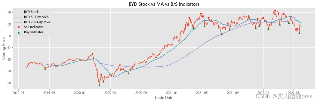
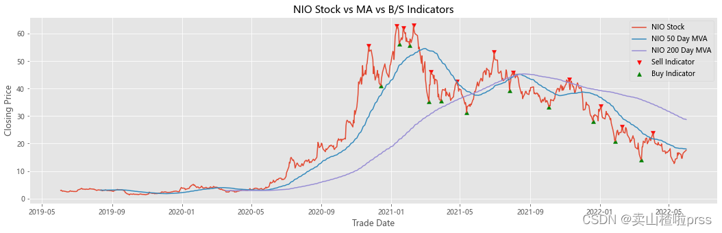
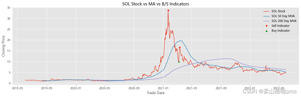
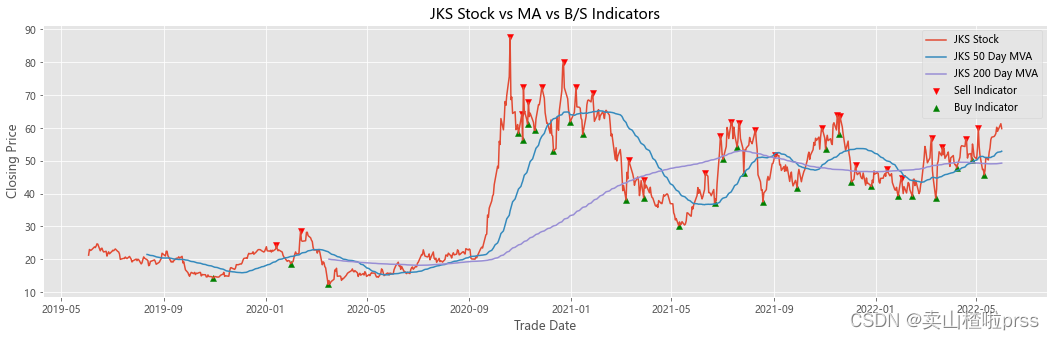
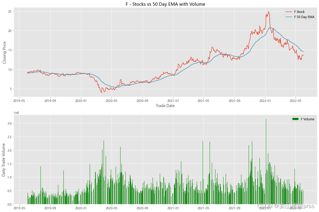
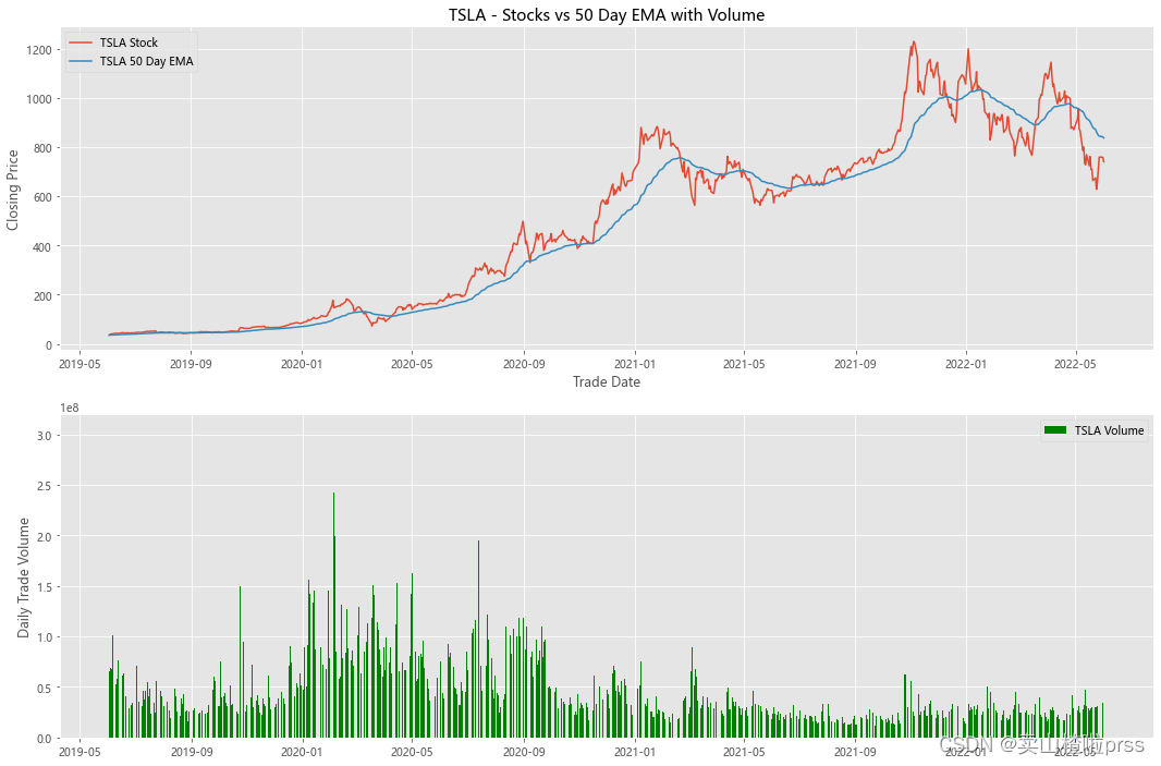
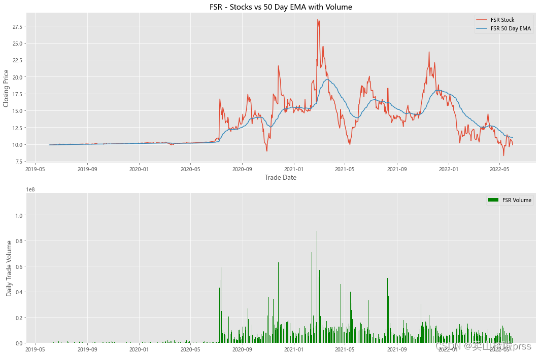
Add stocks, signals and moving averages to plot and visualize
# 股票、信号和移动平均线以绘制和可视化
# 查看股票平稳性
# 有些散户喜欢利用移动平均线来判断买入卖出,比如常见的,五日ma5上穿十日均线ma10时买入股票,反之卖出股票。
for i in tickers:
    stock_close = stocks[i]
    ## Add stocks, signals and moving averages to plot and visualize
    maximaIndex, _ = find_peaks(stock_close, prominence=5)
    maxPrices = [stock_close[i] for i in maximaIndex]
    minimaIndex, _ = find_peaks(stock_close * (-1), prominence=5)
    minPrices = [stock_close[i] for i in minimaIndex]
    fig, ax = plt.subplots(figsize = (18,5))
    ax.scatter(stock_close.index[maximaIndex], maxPrices, marker='v', color='red', label='Sell Indicator')
    ax.scatter(stock_close.index[minimaIndex], minPrices, marker='^', color='green', label='Buy Indicator')
    ax.plot(stock_close.index, stock_close, label = '{} Stock'.format(i))
    ax.set_xlabel('Trade Date')
    ax.set_ylabel('Closing Price')
    ax.set_title('{} Stock vs MA vs B/S Indicators'.format(i))
    shortRollingMVA = stock_close.rolling(window=50).mean()
    longRollingMVA = stock_close.rolling(window=200).mean()
    ax.plot(shortRollingMVA.index, shortRollingMVA, label = '{} 50 Day MVA'.format(i))
    ax.plot(longRollingMVA.index, longRollingMVA, label = '{} 200 Day MVA'.format(i))
    ax.legend()
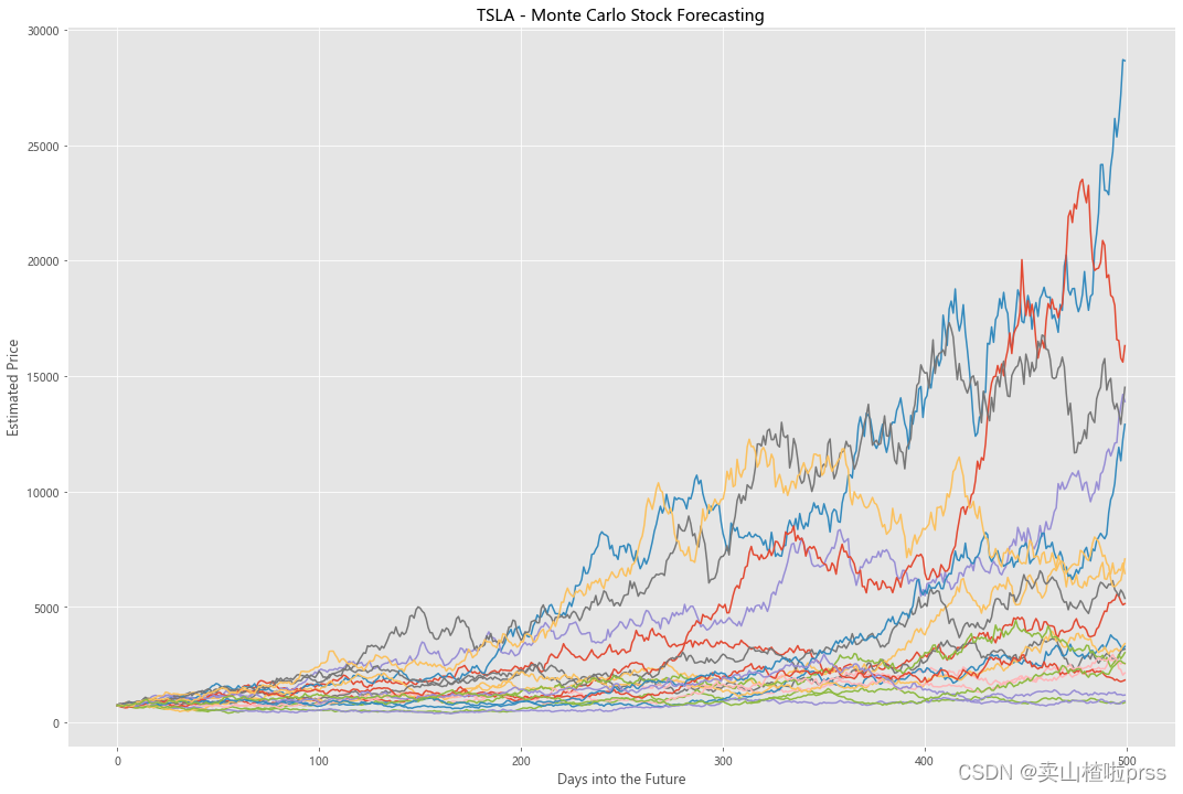
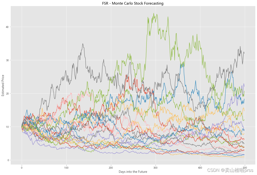
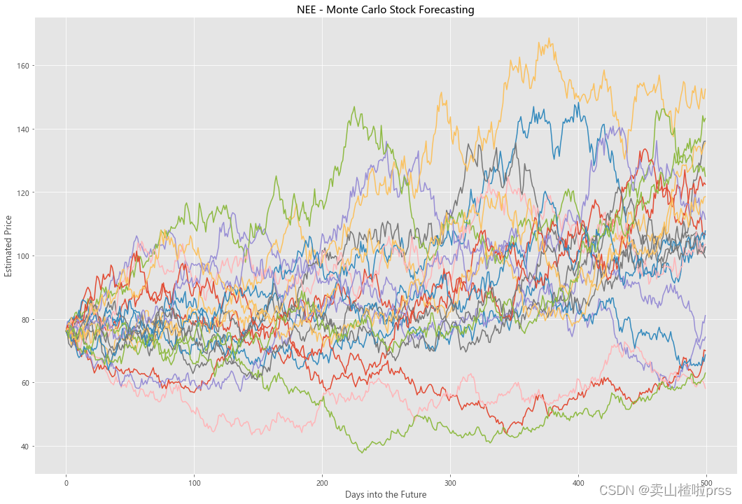
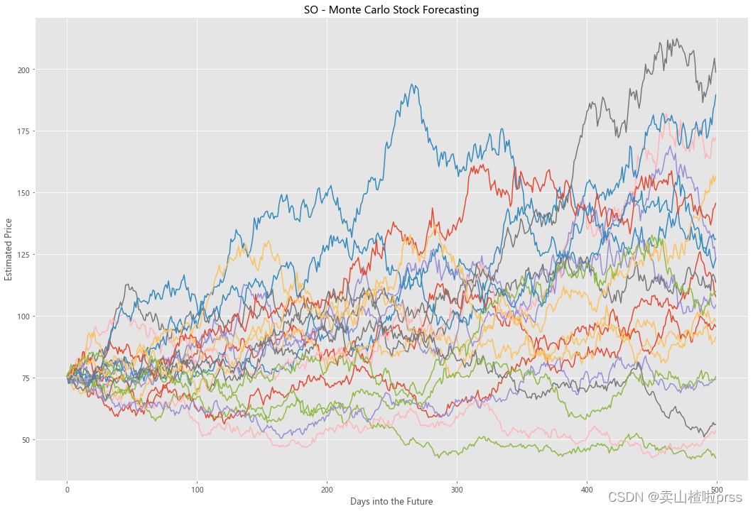
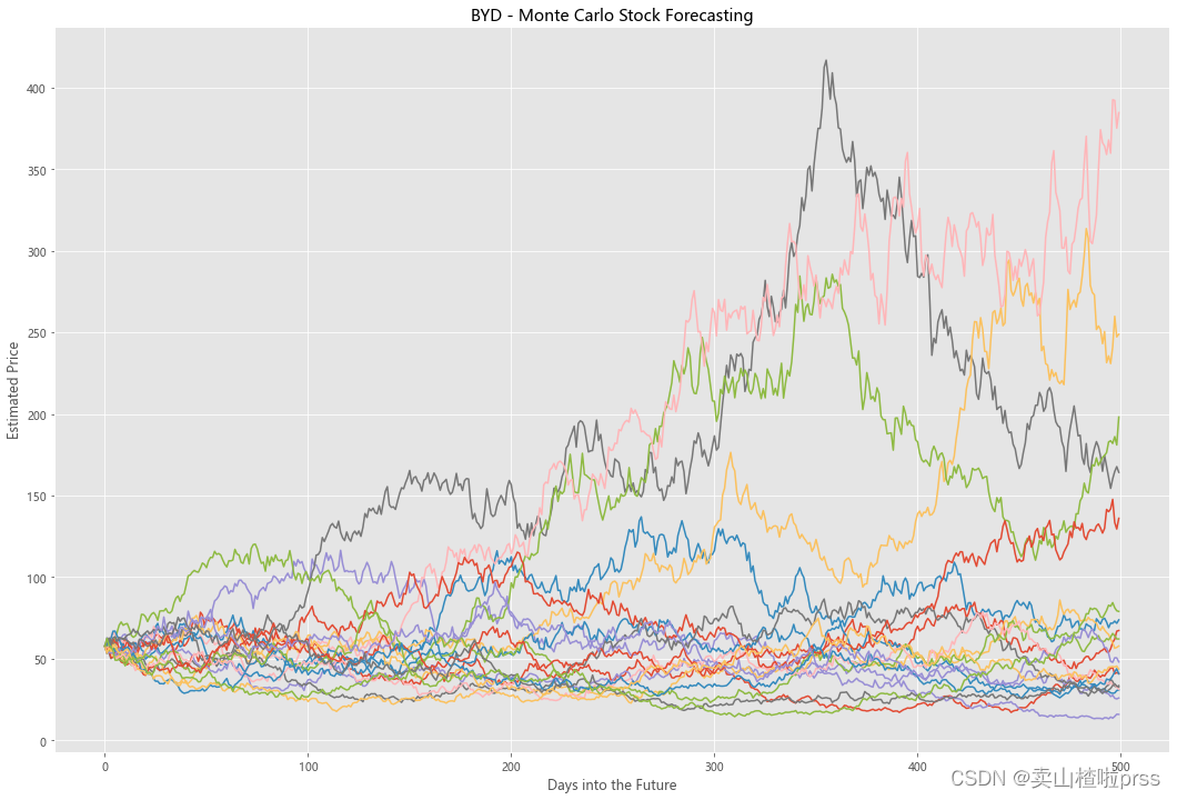
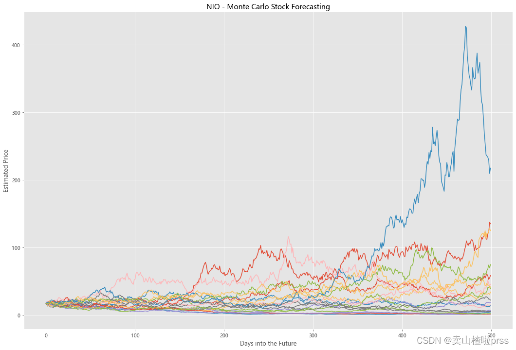
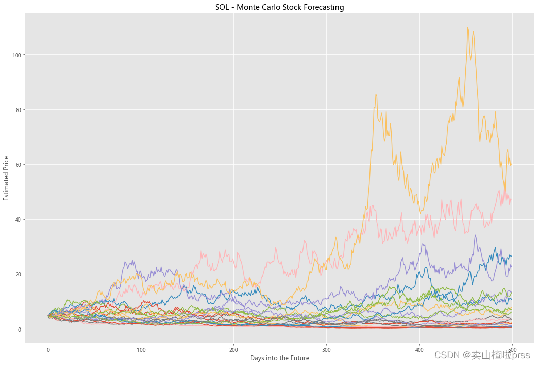
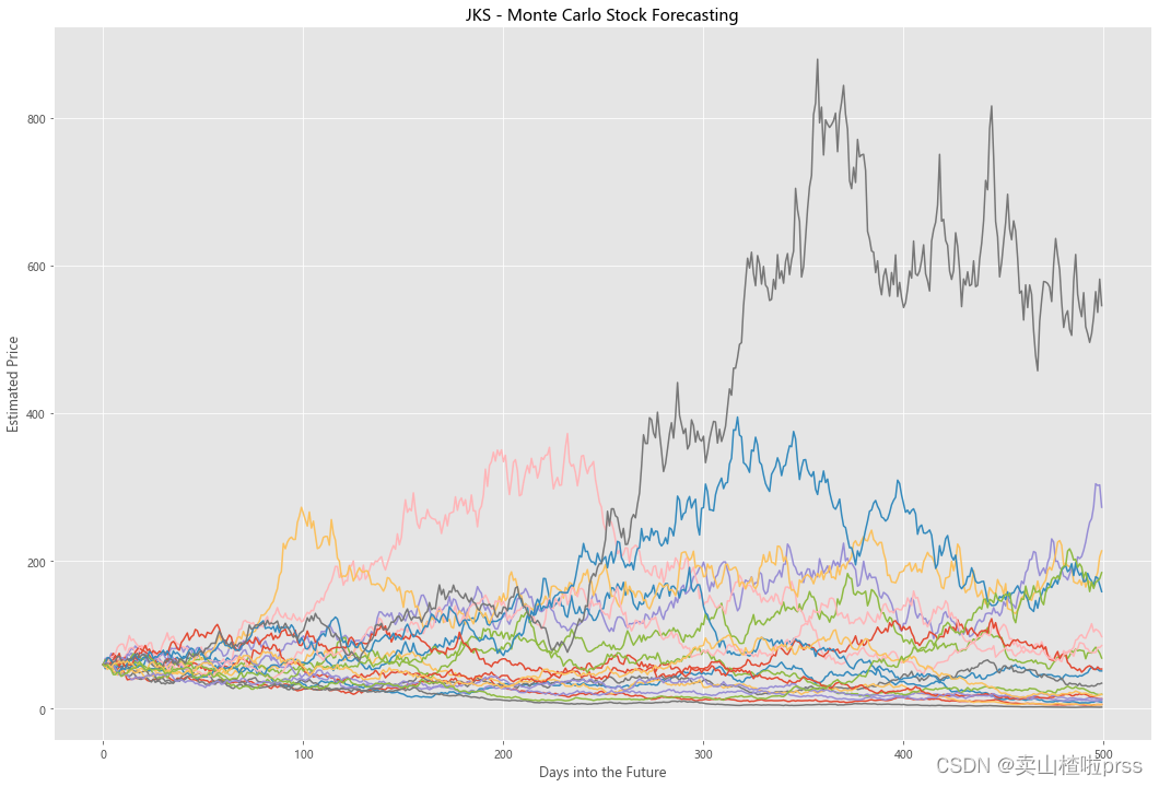
Try to forecast future stock movements via Monte Carlo Simulations
# 通过蒙特卡罗模拟预测未来的股票走势
# 蒙特卡洛模拟是一种统计学方法,用来模拟数据的演变趋势。
# 蒙特卡洛模拟其中20条模拟路径图
for i in tickers:
    stock_close = stocks[i]
    logReturns = np.log(1+stock_close.pct_change())
    ## Need mean and standard deviation to calculate brownian motion (random walk) = r = drift + standard_deviation* e^r
    mean = logReturns.mean()
    variance = logReturns.var()
    ### Calculate drift which estimates how far the stock price will move in the future
    drift = mean - (0.5 * variance)
    standard_deviation = logReturns.std()
    ### Next needed component of brownina motion is a randomly generated variable, such as Z (Z-score), we are projecting how far the stock will deviate from the mean
    simulations = 20
    probability_z = norm.ppf(np.random.rand(simulations,2))
    time_interval = 500 #Number of days into the future we go
    dailyReturns = np.exp(drift + standard_deviation * norm.ppf(np.random.rand(time_interval, simulations))) # Estimate of returns
    # Starting point of our analyysis is S_0, which is the last historical trading today (today)
    S_0 = stock_close.iloc[-1]
    # Create an array with estimated stock movements
    prices = np.zeros_like(dailyReturns) # Empty array of 0s
    prices[0] = S_0
    for t in range(1, time_interval):
        prices[t] = prices[t-1] * dailyReturns[t]
    figMC, axMC = plt.subplots(figsize = (18,12))
    axMC.set_xlabel('Days into the Future')
    axMC.set_ylabel('Estimated Price')
    axMC.set_title('%s - Monte Carlo Stock Forecasting'%i)
    axMC.plot(prices)


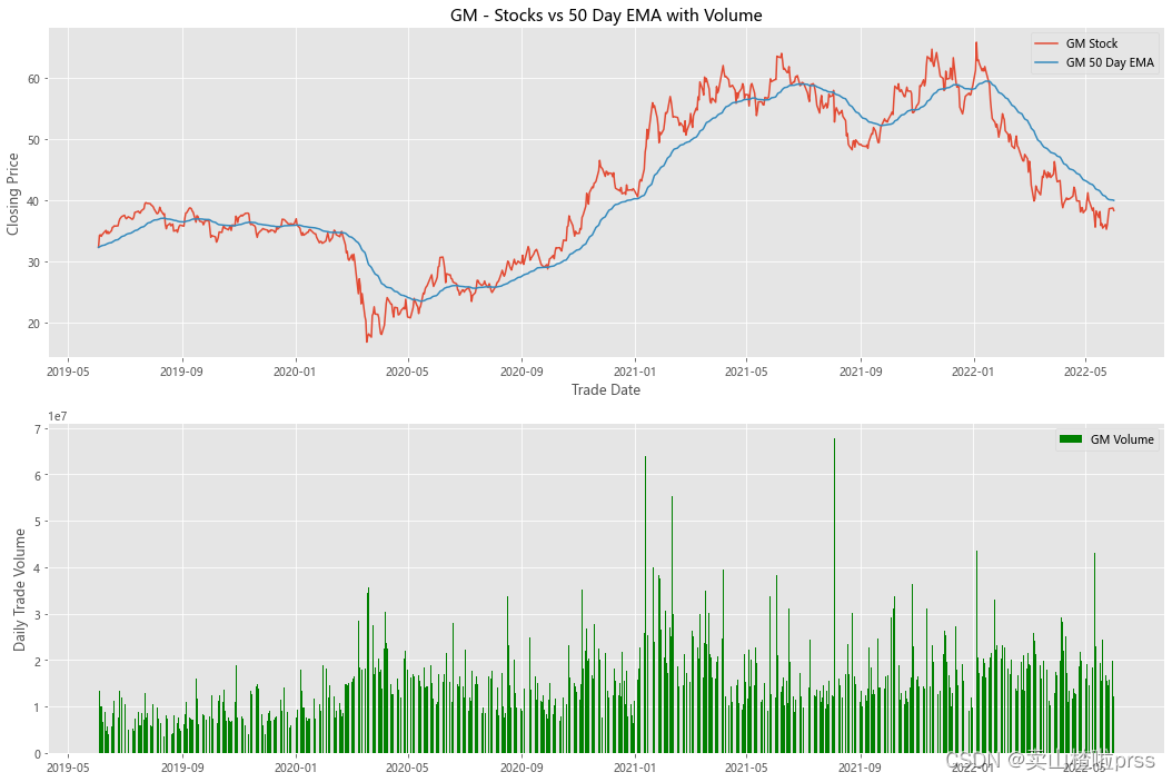
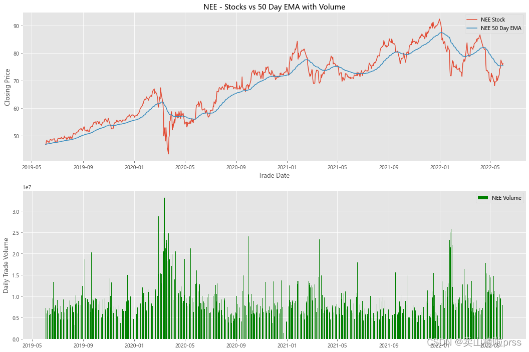
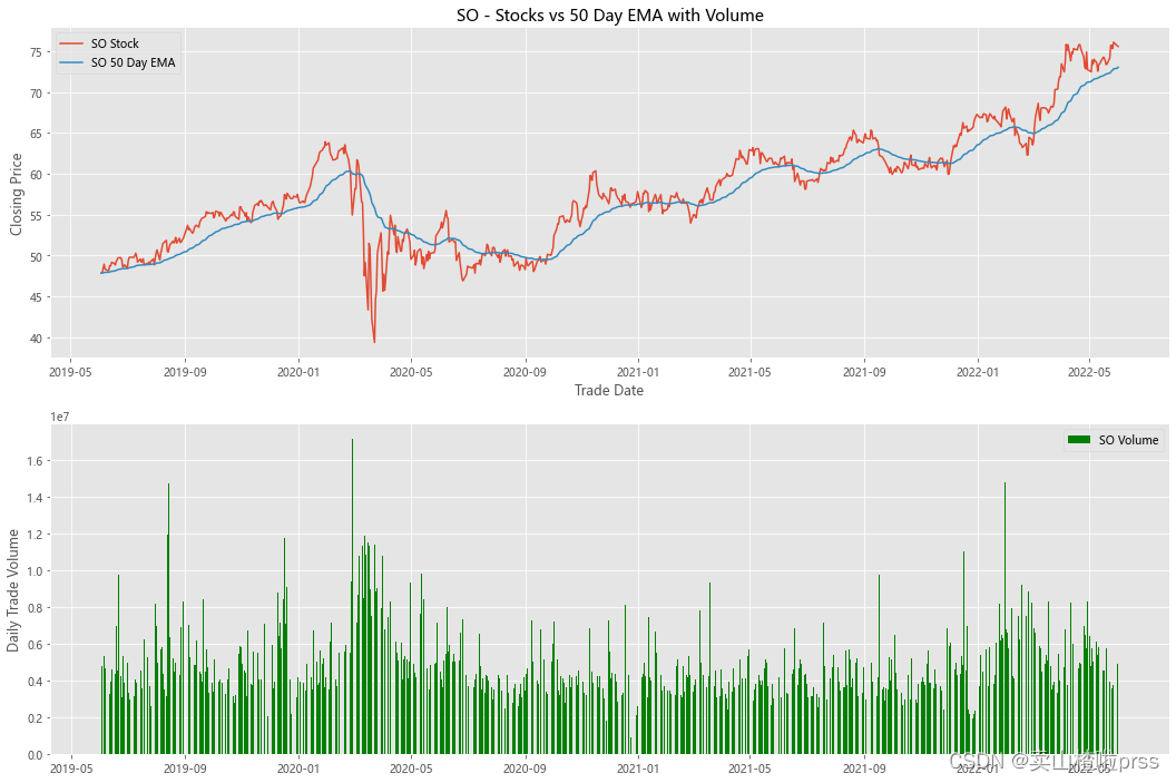
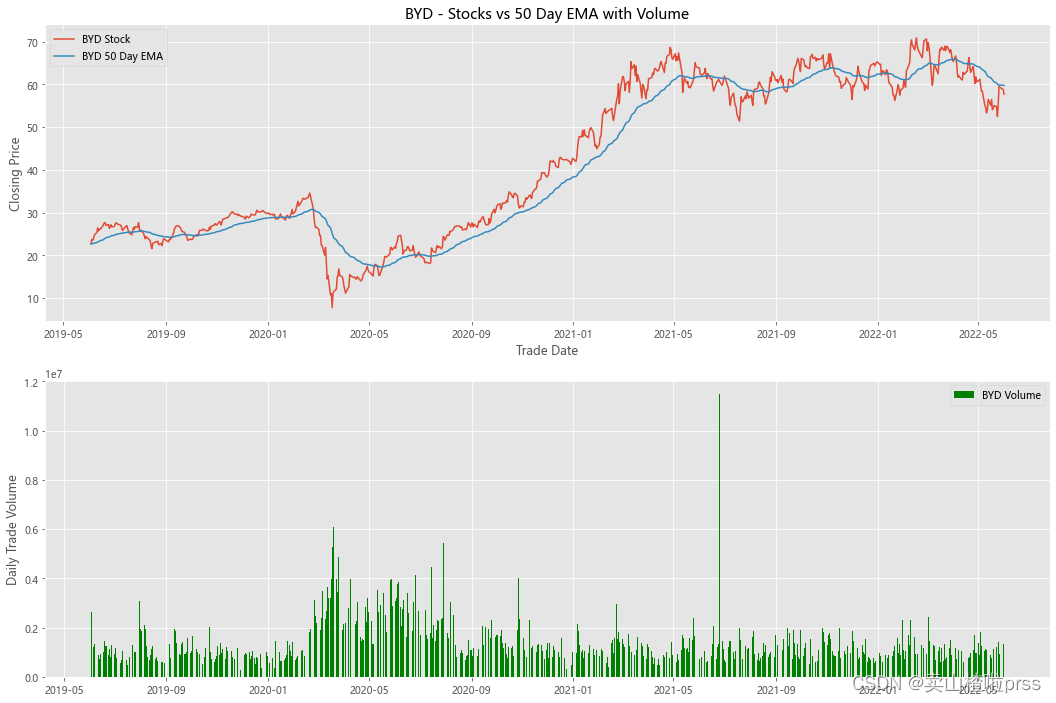
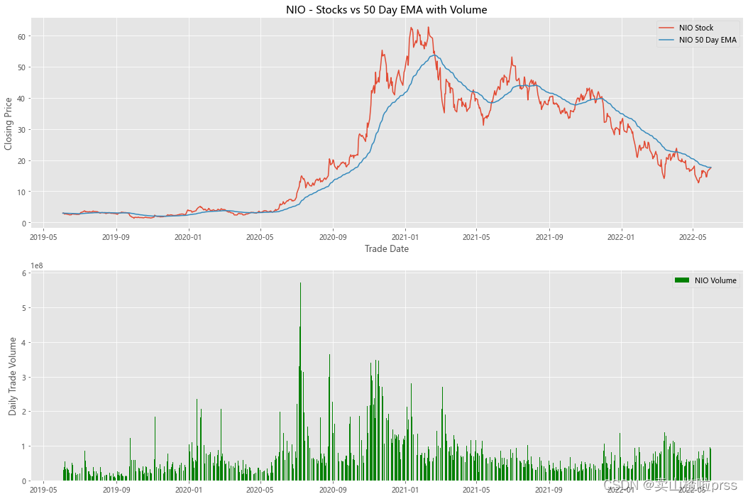
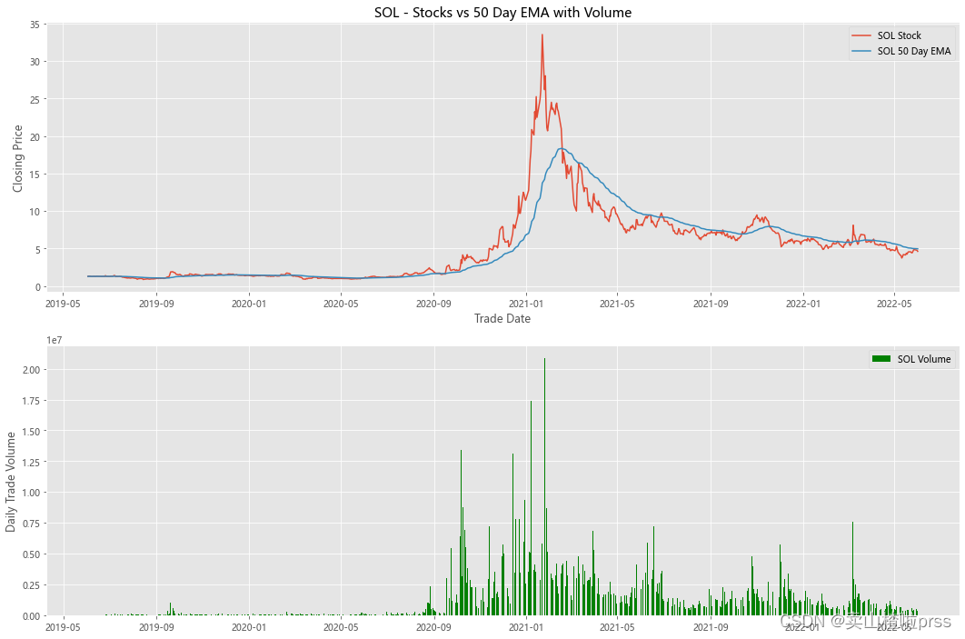
alculate Exponential Moving Averages and Volume
# 计算股票的指数移动平均值和交易量
for i in tickers:
    stock_close = stocks[i]
    fig3, (ax3,ax4) = plt.subplots(2,1,figsize = (18,12))
    emaShort = stock_close.ewm(span=50, adjust=False).mean()
    ax3.plot(stock_close.index, stock_close, label = '{} Stock'.format(i))
    ax3.plot(emaShort.index, emaShort, label = '{} 50 Day EMA'.format(i))
    ax3.set_xlabel('Trade Date')
    ax3.set_ylabel('Closing Price')
    ax3.set_title('%s - Stocks vs 50 Day EMA with Volume'%i)
    ax3.legend()

    volume = eval(i)['Volume']
    ax4.bar(volume.index, volume, label = '{} Volume'.format(i), color='green')
    ax4.set_ylabel('Daily Trade Volume')
    ax4.legend()

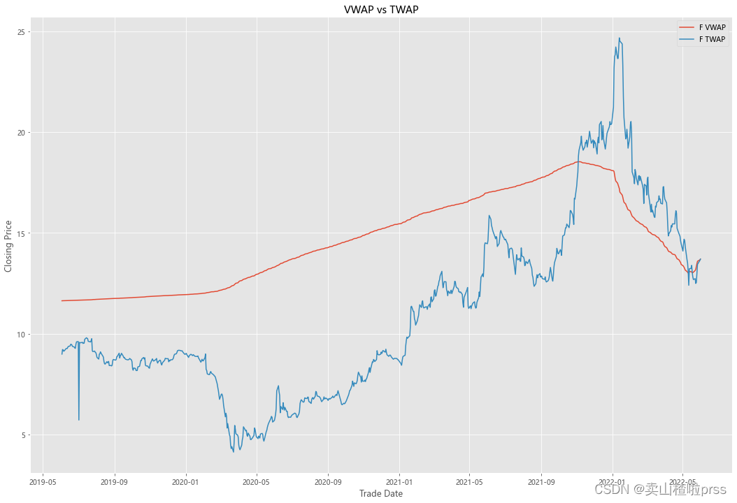
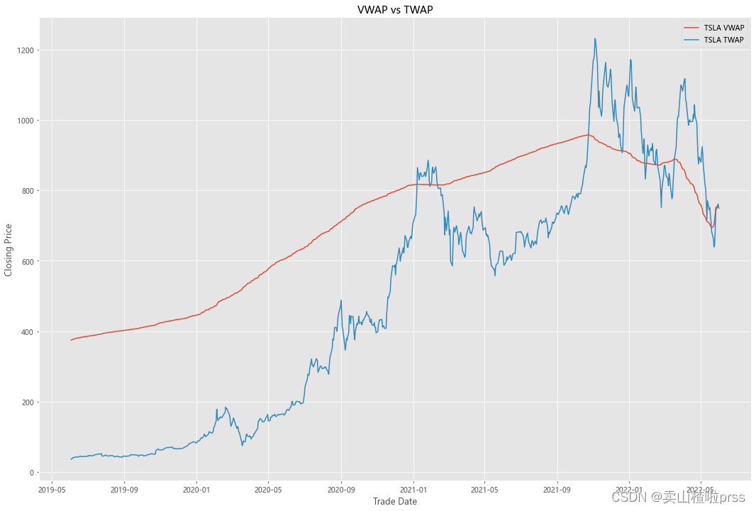
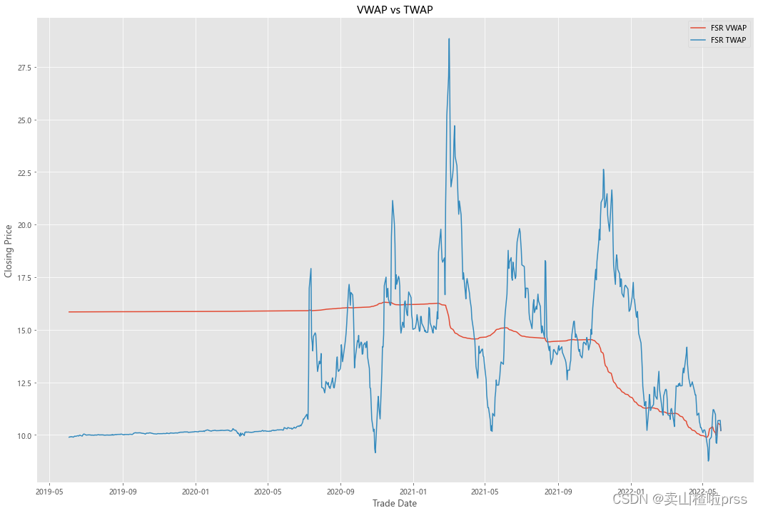
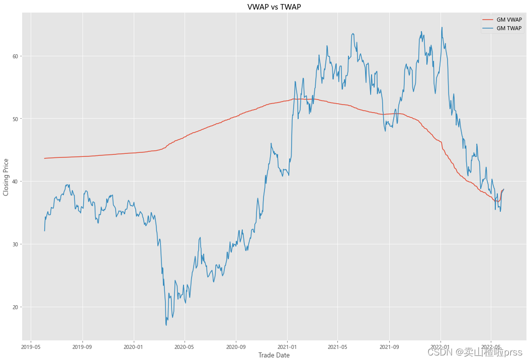
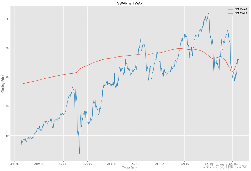
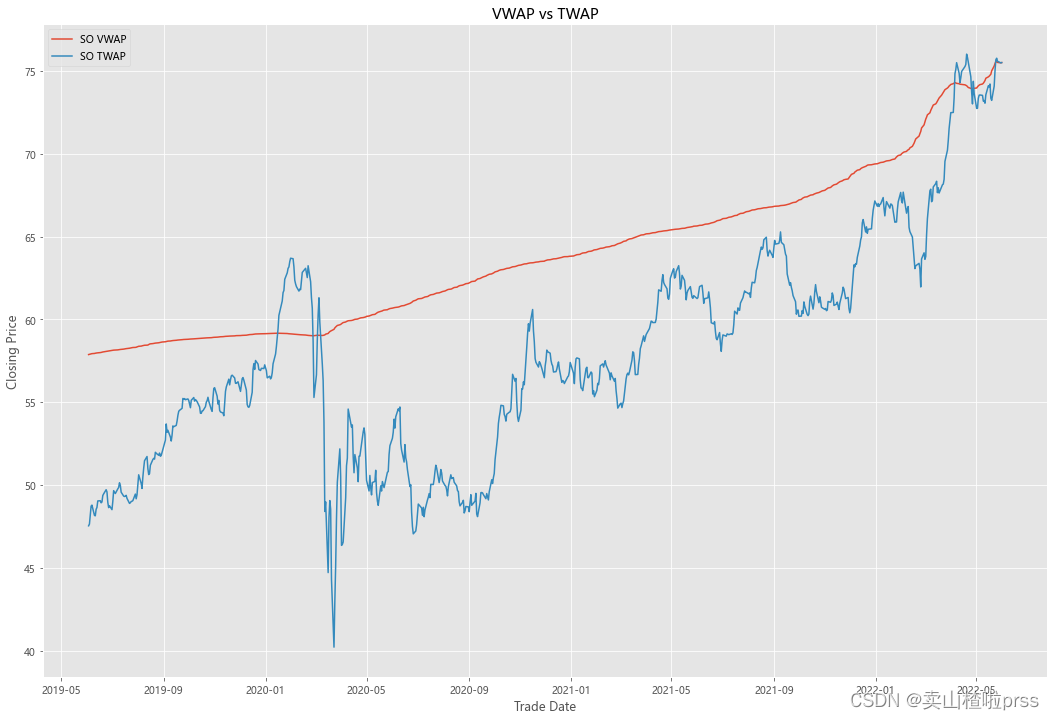
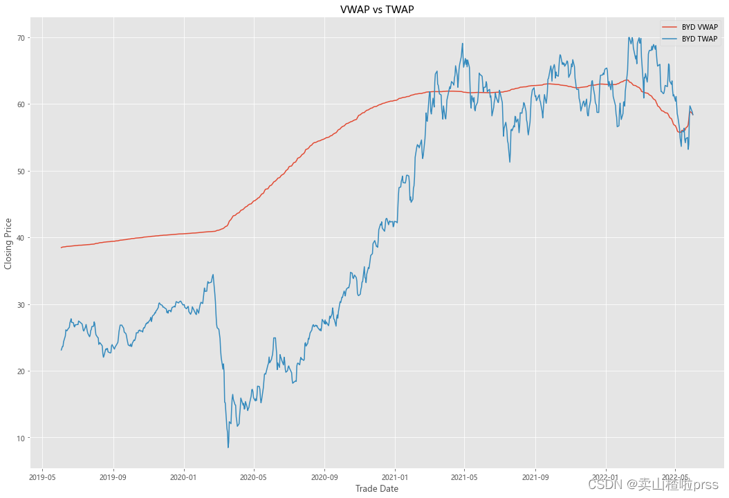
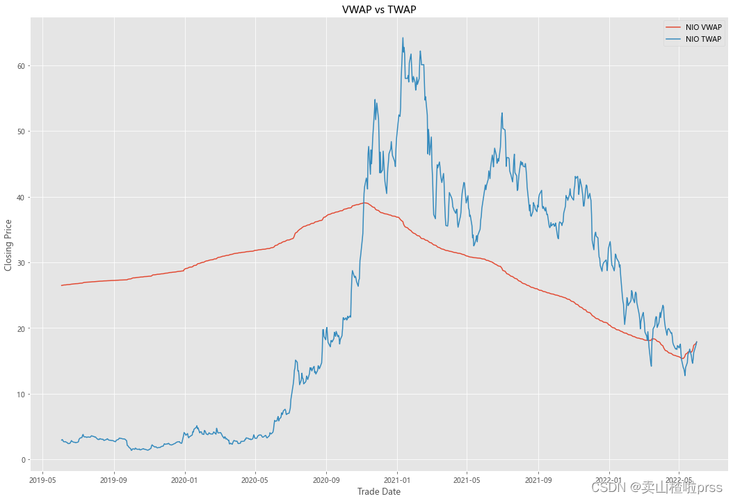
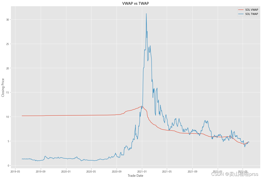
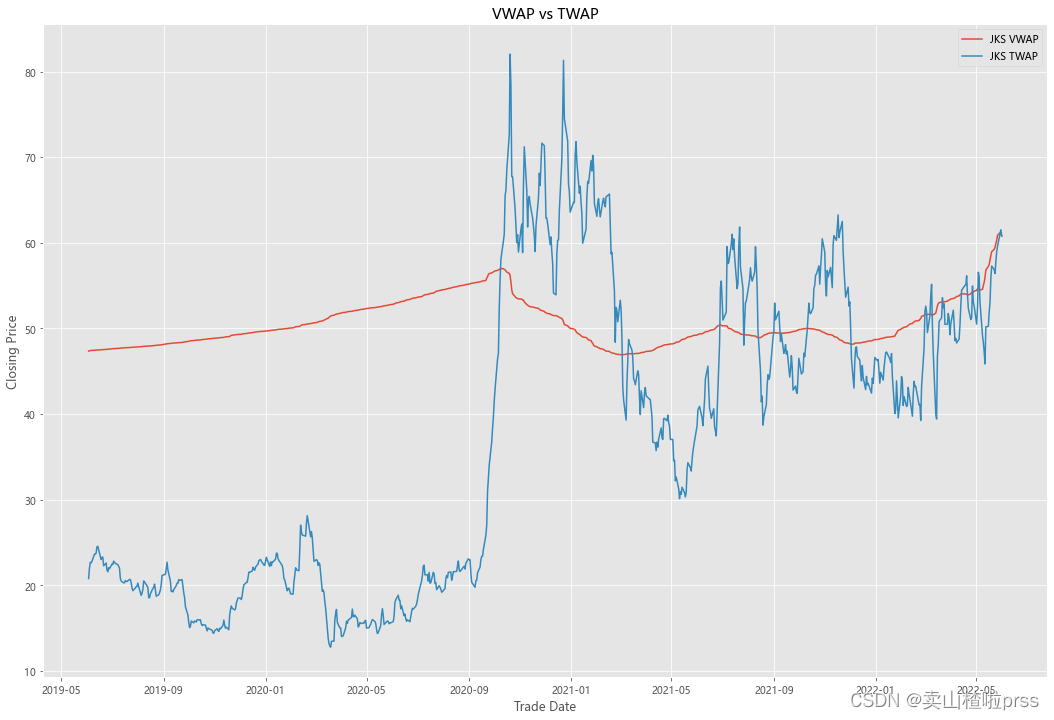
VWAP
####  Quick VWAP Calculation - This is better done with daily intraday data (1 minute ticks), since we dont have that, we are looking at just daily data

for i in tickers:
    VWAP = eval(i)
    VWAP['cumVol'] = VWAP['Volume'].cumsum()
    VWAP['cumVolPrice'] = (VWAP['Volume'] * ((VWAP['High']+VWAP['Low']+VWAP['Open']+VWAP['Close'])/4)).cumsum()
    VWAP['VWAP'] = VWAP['cumVolPrice']/VWAP['cumVol']
    ####  Quick TWAP Calculation
    VWAP['TWAP'] = (VWAP['High']+VWAP['Low']+VWAP['Open']+VWAP['Close'])/4
    fig5, ax5 = plt.subplots(figsize = (18,12))
    ax5.plot(VWAP.index, VWAP['VWAP'], label = '{} VWAP'.format(i))
    ax5.plot(VWAP.index, VWAP['TWAP'], label = '{} TWAP'.format(i))
    ax5.set_xlabel('Trade Date')
    ax5.set_ylabel('Closing Price')
    ax5.set_title('VWAP vs TWAP')
    ax5.legend()
至此