第一步、获取数据
股市数据可以从Yahoo! Finance、 Google Finance以及国内的新浪财经等地方拿到。同时,pandas包提供了轻松从以上网站获取数据的方法。
import pandas as pd            # as 是对包或模块重命名
import pandas.io.data as web   # 导入包和模块,模块可能随着版本的不同会发生变化
import datetime

ImportError: The pandas.io.data module is moved to a separate package (pandas-datareader).
After installing the pandas-datareader package (https://github.com/pydata/pandas-datareader),
 you can change the import ``from pandas.io import data, wb`` to ``from pandas_datareader import data, wb``.
pandas.io.data模块已换成独立的pandas-datareader包,所以上述代码会报错。
所以,在cmd命令行中执行以下语句即可解决这个问题:(安装pandas-datareader包)
pip install pandas_datareader所以新代码为下:
import pandas as pd
import pandas_datareader.data as web
import datetime
start = datetime.datetime(2016,1,1)
end = datetime.date.today()
apple = web.DataReader("AAPL", "yahoo", start, end)

#  web.DataReader("AAPL", "yahoo", start, end)会出现下处错误
# Let's get Apple stock data; Apple's ticker symbol is AAPL
# First argument is the series we want, second is the source ("yahoo" for Yahoo! Finance), third is the start date, fourth is the end date

会输出如下结果:
ImmediateDeprecationError:
Yahoo Daily has been immediately deprecated due to large breaks in the API without the
introduction of a stable replacement. Pull Requests to re-enable these data
connectors are welcome.
上述出现错误的原因是因为雅虎在中国受限制的原因,所以再一次修改代码, 这里我们需要引入另外一个模块‘fix_yahoo_finance’,同样使用pip方法在cmd命令中进行安装。
pip install fix_yahoo_finance所以,代码如下:
import pandas_datareader.data as web
import datetime
import fix_yahoo_finance as yf
yf.pdr_override()

start=datetime.datetime(2006, 1, 1)
end=datetime.datetime(2012, 1, 1)
apple=web.get_data_yahoo('AAPL',start,end)
apple

apple.head()

或者
start=datetime.datetime(2017, 1, 1)
end=datetime.datetime.today()
apple=web.get_data_yahoo('AAPL',start,end)
apple
Out[21]:
                  Open        High         Low       Close   Adj Close  \
Date
2017-01-03  115.800003  116.330002  114.760002  116.150002  113.013916
2017-01-04  115.849998  116.510002  115.750000  116.019997  112.887413
2017-01-05  115.919998  116.860001  115.809998  116.610001  113.461502
2017-01-06  116.779999  118.160004  116.470001  117.910004  114.726402
2017-01-09  117.949997  119.430000  117.940002  118.989998  115.777237
2017-01-10  118.769997  119.379997  118.300003  119.110001  115.893997
第二步、对提取的数据可视化:
import matplotlib.pyplot as plt # Import matplotlib
# This line is necessary for the plot to appear in a Jupyter notebook
%matplotlib inline
# Control the default size of figures in this Jupyter notebook
%pylab inline
pylab.rcParams['figure.figsize'] = (15, 9) # Change the size of plots
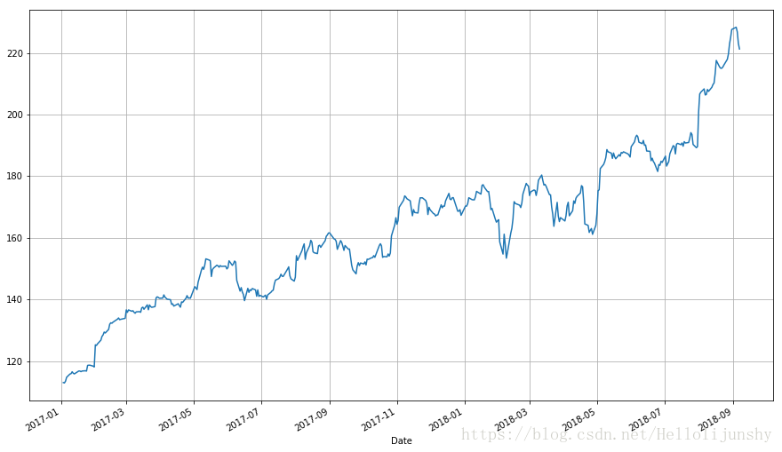
apple["Adj Close"].plot(grid = True) # Plot the adjusted closing price of AAPL
第三步、画
线段图是可行的,但是每一天的数据至少有四个变量(开市,股票最高价,股票最低价和闭市),我们希望找到一种不需要我们画四条不同的线就能看到这四个变量走势的可视化方法。一般来说我们使用烛柱图(也称为日本阴阳烛图表)来可视化金融数据,烛柱图最早在18世纪被日本的稻米商人所使用。可以用matplotlib来作图,但是需要费些功夫。
你们可以使用我实现的一个函数更容易地画烛柱图,它接受pandas的data frame作为数据来源。(程序基于这个例子, 你可以从这里找到相关函数的文档。)
from matplotlib.dates import DateFormatter, WeekdayLocator,\
    DayLocator, MONDAY
from matplotlib.finance import candlestick_ohlc

def pandas_candlestick_ohlc(dat, stick = "day", otherseries = None):
    """
    :param dat: pandas DataFrame object with datetime64 index, and float columns "Open", "High", "Low", and "Close", likely created via DataReader from "yahoo"
    :param stick: A string or number indicating the period of time covered by a single candlestick. Valid string inputs include "day", "week", "month", and "year", ("day" default), and any numeric input indicates the number of trading days included in a period
    :param otherseries: An iterable that will be coerced into a list, containing the columns of dat that hold other series to be plotted as lines

    This will show a Japanese candlestick plot for stock data stored in dat, also plotting other series if passed.
    """
    mondays = WeekdayLocator(MONDAY)        # major ticks on the mondays
    alldays = DayLocator()              # minor ticks on the days
    dayFormatter = DateFormatter('%d')      # e.g., 12

    # Create a new DataFrame which includes OHLC data for each period specified by stick input
    transdat = dat.loc[:,["Open", "High", "Low", "Close"]]
    if (type(stick) == str):
        if stick == "day":
            plotdat = transdat
            stick = 1 # Used for plotting
        elif stick in ["week", "month", "year"]:
            if stick == "week":
                transdat["week"] = pd.to_datetime(transdat.index).map(lambda x: x.isocalendar()[1]) # Identify weeks
            elif stick == "month":
                transdat["month"] = pd.to_datetime(transdat.index).map(lambda x: x.month) # Identify months
            transdat["year"] = pd.to_datetime(transdat.index).map(lambda x: x.isocalendar()[0]) # Identify years
            grouped = transdat.groupby(list(set(["year",stick]))) # Group by year and other appropriate variable
            plotdat = pd.DataFrame({"Open": [], "High": [], "Low": [], "Close": []}) # Create empty data frame containing what will be plotted
            for name, group in grouped:
                plotdat = plotdat.append(pd.DataFrame({"Open": group.iloc[0,0],
                                            "High": max(group.High),
                                            "Low": min(group.Low),
                                            "Close": group.iloc[-1,3]},
                                           index = [group.index[0]]))
            if stick == "week": stick = 5
            elif stick == "month": stick = 30
            elif stick == "year": stick = 365

    elif (type(stick) == int and stick >= 1):
        transdat["stick"] = [np.floor(i / stick) for i in range(len(transdat.index))]
        grouped = transdat.groupby("stick")
        plotdat = pd.DataFrame({"Open": [], "High": [], "Low": [], "Close": []}) # Create empty data frame containing what will be plotted
        for name, group in grouped:
            plotdat = plotdat.append(pd.DataFrame({"Open": group.iloc[0,0],
                                        "High": max(group.High),
                                        "Low": min(group.Low),
                                        "Close": group.iloc[-1,3]},
                                       index = [group.index[0]]))

    else:
        raise ValueError('Valid inputs to argument "stick" include the strings "day", "week", "month", "year", or a positive integer')


    # Set plot parameters, including the axis object ax used for plotting
    fig, ax = plt.subplots()
    fig.subplots_adjust(bottom=0.2)
    if plotdat.index[-1] - plotdat.index[0] < pd.Timedelta('730 days'):
        weekFormatter = DateFormatter('%b %d')  # e.g., Jan 12
        ax.xaxis.set_major_locator(mondays)
        ax.xaxis.set_minor_locator(alldays)
    else:
        weekFormatter = DateFormatter('%b %d, %Y')
    ax.xaxis.set_major_formatter(weekFormatter)

    ax.grid(True)

    # Create the candelstick chart
    candlestick_ohlc(ax, list(zip(list(date2num(plotdat.index.tolist())), plotdat["Open"].tolist(), plotdat["High"].tolist(),
                      plotdat["Low"].tolist(), plotdat["Close"].tolist())),
                      colorup = "black", colordown = "red", width = stick * .4)

    # Plot other series (such as moving averages) as lines
    if otherseries != None:
        if type(otherseries) != list:
            otherseries = [otherseries]
        dat.loc[:,otherseries].plot(ax = ax, lw = 1.3, grid = True)

    ax.xaxis_date()
    ax.autoscale_view()
    plt.setp(plt.gca().get_xticklabels(), rotation=45, horizontalalignment='right')

    plt.show()

pandas_candlestick_ohlc(apple)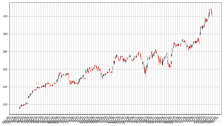
烛状图中黑色线条代表该交易日闭市价格高于开市价格(盈利),红色线条代表该交易日开市价格高于闭市价格(亏损)。刻度线代表当天交易的最高价和最低价(影线用来指明烛身的哪端是开市,哪端是闭市)。烛状图在金融和技术分析中被广泛使用在交易决策上,利用烛身的形状,颜色和位置。
第四步、把多个公司股票绘制在一张图上
当然,烛柱图不能绘制多个股票,需要绘制线段图在一个图上。
获取microsoft公司股价:
import pandas_datareader.data as web
import datetime
import fix_yahoo_finance as yf
yf.pdr_override()

start=datetime.datetime(2017, 1, 1)
end=datetime.datetime.today()
microsoft=web.get_data_yahoo('MSFT',start,end)
microsoft
Out[1]:
                 Open       High        Low      Close  Adj Close    Volume
Date
2017-01-03  62.790001  62.840000  62.130001  62.580002  60.431488  20694100
2017-01-04  62.480000  62.750000  62.119999  62.299999  60.161095  21340000
2017-01-05  62.189999  62.660000  62.029999  62.299999  60.161095  24876000
2017-01-06  62.299999  63.150002  62.040001  62.840000  60.682560  19922900
2017-01-09  62.759998  63.080002  62.540001  62.639999  60.489429  20256600
获取google公司股价:
import pandas_datareader.data as web
import datetime
import fix_yahoo_finance as yf
yf.pdr_override()

start=datetime.datetime(2017, 1, 1)
end=datetime.datetime.today()
google=web.get_data_yahoo('GOOG',start,end)
google.head()


                  Open        High         Low       Close   Adj Close  \
Date
2017-01-03  778.809998  789.630005  775.799988  786.140015  786.140015
2017-01-04  788.359985  791.340027  783.159973  786.900024  786.900024
2017-01-05  786.080017  794.479980  785.020020  794.020020  794.020020
2017-01-06  795.260010  807.900024  792.203979  806.150024  806.150024
2017-01-09  806.400024  809.966003  802.830017  806.650024  806.650024

             Volume
Date
2017-01-03  1657300
2017-01-04  1073000
2017-01-05  1335200
2017-01-06  1640200
2017-01-09  1272400
把apple、Microsoft和Google三家股价的从2017年1月1日到现在的Adj Close值合在一起
import pandas_datareader.data as web
import datetime
import fix_yahoo_finance as yf
yf.pdr_override()

start=datetime.datetime(2017, 1, 1)
end=datetime.datetime.today()

apple=web.get_data_yahoo('AAPL',start,end)
microsoft=web.get_data_yahoo('MSFT',start,end)
google=web.get_data_yahoo('GOOG',start,end)

import pandas as pd
stocks = pd.DataFrame({"AAPL": apple["Adj Close"],
                      "MSFT": microsoft["Adj Close"],
                      "GOOG": google["Adj Close"]})
stocks     # adj close就是等于adjusted close

Out[8]:
                  AAPL         GOOG        MSFT
Date
2017-01-03  113.013916   786.140015   60.431488
2017-01-04  112.887413   786.900024   60.161095
2017-01-05  113.461502   794.020020   60.161095
2017-01-06  114.726402   806.150024   60.682560
2017-01-09  115.777237   806.650024   60.489429
绘图:
stocks.plot(grid = True)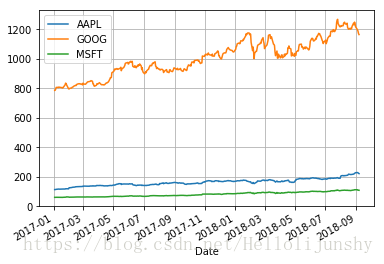
这张图表的问题在哪里呢?虽然价格的绝对值很重要(昂贵的股票很难购得,这不仅会影响它们的波动性,也会影响你交易它们的难易度),但是在交易中,我们更关注每支股票价格的变化而不是它的价格。Google的股票价格比苹果微软的都高,这个差别让苹果和微软的股票显得波动性很低,而事实并不是那样。
一个解决办法就是用两个不同的标度来作图。一个标度用于苹果和微软的数据;另一个标度用来表示Google的数据。
stocks.plot(secondary_y = ["AAPL", "MSFT"], grid = True)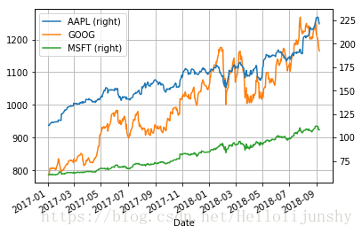
一个“更好”的解决方法是可视化我们实际关心的信息:股票的收益。这需要我们进行必要的数据转化。数据转化的方法很多。其中一个转化方法是将每个交易日的股票交个跟比较我们所关心的时间段开始的股票价格相比较。也就是:

这需要转化stock对象中的数据,操作如下:
# df.apply(arg) will apply the function arg to each column in df, and return a DataFrame with the result
# Recall that lambda x is an anonymous function accepting parameter x; in this case, x will be a pandas Series object
stock_return = stocks.apply(lambda x: x / x[0])
stock_return.head()

Out[11]:
                AAPL      GOOG      MSFT
Date
2017-01-03  1.000000  1.000000  1.000000
2017-01-04  0.998881  1.000967  0.995526
2017-01-05  1.003960  1.010024  0.995526
2017-01-06  1.015153  1.025453  1.004155
2017-01-09  1.024451  1.026090  1.000959
stock_return.plot(grid = True).axhline(y = 1, color = "black", lw = 2)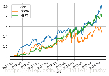
这个图就有用多了。现在我们可以看到从我们所关心的日期算起,每支股票的收益有多高。而且我们可以看到这些股票之间的相关性很高。它们基本上朝同一个方向移动,在其他类型的图表中很难观察到这一现象。
我们还可以用每天的股值变化作图。一个可行的方法是我们使用后一天$t + 1$和当天$t$的股值变化占当天股价的比例:

我们也可以比较当天跟前一天的价格:
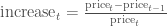
以上的公式并不相同,可能会让我们得到不同的结论,但是我们可以使用对数差异来表示股票价格变化:

(这里的

下面的代码演示了如何计算和可视化股票的对数差异:
# Let's use NumPy's log function, though math's log function would work just as well
import numpy as np
stock_change = stocks.apply(lambda x: np.log(x) - np.log(x.shift(1))) # shift moves dates back by 1.
stock_change.head()
Out[14]:
                AAPL      GOOG      MSFT
Date
2017-01-03       NaN       NaN       NaN
2017-01-04 -0.001120  0.000966 -0.004484
2017-01-05  0.005073  0.009007  0.000000
2017-01-06  0.011087  0.015161  0.008630
2017-01-09  0.009118  0.000620 -0.003188
stock_change.plot(grid = True).axhline(y = 0, color = "black", lw = 2)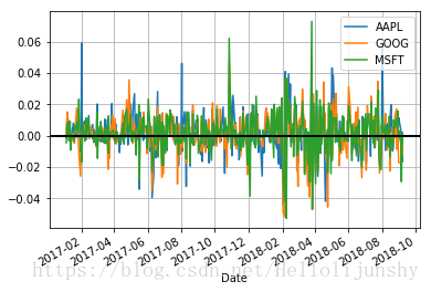
你更倾向于哪种转换方法呢?从相对时间段开始日的收益差距可以明显看出不同证券的总体走势。不同交易日之间的差距被用于更多预测股市行情的方法中,它们是不容被忽视的。
移动平均值
图表非常有用。在现实生活中,有些交易人在做决策的时候几乎完全基于图表(这些人是“技术人员”,从图表中找到规律并制定交易策略被称作技术分析,它是交易的基本教义之一。)下面让我们来看看如何找到股票价格的变化趋势。
一个q天的移动平均值(用
移动平均值可以让一个系列的数据变得更平滑,有助于我们找到趋势。q值越大,移动平均对短期的波动越不敏感。移动平均的基本目的就是从噪音中识别趋势。快速的移动平均有偏小的q,它们更接近股票价格;而慢速的移动平均有较大的q值,这使得它们对波动不敏感从而更加稳定。
pandas提供了计算移动平均的函数。下面我将演示使用这个函数来计算苹果公司股票价格的20天(一个月)移动平均值,并将它跟股票价格画在一起。
import pandas as pd # 不加这个,会提示NameError: name 'pd' is not defined
pandas_candlestick_ohlc(apple)
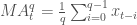
apple["20d"] = np.round(apple["Close"].rolling(window = 20, center = False).mean(), 2)
pandas_candlestick_ohlc(apple.loc['2017-01-01':'2017-08-07',:], otherseries = "20d")
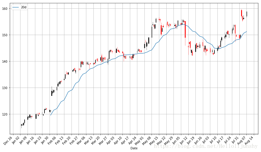
注意到平均值的起始点时间是很迟的。我们必须等到20天之后才能开始计算该值。这个问题对于更长时间段的移动平均来说是个更加严重的问题。因为我希望我可以计算200天的移动平均,我将扩展我们所得到的苹果公司股票的数据,但我们主要还是只关注2016。
import pandas_datareader.data as web
import datetime
import fix_yahoo_finance as yf
yf.pdr_override()

start = datetime.datetime(2010,1,1)
apple=web.get_data_yahoo('AAPL',start,end)
apple["20d"] = np.round(apple["Close"].rolling(window = 20, center = False).mean(), 2)

pandas_candlestick_ohlc(apple.loc['2016-01-04':'2016-08-07',:], otherseries = "20d")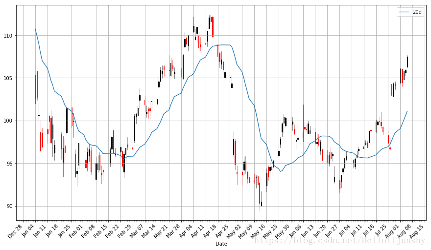
你会发现移动平均比真实的股票价格数据平滑很多。而且这个指数是非常难改变的:一支股票的价格需要变到平局值之上或之下才能改变移动平均线的方向。因此平均线的交叉点代表了潜在的趋势变化,需要加以注意。
交易者往往对不同的移动平均感兴趣,例如20天,50天和200天。要同时生成多条移动平均线也不难:
apple["50d"] = np.round(apple["Close"].rolling(window = 50, center = False).mean(), 2)
apple["200d"] = np.round(apple["Close"].rolling(window = 200, center = False).mean(), 2)

pandas_candlestick_ohlc(apple.loc['2016-01-04':'2016-08-07',:], otherseries = ["20d", "50d", "200d"])
20天的移动平均线对小的变化非常敏感,而200天的移动平均线波动最小。这里的200天平均线显示出来总体的熊市趋势:股值总体来说一直在下降。