appBar的简介
AppBar在APP上的上方(如果有)显示工具栏小部件、前导、标题和操作。
而APP的底部通常用于TabBar。
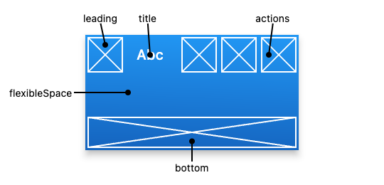
appBar的位置图说明
下图显示了当书写语言从左到右(例如英语)时,工具栏中每个插槽的位置:
appBar的属性
actions → List?
要显示在标题小部件后面一行中的小部件列表。 这个最常用
actionsIconTheme → IconThemeData?
应用程序栏中显示的图标的颜色、不透明度和大小。
automaticallyImplyLeading → bool
控制如果为空,是否应尝试暗示前导小部件。
backgroundColor → Color?
用于应用程序栏的“材质”的填充颜色
bottom → PreferredSizeWidget?
此小部件显示在应用程序栏的底部。
bottomOpacity → double
How opaque the bottom part of the app bar is.
centerTitle → bool?
Whether the title should be centered.
elevation → double?
The z-coordinate at which to place this app bar relative to its parent.
excludeHeaderSemantics → bool
Whether the title should be wrapped with header Semantics.
flexibleSpace → Widget?
This widget is stacked behind the toolbar and the tab bar. Its height will be the same as the app bar’s overall height.
foregroundColor → Color?
The default color for Text and Icons within the app bar.
hashCode → int
The hash code for this object.read-onlyinherited
iconTheme → IconThemeData?
The color, opacity, and size to use for toolbar icons.
key → Key?
Controls how one widget replaces another widget in the tree.finalinherited
leading → Widget?
A widget to display before the toolbar’s title.
leadingWidth → double?
Defines the width of leading widget.
notificationPredicate → ScrollNotificationPredicate
A check that specifies which child’s ScrollNotifications should be listened to.
preferredSize → Size
A size whose height is the sum of toolbarHeight and the bottom widget’s preferred height.
primary → bool
Whether this app bar is being displayed at the top of the screen.
runtimeType → Type
A representation of the runtime type of the object.read-onlyinherited
scrolledUnderElevation → double?
The elevation that will be used if this app bar has something scrolled underneath it.
shadowColor → Color?
The color of the shadow below the app bar.
shape → ShapeBorder?
The shape of the app bar’s Material as well as its shadow.
surfaceTintColor → Color?
The color of the surface tint overlay applied to the app bar’s background color to indicate elevation.
systemOverlayStyle → SystemUiOverlayStyle?
Specifies the style to use for the system overlays that overlap the AppBar.
title → Widget?
The primary widget displayed in the app bar.
titleSpacing → double?
The spacing around title content on the horizontal axis. This spacing is applied even if there is no leading content or actions. If you want title to take all the space available, set this value to 0.0.
titleTextStyle → TextStyle?
The default text style for the AppBar’s title widget.
toolbarHeight → double?
Defines the height of the toolbar component of an AppBar.
toolbarOpacity → double
How opaque the toolbar part of the app bar is.
toolbarTextStyle → TextStyle?
The default text style for the AppBar’s leading, and actions widgets, but not its title.
appBar的实例
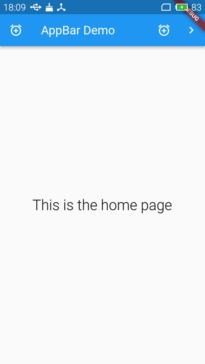
先看个例子:我们创建一个leading为一个IconButton,title 为“appBar Demo”,actiions添加两个IconButton的 appBar。运行的效果图如下:
源码如下:
import 'package:flutter/material.dart';
void main() => runApp(const AppBarApp());
class AppBarApp extends StatelessWidget {
const AppBarApp({
super.key});
Widget build(BuildContext context) {
return const MaterialApp(
home: AppBarExample(),
);
}
}
class AppBarExample extends StatelessWidget {
const AppBarExample({
super.key});
Widget build(BuildContext context) {
return Scaffold(
appBar: AppBar(
title: const Text('AppBar Demo'),
leading: IconButton(
icon: const Icon(Icons.add_alarm_rounded),
tooltip: 'Show Snackbar',
onPressed: () {
ScaffoldMessenger.of(context).showSnackBar(
const SnackBar(content: Text('This is a snackbar')));
},
),
actions: <Widget>[
IconButton(
icon: const Icon(Icons.add_alarm_rounded),
tooltip: 'Show Snackbar',
onPressed: () {
ScaffoldMessenger.of(context).showSnackBar(
const SnackBar(content: Text('This is a snackbar')));
},
),
IconButton(
icon: const Icon(Icons.navigate_next),
tooltip: 'Go to the next page',
onPressed: () {
Navigator.push(context, MaterialPageRoute<void>(
builder: (BuildContext context) {
return Scaffold(
appBar: AppBar(
title: const Text('Next page'),
// automaticallyImplyLeading: false,
),
body: const Center(
child: Text(
'This is the next page',
style: TextStyle(fontSize: 24),
),
),
);
},
));
},
),
],
),
body: const Center(
child: Text(
'This is the home page',
style: TextStyle(fontSize: 24),
),
),
);
}
}
没有太多要说明的,对着运行的效果图
先看leading,这个例子中我们添加了一个IconButton。
title添加的是一个 Text(‘AppBar Demo’),
actions区域也是添加了2个IconButton。
flexibleSpace 和 bottom后面总结。