
一、简介
AppBar 显示在 app 的顶部,或者说 顶端栏,对应着 Android 的 Toolbar。
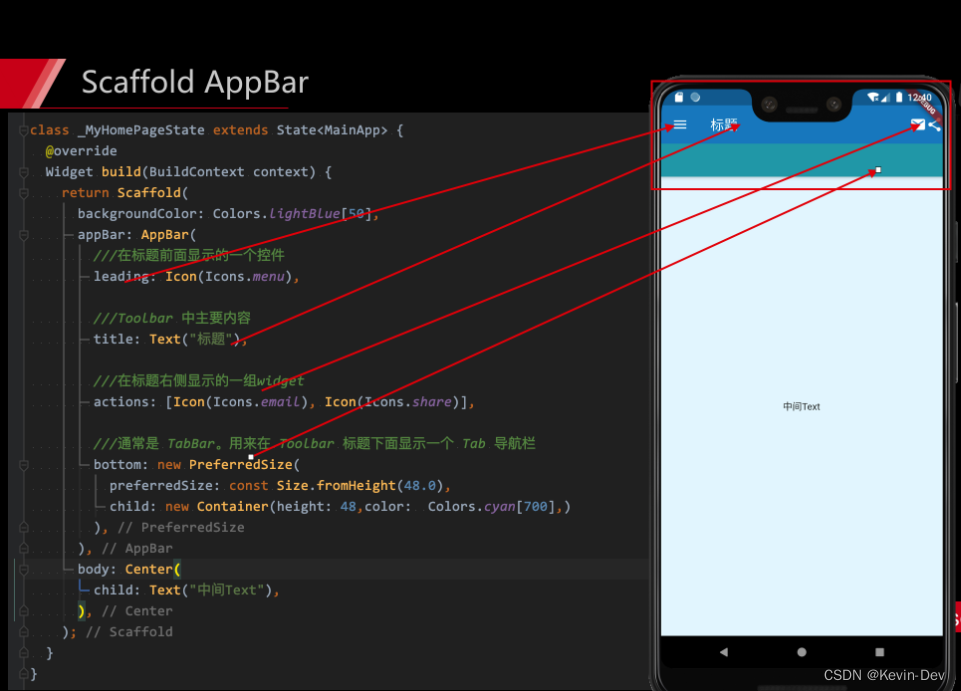
- 基本组成
二、属性
- leading:如果省略了 leading ,但 AppBar 在带有 Drawer 的 Scaffold 中,则会插入一个 button 以打开 Drawer。如果没有Drawer , 默认的是个返回箭头,可以通过设置来关闭automaticallyImplyLeading 为false ,
- automaticallyImplyLeading = true: 如果有 leading 这个不会管用 ; 如果没有leading ,当有侧边栏的时候, false:不会显示默认的图片,true 会显示 默认图片,并响应打开侧边栏的事件
- title: 标题
- actions,右边的icon, 一般的是icon 或者是文字
- flexibleSpace, 在title上面的一个东西,一般无用
- bottom, 一般就是tabbar , 也可以是别的
- elevation, Z轴高度,也就是阴影 默认是1 默认就是有高度 阴影的
- backgroundColor,导航栏的颜色 默认是 ThemeData 的颜色
- brightness,状态栏的深度 有白色和黑色两种主题
- iconTheme,
- centerTitle, title是否居中
- titleSpacing flexibleSpace 和 title 的距离 默认是重合的
- NavigationToolbar.kMiddleSpacing,
- toolbarOpacity = 1.0 导航栏的透明度
- bottomOpacity = 1.0 bottom的透明度
三、实例
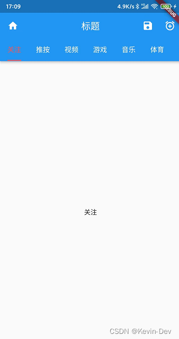
1. 效果图
2. 完整代码
import 'package:flutter/material.dart';

void main() {


  runApp(const MyApp());
}

class MyApp extends StatelessWidget {


  const MyApp({

    Key? key}) : super(key: key);

  @override
  Widget build(BuildContext context) {


    return MaterialApp(
      title: 'Welcome to Flutter',

      home: Scaffold(
          body: Center(
            child: AppBarStatefulWidget(),
          )
      )

    );
  }
}

class AppBarStatefulWidget extends StatefulWidget {


  const AppBarStatefulWidget({

    Key? key}) : super(key: key);

  @override
  _AppBarStatefulWidget createState() => _AppBarStatefulWidget();
}

class _AppBarStatefulWidget extends State with SingleTickerProviderStateMixin {


  final List<Tab> _tabs = <Tab>[
    new Tab(text: '关注'),
    new Tab(text: '推按'),
    new Tab(text: '视频'),
    new Tab(text: '游戏'),
    new Tab(text: '音乐'),
    new Tab(text: '体育'),
    new Tab(text: '生活'),
    new Tab(text: '图片'),
  ];

  var _tabController;

  @override
  void initState() {


    _tabController = TabController(vsync: this, length: _tabs.length);
    super.initState();
  }

  @override
  Widget build(BuildContext context) {


    return Scaffold(
      drawer: _drawer(context),
      body: TabBarView(
        controller: _tabController,
        children: _tabs.map((Tab tab) {


          return new Center(child: Text(tab.text.toString()));
        }).toList(),
      ),
      appBar: AppBar(
        leading: Icon(Icons.home),
        // 如果没有设置这项, 二级页面 会默认是返回箭头  , 有侧边栏的页面默认有图标(用来打开侧边栏)
        automaticallyImplyLeading: true,
        // 如果有 leading  这个不会管用 ; 如果没有leading ,当有侧边栏的时候, false:不会显示默认的图片,true 会显示 默认图片,并响应打开侧边栏的事件
        title: Text("标题"),
        centerTitle: true,
        // 标题是否在居中
        actions: <Widget>[
          IconButton(
              icon: Icon(Icons.save),
              tooltip: 'Add Alarm',
              onPressed: () {


                // 不写onPressed 默认,这个图片不能点击 且会有不可点击的样式(和 写了这个有不同的样式)
                // 如果有 onPressed 但是值是null 也会是不可点击的样式
              }),
          IconButton(
              icon: Icon(Icons.add_alarm),
              tooltip: 'Add Alarm',
              onPressed: () {


                // do nothing
              })
        ],
        bottom: TabBar(
          isScrollable: true,
          labelColor: Colors.redAccent,   // 选中的Widget颜色
          indicatorColor:Colors.redAccent, // 选中的指示器颜色
          labelStyle: new TextStyle(fontSize: 15.0),// 必须设置,设置 color 没用的,因为 labelColor 已经设置了
          unselectedLabelColor: Colors.white,
          unselectedLabelStyle: new TextStyle(
              fontSize: 15.0), // 设置 color 没用的,因为unselectedLabelColor已经设置了
          controller: _tabController,
          // tabbar 必须设置 controller 否则报错
          indicatorSize: TabBarIndicatorSize.label,
          // 有 tab 和 label 两种
          tabs: _tabs,
        ),
      ),
    );
  }
}

Drawer _drawer(BuildContext context) {


  return Drawer(
    child: ListView(
      padding: EdgeInsets.zero,
      children: <Widget>[
        DrawerHeader(
          decoration: BoxDecoration(
            color: Colors.lightBlueAccent,
          ),
          child: Center(
            child: SizedBox(
              width: 60.0,
              height: 60.0,
              child: CircleAvatar(
                child: Text('头像'),
              ),
            ),
          ),
        ),
        ListTile(
          title: Text('Item 1'),
          leading: new CircleAvatar(
            child: new Icon(Icons.school),
          ),
          onTap: () {


            Navigator.pop(context);
          },
        ),
        ListTile(
          title: Text('Item 2'),
          leading: new CircleAvatar(
            child: new Text('B2'),
          ),
          onTap: () {


            Navigator.pop(context);
          },
        ),
        ListTile(
          title: Text('Item 3'),
          leading: new CircleAvatar(
            child: new Icon(Icons.list),
          ),
          onTap: () {


            Navigator.pop(context);
          },
        ),
      ],
    ),
  );
}