AppBar 和 SliverAppBar 是纸墨设计中的 App Bar,也就是 Android 中的 Toolbar,关于 Toolbar 的设计指南请参考纸墨设计中 Toolbar 的内容。
AppBar 和 SliverAppBar 都是继承至 StatefulWidget 类,都代表 Toobar,二则的区别在于 AppBar 位置的固定的应用最上面的;而 SliverAppBar 是可以跟随内容滚动的。他们的主要属性如下:
- leading:在标题前面显示的一个控件,在首页通常显示应用的 logo;在其他界面通常显示为返回按钮
- title: Toolbar 中主要内容,通常显示为当前界面的标题文字
- actions:一个 Widget 列表,代表 Toolbar 中所显示的菜单,对于常用的菜单,通常使用 IconButton 来表示;对于不常用的菜单通常使用 PopupMenuButton 来显示为三个点,点击后弹出二级菜单
- bottom:一个 AppBarBottomWidget 对象,通常是 TabBar。用来在 Toolbar 标题下面显示一个 Tab 导航栏
- elevation:纸墨设计中控件的 z 坐标顺序,默认值为 4,对于可滚动的 SliverAppBar,当 SliverAppBar 和内容同级的时候,该值为 0, 当内容滚动 SliverAppBar 变为 Toolbar 的时候,修改 elevation 的值
- flexibleSpace:一个显示在 AppBar 下方的控件,高度和 AppBar 高度一样,可以实现一些特殊的效果,该属性通常在 SliverAppBar 中使用
- backgroundColor:APP bar 的颜色,默认值为 ThemeData.primaryColor。改值通常和下面的三个属性一起使用
- brightness:App bar 的亮度,有白色和黑色两种主题,默认值为 ThemeData.primaryColorBrightness
- iconTheme:App bar 上图标的颜色、透明度、和尺寸信息。默认值为 ThemeData.primaryIconTheme
- textTheme: App bar 上的文字样式。默认值为 ThemeData.primaryTextTheme
- centerTitle: 标题是否居中显示,默认值根据不同的操作系统,显示方式不一样
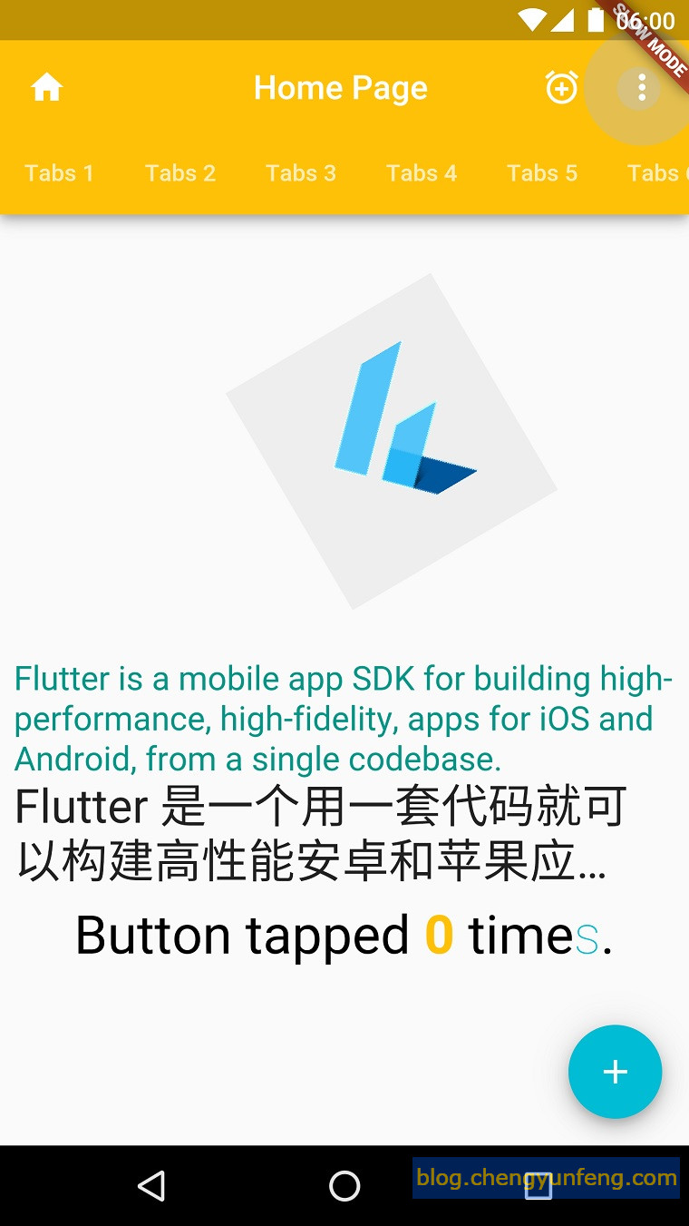
比如下面的代码在 App bar 上添加了功能按钮和 Tabs,并指定标题居中显示、修改 App bar 背景颜色 等:
 @override
  Widget build(BuildContext context) {
    // This method is rerun every time setState is called, for instance
    // as done by the _incrementCounter method above.
    // The Flutter framework has been optimized to make rerunning
    // build methods fast, so that you can just rebuild anything that
    // needs updating rather than having to individually change
    // instances of widgets.
    return new Scaffold(
      appBar: new AppBar(
        title: new Text(config.title),
        leading: new Icon(Icons.home),
        backgroundColor: Colors.amber[500],
        centerTitle: true,
        actions: <Widget>[
          new IconButton(
              icon: new Icon(Icons.add_alarm),
              tooltip: 'Add Alarm',
              onPressed: () {
                // do nothing
              }),
          new PopupMenuButton<String>(
              itemBuilder: (BuildContext context) => <PopupMenuItem<String>>[
                    new PopupMenuItem<String>(
                        value: "price", child: new Text('Sort by price')),
                    new PopupMenuItem<String>(
                        value: "time", child: new Text('Sort by time')),
                  ],
              onSelected: (String action) {
                switch (action) {
                  case "price":
                    // do nothing
                    break;
                  case "time":
                    // do nothing
                    break;
                }
              })
        ],
        bottom: new TabBar(
          isScrollable: true,
          tabs: <Widget>[
            new Tab(text: "Tabs 1"),
            new Tab(text: "Tabs 2"),
            new Tab(text: "Tabs 3"),
            new Tab(text: "Tabs 4"),
            new Tab(text: "Tabs 5"),
            new Tab(text: "Tabs 6"),
          ],
        ),
      ),
      body: body,
      floatingActionButton: new FloatingActionButton(
        onPressed: _incrementCounter,
        tooltip: 'Increment',
        child: new Icon(Icons.add),
      ), // This trailing comma makes auto-formatting nicer for build methods.
    );
  }
显示效果如下: