声明:本文章已独家授权郭霖公众号
在开发UI的时候,常常会有下面这种需求。一列以组为单位的选项,每一组的背景被一个带圆角的矩形包裹,组内不同位置的item按下时,阴影的圆角也不同。
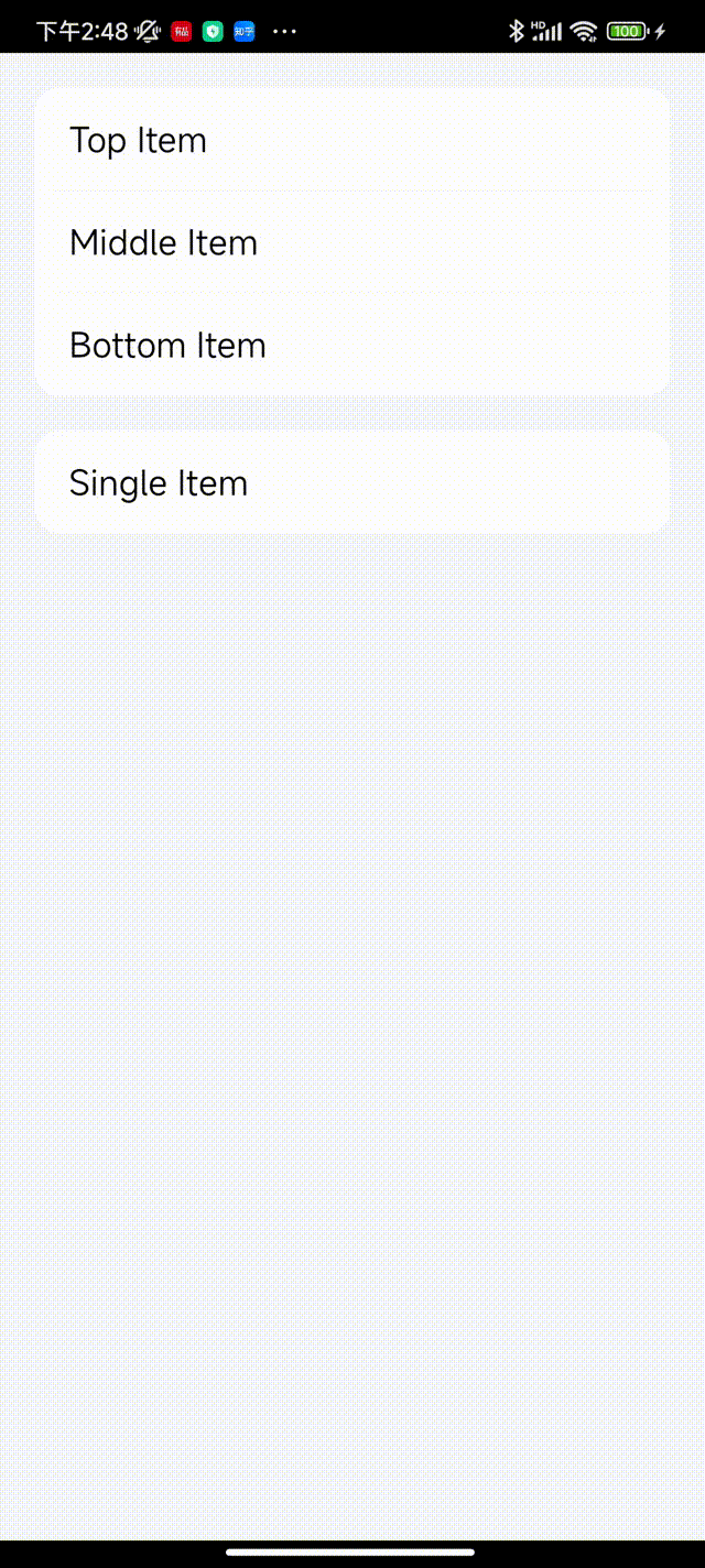
如上图,Top位置需要上面是圆角,Bottom位置需要下面是圆角,Middle位置都不是圆角,Single四个角都是圆角。
要实现这样的效果并不困难,设计4套Selector,分别作为background给四个位置的Item。
但是这样的实现并不优雅,缺点也很明显:每套selector里需要两个drawable文件,4套一共就会有12个xml文件。更可怕的是,当要适配不同颜色和角度的时候,都需要多出来12个xml文件。
虽然xml文件很小,对安装包影响不会很大,但是这样做会让项目后期维护成本增大。
这篇文章就教大家一个比较优雅且简单的方法在代码里提供一个公共方法来设置。
一、利用GradientDrawable和StateListDrawable设置
1、GradientDrawable替换shape
我们平时在xml里写的shape,对应到代码里就是GradientDrawable类。
例如,写一个带圆角的白色矩形,在xml里面这样写:
<?xml version="1.0" encoding="utf-8"?>
<shape xmlns:android="http://schemas.android.com/apk/res/android"
    android:shape="rectangle">
    <corners android:radius="15dp"/>
    <solid android:color="@color/white"/>
</shape>
到代码里就是这样写:
	val drawable = GradientDrawable().apply {


        shape = GradientDrawable.RECTANGLE
        setColor(color)
        cornerRadius = dpTopx(15f)
    }
如果要分别指定四个角的圆角,在xml这样写:
<?xml version="1.0" encoding="utf-8"?>
<shape xmlns:android="http://schemas.android.com/apk/res/android"
    android:shape="rectangle">
    <corners android:topLeftRadius="15dp" android:topRightRadius="15dp"
        android:bottomLeftRadius="10dp" android:bottomRightRadius="10dp"/>
    <solid android:color="@color/white"/>
</shape>
到代码里封装成一个方法就是:
/**
 * 创建一个带圆角的Rectangle背景
 * @param color 颜色
 * @param topLeftRadius 顶部左边圆角值
 * @param topRightRadius 顶部右边圆角值
 * @param bottomLeftRadius 底部左边圆角值
 * @param bottomRightRadius 底部右边圆角值
 */
fun createRectangleWithCorner(
    @ColorInt color: Int,
    topLeftRadius: Float,
    topRightRadius: Float,
    bottomLeftRadius: Float,
    bottomRightRadius: Float
): GradientDrawable {


    val radii = floatArrayOf(
        topLeftRadius, topLeftRadius,
        topRightRadius, topRightRadius,
        bottomRightRadius, bottomRightRadius,
        bottomLeftRadius, bottomLeftRadius
    )
    val drawable = GradientDrawable().apply {


        shape = GradientDrawable.RECTANGLE
        setColor(color)
        cornerRadii = radii
    }
    return drawable
}
其中radii是个float数组,我们可以看下setCornerRadii方法的注释
Specifies radii for each of the 4 corners. For each corner, the array contains 2 values, [X_radius, Y_radius]. The corners are ordered top-left, top-right, bottom-right, bottom-left. This property is honored only when the shape is of type RECTANGLE.
Note: changing this property will affect all instances of a drawable loaded from a resource. It is recommended to invoke mutate() before changing this property.
Params:
radii – an array of length >= 8 containing 4 pairs of X and Y radius for each corner, specified in pixels
注释里说的很清楚,每个角都包含[X_radius, Y_radius],顺序是左上、右上、右下、左下,并且在形状为矩形的时候才有效。
通过在代码里提供createRectangleWithCorner()方法,就可以通过传入参数来指定需要矩形的颜色和圆角等,不用再去写很多的xml文件。
对于这个方法我们还可以再封装一层:
/**
 * 创建一个带圆角的Rectangle背景
 * @param color 颜色
 * @param isTopCorner 顶部是否要圆角
 * @param isBottomCorner 底部是否要圆角
 * @param radius 圆角半径
 */
fun createRectangleWithCorner(
    @ColorInt color: Int,
    isTopCorner: Boolean,
    isBottomCorner: Boolean,
    radius: Float
): GradientDrawable {


    val topRadius = if (isTopCorner) radius else 0f
    val bottomRadius = if (isBottomCorner) radius else 0f
    return createRectangleWithCorner(color, topRadius, topRadius, bottomRadius, bottomRadius)
}
这样,我们就用这个方法来替换掉了shape的xml文件。
2、StateListDrawable替换selector
我们先回到我们的需求UI看一看。
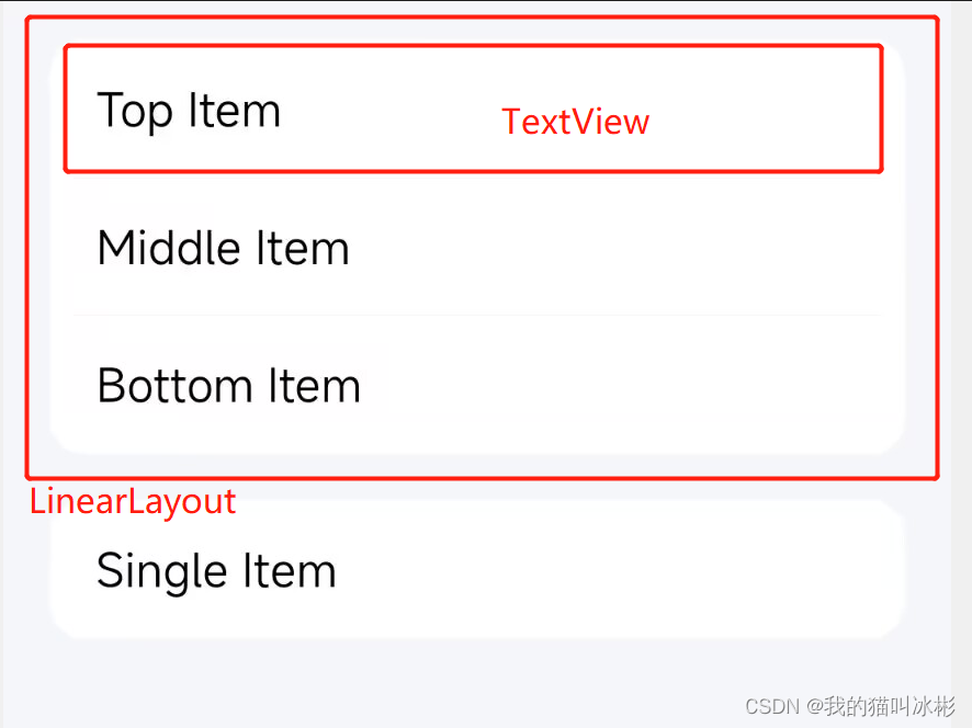
我们可以给最外层的LinearLayout(或者其他的ViewGroup)设置一个带圆角的矩形背景,然后里面的TextView(或者其他的View)统一设置如下的background:
<?xml version="1.0" encoding="utf-8"?>
<selector xmlns:android="http://schemas.android.com/apk/res/android">
    <item android:drawable="@color/transparent" android:state_pressed="false"/>
</selector>
其中的transparent的值是#00000000,也就是完全透明的,和他的parent保持一个颜色。
接着,就需要添加按下时候的drawable了。
我们在代码里获取TextView的background,被转成StateListDrawable类,当然保险起见可以加一个判断保护:
if (mBinding.itemTop.background is StateListDrawable) {


    val topBg = mBinding.itemTop.background as StateListDrawable
}
然后通过以下方法设置按下时候的Drawable
/**
 * 设置按下时候的Drawable
 * @param selector StateListDrawable类
 * @param color 颜色
 * @param isTopCorner 顶部是否要圆角
 * @param isBottomCorner 底部是否要圆角
 * @param radius 圆角半径
 */
fun setPressedDrawable(
    selector: StateListDrawable, @ColorInt color: Int,
    isTopCorner: Boolean,
    isBottomCorner: Boolean,
    radius: Float
) {


    val gradientDrawable =
        createRectangleWithCorner(color, isTopCorner, isBottomCorner, radius)
    selector.addState(intArrayOf(android.R.attr.state_pressed), gradientDrawable)
}
所以,我们这里的替换不是完全替换掉selector的xml文件,而是利用StateListDrawable类让selector最后只需要一个,并不会因为角度、颜色的更改而更改。
这样的好处是,我们在代码里就只需要设置按下时候的样式了。(但有个坑,下面会说)
3、总结
到这里我们就可以用3个方法来替换xml方案了:
/**
 * 创建一个带圆角的Rectangle背景
 * @param color 颜色
 * @param isTopCorner 顶部是否要圆角
 * @param isBottomCorner 底部是否要圆角
 * @param radius 圆角半径
 */
fun createRectangleWithCorner(
    @ColorInt color: Int,
    isTopCorner: Boolean,
    isBottomCorner: Boolean,
    radius: Float
): GradientDrawable {


    val topRadius = if (isTopCorner) radius else 0f
    val bottomRadius = if (isBottomCorner) radius else 0f
    return createRectangleWithCorner(color, topRadius, topRadius, bottomRadius, bottomRadius)
}

/**
 * 创建一个带圆角的Rectangle背景
 * @param color 颜色
 * @param topLeftRadius 顶部左边圆角值
 * @param topRightRadius 顶部右边圆角值
 * @param bottomLeftRadius 底部左边圆角值
 * @param bottomRightRadius 底部右边圆角值
 */
fun createRectangleWithCorner(
    @ColorInt color: Int,
    topLeftRadius: Float,
    topRightRadius: Float,
    bottomLeftRadius: Float,
    bottomRightRadius: Float
): GradientDrawable {


    val radii = floatArrayOf(
        topLeftRadius, topLeftRadius,
        topRightRadius, topRightRadius,
        bottomLeftRadius, bottomLeftRadius,
        bottomRightRadius, bottomRightRadius
    )
    val drawable = GradientDrawable().apply {


        shape = GradientDrawable.RECTANGLE
        setColor(color)
        cornerRadii = radii
    }
    return drawable
}

/**
 * 设置按下时候的Drawable
 * @param selector StateListDrawable类
 * @param color 颜色
 * @param isTopCorner 顶部是否要圆角
 * @param isBottomCorner 底部是否要圆角
 * @param radius 圆角半径
 */
fun setPressedDrawable(
    selector: StateListDrawable, @ColorInt color: Int,
    isTopCorner: Boolean,
    isBottomCorner: Boolean,
    radius: Float
) {


    val gradientDrawable =
        createRectangleWithCorner(color, isTopCorner, isBottomCorner, radius)
    selector.addState(intArrayOf(android.R.attr.state_pressed), gradientDrawable)
}
为了在项目里使用更方便,我们还可以自定义一个View,给这个自定义的View添加style属性:position,radius,pressedColor。
然后在自定义View中统一去调用方法,业务人员在使用的时候,直接在xml布局里去指定这三个属性即可。
由于篇幅原因就这里就不演示了。
二、遇到的坑
本来开开心心写了个工具,以为完美了,却遇到了一个大坑。
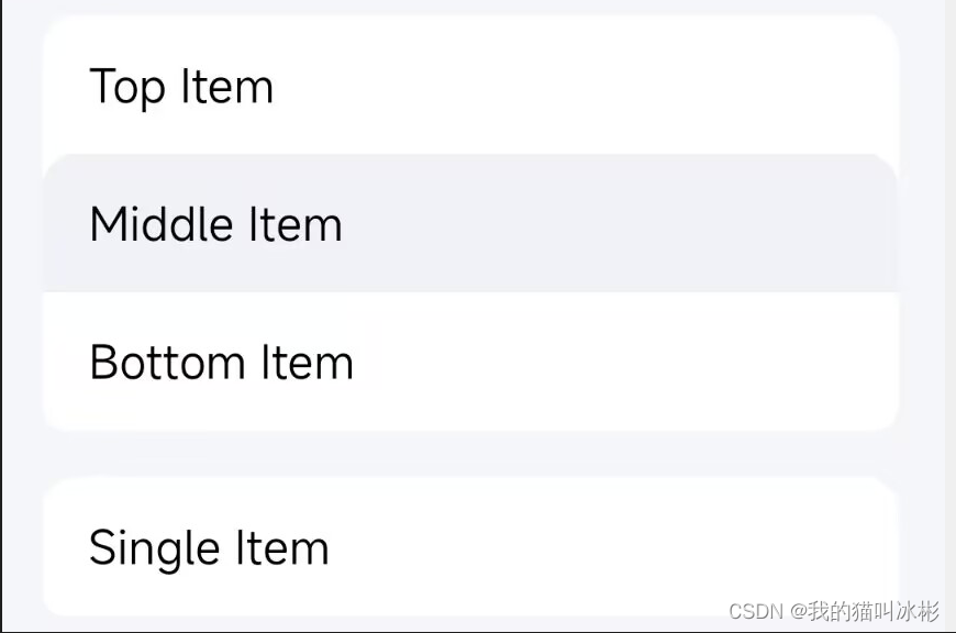
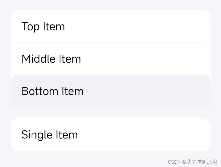
在Android7及以下的机器上,出现了无论怎么设置,所有item的圆角位置都是top的问题。类似这样:
这个问题定位花了很长的时间,所以也是一次值得记录的踩坑。
1、定位问题
在试了很久之后我发现,所有的item按下之后的圆角都和第一个item设置的保持一致了,并且还会影响其他页面。
我就猜测,是不是这个时候他们的background对应的StateListDrawable都是同一个实例了,可是日志打出来发现并不是。
接着我又去翻源码,然后发现了一个关键函数,Drawable里的mutate()
2、mutate()方法
看一下官方注释
Make this drawable mutable. This operation cannot be reversed. A mutable drawable is guaranteed to not share its state with any other drawable. This is especially useful when you need to modify properties of drawables loaded from resources. By default, all drawables instances loaded from the same resource share a common state; if you modify the state of one instance, all the other instances will receive the same modification. Calling this method on a mutable Drawable will have no effect.
使这个drawable可变。 此操作无法撤消。 保证可变的可绘制对象不会与任何其他可绘制对象共享其状态。 当您需要修改从资源加载的可绘制对象的属性时,这尤其有用。 默认情况下,从同一资源加载的所有可绘制实例共享一个公共状态; 如果您修改一个实例的状态,所有其他实例将收到相同的修改。 在可变的 Drawable 上调用此方法将无效。
里面最重要的一句话是:从同一资源加载的所有可绘制实例共享一个公共状态; 如果您修改一个实例的状态,所有其他实例将收到相同的修改
这是以前我从来没注意到的事情。于是我决定去源码分析以下为什么会这样。
3、通过资源获取的Drawable
无论是在代码里通过ResourceCompat.getDrawable()获取,还是在xml里通过@drawable去设置,两种方法都是从资源里去加载一个Drawable。
而他们最终都会走到这个方法:
	@Nullable
    public Drawable getDrawableForDensity(@StyleableRes int index, int density) {


        if (mRecycled) {


            throw new RuntimeException("Cannot make calls to a recycled instance!");
        }

        final TypedValue value = mValue;
        if (getValueAt(index * STYLE_NUM_ENTRIES, value)) {


            if (value.type == TypedValue.TYPE_ATTRIBUTE) {


                throw new UnsupportedOperationException(
                        "Failed to resolve attribute at index " + index + ": " + value);
            }

            if (density > 0) {


                // If the density is overridden, the value in the TypedArray will not reflect this.
                // Do a separate lookup of the resourceId with the density override.
                mResources.getValueForDensity(value.resourceId, density, value, true);
            }
            return mResources.loadDrawable(value, value.resourceId, density, mTheme);
        }
        return null;
    }
再往里走,最终就到了ResourcesImpl.loadDrawable()方法里,这里先看一下里面的关键代码
            final Drawable.ConstantState cs;
            if (isColorDrawable) {


                cs = sPreloadedColorDrawables.get(key);
            } else {


                cs = sPreloadedDrawables[mConfiguration.getLayoutDirection()].get(key);
            }
Drawable.ConstantState是Drawables用来存储Drawables之间的共享常量状态和数据,当加载同一个资源的时候,为了节省内存,就把一些常量和数据放到这里面,同一个资源的drawable都共享。
![[外链图片转存失败,源站可能有防盗链机制,建议将图片保存下来直接上传(img-KOovxQ9q-1667552518980)(C:\Users\lukarzhang\AppData\Roaming\Typora\typora-user-images\image-20221104164438396.png)]](https://img-blog.csdnimg.cn/d1781f48f40840d090a8337664ab9d2a.png)
而代码里的sPreloadedColorDrawables和sPreloadedDrawables是两个静态类
	// Information about preloaded resources.  Note that they are not
    // protected by a lock, because while preloading in zygote we are all
    // single-threaded, and after that these are immutable.
    @UnsupportedAppUsage
    private static final LongSparseArray<Drawable.ConstantState>[] sPreloadedDrawables;
    @UnsupportedAppUsage
    private static final LongSparseArray<Drawable.ConstantState> sPreloadedColorDrawables
            = new LongSparseArray<>();
4、解决问题
有了上面的源码分析,就能定位到问题是因为所有的backGround都是引用了同一个xml资源文件,他们又共享一个Drawable.ConstantState,导致了所有的item按下后的drawable都是一样的圆角了。
要解决的办法也很简单,就是在添加按下的样式前,手动调一次mutate()方法。
/**
 * 设置按下时候的Drawable
 * @param selector StateListDrawable类
 * @param color 颜色
 * @param isTopCorner 顶部是否要圆角
 * @param isBottomCorner 底部是否要圆角
 * @param radius 圆角半径
 */
fun setPressedDrawable(
    selector: StateListDrawable, @ColorInt color: Int,
    isTopCorner: Boolean,
    isBottomCorner: Boolean,
    radius: Float
) {


    selector.mutate()
    val gradientDrawable =
        createRectangleWithCorner(color, isTopCorner, isBottomCorner, radius)
    selector.addState(intArrayOf(android.R.attr.state_pressed), gradientDrawable)
}
我们到源码里看,StateListDrawable的mutate()实际上是调用了成员变量mStateListState的mutate()方法
	@Override
    public Drawable mutate() {


        if (!mMutated && super.mutate() == this) {


            mStateListState.mutate();
            mMutated = true;
        }
        return this;
    }
	void mutate() {


            mThemeAttrs = mThemeAttrs != null ? mThemeAttrs.clone() : null;

            final int[][] stateSets = new int[mStateSets.length][];
            for (int i = mStateSets.length - 1; i >= 0; i--) {


                stateSets[i] = mStateSets[i] != null ? mStateSets[i].clone() : null;
            }
            mStateSets = stateSets;
        }
里面会进行一个clone,这样我们后面再通过addState()设置就不会共享了。至此问题解决。
当然,另一种解决问题的办法就是不要在xml里设置background,而是通过new一个StateListDrawable在代码里设置。
三、总结
本篇文章提供了一种用GradientDrawable和StateListDrawable替换大量selector和shape的xml文件的方法,并在实践中踩到了Drawable.ConstantState的坑,通过分析源码对加载Drawable资源有了新的理解,并且解决了遇到的问题。