转自:https://blog.csdn.net/leilifengxingmw/article/details/50783574
首先扯点别的:这两天一直浑浑噩噩的,不知道干啥,什么也不想干,整日胡思乱想。如今已是春天了,已经过了惊蛰(虽然即墨这几天有点冷),可是我还是没有从一种行尸走肉的麻木中醒过来,不知道自己在干什什么,以后将要都走向哪里。
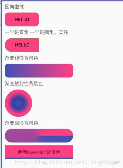
1. 进入正题,今天简单的演示一下Android中如何实现圆角按钮。使用了selector和shape.先看效果吧,感觉效果不是你想要的,果断pass掉。
1 xml布局的第一个,就是一个Button.,其他的都是TextView
<RelativeLayout xmlns:android="http://schemas.android.com/apk/res/android"
    xmlns:tools="http://schemas.android.com/tools"
    android:layout_width="match_parent"
    android:layout_height="match_parent" >
<!--注意 android:background="@drawable/btn_selector"-->
    <Button
        android:id="@+id/Button1"
        android:layout_width="wrap_content"
        android:layout_height="wrap_content"
        android:layout_centerInParent="true"
        android:background="@drawable/btn_selector"
        android:text="@string/hello_world" />

</RelativeLayout>
- 1
- 2
- 3
- 4
- 5
- 6
- 7
- 8
- 9
- 10
- 11
- 12
- 13
- 14
2 注意到上面的Button的background属性
android:background="@drawable/btn_selector"
其中的btn_selector是一个自定义的xml文件,继续看这个文件
- 1
- 2
3在工程的res目录下面新建一个forlder命名成drawable(小写英文的,注意别写错了),然后在drawable目录下新建一个selector文件
btn_selector.xml,大家应该秒懂这个文件的内容和意思吧!当按钮正常没有被按下的时候显示一个背景,按下的时候则显示另外一个颜色的背景,这样可以使用户得知按钮被按下了。
<?xml version="1.0" encoding="utf-8"?>
<selector xmlns:android="http://schemas.android.com/apk/res/android">

    <!-- Button正常状态下的背景 -->
    <item android:drawable="@drawable/btn_bg_normal" android:state_pressed="false"/>
    <!-- Button按下时的背景 -->
    <item android:drawable="@drawable/btn_bg_pressed" android:state_pressed="true"/>
</selector>
- 1
- 2
- 3
- 4
- 5
- 6
- 7
- 8
4 从btn_selector.xml文件中大家又发现了btn_bg_normal和btn_bg_pressed,这两个文件也是在drawable目录下的
4.1 在drawable 目录下新建两个 shape文件分别是btn_bg_normal.xml,和btn_bg_pressed.xml文件
btn_bg_normal.xml
<?xml version="1.0" encoding="utf-8"?>
<!-- 按钮正常的时候的背景 -->
<!-- shape的默认形状是rectangle,还有oval(椭圆),line(线),ring(圆环),我就用过rectangle,其他的大家可以试一试 -->
<shape xmlns:android="http://schemas.android.com/apk/res/android">
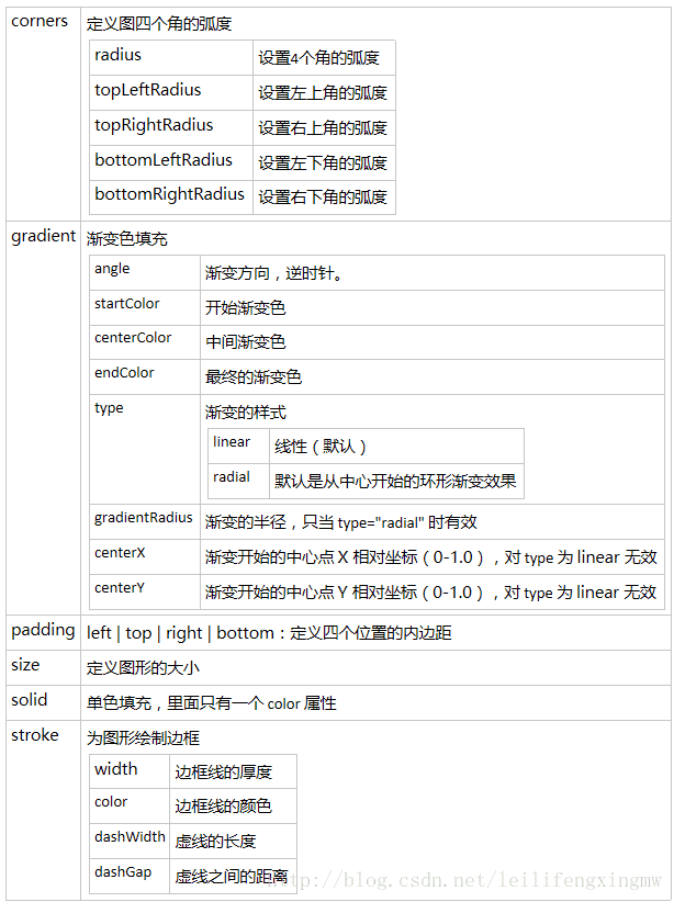
<!-- 矩形的圆角弧度 -->
<corners android:radius="10dp" />
<!-- 矩形的填充色 -->
<solid android:color="#FF4081" />
<!-- 矩形的边框的宽度,每段虚线的长度,和两段虚线之间的颜色和颜色 -->
<stroke
android:width="1dp"
android:dashWidth="8dp"
android:dashGap="4dp"
android:color="#4eb621" />
</shape>
- 1
- 2
- 3
- 4
- 5
- 6
- 7
- 8
- 9
- 10
- 11
- 12
- 13
- 14
- 15
- 16
- 17
btn_bg_pressed.xml
<?xml version="1.0" encoding="utf-8"?>
<shape xmlns:android="http://schemas.android.com/apk/res/android">
    <!-- 矩形的圆角弧度 -->
    <corners android:radius="10dp" />
    <!-- 矩形的填充色 -->
    <solid android:color="#3F51B5" />
    <!-- 矩形的边框的宽度,每段虚线的长度,和两段虚线之间的颜色和颜色 -->
    <stroke
        android:width="1dp"
        android:color="#4eb621"
        android:dashGap="4dp"
        android:dashWidth="8dp" />
</shape>
- 1
- 2
- 3
- 4
- 5
- 6
- 7
- 8
- 9
- 10
- 11
- 12
- 13
两点注意:
注意 stroke 是指shape的边界线
  <stroke
        android:width="1dp"
        android:dashWidth="8dp"
        android:dashGap="4dp"
        android:color="#4eb621" />
- 1
- 2
- 3
- 4
- 5
如果希望边界线是实线而不是虚线的话,可以象下面这样写。
<stroke
        android:width="1dp"
        android:color="#4eb621" />
- 1
- 2
- 3
注意如果要实现只有左边是圆角,右边还是直角这种类似的背景的话,可以如下设置:
<corners
                android:topLeftRadius="20dp"
                android:bottomLeftRadius="20dp"
                android:topRightRadius="0dp"
                android:bottomRightRadius="0dp"  />
- 1
- 2
- 3
- 4
- 5
具体设置corners 每个角的角度
drawable gradient 渐变背景色。
<gradient
  android:angle="integer"
  android:centerX="Float"
  android:centerY="Float"
  android:centerColor="integer"
  android:startColor="color"
  android:endColor="color"
  android:gradientRadius="integer"
  android:type=["linear"|"radial"|"sweep"]
  android:usesLevel=["true"|"false"]
  />
- 1
- 2
- 3
- 4
- 5
- 6
- 7
- 8
- 9
- 10
- 11
angle:角度,当 android:type=“linear”时有效 ,亿45度为单位,逆时针方向旋转
centerX:Float。渐变色中心的 X 相对位置( 0-1.0 )。当 android:type=“linear”时无效
centerY:Float。渐变色中心的 Y 相对位置( 0-1.0 )。当 android:type=“linear”时无效
centerColor:color。可选的颜色,出现在 start 和 end 颜色之间。
gradientRadius:Float。渐变色的半径。当 android:type=“radial” 时有效。
startcolor:开始的颜色
endcolor:结束的颜色
type:渐变色的样式。有效值为:
“linear”:线性渐变,默认值
“radial”:环形渐变。 start 颜色是处于中间的颜色
“sweep”:扇形渐变
useLevel:Boolean。“ true ”表示可以当作 LevelListDrawable 使用(没搞懂是什么意思)
- 1
- 2
- 3
- 4
- 5
- 6
- 7
- 8
- 9
- 10
- 11
- 12
layer-list 使用
图片来自:http://blog.csdn.net/pcaxb/article/details/47781547

例子:如果我们想给一个TextView 添加这样一个背景,一层背景是白色的,另外一层是蓝色的但是只露出来一部分,就可以使用layer-list实现。
<?xml version="1.0" encoding="utf-8"?>
<layer-list xmlns:android="http://schemas.android.com/apk/res/android">

    <!--上面的为背景的底层-->
    <item>
        <shape android:shape="rectangle">
            <solid android:color="@color/colorPrimary" />
        </shape>
    </item>

    <!--背景上面的图层 让底部的背景露出来4dp的高度-->
    <item android:bottom="4dp">
        <shape android:shape="rectangle">
            <solid android:color="@color/colorAccent" />
        </shape>
    </item>
</layer-list>
- 1
- 2
- 3
- 4
- 5
- 6
- 7
- 8
- 9
- 10
- 11
- 12
- 13
- 14
- 15
- 16
- 17
最后来一张图 这才是重点啊,哈哈。
这里只显示了部分用法,还有更多用法以后用到再研究。
源代码 https://github.com/humanheima/ShapeSelectordemo
结尾:参考链接
【1】http://www.jianshu.com/p/f67d8610fcda
【2】http://46aae4d1e2371e4aa769798941cef698.devproxy.yunshipei.com/u013293125/article/details/50359556
【3】http://blog.csdn.net/pcaxb/article/details/47781547