目录
文不如表,表不如图,数据分析师可以影响到老板的决策。在不调用第三方库的情况下,pandas就可以完成 10 多种图表的制作。
数据太大时,excel打不开文件,这时需要pandas
9. 柱状图 bar
9.1 pandas 绘图
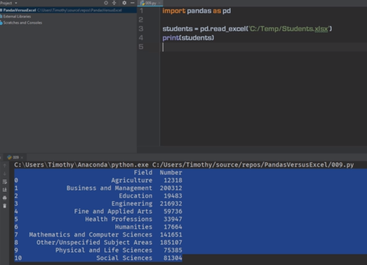
import pandas as pd

students = pd.read_excel('C:/Temp/Students.xlsx')
print(students)
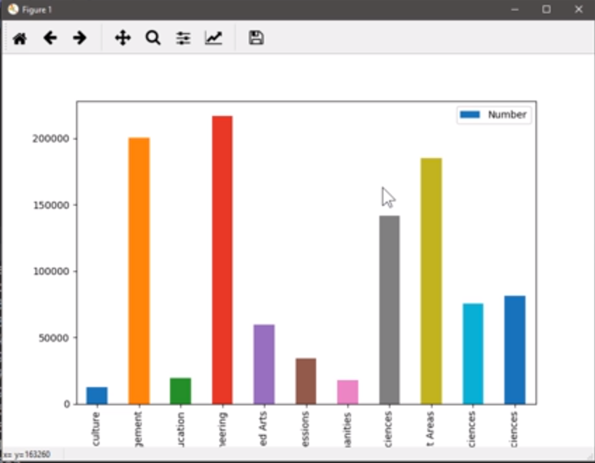
import pandas as pd
import matplotlib.pyplot as plt

students = pd.read_excel('C:/Temp/Students.xlsx')
students.plot.bar(x='Field', y='Number')
print(students)
plt.show()
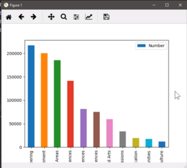
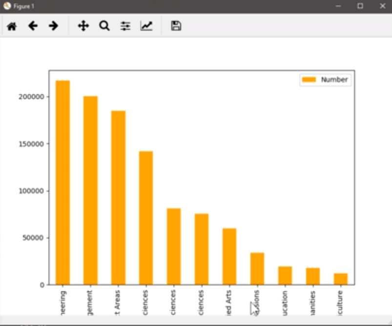
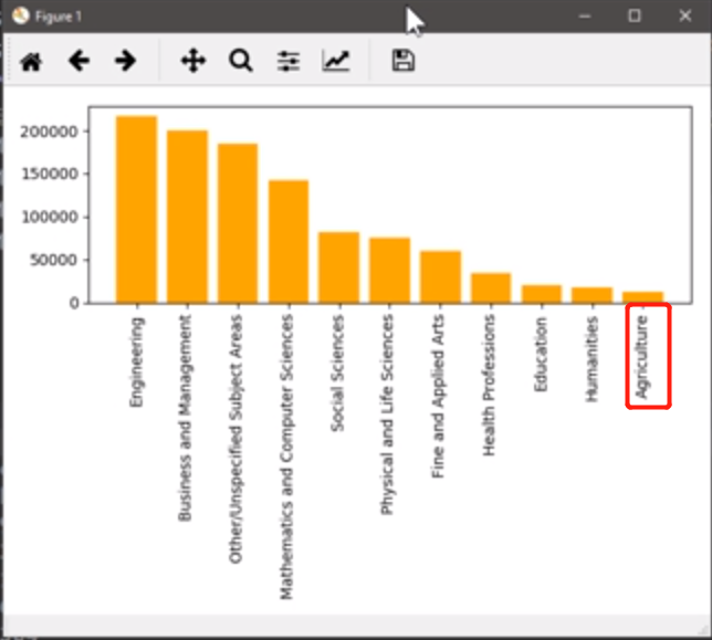
从高到低进行排序:降序排列
import pandas as pd
import matplotlib.pyplot as plt

students = pd.read_excel('C:/Temp/Students.xlsx')
students.sort_values(by='Number', inplace=True, ascending=False)
students.plot.bar(x='Field', y='Number')
print(students)
plt.show()
颜色不一样,看起来比较乱,
import pandas as pd
import matplotlib.pyplot as plt

students = pd.read_excel('C:/Temp/Students.xlsx')
students.sort_values(by='Number', inplace=True, ascending=False)
students.plot.bar(x='Field', y='Number', color='orange')  # 修改
print(students)
plt.show()
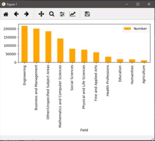
标签完整显示:
import pandas as pd
import matplotlib.pyplot as plt

students = pd.read_excel('C:/Temp/Students.xlsx')
students.sort_values(by='Number', inplace=True, ascending=False)
students.plot.bar(x='Field', y='Number', color='orange')
plt.tight_layout()  # 新增,让图更紧凑,这样可以将x轴标签显示完整。
plt.show()
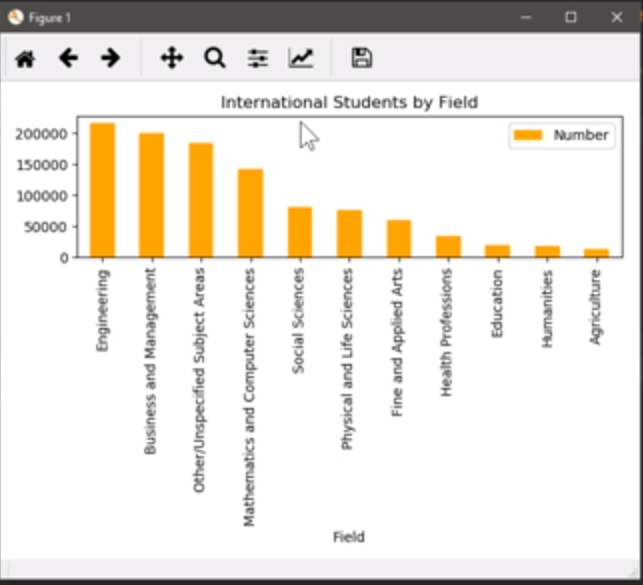
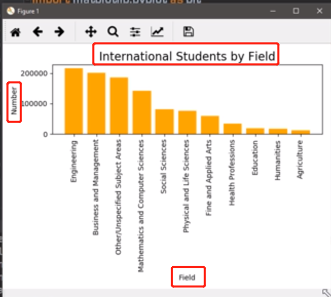
增加Title:
import pandas as pd
import matplotlib.pyplot as plt

students = pd.read_excel('C:/Temp/Students.xlsx')
students.sort_values(by='Number', inplace=True, ascending=False)
students.plot.bar(x='Field', y='Number', color='orange', \
title='International Students by Field')  # 新增 title
plt.tight_layout()  # 让图更紧凑,这样可以将x轴标签显示完整。
plt.show()
9.2 matplotlib.pyplot 绘图
import pandas as pd
import matplotlib.pyplot as plt

students = pd.read_excel('C:/Temp/Students.xlsx')
students.sort_values(by='Number', inplace=True, ascending=False)
# students.plot.bar(x='Field', y='Number', color='orange', title='International Students by Field')  #  title
plt.bar(students.Field, students.Number)
plt.tight_layout()  # 让图更紧凑,这样可以将x轴标签显示完整。
plt.show()
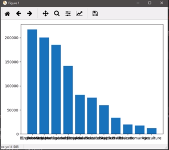
上图中 x 轴标签交织在一起,通过 ratotion 参数将其展开:
import pandas as pd
import matplotlib.pyplot as plt

students = pd.read_excel('C:/Temp/Students.xlsx')
students.sort_values(by='Number', inplace=True, ascending=False)
# students.plot.bar(x='Field', y='Number', color='orange', title='International Students by Field')  #  title
plt.bar(students.Field, students.Number, color='orange')
plt.xticks(students.Field, rotation='90')  # 新增
plt.tight_layout()  # 让图更紧凑,这样可以将x轴标签显示完整。
plt.show()
import pandas as pd
import matplotlib.pyplot as plt

students = pd.read_excel('C:/Temp/Students.xlsx')
students.sort_values(by='Number', inplace=True, ascending=False)
# students.plot.bar(x='Field', y='Number', color='orange', title='International Students by Field')  #  title
plt.bar(students.Field, students.Number, color='orange')
plt.xticks(students.Field, rotation='90')  # 新增

plt.xlabel('Field')
plt.ylabel('Number')
plt.title('International Students by Field', fontsize=16)

plt.tight_layout()  # 让图更紧凑,这样可以将x轴标签显示完整。
plt.show()
10. 分组柱图,深度优化
拼颜值的时代,连做个图都不能例外
本节目标图片:分组比较

重点:
- x 轴标签倾斜
- 颜色调整
- 标题、label 的字号
10.1 pandas 绘图
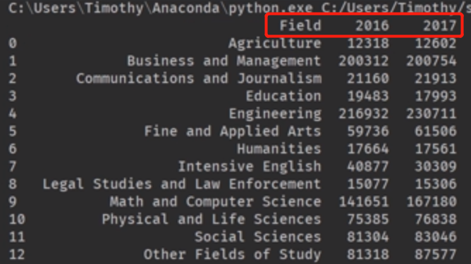
两列数据对比:
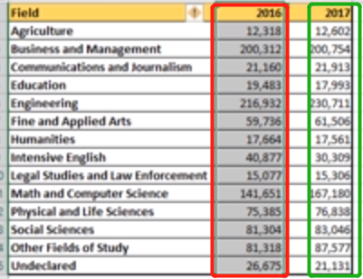
import pandas as pd

students = pd.read_excel('C:/Temp/Students.xlsx')
print(students)
制图:
import pandas as pd
import matplotlib.pyplot as plt
students = pd.read_excel('C:/Temp/Students.xlsx')
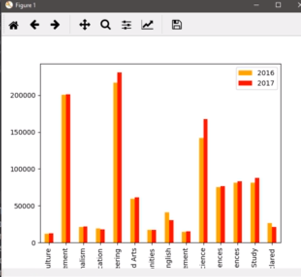
students.plot.bar(x='Field', y=['2016', '2017'], color=['orange', 'red'])
plt.show()
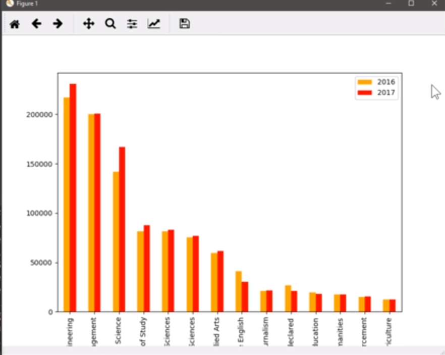
排序:
inplace=Ture不会生成新的DataFrame,ascending=False 从大到小排
import pandas as pd
import matplotlib.pyplot as plt

students = pd.read_excel('C:/Temp/Students.xlsx')
students.sort_values(by='2017', inplace=True, ascending=False)
students.plot.bar(x='Field', y=['2016', '2017'], color=['orange', 'red'])
plt.show()
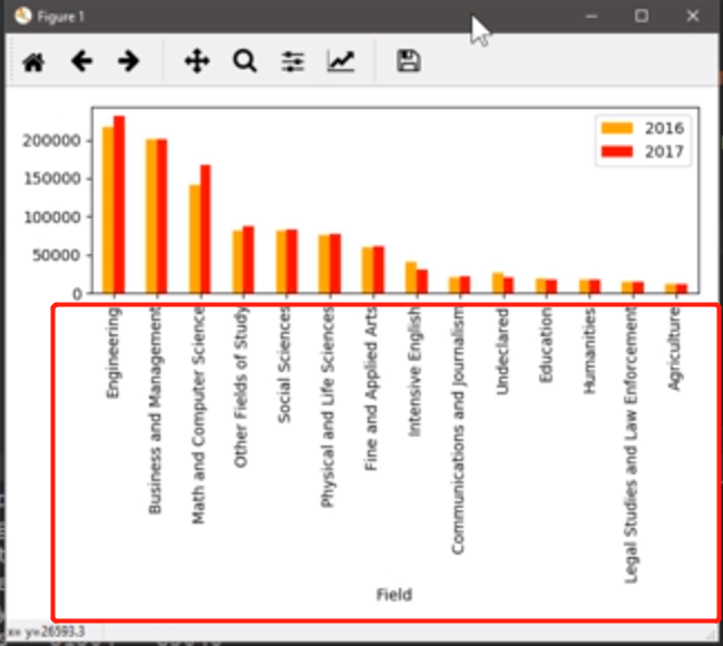
变的宽松:
import pandas as pd
import matplotlib.pyplot as plt

students = pd.read_excel('C:/Temp/Students.xlsx')
students.sort_values(by='2017', inplace=True, ascending=False)
students.plot.bar(x='Field', y=['2016', '2017'], color=['orange', 'red'])
plt.tight_layout()  # 让图更紧凑,这样可以将x轴标签显示完整。
plt.show()
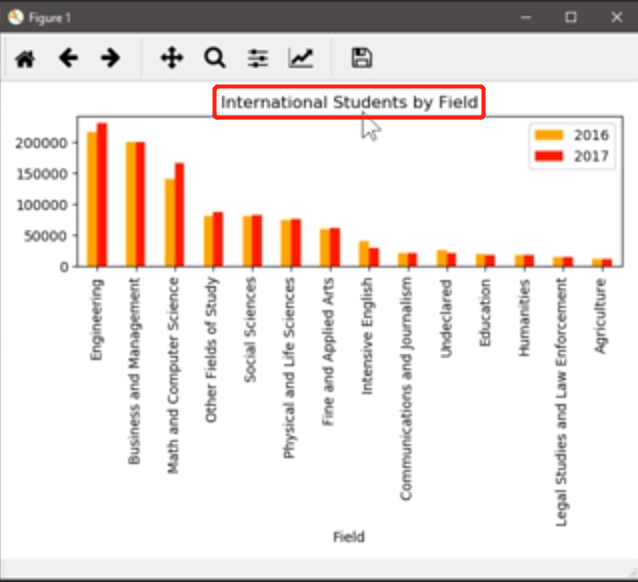
加title
import pandas as pd
import matplotlib.pyplot as plt

students = pd.read_excel('C:/Temp/Students.xlsx')
students.sort_values(by='2017', inplace=True, ascending=False)
students.plot.bar(x='Field', y=['2016', '2017'], color=['orange', 'red'], title='International Students by Field')
plt.tight_layout()  # 让图更紧凑,这样可以将x轴标签显示完整。
plt.show()
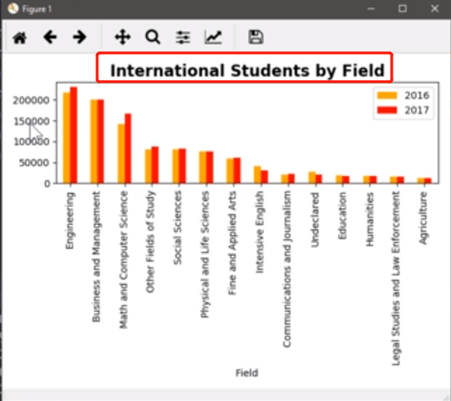
添加Titie,同时将文字大小调为 16 号大写、粗体,必须要用 plt.title进行设置
import pandas as pd
import matplotlib.pyplot as plt

students = pd.read_excel('C:/Temp/Students.xlsx')
students.sort_values(by='2017', inplace=True, ascending=False)
students.plot.bar(x='Field', y=['2016', '2017'], color=['orange', 'red'])
plt.title('International Students by Field', fontsize=16, fontweight='bold')
plt.tight_layout()  # 让图更紧凑,这样可以将x轴标签显示完整。
plt.show()
已经有了一个默认的 x 轴的label了,再添加一个x轴、y轴的label
import pandas as pd
import matplotlib.pyplot as plt

students = pd.read_excel('C:/Temp/Students.xlsx')
students.sort_values(by='2017', inplace=True, ascending=False)
students.plot.bar(x='Field', y=['2016', '2017'], color=['orange', 'red'])
plt.title('International Students by Field', fontsize=16, fontweight='bold')
plt.xlabel('Field', fontweight='bold') # 加粗
plt.ylabel('Number', fontweight='bold') # 加粗
plt.tight_layout()  # 让图更紧凑,这样可以将x轴标签显示完整。
plt.show()

将标签倾斜 45 度.
用matplotlib绘制的图基本分为两大区域,figure和axes(轴)
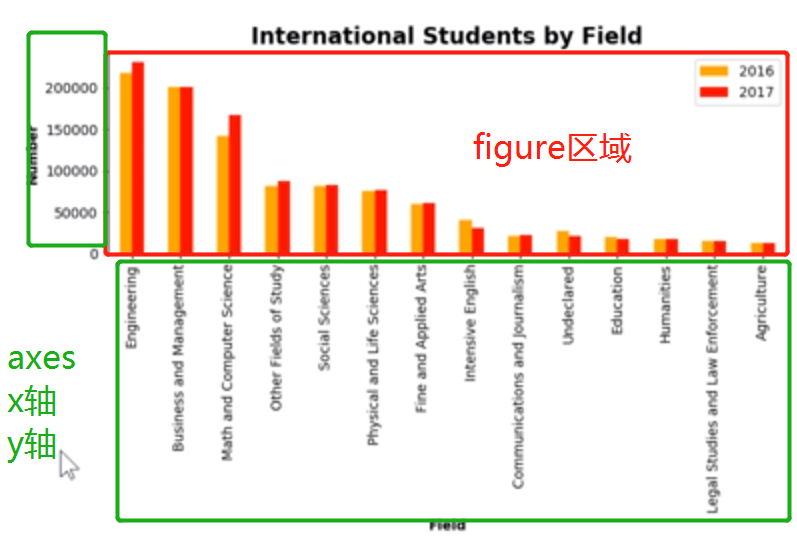
想优化轴的话,首先要拿到它的 axes,需要调用函数plt.gca()
import pandas as pd
import matplotlib.pyplot as plt

students = pd.read_excel('C:/Temp/Students.xlsx')
students.sort_values(by='2017', inplace=True, ascending=False)
students.plot.bar(x='Field', y=['2016', '2017'], color=['orange', 'red'])
plt.title('International Students by Field', fontsize=16, fontweight='bold')
plt.xlabel('Field', fontweight='bold') # 加粗
plt.ylabel('Number', fontweight='bold') # 加粗
ax = plt.gca() # get cart axes 的缩写
ax.set_xticklabels(students['Field'], rotation=45)  # 重新铺一遍 x 轴上的文字
plt.tight_layout()  # 让图更紧凑,这样可以将x轴标签显示完整。
plt.show()
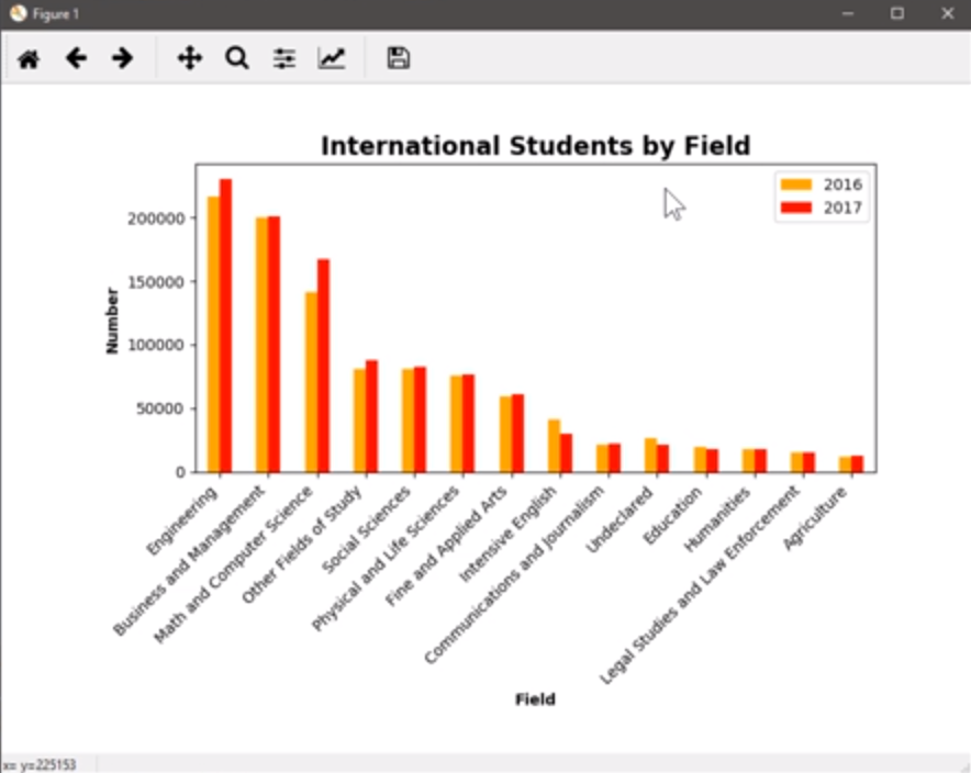
发现有点怪,x 轴的 ticks 没有对其,因为他们以每个单词的中点,作为中心点旋转的,继续修改
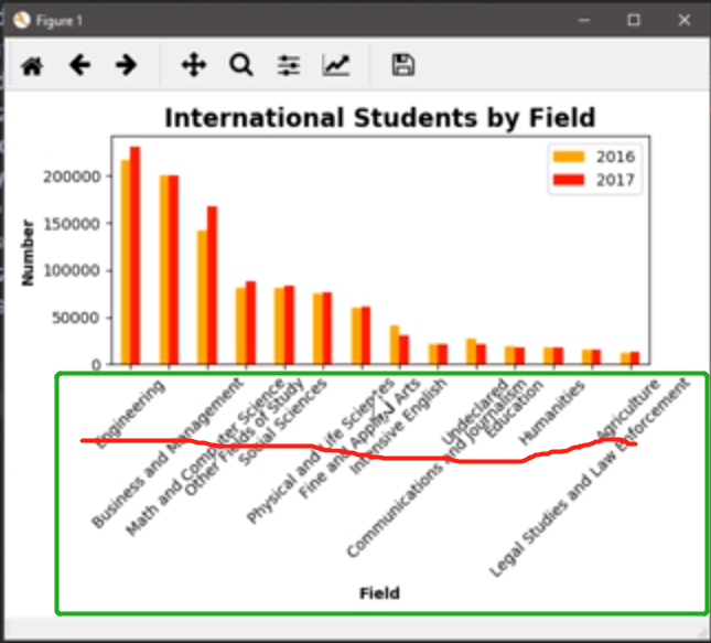
ha:Horizontal alignment 水平对其,将x轴标签单词的开始部分对其,以右侧部分为中心点,进行选择 45 度
import pandas as pd
import matplotlib.pyplot as plt

students = pd.read_excel('C:/Temp/Students.xlsx')
students.sort_values(by='2017', inplace=True, ascending=False)
students.plot.bar(x='Field', y=['2016', '2017'], color=['orange', 'red'])
plt.title('International Students by Field', fontsize=16, fontweight='bold')
plt.xlabel('Field', fontweight='bold') # 加粗
plt.ylabel('Number', fontweight='bold') # 加粗
ax = plt.gca() # get cart axes 的缩写
ax.set_xticklabels(students['Field'], rotation=45, ha='right')  # 重新铺一遍 x 轴上的文字 ha:Horizontal alignment 水平对其
plt.tight_layout()  # 让图更紧凑,这样可以将x轴标签显示完整。
plt.show()
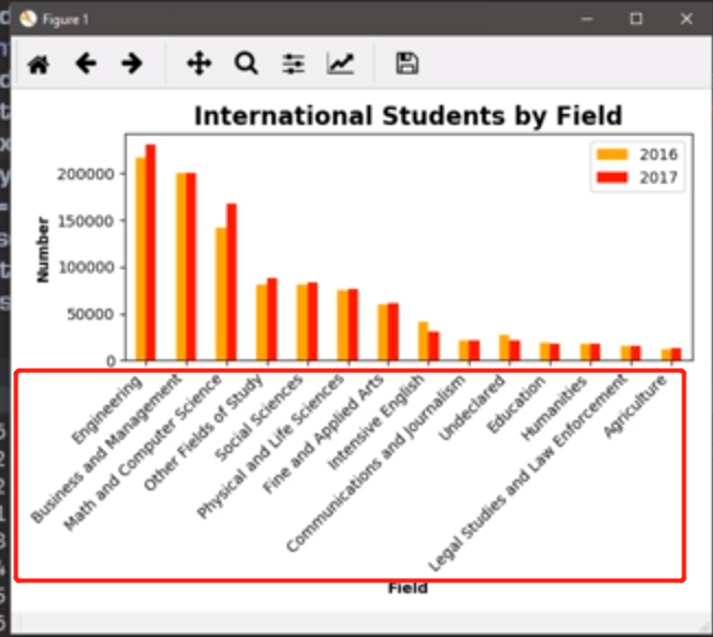
发现新的问题,留的空白太多
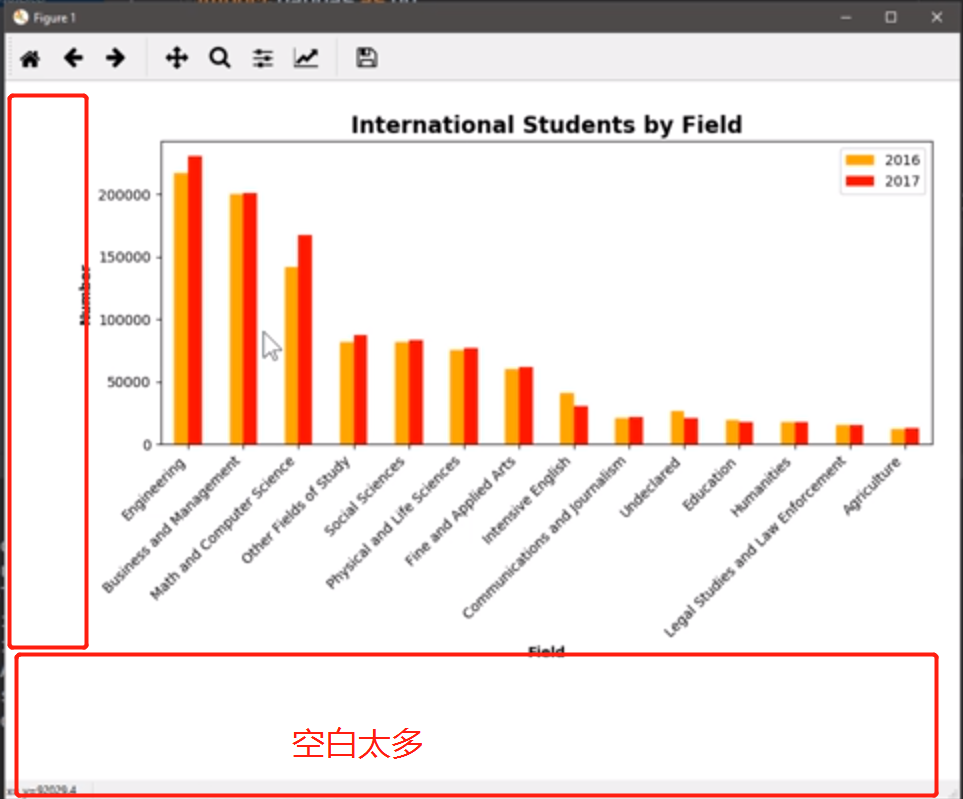
plt.gca()拿到当前的figure图形,子图形的调整subplots_adjust(),left留出 20% 的宽度,bottom(底部)留出42%的宽度,将plt.tight_layout()注销掉
import pandas as pd
import matplotlib.pyplot as plt

students = pd.read_excel('C:/Temp/Students.xlsx')
students.sort_values(by='2017', inplace=True, ascending=False)
students.plot.bar(x='Field', y=['2016', '2017'], color=['orange', 'red'])
plt.title('International Students by Field', fontsize=16, fontweight='bold')
plt.xlabel('Field', fontweight='bold') # 加粗
plt.ylabel('Number', fontweight='bold') # 加粗
ax = plt.gca() # get cart axes 的缩写
ax.set_xticklabels(students['Field'], rotation=45, ha='right')  # 重新铺一遍 x 轴上的文字 ha:Horizontal alignment 水平对其
# plt.tight_layout()  # 让图更紧凑,这样可以将x轴标签显示完整。
plt.show()
11. 叠加柱状图,水平柱状图
叠加柱状图:
转 90° 之后,变成横向的柱状图
11.1 Excel 绘图
数据介绍:用户ID、用户姓名、用户在 10、11、12 三个月使用的次数,看用户在10、11、12三个月的叠加柱状图。

选中区域,然后
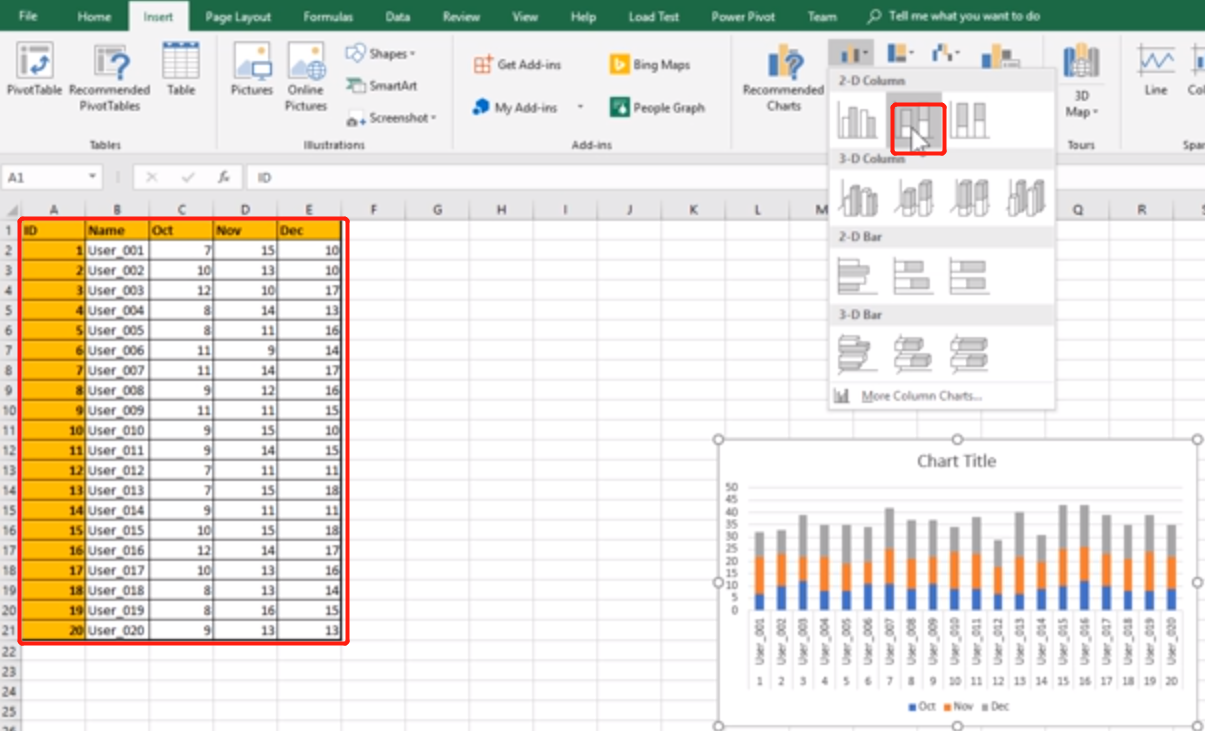
变成横向,

11.2 pandas 绘图
import pandas as pd
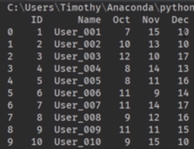
users= pd.read_excel('C:/Temp/Users.xlsx')
print(users)
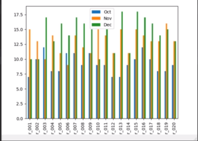
绘制一个分组柱状图(类似上一节课)
import pandas as pd
import matplotlib.pyplot as plt

users= pd.read_excel('C:/Temp/Users.xlsx')
users.plot.bar(x='Name', y=['Oct', 'Nov', 'Dec']]
plt.show()
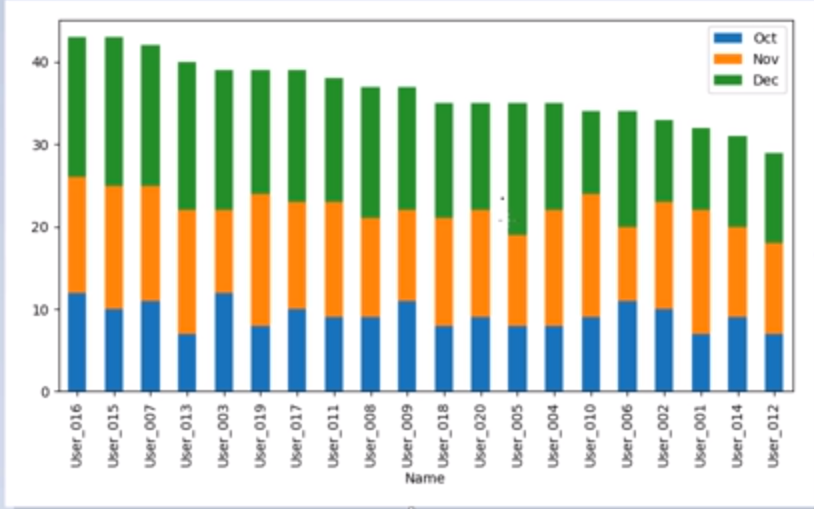
将上图,变成叠加柱状图,添加参数 stacked=True
import pandas as pd
import matplotlib.pyplot as plt

users= pd.read_excel('C:/Temp/Users.xlsx')
users.plot.bar(x='Name', y=['Oct', 'Nov', 'Dec'], stacked=True]
plt.show()
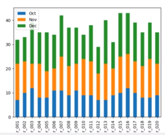
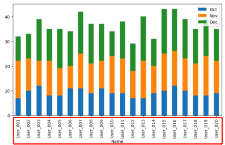
上图中,标签是截断的,修改一下,增加 plt.tight_layout()
import pandas as pd
import matplotlib.pyplot as plt

users= pd.read_excel('C:/Temp/Users.xlsx')
users.plot.bar(x='Name', y=['Oct', 'Nov', 'Dec'], stacked=True]
plt.tight_layout()
plt.show()
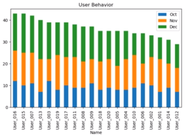
加Title,并按用户总的使用量进行排序:
import pandas as pd
import matplotlib.pyplot as plt

users= pd.read_excel('C:/Temp/Users.xlsx')
users['Total'] = users['Oct'] + users['Nov'] + users['Dec']
users.sort_values(by='Total', inplace=True, ascending=False)
users.plot.bar(x='Name', y=['Oct', 'Nov', 'Dec'], stacked=True]
plt.tight_layout()
plt.show()
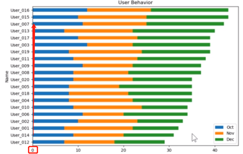
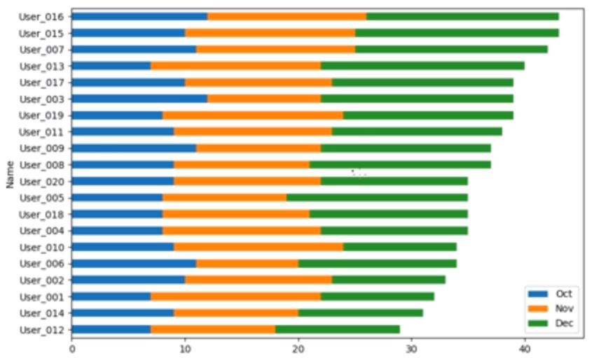
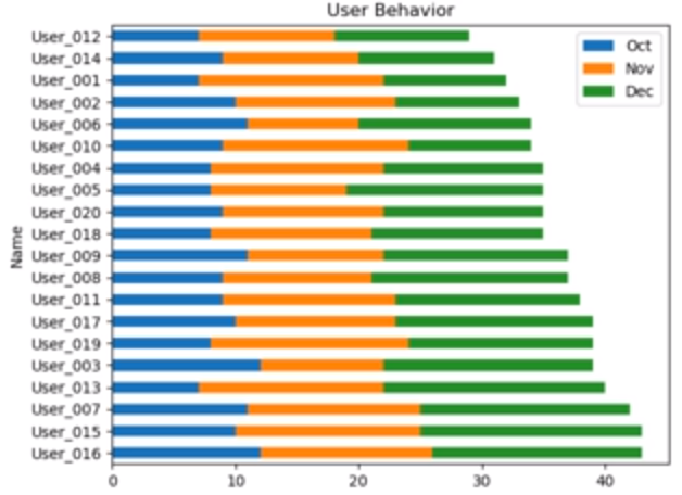
将图转为水平,将plot.bar改为plot.barh (h: horizontal 水平的)
import pandas as pd
import matplotlib.pyplot as plt

users= pd.read_excel('C:/Temp/Users.xlsx')
users['Total'] = users['Oct'] + users['Nov'] + users['Dec']
users.sort_values(by='Total', inplace=True, ascending=False)
users.plot.barh(x='Name', y=['Oct', 'Nov', 'Dec'], stacked=True]
plt.tight_layout()
plt.show()
ascending=True
import pandas as pd
import matplotlib.pyplot as plt

users= pd.read_excel('C:/Temp/Users.xlsx')
users['Total'] = users['Oct'] + users['Nov'] + users['Dec']
users.sort_values(by='Total', inplace=True, ascending=True)
users.plot.barh(x='Name', y=['Oct', 'Nov', 'Dec'], stacked=True]
plt.tight_layout()
plt.show()