最近在刷视频的时候看到有意思的案例 跟着码了一下 持续学习 进步
来源:后盾人 向老师 B站 抖音 可以搜索
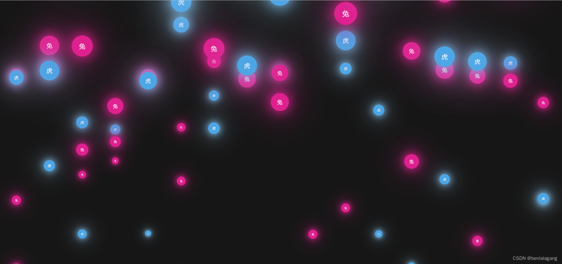
波点上升:
- 使用document.createElement("div") 在页面上创建100个div 并且给每个div 加上一个随机数 --duration(自定义样式名)用来生成动画的执行实现 实现参差感 内部还可写上文字
-
for (let i = 0; i < 100; i++) { const el = document.createElement("div"); el.style.cssText = `--duration:` + (Math.random() * 50 + 10); if (i % 2 === 0) { el.innerText = "虎"; } else { el.innerText = "兔"; } document.body.appendChild(el); } - div 设置相应的样式 有背景颜色的圆、外阴影、... 使用选择器 div:nth-of-type(even) 为偶数的div改变颜色样式 添加动画 大小从0-1 位置从底部到顶部 然后重新设置 动画的持续时间animation-duration: calc(300s / var(--duration));
-
<style>
      body {
        background-color: #161616;
        height: 100vh;
        width: 100vw;
        margin: 0;
        padding: 0;
        overflow: hidden;
      }
      div {
        width: 80px;
        height: 80px;
        position: relative;
        border-radius: 40px;
        margin: 0 5px;
        display: inline-block;
        background-color: #4da6e5;
        box-shadow: 0 0 50px 5px #79bcec, 0 0 150px 5px #a6d2f2;
        animation: hd 5s linear infinite;
        animation-duration: calc(300s / var(--duration));
        color: white;
        text-align: center;
        line-height: 80px;
        font-size: 24px;
      }
      /* 让偶数的div 有不一样的颜色 和阴影效果 */
      div:nth-of-type(even) {
        background-color: #df208f;
        box-shadow: 0 0 50px 5px #df208c, 0 0 150px 5px #df208f;
      }
      /* 定义动画 */
      @keyframes hd {
        from {
          transform: translateY(100vh) scale(0);
        }
        to {
          transform: translateY(-100vh) scale(1);
        }
      }
</style>
效果预览:
演示地址:15.散点波光 (wsg3096.com) http://www.wsg3096.com/chestnut/glistening.html
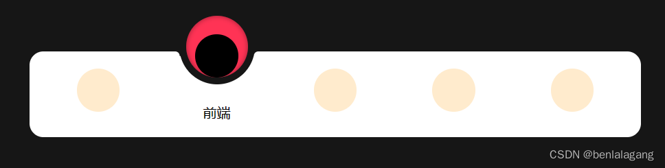
动态的tabbar
-
和一般的tabber 区别就是 加入了 过渡效果 一般的tabbar切换 是 排他思想 去掉兄弟元素的 .active 样式 给自己增加选中样式
-
      const secs = document.querySelectorAll("section");
      const qiu = document.querySelector(".qiu");
      for (let i = 0; i < secs.length; i++) {
        // for循环给每个 选项都添加点击事件
        secs[i].addEventListener("click", () => {
        // 内部再循环 排除所有的 active
          for (let i = 0; i < secs.length; i++) {
            secs[i].classList.remove("active");
          }
// 然后 给自己加上
          secs[i].classList.add("active");
// 移动底部小球的偏移量  小球有过渡效果
          qiu.style.left = `${i * 138 + 36}px`;
        });
      }
HTML结构
    <main>
      <section class="active">
        <div class="icons"></div>
        <span>美工</span>
      </section>
      <section>
        <div class="icons"></div>
        <span>前端</span>
      </section>
      <section>
        <div class="icons"></div>
        <span>后端</span>
      </section>
      <section>
        <div class="icons"></div>
        <span>测试</span>
      </section>
      <section>
        <div class="icons"></div>
        <span>运维</span>
      </section>
      <!-- 同级的div 就代表小球 -->
      <div class="qiu"></div>
    </main>
CSS样式 设置有过度 加上active 时 改变内部的 transform: translateY 实现动画效果
<style>
      body {
        background-color: #161616;
        height: 100vh;
        width: 100vw;
        margin: 0;
        padding: 0;
        overflow: hidden;
      }

      main {
        background-color: #ffffff;
        width: 640px;
        height: 80px;
        padding: 0 36px;
        border-radius: 16px;
        margin: 120px auto;
        text-align: center;
        display: flex;
        justify-content: space-between;
        padding-top: 20px;
        position: relative;
      }

      /* 图标和文字 运动时间 */
      .icons {
        width: 50px;
        height: 50px;
        background-color: blanchedalmond;
        transition: all 0.3s linear;
        pointer-events: none;
        border-radius: 50%;
        margin: 0 auto;
      }

      span {
        font-size: 16px;
        transition: all 0.3s linear;
        opacity: 0;
        display: block;
        transform: translateY(20px);
      }

      section {
        cursor: pointer;
        position: relative;
        z-index: 8;
        width: 88px;
      }

      .active .icons {
        background-color: black;
        transform: translateY(-80%);
      }

      .active span {
        opacity: 1;
        transform: translateY(-10px);
      }

      .qiu {
        width: 72px;
        height: 72px;
        background-color: #f35;
        position: absolute;
        border-radius: 50%;
        top: -50%;
        border: 8px solid #161616;
        transition: 0.31s linear;
        box-shadow: inset 0 0 6px 0 rgba(0, 0, 0, 0.4);
        left: 36px;
      }
</style>
细节:背景球球前后加上 伪类 定位 使得与tabs 融合更加圆润
.qiu::after {
content: "";
width: 30px;
height: 10px;
position: absolute;
top: 42px;
right: -7px;
transform: translateX(100%);
background: #fff;
border-radius: 15px;
box-shadow: -5px -5px 0 0 #161616;
}
.qiu::before {
content: "";
width: 30px;
height: 10px;
position: absolute;
top: 42px;
left: -7px;
transform: translateX(-100%);
background: #fff;
border-radius: 15px;
box-shadow: 5px -5px 0 0 #161616;
}
效果图 icon 用的是纯色块 有精力可以替换成 SVG 或者 iconfont

演示地址:16.带点花的tabbar (wsg3096.com)http://www.wsg3096.com/chestnut/tabbar.html