前言
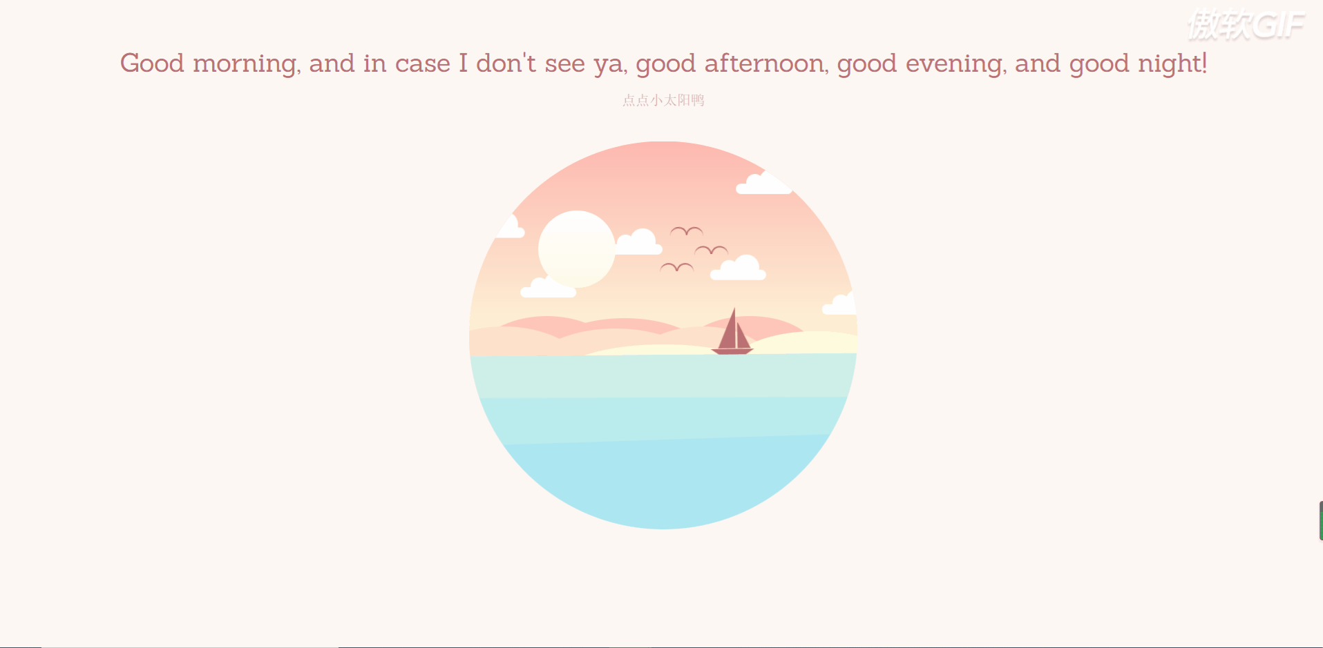
今天分享一个唯美的日月交替的小动画,祝大家早安晚安,每日安好鸭!
ps:现在先贴代码啦,明天醒了更新具体的步骤,带领大家一步一步制作,感谢支持!
一、HTML
<!DOCTYPE html>
<html lang="en" >
<head>
    <meta charset="UTF-8">
    <title>早安、晚安动画</title>
    <link rel="stylesheet" href="https://cdnjs.cloudflare.com/ajax/libs/meyer-reset/2.0/reset.min.css">
    <link rel="stylesheet" href="./style.css">

</head>
<body>
<div class="container-wrapper">
    <h1>Good morning, and in case I don't see ya, good afternoon, good evening, and good night!</h1>

    <p id="subtitle">点点小太阳鸭</p>
    <div class="container">
        <div class="circle-container">
            <!-- 天空部分 -->
            <div class="sky">
                <div class="sky-night">
                    <div class="stars">
                        <div class="shooting-star"></div>
                        <div class="star-group-1"></div>
                        <div class="star-group-2"></div>
                        <div class="star-group-3"></div>
                        <div class="star-group-4"></div>
                    </div>
                </div>

                <!-- 云彩 -->
                <div class="cloud cloud-1"></div>
                <div class="cloud cloud-2"></div>
                <div class="cloud cloud-3"></div>
                <div class="cloud cloud-4"></div>
                <div class="cloud cloud-5"></div>
                <div class="cloud cloud-6"></div>
                <div class="bird bird-1"></div>
                <div class="bird bird-2"></div>
                <div class="bird bird-3"></div>
            </div>

            <!-- 山川 -->
            <div class="mountains">
                <div class="mountain-back">
                    <div class="mountain-back-1"></div>
                    <div class="mountain-back-2"></div>
                </div>
                <div class="mountain-middle">
                    <div class="mountain-middle-1"></div>
                    <div class="mountain-middle-2"></div>
                </div>
                <div class="mountain-top">
                    <div class="mountain-top-1"></div>
                </div>
            </div>

            <!-- 太阳 -->
            <div class="sun-container">
                <div class="sun"></div>
            </div>

            <!-- 海洋 -->
            <div class="ocean">
                <div class="boat"></div>
                <div class="ocean-night">
                    <div class="moon"></div>

                    <!-- 山川 -->
                    <div class="mountains mountains-bottom">
                        <div class="mountain-back">
                            <div class="mountain-back-1"></div>
                            <div class="mountain-back-2"></div>
                        </div>
                        <div class="mountain-middle">
                            <div class="mountain-middle-1"></div>
                            <div class="mountain-middle-2"></div>
                        </div>
                        <div class="mountain-top">
                            <div class="mountain-top-1"></div>
                        </div>
                    </div>
                </div>
            </div>
        </div>
    </div>
</div>
<!-- partial -->
<script src='https://cdnjs.cloudflare.com/ajax/libs/jquery/3.4.1/jquery.min.js'></script>
<script src="https://cdnjs.cloudflare.com/ajax/libs/prefixfree/1.0.7/prefixfree.min.js"></script><script src="./index.js"></script>
</body>
</html>
二、CSS
@import url("https://fonts.googleapis.com/css?family=Sanchez");

* {


    padding: 0;
    margin: 0;
    -webkit-box-sizing: border-box;
    box-sizing: border-box;
}

*:before,
*:after {


    content: "";
    position: absolute;
}

html {


    font-family: "Sanchez", serif;
}

.container-wrapper {


    width: 100%;
    height: 100%;
    display: -webkit-box;
    display: -ms-flexbox;
    display: flex;
    -webkit-box-pack: center;
    -ms-flex-pack: center;
    justify-content: center;
    -webkit-box-align: center;
    -ms-flex-align: center;
    align-items: center;
    -webkit-box-orient: vertical;
    -webkit-box-direction: normal;
    -ms-flex-direction: column;
    flex-direction: column;
}

html {


    -webkit-transition: background-color 3s ease;
    -o-transition: background-color 3s ease;
    transition: background-color 3s ease;
    -webkit-transition-delay: 2s;
    -o-transition-delay: 2s;
    transition-delay: 2s;
    background-color: #fff7f4;
}

.container {


    width: 450px;
    height: 450px;
    position: relative;
}

.container-night {


    background-color: #e4ecff;
}

.circle-container {


    width: 450px;
    height: 450px;
    -webkit-clip-path: circle(50% at 50% 50%);
    clip-path: circle(50% at 50% 50%);
    position: absolute;
    overflow: hidden;
    z-index: 100;
}

.sky {


    position: absolute;
    width: 100%;
    height: 55%;
    top: 0;
    background: -webkit-gradient(
            linear,
            left top,
            left bottom,
            from(#feb8b0),
            to(#fef9db)
    );
    background: -webkit-linear-gradient(#feb8b0, #fef9db);
    background: -o-linear-gradient(#feb8b0, #fef9db);
    background: linear-gradient(#feb8b0, #fef9db);
    z-index: 1;
    overflow: hidden;
}

.sky-night {


    position: absolute;
    width: 100%;
    height: 100%;
    background: -webkit-gradient(
            linear,
            left top,
            left bottom,
            from(#4c3f6d),
            color-stop(#6c62bb),
            to(#93b1ed)
    );
    background: -webkit-linear-gradient(#4c3f6d, #6c62bb, #93b1ed);
    background: -o-linear-gradient(#4c3f6d, #6c62bb, #93b1ed);
    background: linear-gradient(#4c3f6d, #6c62bb, #93b1ed);
    opacity: 0;
    -webkit-transition: opacity 3s;
    -o-transition: opacity 3s;
    transition: opacity 3s;
    -webkit-transition-delay: 2s;
    -o-transition-delay: 2s;
    transition-delay: 2s;
}

.sky-night-fade {


    opacity: 1;
}

@-webkit-keyframes sky-night {


    0% {


        background: -webkit-gradient(
                linear,
                left top,
                left bottom,
                from(#feb8b0),
                to(#fef9db)
        );
        background: -webkit-linear-gradient(#feb8b0, #fef9db);
        background: linear-gradient(#feb8b0, #fef9db);
    }
    100% {


        background: -webkit-gradient(
                linear,
                left top,
                left bottom,
                from(#4c3f6d),
                to(#96b5ee)
        );
        background: -webkit-linear-gradient(#4c3f6d, #96b5ee);
        background: linear-gradient(#4c3f6d, #96b5ee);
    }
}

@keyframes sky-night {


    0% {


        background: -webkit-gradient(
                linear,
                left top,
                left bottom,
                from(#feb8b0),
                to(#fef9db)
        );
        background: -webkit-linear-gradient(#feb8b0, #fef9db);
        background: -o-linear-gradient(#feb8b0, #fef9db);
        background: linear-gradient(#feb8b0, #fef9db);
    }
    100% {


        background: -webkit-gradient(
                linear,
                left top,
                left bottom,
                from(#4c3f6d),
                to(#96b5ee)
        );
        background: -webkit-linear-gradient(#4c3f6d, #96b5ee);
        background: -o-linear-gradient(#4c3f6d, #96b5ee);
        background: linear-gradient(#4c3f6d, #96b5ee);
    }
}

.sun-container {


    z-index: 10;
    position: absolute;
    left: 0;
    right: 0;
    margin: auto;
    top: 0;
    bottom: 0;
    width: 290px;
    height: 290px;
    /*    background-color: rgba(255, 0, 255, 0.2);*/
    -webkit-transform-origin: center center;
    -ms-transform-origin: center center;
    transform-origin: center center;
    -webkit-transition: all 5s ease-in-out;
    -o-transition: all 5s ease-in-out;
    transition: all 5s ease-in-out;
}

.sun {


    position: absolute;
    width: 90px;
    height: 90px;
    border-radius: 50%;
    background: -webkit-gradient(
            linear,
            left top,
            left bottom,
            from(#fefefe),
            to(#fffbe8)
    );
    background: -webkit-linear-gradient(#fefefe, #fffbe8);
    background: -o-linear-gradient(#fefefe, #fffbe8);
    background: linear-gradient(#fefefe, #fffbe8);
    cursor: pointer;
    z-index: 10;
}

.boat {


    position: absolute;
    width: 50px;
    height: 0px;
    border-top: 7px solid #bb7074;
    border-left: 10px solid transparent;
    border-right: 10px solid transparent;
    left: 280px;
    /*    right: -50px;*/
    top: -5px;
    -webkit-transform-origin: center bottom;
    -ms-transform-origin: center bottom;
    transform-origin: center bottom;
    -webkit-animation: boat 5s infinite;
    animation: boat 5s infinite;
    -webkit-animation-delay: 0.25s;
    animation-delay: 0.25s;
    -webkit-transition: all 4s ease-in-out;
    -o-transition: all 4s ease-in-out;
    transition: all 4s ease-in-out;
}

.boat-sail {


    margin-left: -350px;
}

.boat,
.boat:before,
.boat:after {


    position: absolute;
    z-index: 200;
}

@-webkit-keyframes boat {


    0% {


        -webkit-transform: rotate(1deg)translate(2px, 0px);
        transform: rotate(1deg)translate(2px, 0px);
    }
    25% {


        -webkit-transform: rotate(-1deg) translate(-2px, -2px);
        transform: rotate(-1deg) translate(-2px, -2px);
    }
    50% {


        -webkit-transform: rotate(1deg) translate(1px, 0px);
        transform: rotate(1deg) translate(1px, 0px);
    }
    75% {


        -webkit-transform: rotate(-1deg) translate(-1px, -2px);
        transform: rotate(-1deg) translate(-1px, -2px);
    }
    100% {


        -webkit-transform: rotate(1deg) translate(2px, 0px);
        transform: rotate(1deg) translate(2px, 0px);
    }
}

@keyframes boat {


    0% {


        -webkit-transform: rotate(1deg)translate(2px, 0px);
        transform: rotate(1deg)translate(2px, 0px);
    }
    25% {


        -webkit-transform: rotate(-1deg) translate(-2px, -2px);
        transform: rotate(-1deg) translate(-2px, -2px);
    }
    50% {


        -webkit-transform: rotate(1deg) translate(1px, 0px);
        transform: rotate(1deg) translate(1px, 0px);
    }
    75% {


        -webkit-transform: rotate(-1deg) translate(-1px, -2px);
        transform: rotate(-1deg) translate(-1px, -2px);
    }
    100% {


        -webkit-transform: rotate(1deg) translate(2px, 0px);
        transform: rotate(1deg) translate(2px, 0px);
    }
}

.boat:before,
.boat:after {


    width: 0;
    height: 0;
    border: 0 solid transparent;
}

.boat:before {


    bottom: 8px;
    right: -6px;
    border-right-width: 15px;
    border-left-width: 0px;
    border-bottom: 30px solid #bb7074;
}

.boat:after {


    bottom: 8px;
    right: 11px;
    border-right-width: 0px;
    border-left-width: 20px;
    border-bottom: 48px solid #bb7074;
}

.ocean {


    position: absolute;
    width: 100%;
    height: 45%;
    bottom: 0;
    background: #ceefe8;
    z-index: 200;
    -webkit-animation: ocean-top 3s infinite;
    animation: ocean-top 3s infinite;
    opacity: 1;
    -webkit-transition: all 3s ease;
    -o-transition: all 3s ease;
    transition: all 3s ease;
    -webkit-transition-delay: 2s;
    -o-transition-delay: 2s;
    transition-delay: 2s;
    -webkit-transform-origin: top;
    -ms-transform-origin: top;
    transform-origin: top;
}

.animation-stop {


    -webkit-animation: ocean-top 3s forwards;
    animation: ocean-top 3s forwards;
    height: 42%;
}

.ocean-night {


    position: relative;
    width: 100%;
    height: 100%;
    background: -webkit-gradient(
            linear,
            left top,
            left bottom,
            from(#8da6e6),
            to(#788cc9)
    );
    background: -webkit-linear-gradient(#8da6e6, #788cc9);
    background: -o-linear-gradient(#8da6e6, #788cc9);
    background: linear-gradient(#8da6e6, #788cc9);
    opacity: 0;
    -webkit-transition: opacity 3s;
    -o-transition: opacity 3s;
    transition: opacity 3s;
    -webkit-transition-delay: 2s;
    -o-transition-delay: 2s;
    transition-delay: 2s;
    z-index: 500;
}

.ocean-night-fade {


    opacity: 1;
}

.moon {


    position: absolute;
    width: 90px;
    height: 90px;
    border-radius: 50%;
    background: -webkit-gradient(
            linear,
            left top,
            left bottom,
            from(#fefefe),
            to(#fffbe8)
    );
    background: -webkit-linear-gradient(#fefefe, #fffbe8);
    background: -o-linear-gradient(#fefefe, #fffbe8);
    background: linear-gradient(#fefefe, #fffbe8);
    opacity: 0;
    left: 80px;
    margin-top: 90px;
    -webkit-transition: opacity 1s ease;
    -o-transition: opacity 1s ease;
    transition: opacity 1s ease;
}

.moon-fade {


    opacity: 0.3;
    -webkit-transition-delay: 4s;
    -o-transition-delay: 4s;
    transition-delay: 4s;
}

.ocean:before,
.ocean:after {


    width: 100%;
    bottom: 0;
    position: absolute;
    z-index: 200;
}

.ocean:before {


    height: 75%;
    background: #baeced;
    -webkit-animation: ocean-middle 3s infinite;
    animation: ocean-middle 3s infinite;
}

.ocean:after {


    height: 50%;
    background: #ace6f1;
    -webkit-animation: ocean-bottom 2s infinite;
    animation: ocean-bottom 2s infinite;
}

@-webkit-keyframes ocean-top {


    0% {


        -webkit-transform: rotate(0deg);
        transform: rotate(0deg);
    }
    25% {


        -webkit-transform: rotate(-1deg);
        transform: rotate(-1deg);
    }
    50% {


        -webkit-transform: rotate(0deg);
        transform: rotate(0deg);
    }
    75% {


        -webkit-transform: rotate(1deg);
        transform: rotate(1deg);
    }
    100% {


        -webkit-transform: rotate(0deg);
        transform: rotate(0deg);
    }
}

@keyframes ocean-top {


    0% {


        -webkit-transform: rotate(0deg);
        transform: rotate(0deg);
    }
    25% {


        -webkit-transform: rotate(-1deg);
        transform: rotate(-1deg);
    }
    50% {


        -webkit-transform: rotate(0deg);
        transform: rotate(0deg);
    }
    75% {


        -webkit-transform: rotate(1deg);
        transform: rotate(1deg);
    }
    100% {


        -webkit-transform: rotate(0deg);
        transform: rotate(0deg);
    }
}

@-webkit-keyframes ocean-middle {


    0% {


        height: 75%;
    }
    50% {


        height: 77%;
        -webkit-transform: rotate(2deg);
        transform: rotate(2deg);
    }
    100% {


        height: 75%;
    }
}

@keyframes ocean-middle {


    0% {


        height: 75%;
    }
    50% {


        height: 77%;
        -webkit-transform: rotate(2deg);
        transform: rotate(2deg);
    }
    100% {


        height: 75%;
    }
}

@-webkit-keyframes ocean-bottom {


    0% {


        height: 50%;
    }
    50% {


        height: 52%;
        -webkit-transform: rotate(-2deg);
        transform: rotate(-2deg);
    }
    100% {


        height: 50%;
    }
}

@keyframes ocean-bottom {


    0% {


        height: 50%;
    }
    50% {


        height: 52%;
        -webkit-transform: rotate(-2deg);
        transform: rotate(-2deg);
    }
    100% {


        height: 50%;
    }
}

.bird:before,
.bird:after {


    border: 2px solid #bb7074;
    border-bottom: 0;
    width: 18px;
    height: 8px;
    z-index: 200;
}

.bird {


    position: absolute;
    -webkit-animation: bird 1s infinite;
    animation: bird 1s infinite;
    z-index: 200;
    -webkit-transition: all 2s ease-in-out;
    -o-transition: all 2s ease-in-out;
    transition: all 2s ease-in-out;
}

.birds-fly {


    margin-left: 150px;
    margin-top: -100px;
}

.bird:after {


    border-top-left-radius: 18px;
    border-top-right-radius: 18px;
    border-right: 0;
    -webkit-animation: wing-right 1s infinite;
    animation: wing-right 1s infinite;
    -webkit-transform-origin: bottom left;
    -ms-transform-origin: bottom left;
    transform-origin: bottom left;
}

.bird:before {


    left: -19px;
    border-top-right-radius: 18px;
    border-top-left-radius: 18px;
    border-left: 0;
    -webkit-animation: wing-left 1s infinite;
    animation: wing-left 1s infinite;
    -webkit-transform-origin: bottom right;
    -ms-transform-origin: bottom right;
    transform-origin: bottom right;
}

.bird-1 {


    left: 240px;
    top: 140px;
    -webkit-transform: scale(0.9)rotate(10deg);
    -ms-transform: scale(0.9)rotate(10deg);
    transform: scale(0.9)rotate(10deg);
    -webkit-animation-delay: 0.4s;
    animation-delay: 0.4s;
}

.bird-2 {


    left: 280px;
    top: 120px;
    -webkit-transform: scale(0.8)rotate(-5deg);
    -ms-transform: scale(0.8)rotate(-5deg);
    transform: scale(0.8)rotate(-5deg);
    -webkit-animation-delay: 0.2s;
    animation-delay: 0.2s;
}

.bird-3 {


    left: 250px;
    top: 100px;
    -webkit-transform: scale(1)rotate(8deg);
    -ms-transform: scale(1)rotate(8deg);
    transform: scale(1)rotate(8deg);
}

@-webkit-keyframes bird {


    0% {


        -webkit-transform: translate(0px, 0px);
        transform: translate(0px, 0px);
    }
    50% {


        -webkit-transform: translate(2px, -3px);
        transform: translate(2px, -3px);
    }
    100% {


        -webkit-transform: translate(0px, 0px);
        transform: translate(0px, 0px);
    }
}

@keyframes bird {


    0% {


        -webkit-transform: translate(0px, 0px);
        transform: translate(0px, 0px);
    }
    50% {


        -webkit-transform: translate(2px, -3px);
        transform: translate(2px, -3px);
    }
    100% {


        -webkit-transform: translate(0px, 0px);
        transform: translate(0px, 0px);
    }
}

@-webkit-keyframes wing-right {


    0% {


        -webkit-transform: rotate(0deg);
        transform: rotate(0deg);
    }
    50% {


        -webkit-transform: rotate(10deg);
        transform: rotate(10deg);
    }
    100% {


        -webkit-transform: rotate(0deg);
        transform: rotate(0deg);
    }
}

@keyframes wing-right {


    0% {


        -webkit-transform: rotate(0deg);
        transform: rotate(0deg);
    }
    50% {


        -webkit-transform: rotate(10deg);
        transform: rotate(10deg);
    }
    100% {


        -webkit-transform: rotate(0deg);
        transform: rotate(0deg);
    }
}

@-webkit-keyframes wing-left {


    0% {


        -webkit-transform: rotate(0deg);
        transform: rotate(0deg);
    }
    50% {


        -webkit-transform: rotate(-10deg);
        transform: rotate(-10deg);
    }
    100% {


        -webkit-transform: rotate(0deg);
        transform: rotate(0deg);
    }
}

@keyframes wing-left {


    0% {


        -webkit-transform: rotate(0deg);
        transform: rotate(0deg);
    }
    50% {


        -webkit-transform: rotate(-10deg);
        transform: rotate(-10deg);
    }
    100% {


        -webkit-transform: rotate(0deg);
        transform: rotate(0deg);
    }
}

.mountains {


    position: absolute;
    width: 100%;
    /*        background-color: #ccc;*/
    height: 20%;
    bottom: 35%;
    /*        overflow: hidden;*/
}

.mountains-bottom {


    opacity: 0.5;
    -webkit-transform-origin: center;
    -ms-transform-origin: center;
    transform-origin: center;
    -webkit-transform: scaleY(-1);
    -ms-transform: scaleY(-1);
    transform: scaleY(-1);
    top: 0;
    position: fixed;
    overflow: hidden;
    height: 31.5%;
}

.mountains div,
.mountains div:after,
.mountains div:before {


    border-radius: 50%;
    position: absolute;
    z-index: 200;
}

.mountains * {


    -webkit-transition: background 3s ease;
    -o-transition: background 3s ease;
    transition: background 3s ease;
    -webkit-transition-delay: 2s;
    -o-transition-delay: 2s;
    transition-delay: 2s;
}

.mountain-top,
.mountain-top * {


    background: #fffcdd;
}

.mountain-top {


    width: 200px;
    height: 90px;
    top: 18px;
    right: 0;
    margin-right: -50px;
}

.mountain-top-1 {


    position: absolute;
    width: 250px;
    height: 80px;
    top: 15px;
    right: 0;
    margin-right: 150px;
}

.mountain-top-night {


    background: #614da2;
}

.mountain-middle,
.mountain-middle * {


    background: #fee1cb;
}

.mountain-middle {


    width: 180px;
    height: 120px;
    top: 12px;
    margin-left: 180px;
}

.mountain-middle-1 {


    width: 200px;
    height: 100px;
    top: 3px;
    margin-left: -110px;
}

.mountain-middle-2 {


    width: 220px;
    height: 150px;
    margin-left: -250px;
}

.mountain-middle-night {


    background: #6154a4;
}

.mountain-back,
.mountain-back * {


    background: #fec6b9;
}

.mountain-back {


    width: 180px;
    height: 120px;
    top: 0px;
}

.mountain-back-1 {


    width: 200px;
    height: 100px;
    top: 3px;
    margin-left: 80px;
}

.mountain-back-2 {


    width: 150px;
    height: 80px;
    margin-left: 250px;
}

.mountain-back-night {


    background: #7980c8;
}

.cloud,
.cloud:after,
.cloud:before {


    background: #fff;
    position: absolute;
    z-index: 500;
}

.cloud {


    width: 65px;
    height: 12px;
    border-radius: 20px;
    -webkit-animation: cloud 4s infinite;
    animation: cloud 4s infinite;
}

@-webkit-keyframes cloud {


    0% {


        -webkit-transform: translate(0px, 0px);
        transform: translate(0px, 0px);
    }
    25% {


        -webkit-transform: translate(2px, 2px);
        transform: translate(2px, 2px);
    }
    50% {


        -webkit-transform: translate(0px, 0px);
        transform: translate(0px, 0px);
    }
    75% {


        -webkit-transform: translate(-1px, -1px);
        transform: translate(-1px, -1px);
    }
    100% {


        -webkit-transform: translate(0px, 0px);
        transform: translate(0px, 0px);
    }
}

@keyframes cloud {


    0% {


        -webkit-transform: translate(0px, 0px);
        transform: translate(0px, 0px);
    }
    25% {


        -webkit-transform: translate(2px, 2px);
        transform: translate(2px, 2px);
    }
    50% {


        -webkit-transform: translate(0px, 0px);
        transform: translate(0px, 0px);
    }
    75% {


        -webkit-transform: translate(-1px, -1px);
        transform: translate(-1px, -1px);
    }
    100% {


        -webkit-transform: translate(0px, 0px);
        transform: translate(0px, 0px);
    }
}

.cloud:after {


    border-radius: 50%;
    height: 30px;
    left: 27px;
    top: -18px;
    width: 30px;
}

.cloud:before {


    border-radius: 50%;
    height: 20px;
    left: 12px;
    top: -11px;
    width: 20px;
}

.cloud-1 {


    left: 310px;
    top: 50px;
}

.cloud-2 {


    left: 280px;
    top: 150px;
    -webkit-animation-delay: 0.2s;
    animation-delay: 0.2s;
}

.cloud-3 {


    left: 410px;
    top: 190px;
    -webkit-animation-delay: 0.4s;
    animation-delay: 0.4s;
}

.cloud-4 {


    left: 160px;
    top: 120px;
    -webkit-animation-delay: 0.6s;
    animation-delay: 0.6s;
}

.cloud-5 {


    left: 60px;
    top: 170px;
    -webkit-animation-delay: 0.8s;
    animation-delay: 0.8s;
}

.cloud-6 {


    left: 0px;
    top: 100px;
    -webkit-animation-delay: 1s;
    animation-delay: 1s;
}

.stars *,
.stars *:before,
.stars *:after {


    border-radius: 50%;
    background-color: #fff;
    position: absolute;
}

.stars {


    opacity: 0;
    -webkit-transition: opacity 2s ease;
    -o-transition: opacity 2s ease;
    transition: opacity 2s ease;
}

.stars-fade {


    opacity: 1;
    -webkit-transition-delay: 4s;
    -o-transition-delay: 4s;
    transition-delay: 4s;
}

.star-group-1 {


    width: 5px;
    height: 5px;
    left: 225px;
    top: 120px;
    animation: twinkle 2s infinite linear;
}

.star-group-1:before {


    width: 4px;
    height: 4px;
    left: 50px;
    top: 18px;
    opacity: 0.8;
}

.star-group-1:after {


    width: 3px;
    height: 3px;
    left: -35px;
    top: 35px;
    opacity: 1;
}

.star-group-2 {


    width: 5px;
    height: 5px;
    left: 25px;
    top: 175px;
    animation: twinkle 1s infinite linear;
}

.star-group-2:before {


    width: 4px;
    height: 4px;
    left: 40px;
    top: 14px;
    opacity: 0.8;
}

.star-group-2:after {


    width: 3px;
    height: 3px;
    left: 30px;
    top: -40px;
    opacity: 1;
}

.star-group-3 {


    width: 5px;
    height: 5px;
    left: 125px;
    top: 50px;
    animation: twinkle 0.8s infinite linear;
}

.star-group-3:before {


    width: 4px;
    height: 4px;
    left: 50px;
    top: 20px;
    opacity: 0.8;
}

.star-group-3:after {


    width: 3px;
    height: 3px;
    left: 90px;
    top: -20px;
    opacity: 1;
}

.star-group-4 {


    width: 5px;
    height: 5px;
    left: 300px;
    top: 100px;
    animation: twinkle 1.2s infinite linear;
}

.star-group-4:before {


    width: 3px;
    height: 3px;
    left: 80px;
    top: 60px;
    opacity: 0.8;
}

.star-group-4:after {


    width: 3px;
    height: 3px;
    left: 50px;
    top: -20px;
    opacity: 1;
}

@-webkit-keyframes twinkle {


    0% {


        opacity: 1;
    }
    25% {


        opacity: 0.3;
    }
    50% {


        opacity: 0.8;
    }
    75% {


        opacity: 0.5;
    }
    100% {


        opacity: 0.8;
    }
}

@keyframes twinkle {


    0% {


        opacity: 1;
    }
    25% {


        opacity: 0.3;
    }
    50% {


        opacity: 0.8;
    }
    75% {


        opacity: 0.5;
    }
    100% {


        opacity: 0.8;
    }
}

.shooting-star {


    position: absolute;
    background: -webkit-gradient(
            linear,
            left top,
            right top,
            from(rgba(255, 255, 255, 1)),
            to(rgba(255, 255, 255, 0))
    );
    background: -webkit-linear-gradient(
            left,
            rgba(255, 255, 255, 1) 0%,
            rgba(255, 255, 255, 0) 100%
    );
    background: -o-linear-gradient(
            left,
            rgba(255, 255, 255, 1) 0%,
            rgba(255, 255, 255, 0) 100%
    );
    background: linear-gradient(
            to right,
            rgba(255, 255, 255, 1) 0%,
            rgba(255, 255, 255, 0) 100%
    );
    width: 35px;
    height: 3px;
    left: 310px;
    top: 10px;
    -webkit-transform-origin: left;
    -ms-transform-origin: left;
    transform-origin: left;
    -webkit-transform: rotate(-40deg);
    -ms-transform: rotate(-40deg);
    transform: rotate(-40deg);
}

.shooting {


    -webkit-animation: shooting-star 2s 2 ease-in-out;
    animation: shooting-star 2s 2 ease-in-out;
    -webkit-animation-delay: 5s;
    animation-delay: 5s;
}

@-webkit-keyframes shooting-star {


    100% {


        -webkit-transform: rotate(-40deg)translateX(-450px);
        transform: rotate(-40deg)translateX(-450px);
    }
}

@keyframes shooting-star {


    100% {


        -webkit-transform: rotate(-40deg)translateX(-450px);
        transform: rotate(-40deg)translateX(-450px);
    }
}

p a:link,
p a:active,
p a:visited {


    color: inherit;
    text-decoration: none;
    border-bottom: 1px dotted;
    border-bottom-color: inherit;
    opacity: 0.6;
}

h1,
p {


    color: #bb7074;
    -webkit-transition: color 3s;
    -o-transition: color 3s;
    transition: color 3s;
    -webkit-transition-delay: 2s;
    -o-transition-delay: 2s;
    transition-delay: 2s;
    text-align: center;
}

h1 {


    margin: 60px 0 10px 0;
    font-size: 30px;
    position: relative;
}


p {


    font-size: 16px;
    line-height: 16px;
    margin: 40px;
    position: relative;
    opacity:0.6;
}


p#subtitle {


    margin-top: 10px;
}

.text-color {


    color: #7980c8;
}
三、JS
$(function () {


    $('.sun').click(function (e) {


        e.stopPropagation();
        $("html").toggleClass('container-night');
        $(".sky-night").toggleClass('sky-night-fade');
        $("p, h1").toggleClass('text-color');
        $(".ocean-night").toggleClass('ocean-night-fade');
        $(".moon").toggleClass('moon-fade');
        $(".ocean").toggleClass('animation-stop');
        $(".bird").toggleClass('birds-fly');
        $(".boat").toggleClass('boat-sail');
        $(".mountain-top, .mountain-top >*").toggleClass('mountain-top-night');
        $(".mountain-middle, .mountain-middle >*").toggleClass('mountain-middle-night');
        $(".mountain-back, .mountain-back >*").toggleClass('mountain-back-night');
        $(".cloud").delay(2500).fadeToggle(2500);
        $(".stars").toggleClass('stars-fade');
        $(".shooting-star").toggleClass('shooting');

        var angle = ($('.sun-container').data('angle') + 360) || 360;
        $('.sun-container').css({


            'transform': 'rotate(' + angle + 'deg)'
        });
        $('.sun-container').data('angle', angle);

    });
});
总结
Good morning, and in case I don’t see ya, good afternoon, good evening, and good night!