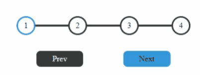
进度条最终效果如下,上面是一个进度条进度,进度通过线条颜色来控制:蓝色表示已达到该进度,黑色表示未达到;下方是两个按钮来控制整体进度条的进度:点击Prev 按钮减少进度,Next 来增加进度;
首先创建一个 index.html,补充页面中的标签元素
<!DOCTYPE html>
<html lang="en">
<head>
    <meta charset="UTF-8">
    <meta http-equiv="X-UA-Compatible" content="IE=edge">
    <meta name="viewport" content="width=device-width, initial-scale=1.0">
    <title>Progress step</title>
    <link rel="stylesheet" href="style.css"/>
</head>
<body>
    <div class="container">
        <div class="progress">
            <div class="progress-bar"></div>
            <div class="circle active">1</div>
            <div class="circle">2</div>
            <div class="circle">3</div>
            <div class="circle">4</div>
        </div>
        <div class="btn-class">
            <div class="pre-btn"><span>Prev</span></div>
            <div class="next-btn active"><span>Next</span></div>
        </div>

    </div>
    <script src="script.js"></script>
</body>
</html>
CSS样式
在 style.css 中补充页面样式以及各标签布局,源于便捷性页面中大部分标都采用 flex 布局方式,
:root {


    --line-border-fill: #3498db;
    --line-border-empty: #383838;
  }


body{


    padding: 0;
    margin: 0;
    overflow: hidden;
}

.container {


    display: flex;
    flex-direction: column;
    align-items: center;
    justify-content: center;
    height: 100vh;
    width: 100vm;
}

.progress{


    display: flex;
    position: relative;
    justify-content: space-between;
    width: 350px;
}

/*
	这里,通过伪元素标签,为未达到进度的线条填充背景颜色;
*/
.progress::before {


    content: '';
    background-color: var(--line-border-empty);
    position: absolute;
    top: 50%;
    left: 0;
    transform: translateY(-50%);
    height: 4px;
    width: 100%;
    z-index: -1;

  }
/*
	当达到进度的线条,进行二次填充
*/
.progress-bar {


    position: absolute;
    background-color: var(--line-border-fill);
    width: 0;
    height: 4px;
    top: 50%;
    left:0;
    z-index: -1;
    transform: translateY(-50%);
    /*
		设置动画效果
	*/
    transition: 0.3s ease;

}

.circle {


    background: red;
    width: 2rem;
    aspect-ratio: 1;
    display: flex;
    justify-content: center;
    align-items: center;
    border-radius: 50%;
    background-color: white;
    border: 3px solid var(--line-border-empty);
    transition: 0.4s ease-in;
}
.circle.active {


    border: 3px solid var(--line-border-fill);
}

.btn-class {


    margin-top: 2rem;
    display: flex;
    width: 350px;
    justify-content: space-around;
}

.btn-class {


    height: 2rem;
}

.btn-class div {


    background-color: var(--line-border-empty);
    border-radius: 0.5rem;
    display: flex;
    cursor: pointer;
    align-items: center;
    transition: 0.4s ease-in;
    color: white;
    cursor: not-allowed;
}

.btn-class div span {


    padding-inline: 2rem;

}
# 激活后的button
.btn-class .active {


    color: black;
    background-color: var(--line-border-fill);
    cursor: pointer;
}
补充js,加入交互效果
进度条整体颜色进度填充是通过 prev 和 next 两个按钮,通过交互点击来实现,
并且对于一些临近条件,需要对按钮点击效果进行禁用,例如
- 1,当进度为0 时,
prev不可点击; - 2,当进度为 4 时(满进度)时,
next不可点击;
以上功能,可以通过以下 js 代码来实现
const preBtn = document.querySelector('.pre-btn');
const nextBtn = document.querySelector('.next-btn');
const allCircles = document.querySelectorAll('.circle')
const progressBar = document.querySelector('.progress-bar')
// 获取 点的长度
const circleLength = allCircles.length;


// 初始索引 给按钮添加监听
let index = 0;
preBtn.addEventListener('click', () => {


    console.log('next click is ')
    index -=1;
    updateProgressBar()
})


nextBtn.addEventListener('click', () => {


    console.log('next click is ')
    index +=1;
    updateProgressBar()
})


// 根据当前索引,更新进度条属性 以及按钮 属性
function updateProgressBar(){


    if(index <= 0){


        index = 0;
        // prev button 判断
        if(preBtn.classList.contains('active')){


            preBtn.classList.remove('active');
        }
    }else{


        if(!preBtn.classList.contains('active')){


            preBtn.classList.add('active');
        }
    }

    if(index +1 >= circleLength){


        index = circleLength-1;
        // next button 判断
        if(nextBtn.classList.contains('active')){


            nextBtn.classList.remove('active');
        }
    }else{


        if(!nextBtn.classList.contains('active')){


            nextBtn.classList.add('active');
        }
    }
    allCircles.forEach((circle, circleIndex) => {


        if(circleIndex <= index && !circle.classList.contains('active')){


            circle.classList.add('active');
        }else if(circleIndex>index && circle.classList.contains('active')){


            circle.classList.remove('active');
        }
    })

    let width =  index*100 /(circleLength-1)
    if(width >100){


        width =100
    }else if(width <0){


        width = 0
    }
    // 进度条宽度
    progressBar.style.width = width + '%';
}
案例中完整代码已放置在 Github 中,可以访问:https://github.com/Largefreedom/HTML_PRACTICE/tree/master/Pra2_progress_steps 获取