今天我们来讲讲指针会动的那种时钟,废话不多说先看效果图吧。

一、html代码
先做好准备代码(我们不用用到背景图片)
<!DOCTYPE html>
<html lang="zh-CN">
    <head>
        <title>时钟案例</title>
        <meta charset="UTF-8">
    </head>
    <body>
            <header>
                <div class="day"></div>       <!--星期-->
                <div class="clock">           <!--时钟的表盘-->
                        <div class="seconds"></div>   <!--时钟的秒针-->
                        <div class="minutes"></div>   <!--时钟的分针-->
                        <div class="hours"></div>     <!--时钟的时针-->
                        <div class="clock_center"></div><!--时钟中间的圆-->
                </div>
                <div class="time"></div>       <!--电子时间-->
            </header>
    </body>
</html>
这里我们,秒针,时针,分钟,都用div代替,使用border-radius这个属性让他们变成尖角。
二、css代码
*{
    margin:0;
    padding:0;
}
body{
    height: 100vh;
}
header{
    width: 300px;
    height: 350px;
    border:1px solid black;             /*让父元素居中*/
    position: relative;
    top:50%;
    left:50%;
    transform:translate(-50%,-50%);
}
.day,.time{                                     /*星期样式*/
    width: 100%;
    box-sizing: border-box;               /*一些华丽花哨的让文字好看一点*/
    padding:5px 10px;
    text-align: center;
    font-weight: 600;
    font-size: 1.5em;
    border:1px solid black;
}
.clock{
    margin: 5px auto;
    width: 250px;
    height: 250px;
    border-radius: 100%;
    border: 2px solid gray;
    background:lightblue;
    display: flex;
    justify-content: center;
}
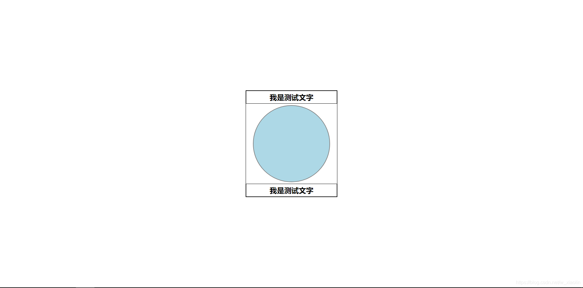
目前是这个效果,我加上边框只是为了方便观察,然后我们再加上指针就完事了。
.clock>div{                     /*时钟下div的通用设置*/
    position: absolute;         /*让所有圆点在在圆心上*/
    bottom: 50%;
    border-radius: 100% 100% 0 0;	/*左右圆角*/
    /*宽度小,然后圆角,看起来就像尖角一样*/
    transform-origin: bottom center;   /*!!!设置旋转点*/

}
.seconds{						/*秒针设置*/
    width: 4px;
    height: 110px;
    background: #777;
}
.minutes{						/*分针设置*/
    width: 8px;
    height: 90px;
    background: orange;
}
.hours{							/*时针设置*/
    width: 11px;
    height: 75px;
    background:pink;
}
div.clock_center{				/*遮挡物的设置*/
    border-radius: 100%;
    width: 15px;
    height: 15px;
    background: #777;
    transform:translateY(50%);	/*加上这条属性就居中了*/
}
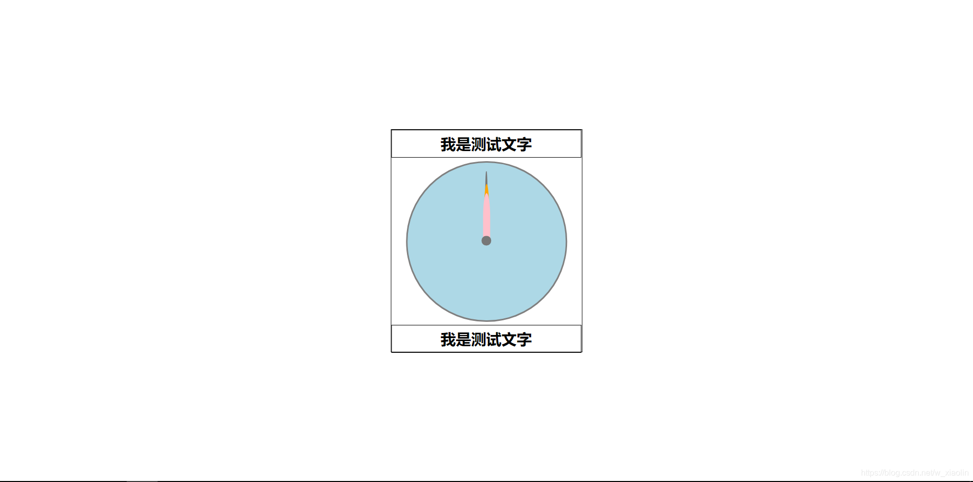
好了,你们应该看到的是这个效果,当然你们还可以美化一点,我美化过多,代码看起来就复杂了,所以这里我就不做过于复杂的美化了(其实就是懒)
三、js代码
首先我们要了解,js的时间对象var time=new Date()通过这个对象我们便可以获取系统时间。
我把我们接下来要用的列举出来
time.getDay()获取当前星期范围为0-6time.getHours()获取当前小时time.getMinutes()获取当前分钟time.getSeconds()获取当前秒
当然还有很多,去菜鸟教程深入了解一下吧!
到了我们最后时刻了(一写代码就激动)
小技巧
当你有多个元素要获取时,他们还没有什么关联,可以通过数组的方式获取,只需要把他们都写如数组,然后在循环获取就好了。
但是也有缺点,如果你想通过名字调用,就必须是id。如果是类名就就得是 数组[下标] 这样调用了
window.onload=function(){           		//让js代码最后加载
    var listclass=['seconds','minutes','hours','day','time'];
    listclass.forEach((val,index,item)=>{
        item[index]=document.querySelector(item[index]);
        document.querySelector("."+val).setAttribute('id',val);
    })
}
window.onload=function(){           //让js代码最后加载
    var listclass=['seconds','minutes','hours','day','time'];   //获取所有元素
    listclass.forEach((val,index,item)=>{
        item[index]=document.querySelector(item[index]);
        document.querySelector("."+val).setAttribute('id',val);
    })
    var time,s,h,m;                 //注册时间变量
    var roateS,roateH,roateM;        //注册旋转变量
    setInterval(() => {             //每秒获取一次时间
        time=new Date();
        s=time.getSeconds();
        roateS=(s * 6);                  //秒每秒旋转度时
        m=time.getMinutes();
        roateM=(m * 6) + (s / 10);         //分每秒旋转度时
        //这里我是让分钟慢慢走,所以加上了秒/10,秒钟跳着走
        h=time.getHours();
        //小时一圈可不是360度
        roateH=(h % 12 * 30)+(m / 2);
        seconds.style.transform=`rotate(${roateS}deg)`;
        minutes.style.transform=`rotate(${roateM}deg)`;
        hours.style.transform=`rotate(${roateH}deg)`;
    }, 1000);
}
小技巧二
我这里用来es6的字符串模板`rotate(${roateS}deg)` = "rotate("+rotateS+"deg)"+" 是等价的
已经可以看到效果了

剩下的无非就是把获取小时,分钟,秒,加到那些测试文字里面,我就直接给出完整代码了。
四、完整代码
<!DOCTYPE html>
<html lang="zh-CN">
    <head>
        <title></title>
        <meta charset="UTF-8">
        <style>
            *{
                margin:0;
                padding:0;
            }
            body{
                height: 100vh;
            }
            header{
                width: 300px;
                height: 350px;
                /* border:1px solid black;             */
                 /*让父元素居中*/
                position: relative;
                top:50%;
                left:50%;
                transform:translate(-50%,-50%);
            }
            .day,.time{                                     /*星期样式*/
                width: 100%;
                box-sizing: border-box;               /*一些华丽花哨的让文字好看一点*/
                padding:5px 10px;
                text-align: center;
                font-weight: 600;
                font-size: 1.5em;
                border:1px solid black;
            }
            .clock{
                margin: 5px auto;
                width: 250px;
                height: 250px;
                border-radius: 100%;
                border: 2px solid gray;
                background:lightblue;
                display: flex;
                justify-content: center;
            }
            .clock>div{                     /*时钟下div的通用设置*/
                position: absolute;         /*让所有圆点在在圆心上*/
                bottom: 50%;
                border-radius: 100% 100% 0 0;
                transform-origin: bottom center;
            }
            .seconds{
                width: 4px;
                height: 110px;
                background: #777;
                /* transform: rotate(45deg); */
            }
            .minutes{
                width: 8px;
                height: 90px;
                background: orange;
            }
            .hours{
                width: 11px;
                height: 75px;
                background:pink;
            }
            div.clock_center{
                border-radius: 100%;
                width: 15px;
                height: 15px;
                background: #777;
                transform:translateY(50%);
            }


        </style>
        <script>
            window.onload=function(){           //让js代码最后加载
                var listclass=['seconds','minutes','hours','day','time'];   //获取所有元素
                listclass.forEach((val,index,item)=>{
                    item[index]=document.querySelector(item[index]);
                    document.querySelector("."+val).setAttribute('id',val);
                })
                var thistime,s,h,m;                 //注册时间变量
                var roateS,roateH,roateM;        //注册旋转变量
                var thisday=['一','二','三','四','五','六','七']
                setInterval(() => {             //每秒获取一次时间
                    thistime=new Date();
                    s=thistime.getSeconds();
                    roateS=(s * 6);                  //秒每秒旋转度时
                    m=thistime.getMinutes();
                    roateM=(m * 6) + (s / 10);         //分每秒旋转度时
                    //这里我是让分钟慢慢走,所以加上了秒/10,秒钟跳着走
                    h=thistime.getHours();
                    //小时一圈可不是360度
                    roateH=(h % 12 * 30)+(m / 2);
                    seconds.style.transform=`rotate(${roateS}deg)`;
                    minutes.style.transform=`rotate(${roateM}deg)`;
                    hours.style.transform=`rotate(${roateH}deg)`;
                    //显示当前的时间
                    day.innerHTML="星期"+thisday[thistime.getDay()];
                    time.innerHTML=`${show(h)}:${show(m)}:${show(s)}`

                }, 1000);

                function show(newtime){                 //这里是让位数永远保持两位
                    return newtime>10?newtime:"0"+newtime;
                }
            }
        </script>
    </head>
    <body>
            <header>
                <div class="day">我是测试文字</div>       <!--星期-->
                <div class="clock">           <!--时钟的表盘-->
                        <div class="seconds"></div>   <!--时钟的秒针-->
                        <div class="minutes"></div>   <!--时钟的分针-->
                        <div class="hours"></div>     <!--时钟的时针-->
                        <div class="clock_center"></div><!--时钟中间的圆-->
                </div>
                <div class="time">我是测试文字</div>       <!--电子时间-->
            </header>
    </body>
</html>
我并没有特别的美化时钟,当然网上有很多特效时钟的案例,就有待你自己去开发了。(其实就是懒h’h)
