文章目录
其他相关文章
从0到一开发微信小程序(1)——申请账号并安装开发环境
从0到一开发微信小程序(2)——开发第一个小程序
从0到一开发微信小程序(3)—小程序框架配置
从0到一开发微信小程序(4)—小程序组件
从0到一开发微信小程序(5)—小程序WXML
从0到一开发微信小程序(6)—小程序常用API ——正在书写中
从0到一开发微信小程序(7)—小程序组件库(提高开发效率)
从0到一开发微信小程序(8)—实战一个商城项目——正在书写中
1、组件
1.1、基础视图
小程序中常用的基础视图,有三种,分别是view,text,image
view:视图容器
text:文本
image:图片。支持 JPG、PNG、SVG、WEBP、GIF 等格式,2.3.0 起支持云文件ID。
1.1.1、view
view的显示效果跟div是一样的,我们可以理解为它就是一个html中的div,它属于块级元素
1.1.1.1、属性说明
| 属性 | 类型 | 默认值 | 必填 | 说明 |
|---|---|---|---|---|
| hover-class | string | none | 否 | 指定按下去的样式类。当 hover-class=“none” 时,没有点击态效果 |
| hover-stop-propagation | boolean | false | 否 | 指定是否阻止本节点的祖先节点出现点击态 |
| hover-start-time | number | 50 | 否 | 按住后多久出现点击态,单位毫秒 |
| hover-stay-time | number | 400 | 否 | 手指松开后点击态保留时间,单位毫秒 |
注意:如果需要滚动视图,请使用scroll-view
测试代码:
新建一个views页面,在views.wxml中添加:
<view class="container">
<view class="page-body">
<view class="page-section">
<view class="page-section-title">
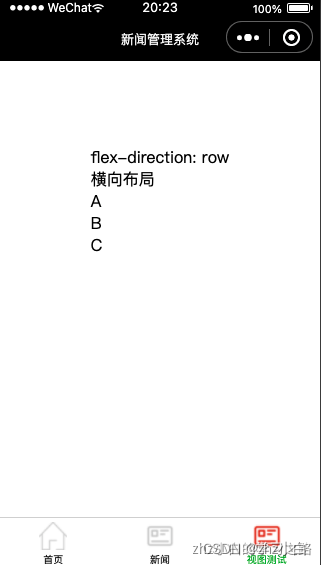
<text>flex-direction: row\n横向布局</text>
</view>
<view class="page-section-spacing">
<view class="flex-wrp" style="flex-direction:row;">
<view class="flex-item demo-text-1">A</view>
<view class="flex-item demo-text-2">B</view>
<view class="flex-item demo-text-3">C</view>
</view>
</view>
</view>
</view>
</view>
展示效果:
1.1.2、text
文本,承载页面文本信息,类似span的功能
<text>文本1</text>
<text>文本2</text>
text 是行内元素
温馨提示:
- text 组件内只支持 text 嵌套
- 除了文本节点以外的其他节点都无法长按选中
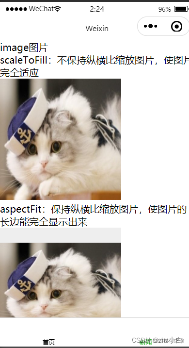
1.1.3、image
图片。支持 JPG、PNG、SVG、WEBP、GIF 等格式
| 属性 | 类型 | 默认值 | 必填 | 说明 |
|---|---|---|---|---|
| src | string | 否 | 图片资源地址 | |
| mode | string | scaleToFill | 否 | 图片裁剪、缩放的模式 |
| webp | boolean | false | 否 | 默认不解析 webP 格式,只支持网络资源 |
| lazy-load | boolean | false | 否 | 图片懒加载,在即将进入一定范围(上下三屏)时才开始加载 |
| show-menu-by-longpress | boolean | false | 否 | 长按图片显示发送给朋友、收藏、保存图片、搜一搜、打开名片/前往群聊/打开小程序(若图片中包含对应二维码或小程序码)的菜单。 |
| binderror | eventhandle | 否 | 当错误发生时触发,event.detail = {errMsg} | |
| bindload | eventhandle | 否 | 当图片载入完毕时触发,event.detail = {height, width} |
在上面中,model的属性值又有很多种
| 合法值 | 说明 |
|---|---|
| scaleToFill | 缩放模式,不保持纵横比缩放图片,使图片的宽高完全拉伸至填满 image 元素 |
| aspectFit | 缩放模式,保持纵横比缩放图片,使图片的长边能完全显示出来。也就是说,可以完整地将图片显示出来。 |
| aspectFill | 缩放模式,保持纵横比缩放图片,只保证图片的短边能完全显示出来。也就是说,图片通常只在水平或垂直方向是完整的,另一个方向将会发生截取。 |
| widthFix | 缩放模式,宽度不变,高度自动变化,保持原图宽高比不变 |
| heightFix | 缩放模式,高度不变,宽度自动变化,保持原图宽高比不变 |
| top | 裁剪模式,不缩放图片,只显示图片的顶部区域 |
| bottom | 裁剪模式,不缩放图片,只显示图片的底部区域 |
| center | 裁剪模式,不缩放图片,只显示图片的中间区域 |
| left | 裁剪模式,不缩放图片,只显示图片的左边区域 |
| right | 裁剪模式,不缩放图片,只显示图片的右边区域 |
| top left | 裁剪模式,不缩放图片,只显示图片的左上边区域 |
| top right | 裁剪模式,不缩放图片,只显示图片的右上边区域 |
| bottom left | 裁剪模式,不缩放图片,只显示图片的左下边区域 |
| bottom right | 裁剪模式,不缩放图片,只显示图片的右下边区域 |
show-menu-by-longpress的属性值对应的字段信息为:
支持长按识别的码
| 类型 | 说明 |
|---|---|
| 小程序码 | |
| 微信个人码 | |
| 企业微信个人码 | |
| 普通群码 | 指仅包含微信用户的群 |
| 互通群码 | 指既有微信用户也有企业微信用户的群 |
| 公众号二维码 |
提示:
- image组件默认宽度320px、高度240px
- image组件中二维码/小程序码图片不支持长按识别。仅在 wx.previewImage 中支持长按识别
- image组件进行缩放时,计算出来的宽高可能带有小数,在不同 webview 内核下渲染可能会被抹去小数部分
测试代码:
新增一个页面:image-view,然后在image-view.js中添加
Page({


  data: {


    array: [{


      mode: 'scaleToFill',
      text: 'scaleToFill:不保持纵横比缩放图片,使图片完全适应'
    }, {


      mode: 'aspectFit',
      text: 'aspectFit:保持纵横比缩放图片,使图片的长边能完全显示出来'
    }, {


      mode: 'aspectFill',
      text: 'aspectFill:保持纵横比缩放图片,只保证图片的短边能完全显示出来'
    }, {


      mode: 'top',
      text: 'top:不缩放图片,只显示图片的顶部区域'
    }, {


      mode: 'bottom',
      text: 'bottom:不缩放图片,只显示图片的底部区域'
    }, {


      mode: 'center',
      text: 'center:不缩放图片,只显示图片的中间区域'
    }, {


      mode: 'left',
      text: 'left:不缩放图片,只显示图片的左边区域'
    }, {


      mode: 'right',
      text: 'right:不缩放图片,只显示图片的右边边区域'
    }, {


      mode: 'top left',
      text: 'top left:不缩放图片,只显示图片的左上边区域'
    }, {


      mode: 'top right',
      text: 'top right:不缩放图片,只显示图片的右上边区域'
    }, {


      mode: 'bottom left',
      text: 'bottom left:不缩放图片,只显示图片的左下边区域'
    }, {


      mode: 'bottom right',
      text: 'bottom right:不缩放图片,只显示图片的右下边区域'
    }],
    src: 'https://res.wx.qq.com/wxdoc/dist/assets/img/0.4cb08bb4.jpg'
  },
  imageError: function(e) {


    console.log('image3发生error事件,携带值为', e.detail.errMsg)
  }
})
在image-view.wxml中添加
<view class="page">
  <view class="page__hd">
    <text class="page__title">image</text>
    <text class="page__desc">图片</text>
  </view>
  <view class="page__bd">
    <view class="section section_gap" wx:for="{

     {array}}" wx:for-item="item">
      <view class="section__title">{

   {item.text}}</view>
      <view class="section__ctn">
        <image style="width: 200px; height: 200px; background-color: #eeeeee;" mode="{

     {item.mode}}" src="{

     {src}}"></image>
      </view>
    </view>
  </view>
</view>
展示效果:
1.2、滑件视图容器Swiper(焦点轮播图)
Swiper常用属性说明:
| 属性 | 类型 | 默认值 | 必填 | 说明 |
|---|---|---|---|---|
| indicator-dots | boolean | false | 否 | 是否显示面板指示点 |
| indicator-color | color | rgba(0, 0, 0, .3) | 否 | 指示点颜色 |
| indicator-active-color | color | #000000 | 否 | 当前选中的指示点颜色 |
| autoplay | boolean | false | 否 | 是否自动切换 |
| interval | number | 5000 | 否 | 自动切换时间间隔 |
| duration | number | 500 | 否 | 滑动动画时长 |
| circular | boolean | false | 否 | 是否采用衔接滑动 |
| vertical | boolean | false | 否 |
滑动视图相信大家应该看过,往左右拉的那种图吧,我们来实现一版,
简单版:新建一个swiper页面,再swiper.wxml中添加
<!-- swiper.wxml -->
<view>
  <swiper class="swiper">
    <swiper-item>
      <image mode="widthFix" src="../../images/1.jpg"></image>
    </swiper-item>
    <swiper-item>
      <image mode="widthFix" src="../../images/2.jpg"></image>
    </swiper-item>
    <swiper-item>
      <image mode="widthFix" src="../../images/3.jpg"></image>
    </swiper-item>
  </swiper>
</view>
在swiper.wxss中添加:(同时设置图片样式充满全屏,因为图片默认大小:宽度320px、高度240px)
/* swiper.wxss */
image{


  width: 100%;
}
展示效果:
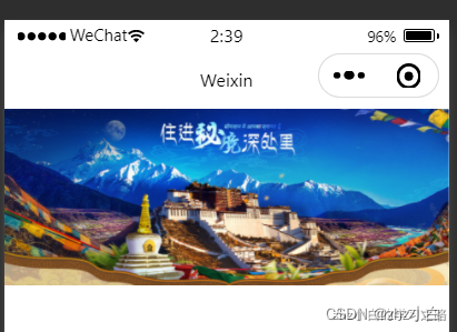
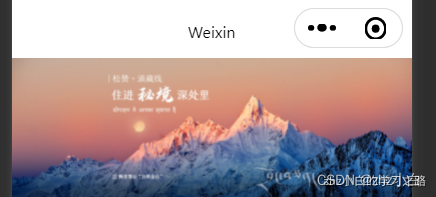
一直向右拉,依次会出现1.jpg,2.jpg,3.jpg的图
复杂版:自动每隔5秒向下换图,新建页面swiper-complex,其中swiper-complex.wxml中添加
<!-- swiper-complex.wxml -->
<view>
  <swiper
  class="swiper"
  indicator-dots="{

     { swiperOptions.indicatorDots }}"
  indicator-color="{

     { swiperOptions.indicatorColor }}"
  indicator-active-color="{

     { swiperOptions.indicatorActiveColor }}"
  autoplay="{

     { swiperOptions.autoplay }}"
  interval="{

     { swiperOptions.interval }}"
  duration="{

     { swiperOptions.duration }}"
  circular="{

     { swiperOptions.circular }}"
  vertical="{

     { swiperOptions.vertical }}"
  >
    <swiper-item>
      <image mode="widthFix" src="../../images/1.jpg"></image>
    </swiper-item>
    <swiper-item>
      <image mode="widthFix" src="../../images/2.jpg"></image>
    </swiper-item>
    <swiper-item>
      <image mode="widthFix" src="../../images/3.jpg"></image>
    </swiper-item>
  </swiper>
</view>
swiper-complex.js中添加
// swiper-complex.js
Page({


  data: {


    swiperOptions:{


      indicatorDots:true,
      indicatorColor:"#fff",
      indicatorActiveColor:"#f00",
      autoplay:true,
      interval:5000,
      duration:1000,
      circular:true,
      vertical:true
     }
   }
})
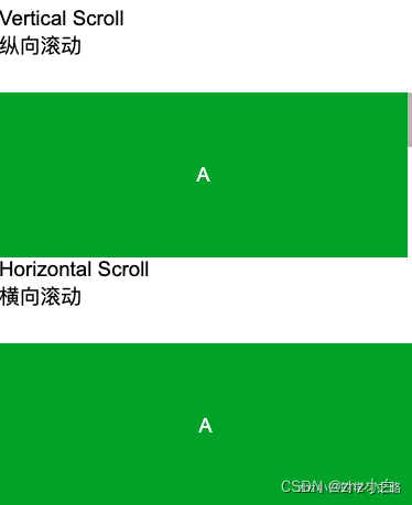
1.3、滚动视图区域(scroll-view)
功能描述
- 可滚动视图区域。使用竖向滚动时,需要给scroll-view一个固定高度,通过 WXSS 设置 height。组件属性的长度单位默认为px,2.4.0起支持传入单位(rpx/px)。
属性说明:
| 属性 | 类型 | 默认值 | 必填 | 说明 |
|---|---|---|---|---|
| scroll-x | boolean | false | 否 | 允许横向滚动 |
| scroll-y | boolean | false | 否 | 允许纵向滚动 |
| upper-threshold | number/string | 50 | 否 | 距顶部/左边多远时,触发 scrolltoupper 事件 |
| lower-threshold | number/string | 50 | 否 | 距底部/右边多远时,触发 scrolltolower 事件 |
| scroll-top | number/string | 否 | 设置竖向滚动条位置 | |
| scroll-left | number/string | 否 | 设置横向滚动条位置 | |
| scroll-into-view | string | 否 | 值应为某子元素id(id不能以数字开头)。设置哪个方向可滚动,则在哪个方向滚动到该元素 | |
| scroll-with-animation | boolean | false | 否 | 在设置滚动条位置时使用动画过渡 |
| enable-back-to-top | boolean | false | 否 | iOS点击顶部状态栏、安卓双击标题栏时,滚动条返回顶部,只支持竖向 |
| enable-flex | boolean | false | 否 | 启用 flexbox 布局。开启后,当前节点声明了 display: flex 就会成为 flex container,并作用于其孩子节点。 |
| scroll-anchoring | boolean | false | 否 | 开启 scroll anchoring 特性,即控制滚动位置不随内容变化而抖动,仅在 iOS 下生效,安卓下可参考 CSS overflow-anchor 属性。 |
| enable-passive | boolean | false | 否 | 开启 passive 特性,能优化一定的滚动性能 |
| refresher-enabled | boolean | false | 否 | 开启自定义下拉刷新 |
| refresher-threshold | number | 45 | 否 | 设置自定义下拉刷新阈值 |
| refresher-default-style | string | “black” | 否 | 设置自定义下拉刷新默认样式,支持设置 black | white | none, none 表示不使用默认样式 |
| refresher-background | string | “#FFF” | 否 | 设置自定义下拉刷新区域背景颜色 |
| refresher-triggered | boolean | false | 否 | 设置当前下拉刷新状态,true 表示下拉刷新已经被触发,false 表示下拉刷新未被触发 |
| enhanced | boolean | false | 否 | 启用 scroll-view 增强特性,启用后可通过 ScrollViewContext |
| 操作 scroll-view | ||||
| bounces | boolean | true | 否 | iOS 下 scroll-view 边界弹性控制 (同时开启 enhanced 属性后生效) |
| show-scrollbar | boolean | true | 否 | 滚动条显隐控制 (同时开启 enhanced 属性后生效) |
| paging-enabled | boolean | false | 否 | 分页滑动效果 (同时开启 enhanced 属性后生效) |
| fast-deceleration | boolean | false | 否 | 滑动减速速率控制 (同时开启 enhanced 属性后生效) |
| binddragstart | eventhandle | 否 | 滑动开始事件 (同时开启 enhanced 属性后生效) detail { scrollTop, scrollLeft } | |
| binddragging | eventhandle | 否 | 滑动事件 (同时开启 enhanced 属性后生效) detail { scrollTop, scrollLeft } | |
| binddragend | eventhandle | 否 | 滑动结束事件 (同时开启 enhanced 属性后生效) detail { scrollTop, scrollLeft, velocity } | |
| bindscrolltoupper | eventhandle | 否 | 滚动到顶部/左边时触发 | |
| bindscrolltolower | eventhandle | 否 | 滚动到底部/右边时触发 | |
| bindscroll | eventhandle | 否 | 滚动时触发,event.detail = {scrollLeft, scrollTop, scrollHeight, scrollWidth, deltaX, deltaY} | |
| bindrefresherpulling | eventhandle | 否 | 自定义下拉刷新控件被下拉 | |
| bindrefresherrefresh | eventhandle | 否 | 自定义下拉刷新被触发 | |
| bindrefresherrestore | eventhandle | 否 | 自定义下拉刷新被复位 | |
| bindrefresherabort | eventhandle | 否 | 自定义下拉刷新被中止 |
测试代码:
新建一个页面score-view,在score-view.js中添加
const order = ['demo1', 'demo2', 'demo3']

Page({


  onShareAppMessage() {


    return {


      title: 'scroll-view',
      path: '/pages/scroll-view/scroll-view'
    }
  },

  data: {


    toView: 'green'
  },

  upper(e) {


    console.log(e)
  },

  lower(e) {


    console.log(e)
  },

  scroll(e) {


    console.log(e)
  },

  scrollToTop() {


    this.setAction({


      scrollTop: 0
    })
  },

  tap() {


    for (let i = 0; i < order.length; ++i) {


      if (order[i] === this.data.toView) {


        this.setData({


          toView: order[i + 1],
          scrollTop: (i + 1) * 200
        })
        break
      }
    }
  },

  tapMove() {


    this.setData({


      scrollTop: this.data.scrollTop + 10
    })
  }
})
score-view.wxml中添加
<view class="container">
  <view class="page-body">
    <view class="page-section">
      <view class="page-section-title">
        <text>Vertical Scroll\n纵向滚动</text>
      </view>
      <view class="page-section-spacing">
        <scroll-view scroll-y="true" style="height: 300rpx;" bindscrolltoupper="upper" bindscrolltolower="lower" bindscroll="scroll" scroll-into-view="{

     {toView}}" scroll-top="{

     {scrollTop}}">
          <view id="demo1" class="scroll-view-item demo-text-1"></view>
          <view id="demo2"  class="scroll-view-item demo-text-2"></view>
          <view id="demo3" class="scroll-view-item demo-text-3"></view>
        </scroll-view>
      </view>
    </view>
    <view class="page-section">
      <view class="page-section-title">
        <text>Horizontal Scroll\n横向滚动</text>
      </view>
      <view class="page-section-spacing">
        <scroll-view class="scroll-view_H" scroll-x="true" bindscroll="scroll" style="width: 100%">
          <view id="demo1" class="scroll-view-item_H demo-text-1"></view>
          <view id="demo2"  class="scroll-view-item_H demo-text-2"></view>
          <view id="demo3" class="scroll-view-item_H demo-text-3"></view>
        </scroll-view>
      </view>
    </view>
  </view>
</view>
score-view.wxss中添加
.page-section-spacing{


  margin-top: 60rpx;
}
.scroll-view_H{


  white-space: nowrap;
}
.scroll-view-item{


  height: 300rpx;
}
.scroll-view-item_H{


  display: inline-block;
  width: 100%;
  height: 300rpx;
}
展示效果:
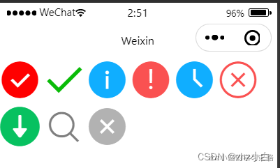
1.4、图标(icon)
图标组件,其实就是字体图标效果,但是这里所提供的只有最常用的几个。
图标的使用方式为:
<icon type="xxx"></icon>
字体图标属性为:
| 属性 | 类型 | 默认值 | 必填 | 说明 |
|---|---|---|---|---|
| type | string | 是 | icon的类型,有效值:success, success_no_circle, info, warn, waiting, cancel, download, search, clear | |
| size | number/string | 23 | 否 | icon的大小,单位默认为px,2.4.0起支持传入单位(rpx/px),2.21.3起支持传入其余单位(rem 等)。 |
| color | string | 否 | icon的颜色,同 css 的color |
新建一个页面icon,其中icon.wxml中添加:
<icon type="success" size="50" color="red"></icon>
<icon type="success_no_circle" size="50"></icon>
<icon type="info" size="50"></icon>
<icon type="warn" size="50"></icon>
<icon type="waiting" size="50"></icon>
<icon type="cancel" size="50"></icon>
<icon type="download" size="50"></icon>
<icon type="search" size="50"></icon>
<icon type="clear" size="50"></icon>
展示效果为:
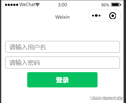
1.5、表单(form )
- 表单,将用户输入的信息提交到服务器
- 小程序的表单与html的表单基本一致
- 表单页面随处可见,比如:登录,注册,信息修改,添加等
我们这里拿一个常用的登录页面来说:
- 我们实现一个简单的登录注册,一般需要三个组件:
- form 表单
- button 按钮
- input 输入框
新建一个页面login,在login.wxml中添加:
<view class="login">
  <form>
    <input placeholder="请输入用户名" />
    <input placeholder="请输入密码" />
    <button type="primary">登录</button>
  </form>
</view>
在login.wxss中添加
.login{


  margin-top: 100rpx;
}
input{


  border: 1px solid #999;
  border-radius: 5px;
  margin: 10px;
  padding-left: 10px;
  height: 70rpx;
}
展示效果为:
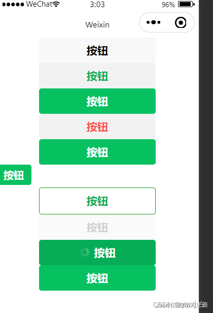
1.6、按钮(button)
- 小程序的 button 按钮与 html 的非常类似,但是小程序的功能要更强大一些
使用形式:
<button>按钮</button>
按钮属性:
| 属性 | 类型 | 默认值 | 必填 | 说明 |
|---|---|---|---|---|
| type | string | default | 否 | 按钮的样式类型 |
| size | string | default | 否 | 按钮的大小 |
| plain | boolean | false | 否 | 按钮是否镂空,背景色透明 |
| disabled | boolean | false | 否 | 是否禁用 |
| loading | boolean | false | 否 | 名称前是否带 loading 图标 |
| form-type | string | 否 | 用于 form组件,点击分别会触发form组件的 submit/reset 事件 |
其中type属性又分为:
| 合法值 | 说明 |
|---|---|
| primary | 绿色 |
| default | 白色 |
| warn | 红色 |
size属性分为:
| 合法值 | 说明 |
|---|---|
| default | 默认大小 |
| mini | 小尺寸 |
测试代码:
<button>按钮</button>
<button type="default">按钮</button>
<button type="primary">按钮</button>
<button type="warn">按钮</button>
<button type="primary" size="default">按钮</button>
<button type="primary" size="mini">按钮</button>
<button type="primary" plain>按钮</button>
<button type="primary" disabled>按钮</button>
<button type="primary" loading>按钮</button>
<button type="primary" form-type="submit">按钮</button>
展示效果:
1.7、输入框(input)
- 输入框是input, 与html的输入框类似,但是增加了很多新的功能
使用形式:
<input/>
属性说明:
| 属性 | 类型 | 默认值 | 必填 | 说明 |
|---|---|---|---|---|
| value | string | 是 | 输入框的初始内容 | |
| placeholder | string | 是 | 输入框为空时占位符 | |
| password | boolean | false | 否 | 是否是密码类型 |
| disabled | boolean | false | 否 | 是否禁用 |
| maxlength | number | 140 | 否 | 最大输入长度,设置为 -1 的时候不限制最大长度 |
| focus | boolean | false | 否 | 获取焦点 |
| type | string | text | 否 | input 的类型 |
| confirm-type | string | done | 否 | 设置键盘右下角按钮的文字,仅在type='text’时生效 |
type 属性详解
| 合法值 | 说明 |
|---|---|
| text | 文本输入键盘 |
| number | 数字输入键盘 |
| idcard | 身份证输入键盘 |
| digit | 带小数点的数字键盘 |
| nickname | 昵称输入键盘 |
confirm-type属性详解
| 合法值 | 说明 |
|---|---|
| send | 右下角按钮为“发送” |
| search | 右下角按钮为“搜索” |
| next | 右下角按钮为“下一个” |
| go | 右下角按钮为“前往” |
| done | 右下角按钮为“完成” |
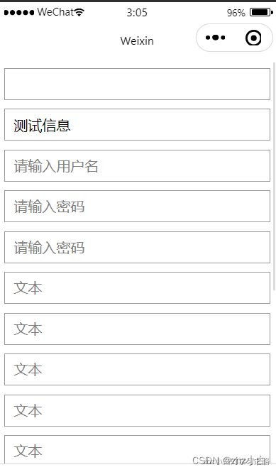
测试代码:
<input />
<input value="测试信息"/>
<input placeholder="请输入用户名"/>
<input placeholder="请输入密码" password/>
<input placeholder="请输入密码" disabled/>
<input placeholder="文本" maxlength="10"/>
<input placeholder="文本" focus/>
<input placeholder="文本" type="text"/>
<input placeholder="文本" type="number"/>
<input placeholder="文本" type="idcard"/>
<input placeholder="文本" type="digit"/>
<input placeholder="文本" type="nickname"/>
<input placeholder="文本" type="text" confirm-type="send"/>
<input placeholder="文本" type="text" confirm-type="search"/>
<input placeholder="文本" type="text" confirm-type="next"/>
<input placeholder="文本" type="text" confirm-type="go"/>
<input placeholder="文本" type="text" confirm-type="done"/>
input{


  border: 1px solid #999;
  height: 80rpx;
  margin: 10px;
  padding-left: 10px;
}
展示效果:
1.8、picker(滚动选择器)
- 选择器的种类有很多,分别为:
- 普通选择器
- 多列选择器
- 时间选择器
- 日期选择器
- 省市区选择器
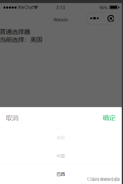
1.8.1、普通选择器
指定mode属性为selector,或者默认不指定mode
<view>普通选择器</view>
<picker bindchange="bindPickerChange" value="{

     {index}}" range="{

     {array}}">
  <view class="picker">
     当前选择:{

   {array[index]}}
  </view>
</picker>
选择器展示效果需要配合逻辑
Page({


  data: {


    array: ['美国', '中国', '巴西', '日本'],
    index: 0
   },
  bindPickerChange(e) {


    this.setData({


      index: e.detail.value
     })
   }
})
展示效果:
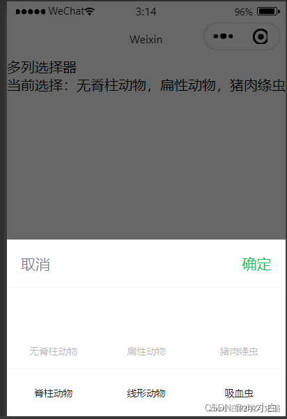
1.8.2、多列选择器
指定mode属性为multiSelector
<view>多列选择器</view>
<picker mode="multiSelector" bindchange="bindMultiPickerChange" value="{

     {multiIndex}}" range="{

     {multiArray}}">
  <view class="picker">
     当前选择:{

   {multiArray[0][multiIndex[0]]}},{

   {multiArray[1][multiIndex[1]]}},{

   {multiArray[2][multiIndex[2]]}}
  </view>
</picker>
Page({


  data: {


    multiArray: [
       ['无脊柱动物', '脊柱动物'],
       ['扁性动物', '线形动物', '环节动物', '软体动物', '节肢动物'],
       ['猪肉绦虫', '吸血虫']
     ],
    multiIndex: [0, 0, 0],
   },
  bindMultiPickerChange: function (e) {


    this.setData({


      multiIndex: e.detail.value
     })
   }
})
展示效果:
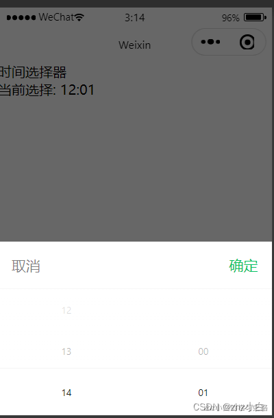
1.8.3、时间选择器
指定mode属性为time
<view>时间选择器</view>
<picker mode="time" value="{

     {time}}" start="09:01" end="21:01" bindchange="bindTimeChange">
  <view class="picker">
     当前选择: {

   {time}}
  </view>
</picker>
Page({


  data: {


    time: '12:01'
   },
  bindTimeChange: function (e) {


    console.log('picker发送选择改变,携带值为', e.detail.value)
    this.setData({


      time: e.detail.value
     })
   }
})
展示效果:
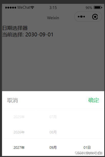
1.8.4、日期选择器
指定mode属性为date
<view>日期选择器</view>
<picker mode="date" value="{

     {date}}" start="2000-09-01" end="2030-09-01" bindchange="bindDateChange">
  <view class="picker">
     当前选择: {

   {date}}
  </view>
</picker>
Page({


  data: {


    date: '2030-09-01'
   },
  bindDateChange: function (e) {


    console.log('picker发送选择改变,携带值为', e.detail.value)
    this.setData({


      date: e.detail.value
     })
   }
})
展示效果:
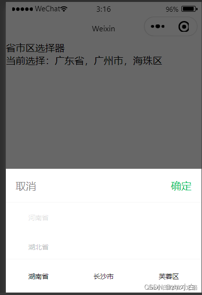
1.8.5、省市区选择器
指定mode属性为region
<view>省市区选择器</view>
<picker mode="region" bindchange="bindRegionChange" value="{

     {region}}">
  <view class="picker">
     当前选择:{

   {region[0]}},{

   {region[1]}},{

   {region[2]}}
  </view>
</picker>
Page({


  data: {


    region: ['广东省', '广州市', '海珠区']
   },
  bindRegionChange: function (e) {


    console.log('picker发送选择改变,携带值为', e.detail.value)
    this.setData({


      region: e.detail.value
     })
   }
})
展示效果:
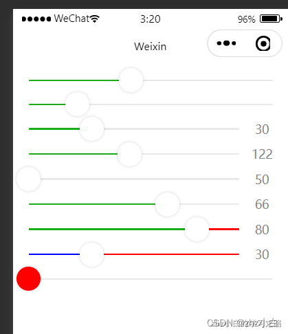
1.9、slider(滑动选择器)
使用形式
<slider/>
常用属性
| 属性 | 类型 | 默认值 | 必填 | 说明 |
|---|---|---|---|---|
| step | number | 1 | 否 | 步长,取值必须大于 0,并且可被(max - min)整除 |
| show-value | boolean | false | 否 | 是否显示当前 value |
| min | number | 0 | 否 | 最小值 |
| max | number | 100 | 否 | 最大值 |
| disabled | boolean | false | 否 | 是否禁用 |
| value | number | 0 | 否 | 当前取值 |
| backgroundColor | color | #e9e9e9 | 否 | 背景条的颜色 |
| activeColor | color | #1aad19 | 否 | 已选择的颜色 |
| block-color | color | #ffffff | 否 | 滑块的颜 |
测试代码:
<slider />
<slider step="20"/>
<slider show-value/>
<slider min="50" max="200" show-value/>
<slider min="50" max="200" show-value disabled/>
<slider show-value value="30"/>
<slider show-value value="30" backgroundColor="red"/>
<slider show-value value="30" backgroundColor="red" activeColor="blue"/>
<slider block-color="red"/>
展示效果:
1.10、表单其他组件
表单是常用的组件,同样,在表单中,也有很多配套的组件
- checkbox
- radio
- label
- switch
- textarea
checkbox(复选框 )
多选项目,与html复选框基本一致
<checkboxchecked=“true”/>选中
checked 表示初始状态为选中(true) 或 未选中(false)
配合 checkbox-group 形成一组
<checkbox-group>
  <checkbox checked="true" />读书
  <checkbox checked="true" />打游戏
  <checkbox />听音乐
</checkbox-group>
radio(单选项目)
单选项目,与html单选框基本一致
<radiochecked=“true”/>选中
checked 表示初始状态为选中(true) 或 未选中(false)
配合 radio-group 形成一组
<radio-group>
  <radio checked="true"/>选项1
  <radio checked="false"/>选项2
  <radio checked="false"/>选项3
  <radio checked="false"/>选项4
</radio-group>
label(标签)
用来改进表单组件的可用性,与html的label基本一致
<label for="menu">
  <checkbox id="menu" checked="true"/>选中
</label>
switch(开关选择器)
开关选择器,有着比较美观的展示效果
<switch/>
属性列表
| 属性 | 类型 | 默认值 | 必填 | 说明 |
|---|---|---|---|---|
| checked | boolean | false | 否 | 是否选中 |
| disabled | boolean | false | 否 | 是否禁用 |
| type | string | switch | 否 | 样式,有效值:switch, checkbox |
| color | string | #04BE02 | 否 | switch 的颜色,同 css 的 color |
<switch />
<switch checked="true"/>
<switch checked="true" disabled/>
<switch checked="true" type="checkbox"/>
<switch checked="true" color="red"/>
textarea(多行输入框)
多行输入框,与html多行输入框基本一致
<textarea/>
为了可见性,我们需要增加样式
textarea{


  border: 1px solid red;
}
| 属性 | 类型 | 默认值 | 必填 | 说明 |
|---|---|---|---|---|
| value | string | 否 | 输入框的内容 | |
| placeholder | string | 否 | 输入框为空时占位符 | |
| disabled | boolean | false | 否 | 是否禁用 |
| maxlength | number | 140 | 否 | 最大输入长度,设置为 -1 的时候不限制最大长度 |
| focus | boolean | false | 否 | 获取焦点 |
| auto-height | boolean | false | 否 | 是否自动增高 |
<textarea value="文本内容" />
<textarea placeholder="占位符" />
<textarea maxlength="10" />
<textarea disabled />
<textarea focus />
<textarea auto-height/>
1.11、navigator(页面之间跳转)
navigator 实现页面之间的跳转
<navigator url="/pages/other/other">跳转其他页面</navigator>
常用属性说明
| 属性 | 类型 | 默认值 | 必填 | 说明 |
|---|---|---|---|---|
| url | string | 否 | 当前小程序内的跳转链接 | |
| open-type | string | navigate | 否 | 跳转方式,默认打开新页面,redirect 在当前页面打开 |
测试代码:
<navigator url="/pages/other/other" >跳转其他页面</navigator>
<navigator url="/pages/slider/slider" open-type="redirect">在当前页打开</navigator>
扩展:生命周期函数
onUnload 在之前的讲解中无法测试,现在有了navigator,我们可以进行测试了
在 navigator 的属性open-type设置为redirect时,我们可以观察输入结果
Page({


  onUnload() {


    console.log("卸载");
   }
})
1.12、audio(音乐)
音频播放
<audio src="https://music.163.com/song/media/outer/url?id=1961763339" controls></audio>
切换音乐
通过修改audio的属性,切换音乐
<audio
  id="{

     { audioOptions.id }}"
  poster="{

     { audioOptions.poster }}"
  name="{

     { audioOptions.name }}"
  author="{

     { audioOptions.author }}"
  src="{

     { audioOptions.src }}"
  controls="{

     { audioOptions.controls }}"
  loop="{

     { audioOptions.loop }}">
</audio>
<button type="primary" bindtap="changeMusicHandle">切换</button>
Page({


  data: {


    audioOptions:{


      id:"myAudio",
      name:"妈妈的话",
      author:"zby忠宇",
      poster:"https://p2.music.126.net/6y-UleORITEDbvrOLV0Q8A==/5639395138885805.jpg",
      src:"https://music.163.com/song/media/outer/url?id=1961763339",
      controls:true,
      loop:true
     }
   },
  changeMusicHandle(){


    this.setData({


      audioOptions:{


        id:"myAudio",
        name:"时光洪流",
        author:"程响",
        poster:"https://p2.music.126.net/6y-UleORITEDbvrOLV0Q8A==/5639395138885805.jpg",
        src:"https://music.163.com/song/media/outer/url?id=1868943615",
        controls:true,
        loop:true
       }
     })
   }
})
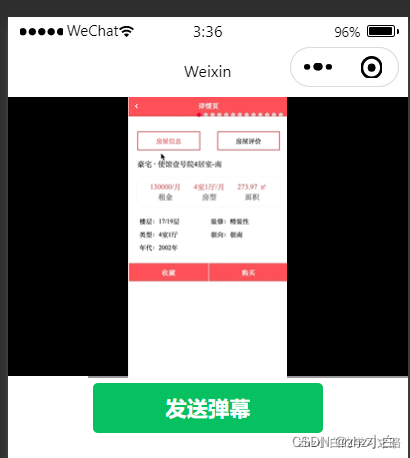
1.13、video(视频)
视频播放
<video src="http://iwenwiki.com/api/livable/livable.mp4"></video>
为了美观,我们将视频宽度充满全屏
video{


  width: 100%;
}
属性说明
| 属性 | 类型 | 默认值 | 必填 | 说明 |
|---|---|---|---|---|
| src | string | 是 | 要播放视频的资源地址,支持网络路径、本地临时路径 | |
| duration | number | 否 | 指定视频时长 | |
| controls | boolean | true | 否 | 是否显示默认播放控件(播放/暂停按钮、播放进度、时间) |
| autoplay | boolean | false | 否 | 是否自动播放 |
| loop | boolean | false | 否 | 是否循环播放 |
| muted | boolean | false | 否 | 是否静音播放 |
| initial-time | number | 0 | 否 | 指定视频初始播放位置 |
| show-mute-btn | boolean | false | 否 | 是否显示静音按钮 |
| danmu-list | Array | 否 | 弹幕列表 | |
| danmu-btn | boolean | false | 否 | 是否显示弹幕按钮,只在初始化时有效,不能动态变更 |
| enable-danmu | boolean | false | 否 | 是否展示弹幕,只在初始化时有效,不能动态变更 |
测试代码:
<video
  id="myVideo" src="http://iwenwiki.com/api/livable/livable.mp4"
  duration="100"
  controls
  autoplay
  loop
  muted
  initial-time="10"
  show-mute-btn
  title="制作歌曲"
  danmu-list="{

     { danmuList }}"
  danmu-btn
  enable-danmu
></video>
<button type="primary" bindtap="sendDanmuHandle">发送弹幕</button>
Page({


  data: {


    danmuList: [{


      text: '第 1s 出现的弹幕',
      color: '#ff0000',
      time: 11
     }]
   },
  onReady() {


    this.videoContext = wx.createVideoContext('myVideo')
   },
  sendDanmuHandle() {


    this.videoContext.sendDanmu({


      text: "真好看",
      color: "#00ff00"
     })
   }
})
展示效果:
1.14、camera(拍照)
系统相机。扫码二维码功能
<camera style="width: 100%; height: 300px;"></camera>
属性说明
| 属性 | 类型 | 默认值 | 必填 | 说明 |
|---|---|---|---|---|
| mode | string | normal | 否 | 应用模式,只在初始化时有效,不能动态变更 normal:相机模式 scanCode:扫码模式 |
| device-position | string | back | 否 | 摄像头朝向 front:前置 back:后置 |
| flash | string | auto | 否 | 闪光灯,值为 auto , on, off |
测试代码:
<camera mode="normal" device-position="back" flash="on" style="width: 100%; height: 300px;"></camera>
<button type="primary" bindtap="takePhotoHandle">拍照</button>
<view>预览</view>
<image mode="widthFix" src="{

     {src}}"></image>属性说明
Page({


  data:{


    src:""
   },
  takePhotoHandle() {


    const ctx = wx.createCameraContext()
    ctx.takePhoto({


      quality: 'high',
      success: (res) => {


        this.setData({


          src: res.tempImagePath
         })
       }
     })
   }
})
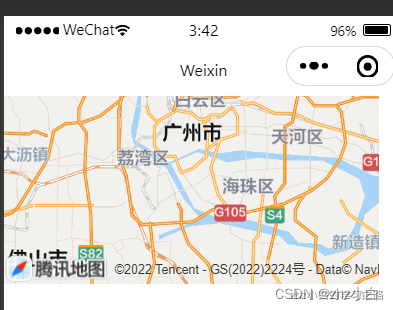
1.15、map(地图)
地图,小程序地图实现功能相对比基础一些,如果要实现完整的地图能力,请参考腾讯地图:https://lbs.qq.com/product/miniapp/home/
<map latitude="23.099994" longitude="113.324520"></map>
属性说明
| 属性 | 类型 | 默认值 | 必填 | 说明 |
|---|---|---|---|---|
| longitude | number | 是 | 中心经度 | |
| latitude | number | 是 | 中心纬度 | |
| scale | number | 16 | 否 | 缩放级别,取值范围为3-20 |
| min-scale | number | 3 | 否 | 最小缩放级别 |
| max-scale | number | 20 | 否 | 最大缩放级别 |
测试代码:
<map
 latitude="{

     {latitude}}"
 longitude="{

     {longitude}}"
 scale="12"
 min-scale="10"
 max-scale="18"
></map>
Page({


  data: {


    latitude: 23.099994,
    longitude: 113.324520,
   }
})
展示效果:
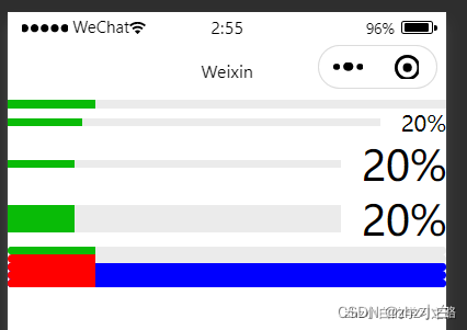
1.16、进度条(progress)
- 进度条相信大家应该都知道是什么吧,我们日常生活中随地可见,我这里就不说明了
使用方式:20%的进度条
<progress percent="20"/>
属性设置:
属性说明
| 属性 | 类型 | 默认值 | 必填 | 说明 |
|---|---|---|---|---|
| percent | number | 否 | 百分比0~100 | |
| show-info | boolean | false | 否 | 在进度条右侧显示百分比 |
| border-radius | number/string | 0 | 否 | 圆角大小 |
| font-size | number/string | 16 | 否 | 右侧百分比字体大小 |
| stroke-width | number/string | 6 | 否 | 进度条线的宽度 |
| activeColor | string | #09BB07 | 否 | 进度条颜色 |
| backgroundColor | string | #EBEBEB | 否 | 未选择的进度条的颜色 |
| active | boolean | false | 否 | 进度条从左往右的动画 |
| duration | number | 30 | 否 | 进度增加1% |
测试用例:
<progress percent="20"/>
<progress percent="20" show-info/>
<progress percent="20" show-info font-size="30"/>
<progress percent="20" show-info font-size="30" stroke-width="20"/>
<progress percent="20" border-radius="5"/>
<progress percent="20" border-radius="5" activeColor="#f00"/>
<progress percent="20" border-radius="5" activeColor="#f00" backgroundColor="#00f"/>
<progress percent="20" border-radius="5" activeColor="#f00" backgroundColor="#00f" active/>
<progress percent="20" border-radius="5" activeColor="#f00" backgroundColor="#00f" active duration="90"/>
效果为:
我是zhz小白,一个在互联网行业的小白,立志成为一名架构师
https://blog.csdn.net/zhouhengzhe?t=1