桓峰基因公众号推出基于R语言绘图教程并配有视频在线教程,目前整理出来的教程目录如下:
FigDraw 1. SCI 文章的灵魂 之 简约优雅的图表配色
FigDraw 2. SCI 文章绘图必备 R 语言基础
FigDraw 3. SCI 文章绘图必备 R 数据转换
FigDraw 4. SCI 文章绘图之散点图 (Scatter)
FigDraw 5. SCI 文章绘图之柱状图 (Barplot)
FigDraw 6. SCI 文章绘图之箱线图 (Boxplot)
FigDraw 7. SCI 文章绘图之折线图 (Lineplot)
FigDraw 8. SCI 文章绘图之饼图 (Pieplot)
FigDraw 9. SCI 文章绘图之韦恩图 (Vennplot)
FigDraw 10. SCI 文章绘图之直方图 (HistogramPlot)
FigDraw 11. SCI 文章绘图之小提琴图 (ViolinPlot)
FigDraw 12. SCI 文章绘图之相关性矩阵图(Correlation Matrix)
前言
在一些学术论文中,经常会看到用「相关性矩阵(correlation matrix)」 去表示数据集中每对数据变量间的关系,可以实现对数据集大致情况的一个快速预览,常常用于探索性分析。本期推文就汇总一下6种绘制相关性矩阵的方法。
什么是相关性矩阵?
相关性分析是指对两个或多个具备相关性的变量元素进行分析,从而衡量两个变量因素的相关密切程度。相关性的元素之间需要存在一定的联系或者概率才可以进行相关性分析。
当两个变量之间存在非常强烈的相互依赖关系的时候,我们就可以说两个变量之间存在高度相关性。若两组的值一起增大,我们称之为正相关,若一组的值增大时,另一组的值减小,我们称之为负相关。
默认一般使用皮尔逊算法算相关性。皮尔逊相关系数广泛用于度量两个变量之间的相关程度,其值介于-1与1之间。
计算完相关性后,我们通过相关性矩阵做可视化。矩阵的上下中三个面板支持多种图案,有热力图,柱形图,散点图,折线图,饼图等多种模式可供选择。
软件安装
这我们将介绍6种方法,所以安装的软件包稍微多了一些,如下:
if (!require(corrplot)) install.packages("corrplot")
if (!require(ggcorrplot)) install.packages("ggcorrplot")
if (!require(corrgram)) install.packages("corrgram")
if (!require(PerformanceAnalytics)) install.packages("PerformanceAnalytics")
if (!require(GGally)) install.packages("GGally")
数据读取
这里所有的绘制方法我们都采用同一个数据集即为mtcars,如下:
data(mtcars)
mtcars
##                      mpg cyl  disp  hp drat    wt  qsec vs am gear carb
## Mazda RX4           21.0   6 160.0 110 3.90 2.620 16.46  0  1    4    4
## Mazda RX4 Wag       21.0   6 160.0 110 3.90 2.875 17.02  0  1    4    4
## Datsun 710          22.8   4 108.0  93 3.85 2.320 18.61  1  1    4    1
## Hornet 4 Drive      21.4   6 258.0 110 3.08 3.215 19.44  1  0    3    1
## Hornet Sportabout   18.7   8 360.0 175 3.15 3.440 17.02  0  0    3    2
## Valiant             18.1   6 225.0 105 2.76 3.460 20.22  1  0    3    1
## Duster 360          14.3   8 360.0 245 3.21 3.570 15.84  0  0    3    4
## Merc 240D           24.4   4 146.7  62 3.69 3.190 20.00  1  0    4    2
## Merc 230            22.8   4 140.8  95 3.92 3.150 22.90  1  0    4    2
## Merc 280            19.2   6 167.6 123 3.92 3.440 18.30  1  0    4    4
## Merc 280C           17.8   6 167.6 123 3.92 3.440 18.90  1  0    4    4
## Merc 450SE          16.4   8 275.8 180 3.07 4.070 17.40  0  0    3    3
## Merc 450SL          17.3   8 275.8 180 3.07 3.730 17.60  0  0    3    3
## Merc 450SLC         15.2   8 275.8 180 3.07 3.780 18.00  0  0    3    3
## Cadillac Fleetwood  10.4   8 472.0 205 2.93 5.250 17.98  0  0    3    4
## Lincoln Continental 10.4   8 460.0 215 3.00 5.424 17.82  0  0    3    4
## Chrysler Imperial   14.7   8 440.0 230 3.23 5.345 17.42  0  0    3    4
## Fiat 128            32.4   4  78.7  66 4.08 2.200 19.47  1  1    4    1
## Honda Civic         30.4   4  75.7  52 4.93 1.615 18.52  1  1    4    2
## Toyota Corolla      33.9   4  71.1  65 4.22 1.835 19.90  1  1    4    1
## Toyota Corona       21.5   4 120.1  97 3.70 2.465 20.01  1  0    3    1
## Dodge Challenger    15.5   8 318.0 150 2.76 3.520 16.87  0  0    3    2
## AMC Javelin         15.2   8 304.0 150 3.15 3.435 17.30  0  0    3    2
## Camaro Z28          13.3   8 350.0 245 3.73 3.840 15.41  0  0    3    4
## Pontiac Firebird    19.2   8 400.0 175 3.08 3.845 17.05  0  0    3    2
## Fiat X1-9           27.3   4  79.0  66 4.08 1.935 18.90  1  1    4    1
## Porsche 914-2       26.0   4 120.3  91 4.43 2.140 16.70  0  1    5    2
## Lotus Europa        30.4   4  95.1 113 3.77 1.513 16.90  1  1    5    2
## Ford Pantera L      15.8   8 351.0 264 4.22 3.170 14.50  0  1    5    4
## Ferrari Dino        19.7   6 145.0 175 3.62 2.770 15.50  0  1    5    6
## Maserati Bora       15.0   8 301.0 335 3.54 3.570 14.60  0  1    5    8
## Volvo 142E          21.4   4 121.0 109 4.11 2.780 18.60  1  1    4    2
绘制方法
这里展示了六个不同的软件包绘制相关矩阵图的方法,总有一款适合您,话不多说,上代码和版式,挑选自己觉得顺眼的使用即可。
1. corrplot {corrplot}
A visualization of a correlation matrix. Description A graphical display of a correlation matrix, confidence interval. The details are paid great attention to. It can also visualize a general matrix by setting is.corr = FALSE.
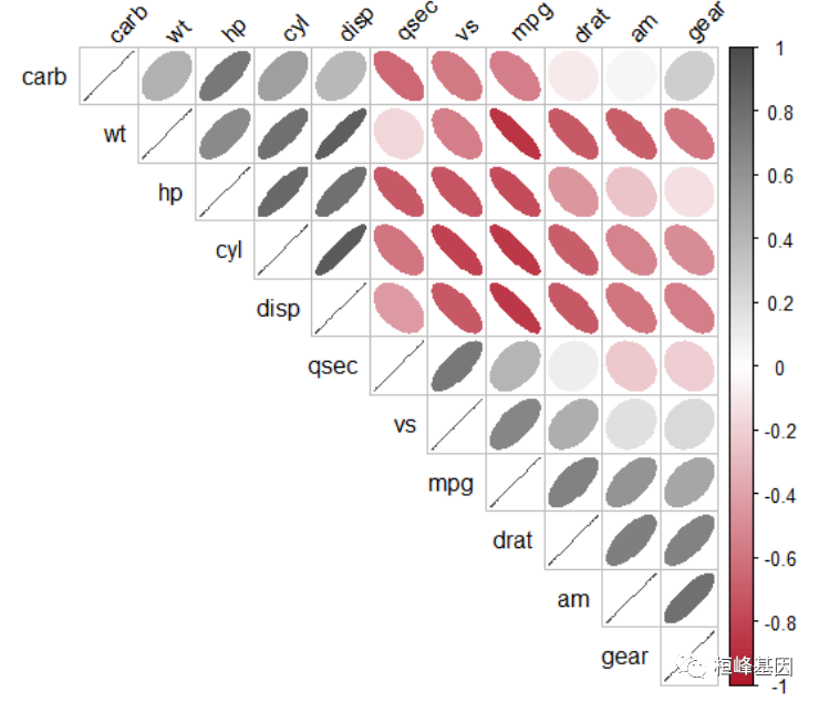
简单相关矩阵
library(corrplot)
col1 <- colorRampPalette(c("#B2182B", "white", "#4D4D4D"))
corrplot(cor(mtcars), type = "upper", method = "ellipse", col = col1(100), order = "hclust",
    addrect = 2, tl.col = "black", tl.srt = 45)
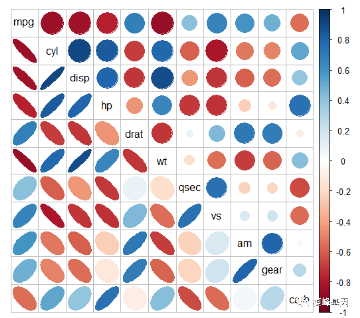
组合样式
corrplot.mixed(cor(mtcars), lower = "ellipse", upper = "circle", tl.col = "black",
    tl.srt = 45)
2. ggcorrplot {ggcorrplot}
Visualization of a correlation matrix using ggplot2 Description ggcorrplot(): A graphical display of a correlation matrix using ggplot2. cor_pmat(): Compute a correlation matrix p-values.
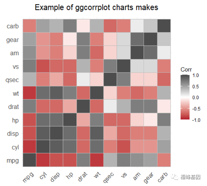
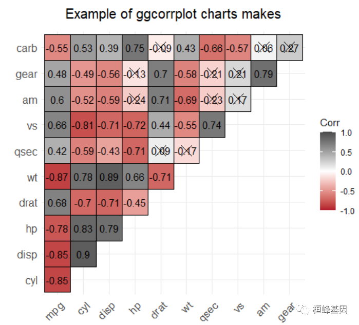
简单矩阵图
library(ggcorrplot)
library(ggtext)
data(mtcars)
corr <- round(cor(mtcars), 1)
p.mat <- cor_pmat(mtcars)
colors = c("#B2182B", "white", "#4D4D4D")


ggcorrplot(corr, colors = colors, ggtheme = ggplot2::theme_minimal) + labs(x = "",
    y = "", title = "Example of ggcorrplot charts makes") + theme(plot.title = element_markdown(hjust = 0.5,
    vjust = 0.5, color = "black", size = 15, margin = margin(t = 1, b = 12)), plot.subtitle = element_markdown(hjust = 0,
    vjust = 0.5, size = 20), plot.caption = element_markdown(face = "bold", size = 15))
圆形右下
ggcorrplot(corr, colors = colors, method = "circle", outline.color = "black", lab = TRUE,
    type = "lower", lab_size = 4) + labs(x = "", y = "", title = "Example of ggcorrplot charts makes") +
    theme(plot.title = element_markdown(hjust = 0.5, vjust = 0.5, color = "black",
        size = 15, margin = margin(t = 1, b = 12)), plot.subtitle = element_markdown(hjust = 0,
        vjust = 0.5, size = 20), plot.caption = element_markdown(face = "bold", size = 15))
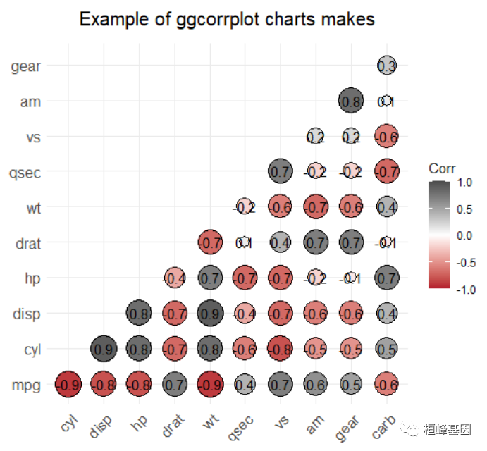
方形上半面
ggcorrplot(cor(mtcars), colors = colors, outline.color = "black", lab = TRUE, type = "upper",
    p.mat = p.mat, digits = 2) + labs(x = "", y = "", title = "Example of ggcorrplot charts makes") +
    theme(plot.title = element_markdown(hjust = 0.5, vjust = 0.5, color = "black",
        size = 15, margin = margin(t = 1, b = 12)), plot.subtitle = element_markdown(hjust = 0,
        vjust = 0.5, size = 20), plot.caption = element_markdown(face = "bold", size = 15))
3. corrgram {corrgram}
Draw a correlogram Description The corrgram function produces a graphical display of a correlation matrix, called a correlogram. The cells of the matrix can be shaded or colored to show the correlation value.
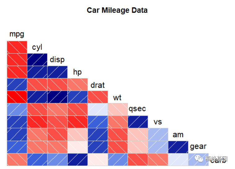
默认
library(corrgram)
corrgram(mtcars, lower.panel = panel.shade, upper.panel = NULL, text.panel = panel.txt,
    cor.method = "pearson", main = "Car Mileage Data")
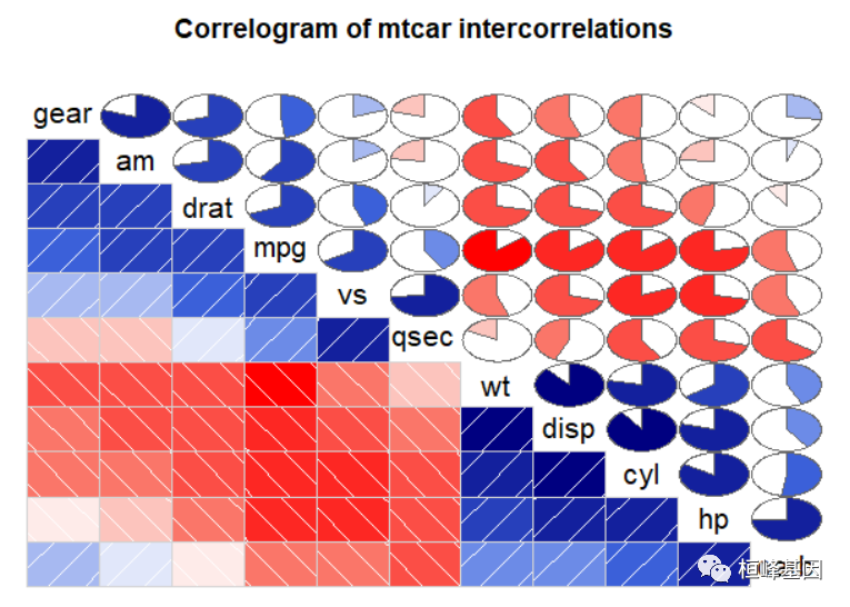
添加饼图
上三角区域使用饼图表示相关系数;蓝色和从12点钟处开始顺时针填充饼图表示两个变量呈正相关,红色和逆时针方向填充饼图表示变量负相关:
corrgram(mtcars, order = TRUE, lower.panel = panel.shade, upper.panel = panel.pie,
    text.panel = panel.txt, main = "Correlogram of mtcar intercorrelations")
4. ggcorr {GGally}
Correlation matrix Description Function for making a correlation matrix plot, using ggplot2. The function is directly inspired by Tian Zheng and Yu-Sung Su’s corrplot function in the ‘arm’ package. Please visit https://github.com/briatte/ggcorr for the latest version of ggcorr, and see the vignette at https://briatte.github.io/ggcorr/ for many examples of how to use it.
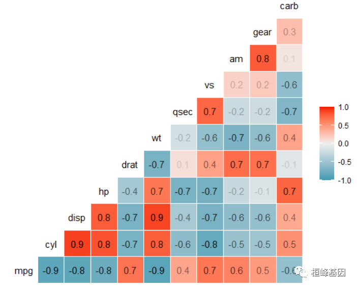
默认
library(GGally)
ggcorr(mtcars, label = TRUE, label_alpha = TRUE)
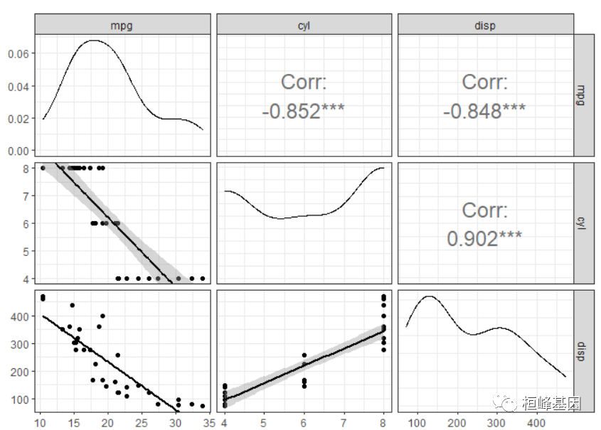
绘制相关系数矩阵图
ggpairs(mtcars, columns = c("mpg", "cyl", "disp"), upper = list(continuous = wrap("cor",
    size = 6)), lower = list(continuous = "smooth")) + theme_bw()
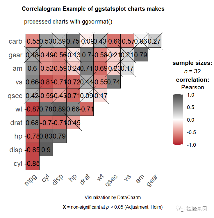
5. ggcorrmat {ggstatsplot}
Visualization of a correlation matrix Description Correlation matrix or a dataframe containing results from pairwise correlation tests. The package internally uses ggcorrplot::ggcorrplot for creating the visualization matrix, while the correlation analysis is carried out using the correlation::correlation function.
基础样例
library(ggstatsplot)
p1 <- ggcorrmat(data = mtcars, colors = c("#B2182B", "white", "#4D4D4D"), title = "Correlalogram Example of ggstatsplot charts makes",
    subtitle = "processed charts with ggcorrmat()", caption = "Visualization by DataCharm",
    ggtheme = hrbrthemes::theme_ipsum(base_family = "Roboto Condensed"), ) + theme(plot.title = element_text(hjust = 0.5,
    vjust = 0.5, color = "black", size = 10, margin = margin(t = 1, b = 12)), plot.subtitle = element_text(hjust = 0,
    vjust = 0.5, size = 8), plot.caption = element_text(face = "bold", size = 10))
p1
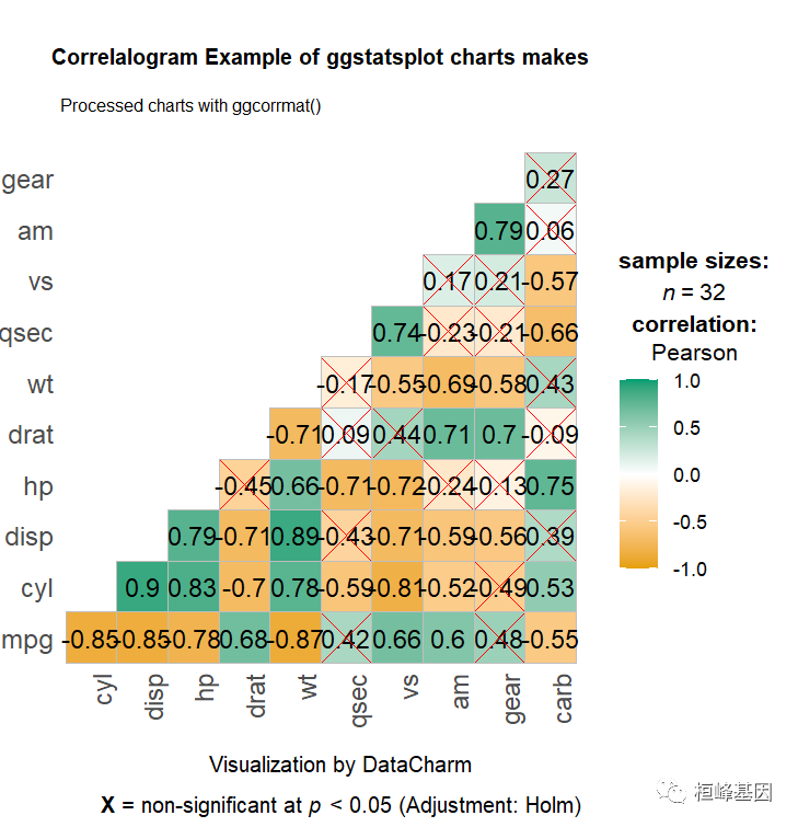
定制化操作
p2 <- ggcorrmat(data = mtcars, matrix.type = "lower", ggcorrplot.args = list(lab_col = "black",
    lab_size = 4, tl.srt = 90, pch.col = "red", pch.cex = 10), title = "Correlalogram Example of ggstatsplot charts makes",
    subtitle = "Processed charts with ggcorrmat()", caption = "Visualization by DataCharm") +
    theme(plot.title = element_text(hjust = 0.5, vjust = 0.5, color = "black", size = 10,
        margin = margin(t = 1, b = 12)), plot.subtitle = element_text(hjust = 0,
        vjust = 0.5, size = 8), plot.caption = element_text(face = "bold", size = 10))
p2
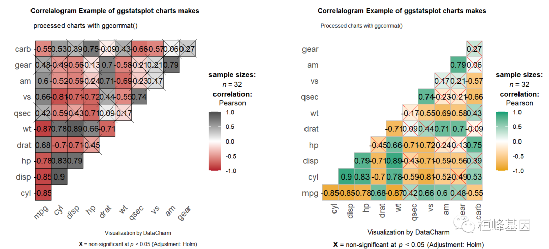
组合
对于支持ggplot2的软件包,可以直接组合图形,但是不支持的就需要另找其他方法了!
library(patchwork)
p1 | p2
6. chart.Correlation {PerformanceAnalytics}
correlation matrix chart Visualization of a Correlation Matrix. On top the (absolute) value of the correlation plus the result of the cor.test as stars. On bottom, the bivariate scatterplots, with a fitted line
library(PerformanceAnalytics)
my_data <- mtcars[, c(1, 3, 4, 5, 6, 7)]
chart.Correlation(my_data, histogram = TRUE, pch = 19)

References:
-
Robert I. Kabacoff. R in Action-Data analysis and graphics with R.Manning Publications Co. 2015: 283-287.
-
Friendly, Michael. 2002. Corrgrams: Exploratory Displays for Correlation Matrices. The American Statistician, 56, 316–324.
-
D. J. Murdoch and E. D. Chow. 1996. A Graphical Display of Large Correlation Matrices. The American Statistician, 50, 178-180.
-
Michael Friendly (2002). Corrgrams: Exploratory displays for correlation matrices. The American Statistician, 56, 316–324.
这期相关性矩阵绘制其实蛮简单的,在是使用过程中根据自己的数据情况进行调整参数,我相信通过我这套教程,各位老师、同学都能够实现相关性矩阵绘图自由,未来也会成为一名会作图的科研人员!
图片