
点击关注,桓峰基因
桓峰基因
生物信息分析,SCI文章撰写及生物信息基础知识学习:R语言学习,perl基础编程,linux系统命令,Python遇见更好的你
128篇原创内容
公众号
桓峰基因公众号推出基于R语言绘图教程并配有视频在线教程,目前整理出来的教程目录如下:
FigDraw 1. SCI 文章的灵魂 之 简约优雅的图表配色
FigDraw 2. SCI 文章绘图必备 R 语言基础
FigDraw 3. SCI 文章绘图必备 R 数据转换
FigDraw 4. SCI 文章绘图之散点图 (Scatter)
FigDraw 5. SCI 文章绘图之柱状图 (Barplot)
FigDraw 6. SCI 文章绘图之箱线图 (Boxplot)
FigDraw 7. SCI 文章绘图之折线图 (Lineplot)
FigDraw 8. SCI 文章绘图之饼图 (Pieplot)
FigDraw 9. SCI 文章绘图之韦恩图 (Vennplot)
FigDraw 10. SCI 文章绘图之直方图 (HistogramPlot)
FigDraw 11. SCI 文章绘图之小提琴图 (ViolinPlot)
FigDraw 12. SCI 文章绘图之相关性矩阵图(Correlation Matrix)
FigDraw 13. SCI 文章绘图之桑葚图及文章复现(Sankey)
FigDraw 14. SCI 文章绘图之和弦图及文章复现(Chord Diagram)
前言
和弦图可以用连接线或条带的方式展示不同对象之间的关系。和弦图主要从以下几个层面来展示关系信息:
-
连接,可以直接显示不同对象之间存在关系
-
连接的宽度与关系的强度成正比
-
连接的颜色可以代表关系的另一种映射,如关系的类型
-
扇形的大小,代表对象的度量
和弦图适用范围
和弦图是一种显示矩阵中数据间相互关系的可视化展现形式,它可以在复杂关联数据展现中,有效降低视觉复杂度,常被用来表现复杂的关系、以及数据的流动情况等。和弦图已经被广泛应用到多组学关联分析的研究中,组学研究包括代谢组学、微生物组学、转录组学、蛋白组学等,多组学分析就是组学与组学之间联合分析,例如微生物组+代谢组,转录组+代谢组,转录组+蛋白组等。迈维代谢云平台高级和弦图小工具,进行多组学相关性分析。
和弦图怎么看
和弦图主要由节点分段和圆弧连接两个部分组成,如下图所示:节点数据沿圆周径向排列,节点之间使用带权重(有宽度)的弧线连接。根据设定的阈值,如相关性 |r| >= 0.8 且相关系数显著性检验的 p value < 0.05 的数据绘图,弦连接(link)的宽度表示所连接的两个对象的相关性大小,link越宽,相关性绝对值越大。红色表示正相关性,蓝色表示负相关性。
软件安装
在 circlize 中,有一个专门的函数用于绘制和弦图:chordDiagram(),并不需要使用 circos.link 来一个个绘制。
if (!require(circlize)) install.packages("circlize")
例子解析
1. 数据读取
chordDiagram() 函数支持两种格式的输入数据:
邻接矩阵:
行和列分别表示连接的对象,如果对象之间存在关系,则对应行列的值将表示关系的强度,例如
set.seed(999)
mat = matrix(sample(18, 18), 3, 6)
rownames(mat) = paste0("S", 1:3)
colnames(mat) = paste0("E", 1:6)
mat
##    E1 E2 E3 E4 E5 E6
## S1  4 14 13 17  5  2
## S2  7  1  6  8 12 15
## S3  9 10  3 16 11 18
邻接列表:
包含三列数据,前两列的值表示连接的两个对象,第三列值为连接的强度,例如:
df = data.frame(from = rep(rownames(mat), times = ncol(mat)), to = rep(colnames(mat),
    each = nrow(mat)), value = as.vector(mat), stringsAsFactors = FALSE)
df
##    from to value
## 1    S1 E1     4
## 2    S2 E1     7
## 3    S3 E1     9
## 4    S1 E2    14
## 5    S2 E2     1
## 6    S3 E2    10
## 7    S1 E3    13
## 8    S2 E3     6
## 9    S3 E3     3
## 10   S1 E4    17
## 11   S2 E4     8
## 12   S3 E4    16
## 13   S1 E5     5
## 14   S2 E5    12
## 15   S3 E5    11
## 16   S1 E6     2
## 17   S2 E6    15
## 18   S3 E6    18
制作和弦图的基本用法
1. 简单和选图
首先我们生成数据读取时生成的矩阵进行绘制和弦图,如下:
library(circlize)
chordDiagram(mat)
circos.clear()
再用生成的列表进行绘制和弦图,如下:
chordDiagram(df)
circos.clear()
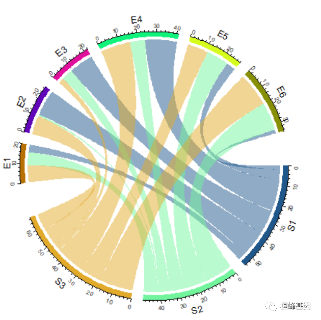
默认的Chord Diagram由标签轨道、网格轨道(也可以称之为线、矩形)和轴和链接组成。与矩阵中的行对应的扇区位于圆的下半部分。如果输入是数据帧,扇区的顺序是union(rownames(mat), colnames(mat))或union(df[[1]], df[[2]])的顺序。扇区的顺序可以通过顺序参数来控制(图14.2,左)。当然,序向量的长度应该与扇区的数量相同。
2. 修改顺序
par(mfrow = c(1, 2))
chordDiagram(mat, order = c("S2", "S1", "S3", "E4", "E1", "E5", "E2", "E6", "E3"))
circos.clear()

chordDiagram(mat, order = c("S2", "S1", "E4", "E1", "S3", "E5", "E2", "E6", "E3"))
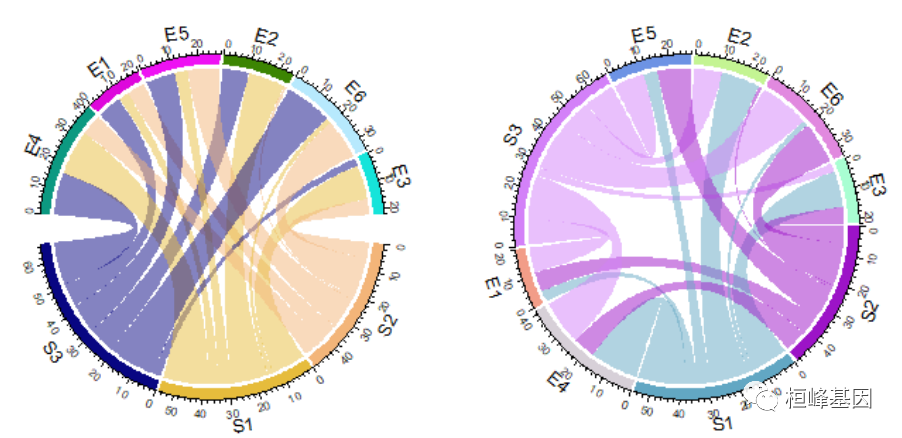
circos.clear()
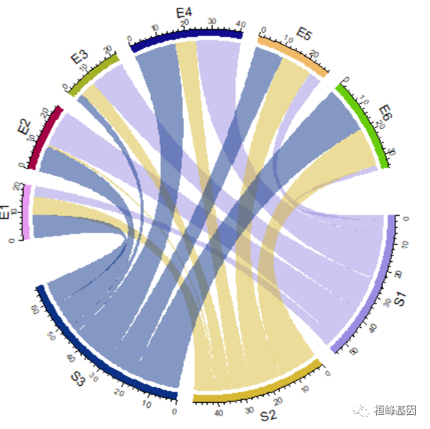
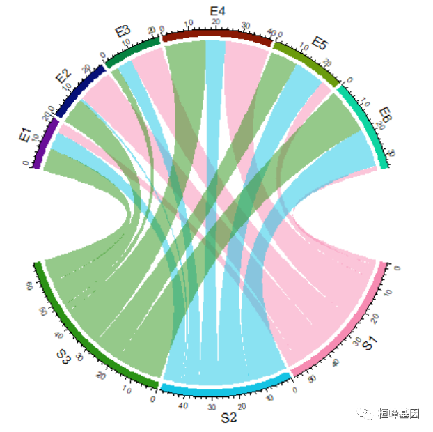
3. 调整circos.par()
如果想要让行和列的扇形之间间隔更大,可以设置 gap.after
circos.par(gap.after = c(rep(5, nrow(mat) - 1), 15, rep(5, ncol(mat) - 1), 15))
chordDiagram(mat)
[外链图片转存失败,源站可能有防盗链机制,建议将图片保存下来直接上传(img-WYEzQ0mU-1657162603096)(https://mmbiz.qpic.cn/mmbiz_png/5ia62S5YZaMzEgU9PMC5DdQibwoeHHVOMXibP6hUY41NCxlLKtQibk41hEet88d8T27GR1VjLtaKrGKBb3SOv8rAUQ/640?wx_fmt=png)]
circos.clear()
数据框模式
circos.par(gap.after = c(rep(5, length(unique(df[[1]])) - 1), 15, rep(5, length(unique(df[[2]])) -
    1), 15))
chordDiagram(df)
circos.clear()
也可以使用命名向量的形式,指定每个扇形的间隔:
circos.par(gap.after = c(S1 = 5, S2 = 5, S3 = 15, E1 = 5, E2 = 5, E3 = 5, E4 = 5,
    E5 = 5, E6 = 15))
chordDiagram(mat)
circos.clear()
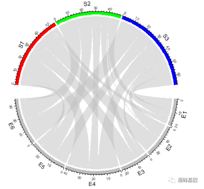
有一个专门的参数 big.gap 可以用来指定行列扇形之间的间隔
chordDiagram(mat, big.gap = 30)
circos.clear()
small.gap 参数控制对应于矩阵行或列的扇区之间的间隙。默认值为1度,通常不需要设置。big.gap和small.gap的差距还可以在组数大于2的场景中设置gap,类似于正常的圆形图,第一个扇区(邻接矩阵的第一行或邻接表的第一行)从圆的右中心开始,扇区按时钟的顺序排列。第一个扇区的起始度可以通过circos.par(start.degree=…)来设置,方向可以通过circos.par(时钟)来设置。wise =…)。设置circos.par(时钟:wise = FALSE)使联系变得如此扭曲。实际上,通过设置所有扇区的倒序,也可以使时钟方向相反。正如我们所看到的,左图中的链接非常扭曲,而在右图中看起来仍然很好。原因是chordDiagram()会根据扇区的排列自动优化链接的位置。
par(mfrow = c(1, 2))
circos.par(start.degree = 85, clock.wise = FALSE)
chordDiagram(mat)
circos.clear()

circos.par(start.degree = 85)
chordDiagram(mat, order = c(rev(colnames(mat)), rev(rownames(mat))))
circos.clear()
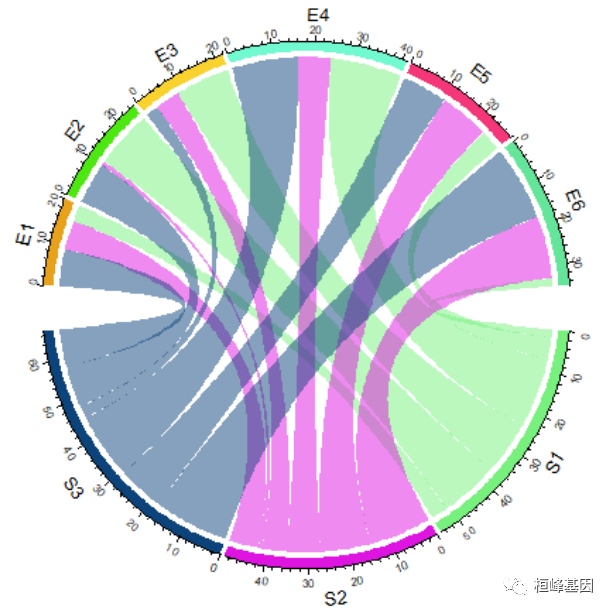
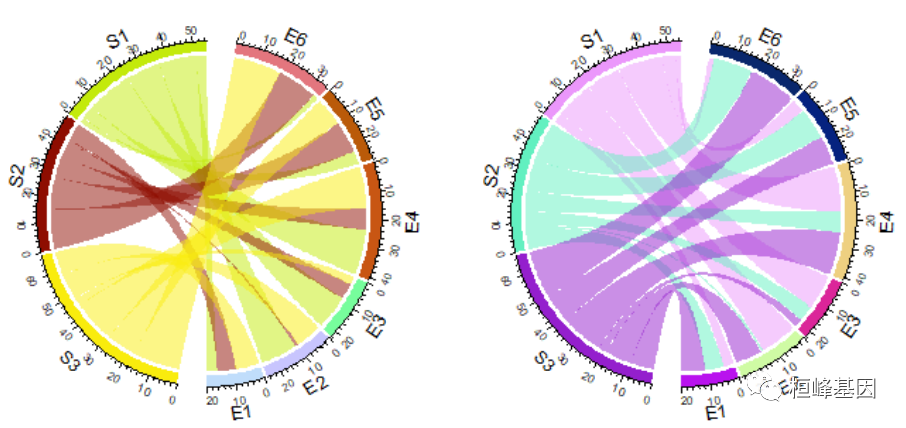
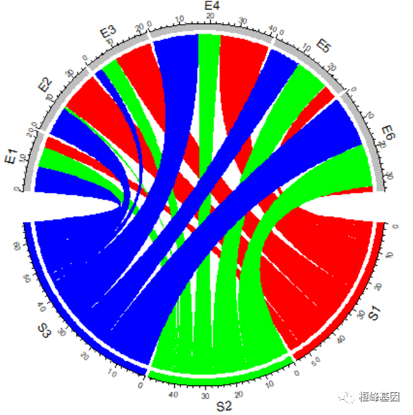
2. 修改颜色
设置扇形颜色
通常扇形分为两个组,其中一个分组为矩阵的行或数据框的第一列,另一个分组为矩阵的列或数据框的第二列。
连接的颜色默认对应于第一个分组的扇形的颜色,所以,改变扇形的颜色也会影响连接的颜色。
扇形的颜色使用 grid.col 参数来设置,最好使用命名向量的方式设置颜色映射。如果只给定颜色向量值,则按照扇形的顺序设置颜色。
grid.col = c(S1 = "red", S2 = "green", S3 = "blue", E1 = "grey", E2 = "grey", E3 = "grey",
    E4 = "grey", E5 = "grey", E6 = "grey")
chordDiagram(mat, grid.col = grid.col)
chordDiagram(t(mat), grid.col = grid.col)
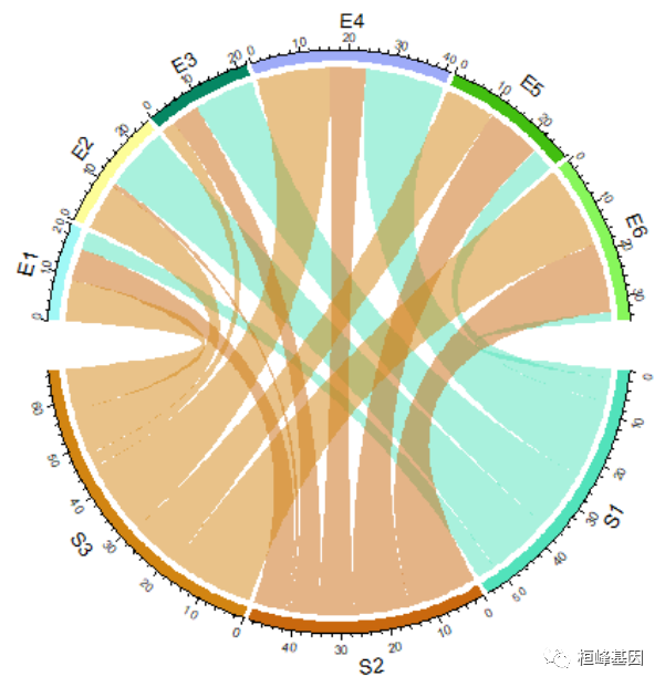
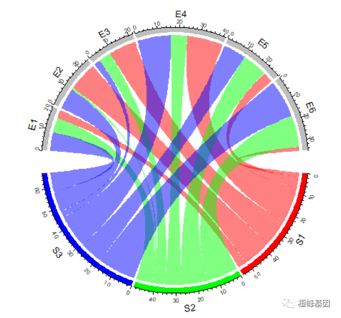
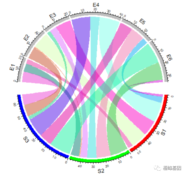
设置连接颜色
transparency 可以设置连接颜色的透明度,0 表示不透明,1 表示完全透明,默认透明度为 0.5。
chordDiagram(mat, grid.col = grid.col, transparency = 0)
对于邻接矩阵,连接的颜色可以使用颜色矩阵来指定:
col_mat = rand_color(length(mat), transparency = 0.5)
dim(col_mat) = dim(mat)  # to make sure it is a matrix
chordDiagram(mat, grid.col = grid.col, col = col_mat)
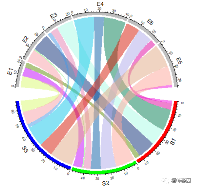
因为在创建颜色矩阵时,以及指定了透明度,如果再设置 transparency 参数的值将会被忽略。对于邻接列表,可以使用一个与数据框长度相同的颜色向量来指定:
col = rand_color(nrow(df))
chordDiagram(df, grid.col = grid.col, col = col)
其他绘图参数
还有很多绘图可以修改的参数,这里就不在一一赘述了,直接看下官网即可:
https://jokergoo.github.io/circlize_book/book/the-chorddiagram-function.html
文章和弦图复现
文章中的内容介绍
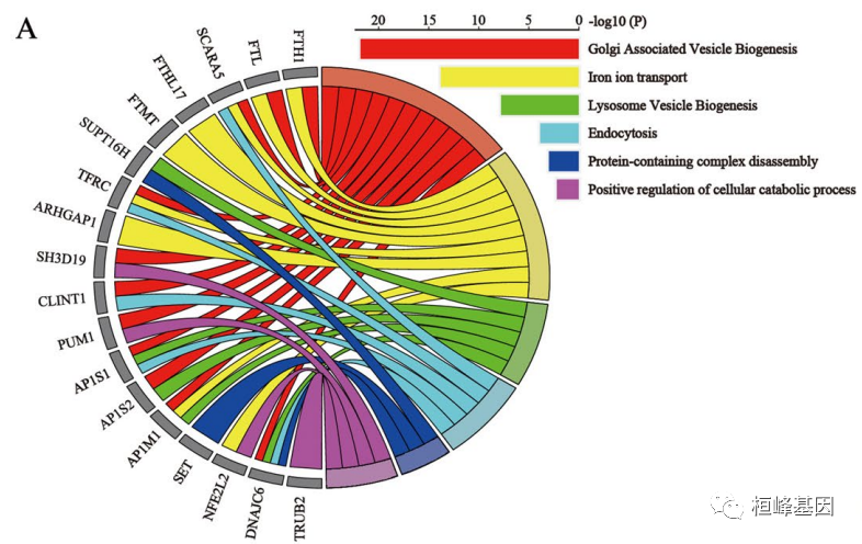
接下来我们看下文章中的使用方法,之后可以考虑套用此图为文章增加点色彩感。这是一篇2021年发表在Cancer Cell 上文章,该文章 FTH通过维持体内铁稳态促进细胞增殖,使肝癌细胞特异性抵抗铁死亡。

该文章的Fig. 5A, 文章提到该部分的解释为:
To better characterize the related events of FTH in the progression of hepatocellular carcinoma, we use the GENEMANIA database to analyze the proteins interaction network of FTH. As Fig. 5A shows, according to their score, the top 20 proteins were as follows: FTL, SCARA5, FTHL17, FTMT, SUPT16H, TFRC, ARHGAP1, SH3D19, CLINT1, PUM1, AP1S1, SIRT4, AP1S2, CSF3R, AP1M1, SET, NFE2L2, DNAJC6, TRUB2, and CEP55.
图表注释如下:
The GO chord plot showed the top 18 significant FTH1-related genes and the 6 most enriched GO pathways (data from GeneMANIA database)
文章图和弦图复现
这个图像其实是分成两部分,一部分是和弦图,另一部分是GO注释的条形图,我们可以分开绘制,之后在通过AI组图,也可以直接拼接在一起,但是非常麻烦,需要不断的调整。
绘制和弦图
在文章中获得数据,整理成矩阵,然后设置扇形的颜色,直接绘图即可:
data <- read.table("GeneInteraction.txt")
data = as.matrix(data)
data
##    TRUB DNAJC NFEL SET APM AP1S APS PUM CLINT SHD ARHGAP TFRC SUPTH FTMT FTHL
## R1    0     1    0   0   2    2   2   2     3   3      0    1     0    0    0
## R2    0     0    3   0   2    0   0   0     0   0      4    1     0    4    4
## R3    0     1    0   0   1    2   1   0     0   0      0    0     2    0    0
## R4    0     1    0   0   0    0   2   0     3   0      0    1     0    0    0
## R5    0     1    0   4   0    0   0   0     0   0      0    0     2    0    0
## R6    4     0    2   0   0    0   0   2     0   2      0    0     0    0    0
##    SCARA FTL FTH
## R1     1   2   2
## R2     1   2   2
## R3     0   0   0
## R4     1   0   0
## R5     0   0   0
## R6     0   0   0
# 设置颜色:
col <- c(R1 = "#E61E18", R2 = "#EEE940", R3 = "#78B837", R4 = "#71B7C1", R5 = "#33538E",
    R6 = "#9F5D92", FTH = "grey50", FTL = "grey50", SCARA = "grey50", FTHL = "grey50",
    FTMT = "grey50", SUPTH = "grey50", TFRC = "grey50", ARHGAP = "grey50", SHD = "grey50",
    CLINT = "grey50", PUM = "grey50", APS = "grey50", AP1S = "grey50", APM = "grey50",
    SET = "grey50", NFEL = "grey50", DNAJC = "grey50", TRUB = "grey50")

# 设置角度:
circos.par(start.degree = 90)
chordDiagram(data, grid.col = col, transparency = 0, link.lwd = 1.8, link.lty = 1,
    link.border = "black", grid.border = "black", big.gap = 2, annotationTrack = "grid",
    preAllocateTracks = list(track.height = max(strwidth(unlist(dimnames(data))))))

circos.track(track.index = 1, panel.fun = function(x, y) {
    circos.text(CELL_META$xcenter, CELL_META$ylim[1], CELL_META$sector.index, facing = "clockwise",
        niceFacing = TRUE, adj = c(0, 0.5))
}, bg.border = NA)  #这个不能缺
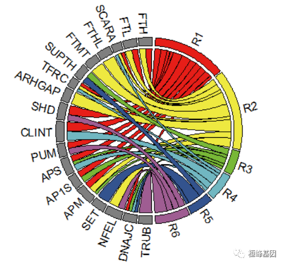
circos.clear()
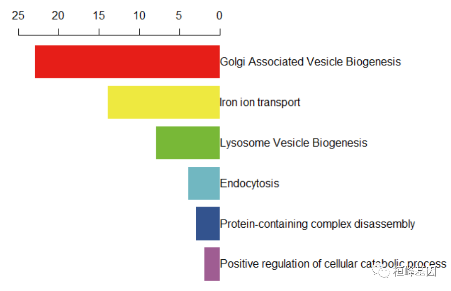
绘制条形图
我们根据图形上大概的数值,给出一组数pvalue,在加上GO描述,做成数据框,利用基础绘图函数barplot绘制条形图:
pvalue = rev(c(23, 14, 8, 4, 3, 2))
go = rev(c("Golgi Associated Vesicle Biogenesis", "Iron ion transport", "Lysosome Vesicle Biogenesis",
    "Endocytosis", "Protein-containing complex disassembly", "Positive regulation of cellular catabolic process"))

pp <- as.data.frame(cbind(go, pvalue))
pp$pvalue = -as.numeric(pp$pvalue)
pp$go = factor(pp$go, levels = go)
par(mar = c(2, 2, 4, 18))
col = rev(c("#E61E18", "#EEE940", "#78B837", "#71B7C1", "#33538E", "#9F5D92"))
x <- barplot(pvalue ~ go, data = pp, horiz = T, axes = F, xlim = c(-25, 0), col = col,
    xpd = TRUE, names.arg = pp$go, border = "white", axisnames = F, add = F)

axis(side = 3, at = -rev(seq(0, 25, 5)), labels = rev(seq(0, 25, 5)))
text(x = 0, y = x, labels = pp$go, xpd = T, adj = 0)
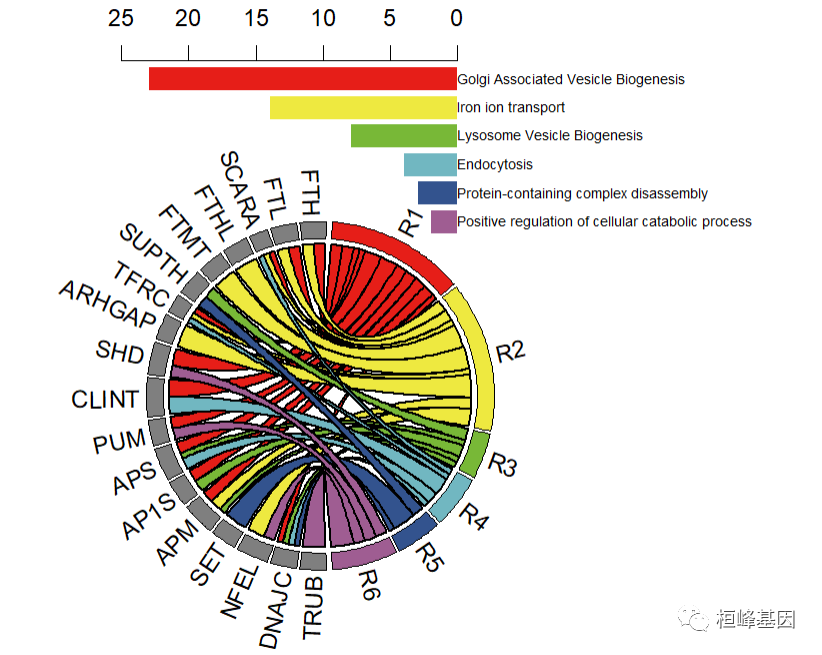
图形拼接
我们看到文章中的原图就是和弦图和条形图的组合图,那么我们就利用简单组合图par()中的参数来fig设置图形的位置,首先看下参数说明:
fig: A numerical vector of the form c(x1, x2, y1, y2) which gives the (NDC) coordinates of the figure region in the display region of the device. If you set this, unlike S, you start a new plot, so to add to an existing plot use new = TRUE as well.
此外我们还需要设置new参数,说明如下:
new: logical, defaulting to FALSE. If set to TRUE, the next high-level plotting command (actually plot.new) should not clean the frame before drawing as if it were on a new device. It is an error (ignored with a warning) to try to use new = TRUE on a device that does not currently contain a high-level plot.
两张图的设置先后顺序,如下:
par(fig=c(0,0.85,0,0.85),new=FALSE)
par(fig=c(0.2,1,0.55,1),new=TRUE,mar=c(2,2,4,18))
最后我们里面参数par()的设置完成组合拼图,代码如下:
data <- read.table("GeneInteraction.txt")
data = as.matrix(data)
# 设置颜色:
col <- c(R1 = "#E61E18", R2 = "#EEE940", R3 = "#78B837", R4 = "#71B7C1", R5 = "#33538E",
    R6 = "#9F5D92", FTH = "grey50", FTL = "grey50", SCARA = "grey50", FTHL = "grey50",
    FTMT = "grey50", SUPTH = "grey50", TFRC = "grey50", ARHGAP = "grey50", SHD = "grey50",
    CLINT = "grey50", PUM = "grey50", APS = "grey50", AP1S = "grey50", APM = "grey50",
    SET = "grey50", NFEL = "grey50", DNAJC = "grey50", TRUB = "grey50")
par(fig = c(0, 0.85, 0, 0.85), new = FALSE)
circos.par(start.degree = 90)
chordDiagram(data, grid.col = col, transparency = 0, link.lwd = 1.8, link.lty = 1,
    link.border = "black", grid.border = "black", big.gap = 2, annotationTrack = "grid",
    preAllocateTracks = list(track.height = max(strwidth(unlist(dimnames(data))))))

circos.track(track.index = 1, panel.fun = function(x, y) {
    circos.text(CELL_META$xcenter, CELL_META$ylim[1], CELL_META$sector.index, facing = "clockwise",
        niceFacing = TRUE, adj = c(0, 0.5))
}, bg.border = NA)  #这个不能缺

circos.clear()
par(fig = c(0.2, 1, 0.55, 1), new = TRUE, mar = c(2, 2, 4, 18))
x <- barplot(pvalue ~ go, data = pp, horiz = T, axes = F, xlim = c(-25, 0), col = col,
    xpd = TRUE, names.arg = pp$go, border = "white", axisnames = F, add = F)

axis(side = 3, at = -rev(seq(0, 25, 5)), labels = rev(seq(0, 25, 5)))
text(x = 0, y = x, labels = pp$go, xpd = T, adj = 0)
通过这期教程,您是不是觉得高大上的和弦图也没有那么难了,跟着桓峰基因学绘图教程,简单轻松实现CNS级别图形绘制,快来关注吧!
桓峰基因,铸造成功的您!
References:
-
Hu W, Zhou C, Jing Q, et al. FTH promotes the proliferation and renders the HCC cells specifically resist to ferroptosis by maintaining iron homeostasis. Cancer Cell Int. 2021;21(1):709. Published 2021 Dec 29.
-
Becker, R. A., Chambers, J. M. and Wilks, A. R. (1988) The New S Language. Wadsworth & Brooks/Cole.
-
Murrell, P. (2005) R Graphics. Chapman & Hall/CRC Press.