代码
<!DOCTYPE html>
<html lang="en">
<head>
<meta charset="UTF-8">
<meta http-equiv="X-UA-Compatible" content="IE=edge">
<meta name="viewport"
content="width=device-width, initial-scale=1.0,maximum-scale=1.0,minimum-scale=1.0,user-scalable=no">
<title>flex - 弹性盒</title>
</head>
<style>
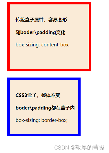
.box_1{
height: 200px;
width: 250px;
background-color: antiquewhite;
border: 8px red solid;
box-sizing: content-box;
padding-left: 20px;
padding-top: 20px;
margin-left: 20px;
}
.box_2{
height: 200px;
width: 250px;
background-color: antiquewhite;
border: 8px blue solid;
box-sizing: border-box;
padding-left: 20px;
padding-top: 20px;
margin-left: 20px;
}
</style>
<body>
<div class="box_1">
<h4>传统盒子属性,容易变形</h4>
<h4>随boder\padding变化</h4>
box-sizing: content-box;
</div>
<br>
<div class="box_2">
<h4>CSS3盒子,整体不变</h4>
<h4>boder\padding都在盒子内</h4>
box-sizing: border-box;
</div>
</body>
</html>