利用宽度(width)和高度(height)相关的工具类来轻松实现对页面元素的高度和宽度的设定。
1、相对于父元素的尺寸
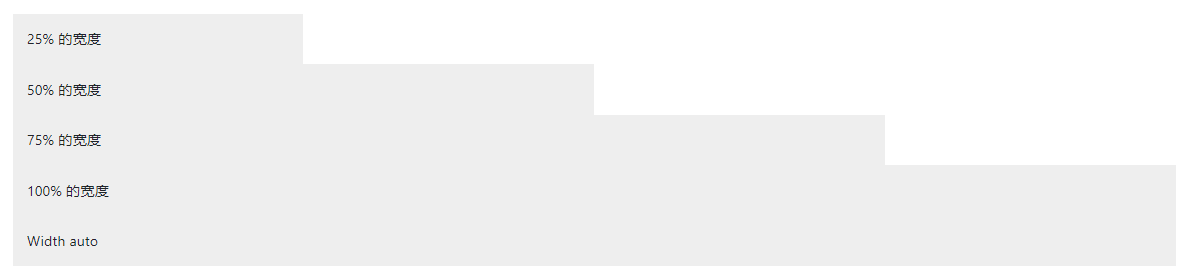
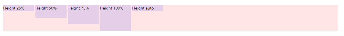
宽度(Width)和高度(height)工具类是依据 _variables.scss 文件中的 $sizes Sass 变量生成的。默认情况下支持 25%、50%、75%、100% 和 auto 值。根据你的需要修改这些值,就可以生成不同的工具类。
<div class="w-25 p-3" style="background-color: #eee;">25% 的宽度</div>
<div class="w-50 p-3" style="background-color: #eee;">50% 的宽度</div>
<div class="w-75 p-3" style="background-color: #eee;">75% 的宽度</div>
<div class="w-100 p-3" style="background-color: #eee;">100% 的宽度</div>
<div class="w-auto p-3" style="background-color: #eee;">Width auto</div>
<div style="height: 100px; background-color: rgba(255,0,0,0.1);">
  <div class="h-25 d-inline-block" style="width: 120px; background-color: rgba(0,0,255,.1)">Height 25%</div>
  <div class="h-50 d-inline-block" style="width: 120px; background-color: rgba(0,0,255,.1)">Height 50%</div>
  <div class="h-75 d-inline-block" style="width: 120px; background-color: rgba(0,0,255,.1)">Height 75%</div>
  <div class="h-100 d-inline-block" style="width: 120px; background-color: rgba(0,0,255,.1)">Height 100%</div>
  <div class="h-auto d-inline-block" style="width: 120px; background-color: rgba(0,0,255,.1)">Height auto</div>
</div>
如果需要,你也可以使用 max-width: 100%; 和 max-height: 100%; 工具类
<img src="..." class="mw-100" alt="...">

<div style="height: 100px; background-color: rgba(255,0,0,0.1);">
  <div class="mh-100" style="width: 100px; height: 200px; background-color: rgba(0,0,255,0.1);">Max-height 100%</div>
</div>

2、相对于视口(viewport)的尺寸
你还可以使用工具类来设置相对于视口(viewport)的宽度和高度。
<div class="min-vw-100">Min-width 100vw</div>
<div class="min-vh-100">Min-height 100vh</div>
<div class="vw-100">Width 100vw</div>
<div class="vh-100">Height 100vh</div>
后记
如果你感觉文章不咋地
//(ㄒoㄒ)//,就在评论处留言,作者继续改进;o_O???
如果你觉得该文章有一点点用处,可以给作者点个赞;\\*^o^*//
如果你想要和作者一起进步,可以微信扫描二维码,关注前端老L;~~~///(^v^)\\\~~~
谢谢各位读者们啦(^_^)∠※!!!
