网页布局第一准测:标准流设置上下盒子排列,浮动设置左右盒子排列
网页布局第二准测:先设置盒子大小,之后设置盒子的位置
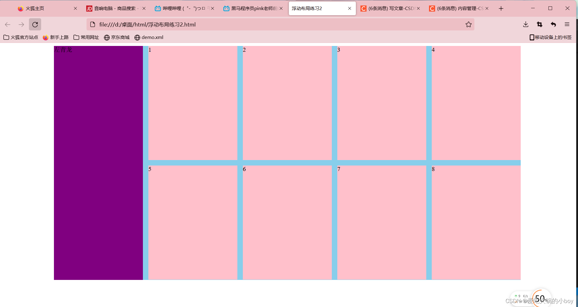
代码:
<!DOCTYPE html>
<html lang="en">
<head>
    <meta charset="UTF-8">
    <meta http-equiv="X-UA-Compatible" content="IE=edge">
    <meta name="viewport" content="width=device-width, initial-scale=1.0">
    <title>浮动布局练习2</title>

    <style>

     /* 整个盒子大小 */
     .box{
            width: 1226px;
            height: 615px;
            background-color: pink;
            margin: 0 auto;
        }

        /* 左盒子 */
    .left{
             /* 左对齐 */
            float: left;
            width: 234px;
            height: 615px;
            background-color:purple;
            }


        /* 右盒子 */
     .right{
            /* 左对齐 */
            float:left;
            width: 992px;
            height: 615px;
            background-color: skyblue;
           }

    /* 子代选择器 */
    .right>div{

         float: left;
         width: 234px;
         height: 300px;
         background-color: pink;
         /* 从第一个盒子开始留出左边14像素的距离 */
         margin-left: 14px;
         /* 从第一个盒子开始留出下边14像素的距离 */
         margin-bottom: 14px;
    }

     </style>

</head>

<body>
       <div class="box">

             <div class="left">左青龙</div>
             <div class="right">
                  <div>1</div>
                  <div>2</div>
                  <div>3</div>
                  <div>4</div>
                  <div>5</div>
                  <div>6</div>
                  <div>7</div>
                  <div>8</div>
             </div>
       </div>
</body>

</html>
运行效果