前言
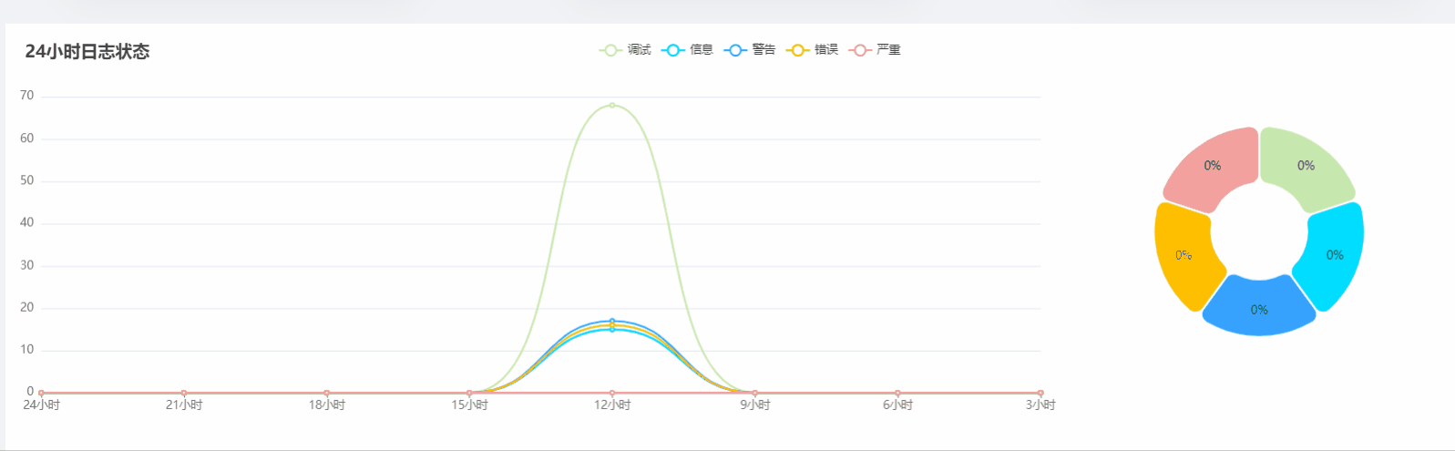
最近写项目,有一块功能需要使用双图进行联动的展示,左边折线图,鼠标移动折线图焦点,能把每个点的数据情况展示到饼图上,这里记录一下,希望对大家有帮助
实现的效果:
实现步骤:
首先先实现折线图的部分:
option = {


    color: ['#c6e8ad', '#00DDFF', '#37A2FF', '#FFBF00', '#f3a19e'],
    legend: {

    },
    tooltip: {


      trigger: 'axis',
      showContent: false
    },
    dataset: {


      // ['严重', '错误', '警告', '信息', '调试']
      // data: ['当前', '三小时前', '六小时前', '九小时前', '十二小时前', '十五小时前', '十八小时前', '二十一小时前']
      source: [
        ['时间', '当前', '三小时前', '六小时前', '九小时前', '十二小时前', '十五小时前', '十八小时前', '二十一小时前'],
        ['调试', 56, 82, 101, 70, 83, 85, 87, 84],
        ['信息', 51, 51, 55, 53, 73, 68, 69, 73],
        ['警告', 12, 15, 30, 25, 0, 23, 15, 18],
        ['错误', 3, 7, 2, 6, 6, 8, 3, 2],
        ['严重', 5, 1, 0, 0, 0, 2, 0, 2]
      ]
    },
    xAxis: [
      {


        type: 'category',
        boundaryGap: false,
        axisTick: {


          alignWithLabel: true
        }
      }
    ],

    yAxis: {

     gridIndex: 0 },
    grid: [
      {


        width: '70%',
        left: '0%',
        bottom: '3%',
        containLabel: true
      }
    ],
    series: [
      {


        type: 'line',
        smooth: true,
        seriesLayoutBy: 'row',
        emphasis: {

     focus: 'series' }
      },
      {


        type: 'line',
        smooth: true,
        seriesLayoutBy: 'row',
        emphasis: {

     focus: 'series' }
      },
      {


        type: 'line',
        smooth: true,
        seriesLayoutBy: 'row',
        emphasis: {

     focus: 'series' }
      },
      {


        type: 'line',
        smooth: true,
        seriesLayoutBy: 'row',
        emphasis: {

     focus: 'series' }
      },
      {


        type: 'line',
        smooth: true,
        seriesLayoutBy: 'row',
        emphasis: {

     focus: 'series' }
      },
      {


        type: 'pie',
        id: 'pie',
        center: ['85%', '50%'],
        radius: ['25%', '55%'],
        itemStyle: {


          borderRadius: 10,
          borderColor: '#fff',
          borderWidth: 2
        },
        label: {


          position: 'inside',
          formatter: '{d}%'
        },
        emphasis: {


          label: {


            show: true,
            fontSize: '18',
            fontWeight: 'bold',
            formatter: '{b}:{@当前}'
          }
        },
        encode: {


          itemName: '时间',
          value: '当前',
          tooltip: '当前'
        }
      }
    ]
  };
然后再来渲染饼图,要想使折线图和饼图联动的关键就在于这里的代码:
 myChart.on('updateAxisPointer', function (event) {


    const xAxisInfo = event.axesInfo[0];
    if (xAxisInfo) {


      const dimension = xAxisInfo.value + 1;
      myChart.setOption({


        series: {


          id: 'pie',
          label: {


            formatter: '{d}%'
          },
          encode: {


            value: dimension,
            tooltip: dimension
          }
        }
      });
    }
  });
最后渲染出echarts图就可以啦:
myChart.setOption(option);
完整代码:
setTimeout(function () {


  option = {


    color: ['#c6e8ad', '#00DDFF', '#37A2FF', '#FFBF00', '#f3a19e'],
    legend: {

    },
    tooltip: {


      trigger: 'axis',
      showContent: false
    },
    dataset: {


      // ['严重', '错误', '警告', '信息', '调试']
      // data: ['当前', '三小时前', '六小时前', '九小时前', '十二小时前', '十五小时前', '十八小时前', '二十一小时前']
      source: [
        ['时间', '当前', '三小时前', '六小时前', '九小时前', '十二小时前', '十五小时前', '十八小时前', '二十一小时前'],
        ['调试', 56, 82, 101, 70, 83, 85, 87, 84],
        ['信息', 51, 51, 55, 53, 73, 68, 69, 73],
        ['警告', 12, 15, 30, 25, 0, 23, 15, 18],
        ['错误', 3, 7, 2, 6, 6, 8, 3, 2],
        ['严重', 5, 1, 0, 0, 0, 2, 0, 2]
      ]
    },
    xAxis: [
      {


        type: 'category',
        boundaryGap: false,
        axisTick: {


          alignWithLabel: true
        }
      }
    ],

    yAxis: {

     gridIndex: 0 },
    grid: [
      {


        width: '70%',
        left: '0%',
        bottom: '3%',
        containLabel: true
      }
    ],
    series: [
      {


        type: 'line',
        smooth: true,
        seriesLayoutBy: 'row',
        emphasis: {

     focus: 'series' }
      },
      {


        type: 'line',
        smooth: true,
        seriesLayoutBy: 'row',
        emphasis: {

     focus: 'series' }
      },
      {


        type: 'line',
        smooth: true,
        seriesLayoutBy: 'row',
        emphasis: {

     focus: 'series' }
      },
      {


        type: 'line',
        smooth: true,
        seriesLayoutBy: 'row',
        emphasis: {

     focus: 'series' }
      },
      {


        type: 'line',
        smooth: true,
        seriesLayoutBy: 'row',
        emphasis: {

     focus: 'series' }
      },
      {


        type: 'pie',
        id: 'pie',
        center: ['85%', '50%'],
        radius: ['25%', '55%'],
        itemStyle: {


          borderRadius: 10,
          borderColor: '#fff',
          borderWidth: 2
        },
        label: {


          position: 'inside',
          formatter: '{d}%'
        },
        emphasis: {


          label: {


            show: true,
            fontSize: '18',
            fontWeight: 'bold',
            formatter: '{b}:{@当前}'
          }
        },
        encode: {


          itemName: '时间',
          value: '当前',
          tooltip: '当前'
        }
      }
    ]
  };
  myChart.on('updateAxisPointer', function (event) {


    const xAxisInfo = event.axesInfo[0];
    if (xAxisInfo) {


      const dimension = xAxisInfo.value + 1;
      myChart.setOption({


        series: {


          id: 'pie',
          label: {


            formatter: '{d}%'
          },
          encode: {


            value: dimension,
            tooltip: dimension
          }
        }
      });
    }
  });
  myChart.setOption(option);
});
最后
完整的代码以及在上面啦,大家在页面写好之后,只需要把 source中的数据替换成自己的就可以了,如果对你有帮助,点赞关注支持一下,谢谢大家