seaborn
风格样式
seaborn基于matplotlib图库封装而成,并提供5种主题风格
seaborn的几类方法
| 风格 | 样式 |
|---|---|
| darkgrid | 灰背景,网格图,无边线 |
| whitegrid | 白背景,网格图,无边线 |
| dark | 灰背景图,无边线 |
| white | 白色标准图,有边线 |
| ticks | white+轴外标线,有边线 |
| 代码 | 说明 | 代码 | 说明 |
|---|---|---|---|
| set() | 初始化seaborn设置 | set_style() | 调用风格 |
| axes_style() | with 域调用风格 | despine() | 设置图型边框 |
| set_context() | 设置图型及文本 | load_dataset | 包内数据集 |
| — | — | — | — |
| distplot() | 单变量柱型图 | jointplot() | 散点柱型图 |
| pairplot() | 多维散点图 | regplot() | 离散变量,回归图 |
| stripplot() | 分类变量散点图 | swarmplot() | 多维散点图 |
| boxplot() | 箱图 | violinplot() | 小提琴图 |
| pointplot() | 差异性变化图 | factorplot() | 图型包,可调用mat图型 |
| FacetGrid() | 图型集合框架配合.map使用 | heatmap() | 热力图 |
1、seaborn 5种主题风格示例
生成数据集
import seaborn as sns
import numpy as np
import matplotlib.pyplot as plt

#定义数据集
def sinplot(flip=1):
    x=np.linspace(0,14,100)
    for i in range(1,7):
        plt.plot(x,np.sin(x+i*.5)*(7-i)*flip)
#定义边框大小
def figure_new():
    plt.figure(figsize=(5,3))
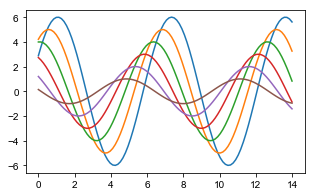
绘制图型plt图型(一)
figure_new()
sinplot()
绘制(二)set_style调用"dark"风格打印
sns.set_style(style=None, rc=None)
style 风格,rc 线条设置
figure_new()
sns.set_style('dark') #设置打印风格
plt.title('seaborn-dark')
sinplot()

绘制(三) with语句的绘制,域内使用风格,不改变整体的布局风格
with sns.axes_style(style=None, rc=None)
#sns.set() 初始化调色器
figure_new()
with sns.axes_style('whitegrid'): #使用with语句,定义域在域内使用
    plt.title('seaborn-whitegrid-with-whitegrid')
    sinplot()

绘制(四)for打印所有样式
style=['darkgrid', 'whitegrid', 'dark', 'white', 'ticks']
for i in range(5): #使用循环打印出5种风格
    figure_new()
    with sns.axes_style(style[i]):
        plt.title('for---'+style[i])
        sinplot()
#运行查看五种风格
despine 设置图型边框,轴线
despine(fig=None, ax=None, top=True, right=True, left=False, bottom=False, offset=None, trim=False)
plt.title('despine')
sinplot()
sns.despine(top=False,right=True,offset=20) #头部与右侧隐藏,offset图型偏移20
sns.set_style('white')

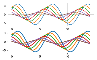
绘制差异性子图
with sns.axes_style('whitegrid'): #绘制差异性子图
    plt.subplot(211)
    sinplot()
plt.subplot(212)
sns.set_context('notebook',font_scale=1.5,rc={

    'lines.linewidth':2.5}) #设置大小风格,font_scale字体大小,rc线宽
sns.set_style('ticks')
sns.despine()
sinplot()
2、探索分析图型
distplot单变量分析
distplot(a, bins=None, hist=True, kde=True, rug=False, fit=None, hist_kws=None, kde_kws=None, rug_kws=None, fit_kws=None, color=None, vertical=False, norm_hist=False, axlabel=None, label=None, ax=None)
柱型图
from scipy import stats
x=np.random.normal(size=100) #正态分布
sns.distplot(x,kde=True) #kde分布

概率密度分布
x=np.random.gamma(6,size=200)  #生成偏态分布数据集
sns.distplot(x,bins=20,kde=False,fit=stats.gamma) #fit似合形式scipy.stats概率密度函数指标

jointplot二分类变量分析
jointplot(x, y, data=None, kind=‘scatter’, stat_func=None, color=None, height=6, ratio=5, space=0.2, dropna=True, xlim=None, ylim=None, joint_kws=None, marginal_kws=None, annot_kws=None, **kwargs)
散点图
mean,cov=[0,1],[(1,.5),(.5,1)] #均值,协方差
data=np.random.multivariate_normal(mean,cov,200) #指定均值与协方差生成随机数据
df=pd.DataFrame(data,columns=['x','y']) #生成DataFrame数据集
sns.jointplot(x='x',y='y',data=df)  #jointplot 散点图+单变量图

大数据量,散点图色差化
x,y=np.random.multivariate_normal(mean,cov,1000).T #生成大数据量,横向数据集
with sns.axes_style('white'):
    sns.jointplot(x=x,y=y,kind='hex',color='k') #kind=‘hex',数据按数量累计计算颜色深度,指定为黑色

3、多维度分析图
多维交叉散点图 pairplot(data, hue=None, hue_order=None, palette=None, vars=None, x_vars=None, y_vars=None, kind=‘scatter’, diag_kind=‘auto’, markers=None, height=2.5, aspect=1, dropna=True, plot_kws=None, diag_kws=None, grid_kws=None, size=None)
iris=sns.load_dataset('iris') #调用内置数据集
sns.pairplot(iris) #多维散点图

4、回归分析
回归图 regplot(x, y, data=None, x_estimator=None, x_bins=None, x_ci=‘ci’, scatter=True, fit_reg=True, ci=95, n_boot=1000, units=None, order=1, logistic=False, lowess=False, robust=False, logx=False, x_partial=None, y_partial=None, truncate=False, dropna=True, x_jitter=None, y_jitter=None, label=None, color=None, marker=‘o’, scatter_kws=None, line_kws=None, ax=None)
tips=sns.load_dataset('tips') #调用小费数据集
plt.title('regplot')
sns.regplot(x='total_bill',y='tip',data=tips) #x,y轴定义,data数据集定义

多维交叉基点图
散点图交叉分析
tips=sns.load_dataset('tips')
sns.pairplot(tips[['total_bill','tip','sex']],hue='sex') #指定数据集,hue指定分类信息
plt.title('pairplot',fontdict={

    'fontsize':20},loc='left') #标题设定

分类数据集,回归分析
tips=sns.load_dataset('tips')
plt.title('regplot')
sns.regplot(x='size',y='tip',data=tips,x_jitter=.2) #离散型变量的回归分析

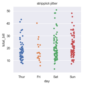
stripplot 分类数
stripplot(x=None, y=None, hue=None, data=None, order=None, hue_order=None, jitter=True, dodge=False, orient=None, color=None, palette=None, size=5, edgecolor=‘gray’, linewidth=0, ax=None, **kwargs)
plt.title('stripplot-jitter')
sns.stripplot(x='day',y='total_bill',data=tips,jitter=True) #文本型分类,统计数据集,jitter重叠数据自动进行偏移(默认值True)
分类数据的平行堆积
swarmplot(x=None, y=None, hue=None, data=None, order=None, hue_order=None, dodge=False, orient=None, color=None, palette=None, size=5, edgecolor=‘gray’, linewidth=0, ax=None, **kwargs)
plt.title('swarmplot')
sns.swarmplot(x='day',y='total_bill',data=tips)

箱图
boxplot(x=None, y=None, hue=None, data=None, order=None, hue_order=None, orient=None, color=None, palette=None, saturation=0.75, width=0.8, dodge=True, fliersize=5, linewidth=None, whis=1.5, notch=False, ax=None, **kwargs)
sns.boxplot(x='day',y='total_bill',hue='time',data=tips) #hue按颜色增加分类数据的箱型图

使用split二分类字段数据组合
sns.violinplot(x='day',y='total_bill',hue='sex',data=tips,split=True)

inner 中心点设置,color颜色
sns.violinplot(x='day',y='total_bill',data=tips,inner=None,color='r')

fig,axes=plt.subplots(2,2)
sns.violinplot(x="day",y="total_bill",data=tips,inner="box",ax=axes[0,0])  #钢琴图内显示箱型图(左上)
sns.violinplot(x="day",y="total_bill",data=tips,inner="quartile",ax=axes[0,1])  #钢琴图内显示四分位数线(右上)
sns.violinplot(x="day",y="total_bill",data=tips,inner="point",ax=axes[1,0])  #钢琴图内显示具体数据点(左下)
sns.violinplot(x="day",y="total_bill",data=tips,inner="stick",ax=axes[1,1])  #钢琴图内显示具体数据棒(右下)

调用调色板palette
planets = sns.load_dataset("planets")
ax = sns.violinplot(y="orbital_period", x="method",
                    data=planets[planets.orbital_period < 1000],
                    scale="width", palette="Set3")

图型包
调用matplotlib包的图型
factorplot(*args, **kwargs) 默认拆线图
差异图,数据的变化
sns.factorplot(x='day',y='total_bill',hue='smoker',data=tips) #不指定,拆线图
拆线图,kind定义图型类型
sns.factorplot(x='day',y='total_bill',hue='smoker',data=tips,kind='bar')
分类图,col定义图型分类
sns.factorplot(x='day',y='total_bill',hue='smoker',col='time',data=tips,kind='swarm')

箱型图,size定义大小,aspect图型长宽比
sns.factorplot(x='time',y='total_bill',hue='smoker',col='day',data=tips,kind='box',size=4,aspect=.5)

子数据集的展示
组合型
FacetGrid(data, row=None, col=None, hue=None, col_wrap=None, sharex=True, sharey=True, height=3, aspect=1, palette=None, row_order=None, col_order=None, hue_order=None, hue_kws=None, dropna=True, legend_out=True, despine=True, margin_titles=False, xlim=None, ylim=None, subplot_kws=None, gridspec_kws=None, size=None)
分类子宽体图
g=.FacetGrid(数据集,分类)
g.map(图型类别,字段)
柱型图
g=sns.FacetGrid(tips,col='time') #导入数据集,展示子集time(午餐,晚餐)
g.map(plt.hist,'tip') #调用图型,导入数据使用字段

散点图
g=sns.FacetGrid(tips,col='sex',hue='smoker')
g.map(plt.scatter,'total_bill','tip',alpha=.6) #alpha透明度
g.add_legend() #增加图例,默认不显示图例

交叉散点回归图
g=sns.FacetGrid(tips,row='smoker',col='time',margin_titles=True) #名称显示方式
g.map(sns.regplot,'size','total_bill',color='r',fit_reg=True,x_jitter=.7) #fig_reg回归线,x_jitter偏离大小

分类柱型差值图
g=sns.FacetGrid(tips,col='day',size=4,aspect=.5) #指定大小,长宽比
g.map(sns.barplot,'sex','total_bill')

#order_days=tips.day.values.categories #取出不重复列值,后续使用指定list进行排序
order_days=pd.Categorical(['Sun','Thur','Fri','Sat']) #指定列
g=sns.FacetGrid(tips,row='day',row_order=order_days,size=1.7,aspect=4.) #设置绘图顺序,指定图型大小,批定长宽比
g.map(sns.boxplot,'total_bill')

pal=dict(Lunch='seagreen',Dinner='gray')
g=sns.FacetGrid(tips,hue='time',palette=pal,size=5)
g.map(plt.scatter,'total_bill','tip',s=50,alpha=.7,linewidth=.5,edgecolor='white') #s点大小
g.add_legend()

g=sns.FacetGrid(tips,hue='sex',palette='Set1',size=5,hue_kws={

    'marker':["^",'v']})
g.map(plt.scatter,'total_bill','tip',s=100,linewidth=.5,edgecolor='white')
g.add_legend() #增加图例

多维度分类图型
with sns.axes_style('white'):
    g=sns.FacetGrid(tips,row='sex',col='smoker',margin_titles=True,size=2.5)
g.map(plt.scatter,'total_bill','tip',color='#334488',edgecolor='white',lw=.5)
g.set_axis_labels('Total bill(US Dollars)','Tip') #轴标题
g.set(xticks=[10,30,50],yticks=[2,6,10]) #子图轴标签
g.fig.subplots_adjust(wspace=.02,hspace=.02) #子图间隔设置
#g.fig.subplots_adjust(left=.125,right=.5,bottom=.1,top=.9,wspace=.02,hspace=.02) #偏移参数

多维分析图
PairGrid(data, hue=None, hue_order=None, palette=None, hue_kws=None, vars=None, x_vars=None, y_vars=None, diag_sharey=True, height=2.5, aspect=1, despine=True, dropna=True, size=None)
g = sns.PairGrid(iris, hue="species", palette="Set2",
                  hue_kws={

    "marker": ["o", "s", "D"]}) #palette色板,marker标记形状
g = g.map(plt.scatter, linewidths=1, edgecolor="w", s=40)
g = g.add_legend()

iris=sns.load_dataset('iris')

g = sns.PairGrid(iris)
g = g.map_upper(plt.scatter) #高位散点图
g = g.map_lower(sns.kdeplot, cmap="Blues_d") #低位核密度图
g = g.map_diag(sns.kdeplot, lw=3, legend=False)

iris=sns.load_dataset('iris')
g = sns.PairGrid(iris, hue="species")
g = g.map_diag(plt.hist, histtype="step", linewidth=3) #histtype设置柱型样式,linewidth线宽
g = g.map_offdiag(plt.scatter)
g = g.add_legend()

热力图
np.random.seed(0)
df=np.random.rand(3,3) #生成矩阵数据
sns.heatmap(df)

设置最大最小值,设置中心点
np.random.seed(0) #设置时钟起始值
df=np.arange(25).reshape(5,5) #生成矩阵
sns.heatmap(df,vmin=5,vmax=20,center=15) #vmin,vmax设置色板的最大最小值,center设置中心值,上下按颜色区分

热力图默认参数
figure_new()
flights=sns.load_dataset('flights') #航班数据
#flights.head()
flights=flights.pivot('month','year','passengers')
ax=sns.heatmap(flights,cbar=False) #隐藏色度条

热力图,色板放到x轴
flights = sns.load_dataset("flights") #调用航班数据
flights = flights.pivot("month", "year", "passengers") #交叉表
grid_kws = {

    "height_ratios": (.9, .05), "hspace": 0.4} #定义图型大小,height_rations 高度0.9,和高度,0.05,hspace间隔设置
f, (ax, cbar_ax) = plt.subplots(2, gridspec_kw=grid_kws) #绘制图型框架,定义ax,cbar_ax框大小
ax = sns.heatmap(flights, ax=ax,
                 cbar_ax=cbar_ax,
                 cbar_kws={

    "orientation": "horizontal"}) #图型加载到框架内

corr=np.corrcoef(np.random.randn(10,200))
mask=np.zeros_like(corr)
mask[np.triu_indices_from(mask)]=True  #对角线为一半为1
with sns.axes_style('white'):
    ax=sns.heatmap(corr,mask=mask,vmax=.3,square=True)
