【微信小程序开发小白零基础入门】微信小程序界面API【建议收藏】
文章目录
一、 交互反馈
1. 消息提示框
小程序使用wx.showToast(OBJECT)显示消息提示框,OBJECT参数说明如表所示| 参数 | 类型 | 必填 | 说明 |
|---|---|---|---|
| title | String | 是 | 提示的内容 |
| icon | String | 否 | 图标,有效值“success", “loading”, “none” |
| image | String | 否 | 自定义图标的本地路径,image的优先级高于icon(最低版本1.1.0) |
| duration | Number | 否 | 提示的延迟时间,单位毫秒,默认:1500 |
| mask | Boolean | 否 | 是否显示透明蒙层,防止触摸穿透,默认:false |
| success | Function | 否 | 接口调用成功的回调函数 |
| fail | Function | 否 | 接口调用失败的回调函数 |
| complete | Function | 否 | 接口调用结束的回调函数(调用成功与否都会执行) |
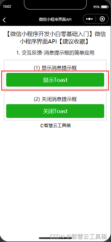
1.1.1 显示消息提示框
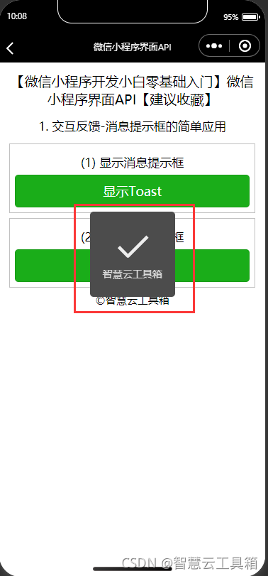
icon有效值说明如下: 、success:icon默认值,用于显示成功图标,title文本最多显示 7 个汉字长度; 2、loading:显示加载图标,此时 title 文本最多显示 7 个汉字长度; 3、none:不显示图标,此时 title 文本最多可显示两行(最低版本1.9.0)。
js文件
 data: {


  },
  showToast: function () {


    wx.showToast({


      title: '智慧云工具箱',
      duration: 70000
    })
  },
json文件
{

    "navigationBarTitleText": "智慧云工具箱-微信小程序界面API"

}
wxml文件
    <view class='demo-box'>
      <view class='title'>(1) 显示消息提示框</view>
      <button type="primary" bindtap="showToast">显示Toast</button>
    </view>
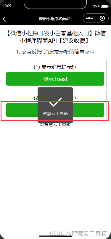
1.1.2 关闭消息提示框
虽然消息提示框可以在指定时间后自动消失,小程序也可以使用wx.hideToast()提前关闭消息提示框。
js文件
  hideToast: function () {


    wx.hideToast()
  },
<font color=#999AAA >json文件
```javascript
{"navigationBarTitleText": "智慧云工具箱-微信小程序界面API"

}
wxml文件
    <view class='demo-box'>
      <view class='title'>(2) 关闭消息提示框</view>
      <button type="primary" bindtap="hideToast">关闭Toast</button>
    </view>
  </view>
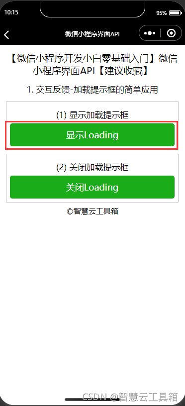
2. 加载提示框
2.2.1 显示加载提示框
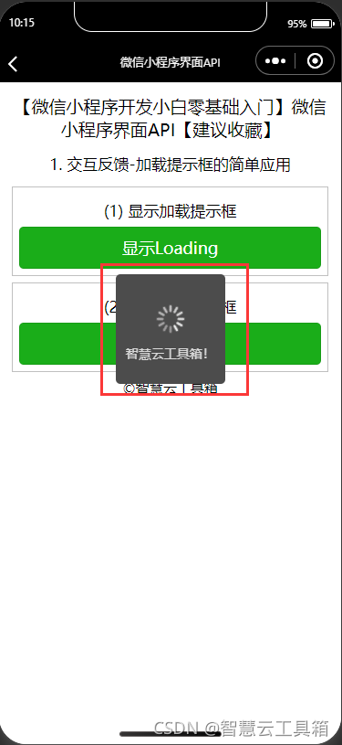
小程序使用wx.showLoading(OBJECT)显示loading提示框,该接口从基础库 1.1.0 开始支持,低版本需做兼容处理。其OBJECT参数说明如表所示| 参数 | 类型 | 必填 | 说明 |
|---|---|---|---|
| title | String | 是 | 提示的内容 |
| mask | Boolean | 否 | 是否显示透明蒙层,防止触摸穿透,默认: false |
| success | Function | 否 | 接口调用成功的回调函数 |
| fail | Function | 否 | 接口调用失败的回调函数 |
| complete | Function | 否 | 接口调用结束的回调函数(调用成功与否都执行) |
js文件
  showLoading: function () {


    wx.showLoading({


      title: '智慧云工具箱!'
    })
  },
json文件
{

    "navigationBarTitleText": "智慧云工具箱-微信小程序界面API"

}
wxml文件
<view class='demo-box'>
      <view class='title'>(1) 显示加载提示框</view>
      <button type="primary" bindtap="showLoading">显示Loading</button>
    </view>
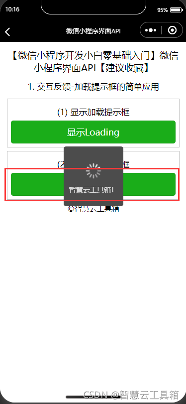
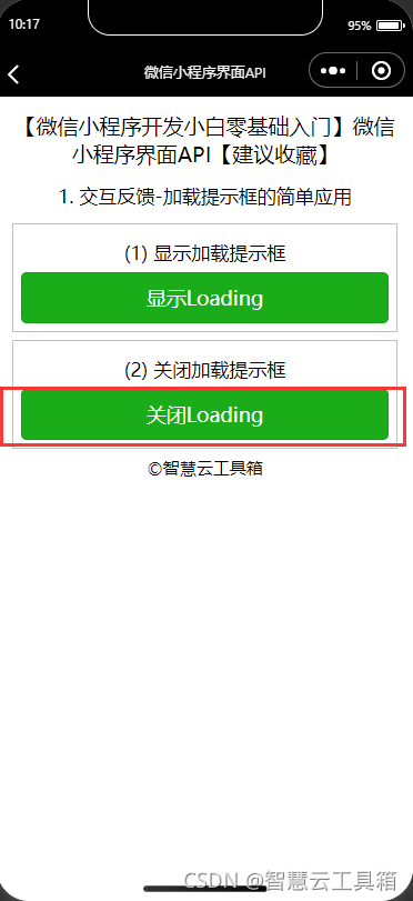
2.2.2 关闭加载提示框
小程序使用wx.hideLoading()关闭loading 提示框,该接口从基础库 1.1.0 开始支持,低版本需做兼容处理。
js文件
  hideLoading: function () {


    wx.hideLoading()
  },
json文件
{

    "navigationBarTitleText": "智慧云工具箱-微信小程序界面API"

}
wxml文件
<view class='demo-box'>
      <view class='title'>(2) 关闭加载提示框</view>
      <button type="primary" bindtap="hideLoading">关闭Loading</button>
    </view>
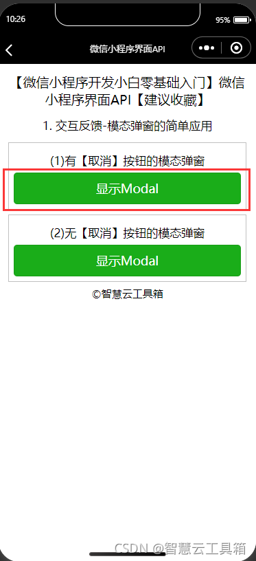
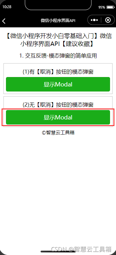
3. 模态弹窗
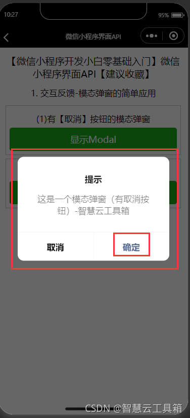
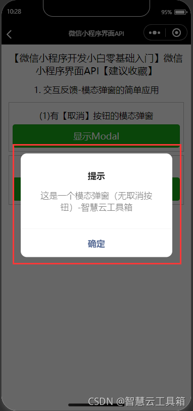
小程序使用wx.showModal(OBJECT)显示模态弹窗,其OBJECT参数说明如表所示。
| 参数 | 类型 | 必填 | 说明 |
|---|---|---|---|
| title | String | 是 | 提示的标题 |
| content | String | 是 | 提示的内容 |
| showCancel | Boolean | 否 | 是否显示取消按钮,默认为true |
| cancelText | String | 否 | 取消按钮的文字,默认为"取消",最多4个字符 |
| cancelColor | HexColor | 否 | 取消按钮的文字颜色,默认为"#000000" |
| confirmText | String | 否 | 确定按钮的文字,默认为"确定",最多4个字符 |
| confirmColor | HexColor | 否 | 确定按钮的文字颜色,默认为"#3CC51F" |
| success | Function | 否 | 接口调用成功的回调函数 |
| fail | Function | 否 | 接口调用失败的回调函数 |
| complete | Function | 否 | 接口调用结束的回调函数(调用成功与否都会执行) |
其中success返回参数说明如表所示。
| 参数 | 类型 | 说明 |
|---|---|---|
| confirm | Boolean | 为true 时,表示用户点击了确定按钮 |
| cancel | Boolean | 为true时,表示用户点击了取消(用于Android系统区分点击蒙层关闭还是点击取消按钮关闭) |
js文件
  showModal1:function(){


    wx.showModal({


      title: '提示',
      content: '这是一个模态弹窗(有取消按钮)-智慧云工具箱',
      success: function (res) {


        if (res.confirm) {


          console.log('确定按钮被点击')
        } else if (res.cancel) {


          console.log('取消按钮被点击')
        }
      }
    })
  },
  showModal2: function () {


    wx.showModal({


      title: '提示',
      content: '这是一个模态弹窗(无取消按钮)-智慧云工具箱',
      showCancel:false
    })
  },
json文件
{

    "navigationBarTitleText": "智慧云工具箱-微信小程序界面API"

}
wxml文件
 <view class='page-body'>
    <view class='demo-box'>
      <view class='title'>(1)有【取消】按钮的模态弹窗</view>
      <button type="primary" bindtap="showModal1">显示Modal</button>
    </view>
    <view class='demo-box'>
      <view class='title'>(2)无【取消】按钮的模态弹窗</view>
      <button type="primary" bindtap="showModal2">显示Modal</button>
    </view>
  </view>
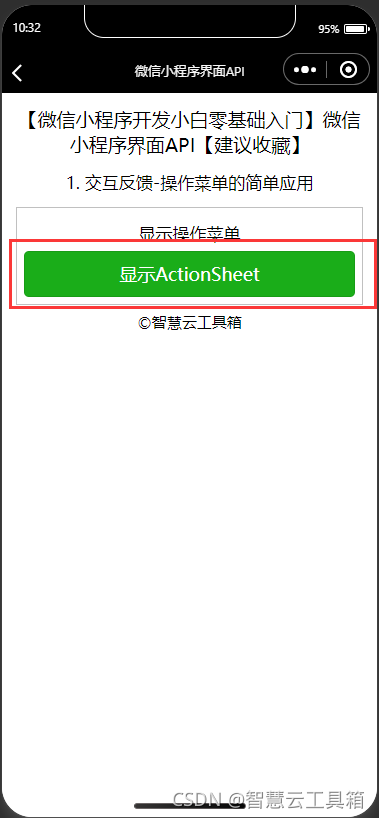
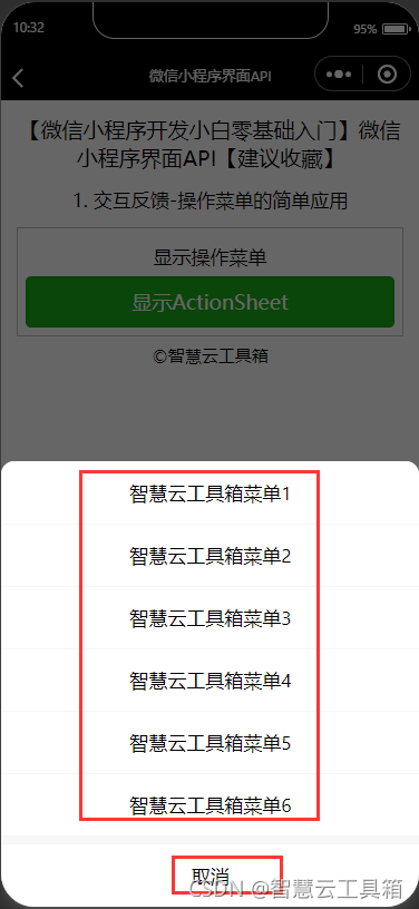
4. 操作菜单
小程序使用wx.showActionSheet(OBJECT)显示从底部浮出的操作菜单,其OBJECT参数说明如下表所示。| 参数 | 类型 | 必填 | 说明 |
|---|---|---|---|
| itemList | String Array | 是 | 按钮选项的文字数组,数组长度最大为6个 |
| itemColor | HexColor | 否 | 按钮选项的文字颜色,默认为"#000000" |
| success | Function | 否 | 接口调用成功的回调函数,详见返回参数说明 |
| fail | Function | 否 | 接口调用失败的回调函数 |
| complete | Function | 否 | 接口调用结束的回调函数(调用成功与否都执行) |
| 参数 | 类型 | 说明 |
|---|---|---|
| taplndex | Number | 用户点击的按钮,从上到下的顺序,从0开始 |
js文件
data: {


  },
  showActionSheet: function () {


    wx.showActionSheet({


      itemList: ['智慧云工具箱菜单1', '智慧云工具箱菜单2', '智慧云工具箱菜单3', '智慧云工具箱菜单4', '智慧云工具箱菜单5','智慧云工具箱菜单6'],
      success: function (res) {


        console.log(res.tapIndex)
      },
      fail: function (res) {


        console.log(res.errMsg)
      }
    })
  },
json文件
{

    "navigationBarTitleText": "智慧云工具箱-微信小程序界面API"

}
wxml文件
    <view class='demo-box'>
      <view class='title'>显示操作菜单</view>
      <button type="primary" bindtap="showActionSheet">显示ActionSheet</button>
    </view>
二、 导航条设置
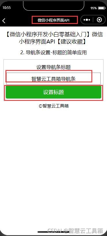
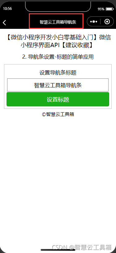
2.1 当前页面标题设置
小程序使用wx.setNavigationBarTitle(OBJECT)动态设置当前页面的标题,其OBJECT参数说明如表所示。| 参数 | 类型 | 必填 | 说明 |
|---|---|---|---|
| title | String | 是 | 页面标题 |
| success | Function | 否 | 接口调用成功的回调图数 |
| fail | Function | 否 | 接口调用失败的回调图数 |
| complete | Function | 否 | 接口调用结束的回调图数(调用成功与否都执行) |
js文件
  data: {


    title:''
  },
  titleInput: function (e) {


    this.setData({

    title:e.detail.value})
  },
  setTitle: function () {


    let title = this.data.title;
    wx.setNavigationBarTitle({


      title: title
    })
  },
json文件
{

    "navigationBarTitleText": "智慧云工具箱-微信小程序界面API"

}
wxml文件
<view class='demo-box'>
      <view class='title'>设置导航条标题</view>
      <input type='text' placeholder='请输入自定义的导航条标题' bindinput='titleInput'></input>
      <button type="primary" bindtap="setTitle">设置标题</button>
    </view>
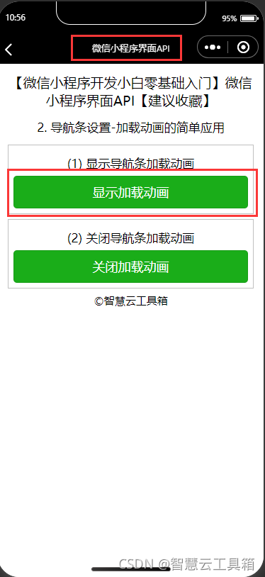
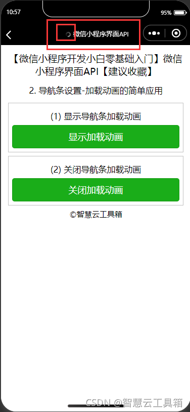
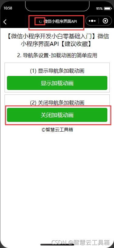
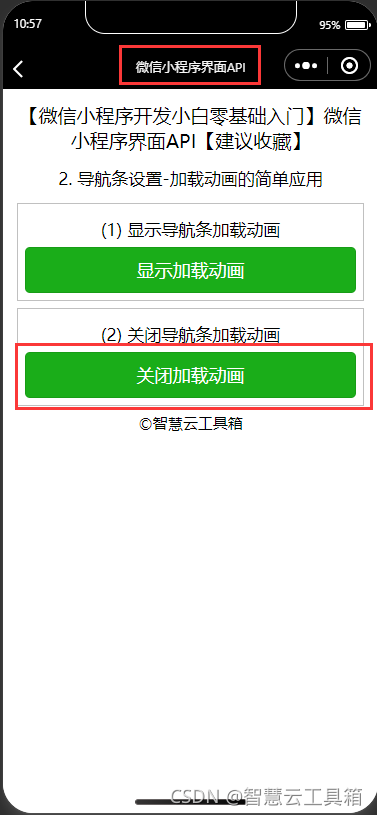
2.2 导航条加载动画
微信小程序分别使用: 1、wx.showNavigationBarLoading()在当前页面显示导航条加载动画 2、wx.hideNavigationBarLoading()在当前页面隐藏导航条加载动画。
js文件
 data: {


  },
  showLoading: function () {


    wx.showNavigationBarLoading()
  },
  hideLoading: function () {


    wx.hideNavigationBarLoading()
  },
json文件
{

    "navigationBarTitleText": "智慧云工具箱-微信小程序界面API"

}
wxml文件
 <view class='demo-box'>
      <view class='title'>(1) 显示导航条加载动画</view>
      <button type="primary" bindtap="showLoading">显示加载动画</button>
    </view>
    <view class='demo-box'>
      <view class='title'>(2) 关闭导航条加载动画</view>
      <button type="primary" bindtap="hideLoading">关闭加载动画</button>
    </view>
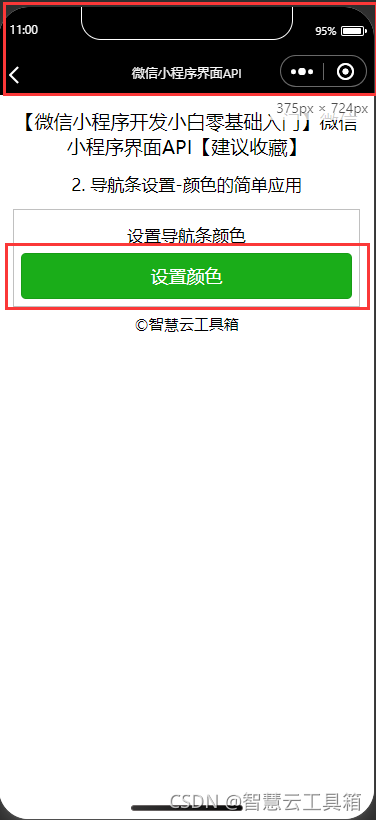
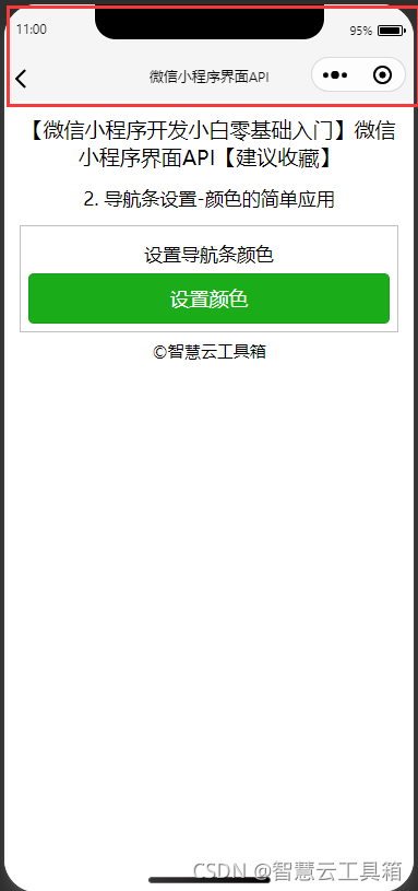
2.3 导航条颜色设置
微信小程序使用wx.setNavigationBarColor(OBJECT)设置导航条颜色,该接口从基础库 1.4.0 开始支持,低版本需做兼容处理。其OBJECT参数说明如表所示。| 参数 | 类型 | 必填 | 说明 |
|---|---|---|---|
| frontcolor | string | 是 | 前景颜色值,包括按钮、标题、状态栏的颜色,仅支持#fff和#000000(不支持颇色单词或缩写成#fff的形式) |
| backgroundcolor | string | 是 | 背景颜色值。有效值为十六进制颜色 |
| animation | Object | 否 | 动画效果 |
| animation.duration | Number | 否 | 动画变化时间,默认0,单位:笔秒 |
| animation.timingFune | string | 否 | 动画变化方式,默认linear |
| suecess | Function | 否 | 接口调用成功的回调函数。返回String类型参数errMsg表示调用结果 |
| fail | Function | 否 | 接口调用失败的回调函数 |
| complete | Function | 否 | 接口调用结束的回调函数(调用成功与否都执行) |
js文件
 setColor:function(){


    wx.setNavigationBarColor({


      frontColor: '#000000',
      backgroundColor: '#FFF',
      animation: {


        duration: 2000,
        timingFunc: 'easeInOut'
      }
    })
  },
json文件
{

    "navigationBarTitleText": "智慧云工具箱-微信小程序界面API"

}
wxml文件
 <view class='demo-box'>
      <view class='title'>设置导航条颜色</view>
      <button type="primary" bindtap="setColor">设置颜色</button>
    </view>
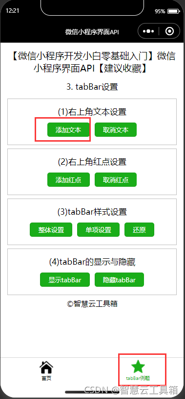
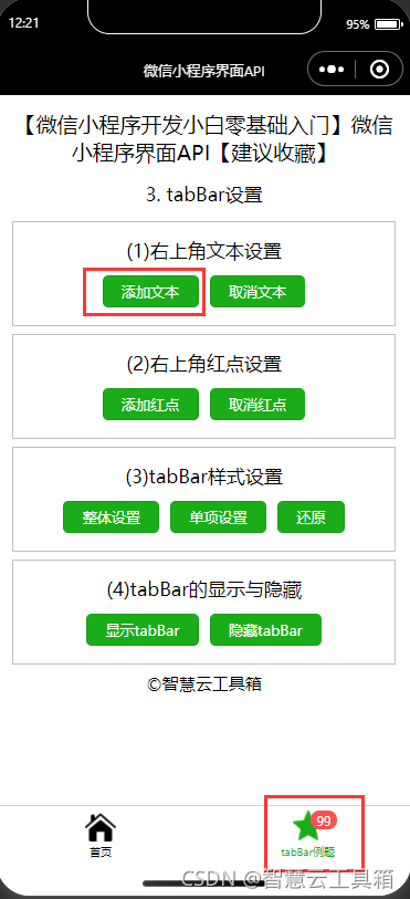
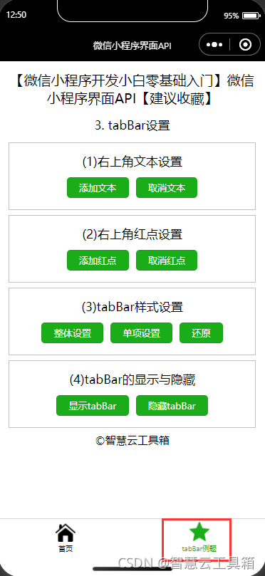
三、 tabBar设置
3.1 tabBar标记
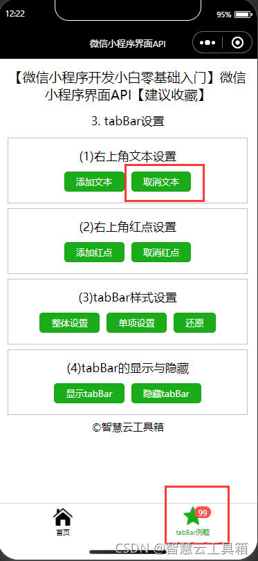
3.1.1 设置tabBar标记
小程序使用wx.setTabBarBadge(OBJECT)为tabBar某一项的右上角添加文本,该接口从基础库 1.9.0 开始支持,低版本需做兼容处理。 其OBJECT 参数说明如表所示。| 参数 | 类型 | 必填 | 说明 |
|---|---|---|---|
| indlex | Number | 是 | tabBar的哪—项,从左边算起,从O开始计数 |
| text | String | 是 | 显示的文本,超过3个字符则显示成“…" |
| success | Function | 否 | 接口调用成功的回调函数 |
| fail | Eunction | 否 | 查接口调用失败的回调函数 |
| complete | Function | 否 | 接口调用结束的回调函数(调用成功与否都执行) |
js文件
  //设置文本
  setText: function () {


    wx.setTabBarBadge({


      index: 1,
      text: '99'
    })
  },
json文件
{

    "navigationBarTitleText": "智慧云工具箱-微信小程序界面API"

}
wxml文件
    <view class='demo-box'>
      <view class='title'>右上角文本设置</view>
      <button type="primary" size='mini' bindtap="setText">添加文本</button>
    </view>
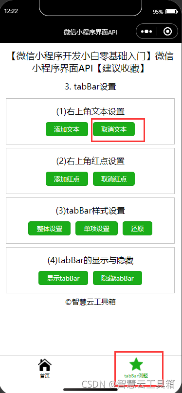
3.1.2 移除tabBar标记
小程序使用wx.removeTabBarBadge(OBJECT)移除 tabBar 某一项右上角的文本,该接口从基础库 1.9.0 开始支持,低版本需做兼容处理。
其OBJECT 参数说明如表所示。
| 参数 | 类型 | 必填 | 说明 |
|---|---|---|---|
| index | Number | 是 | tabBar的哪—项,从左边算起,从0开始计数 |
| success | Function | 否 | 接口调用成功的回调函数 |
| fail | Function | 否 | 接口调用失败的回调函数 |
| complete | Function | 否 | 接口调用结束的回调函数((调用成功与否都执行) |
js文件
  //取消文本
  removeText: function () {


    wx.removeTabBarBadge({


      index: 1
    })
  },
json文件
{

    "navigationBarTitleText": "智慧云工具箱-微信小程序界面API"

}
wxml文件
    <view class='demo-box'>
      <view class='title'>右上角文本设置</view>
      <button type="primary" size='mini' bindtap="removeText">取消文本</button>
    </view>
3.2 tabBar红点
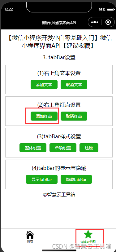
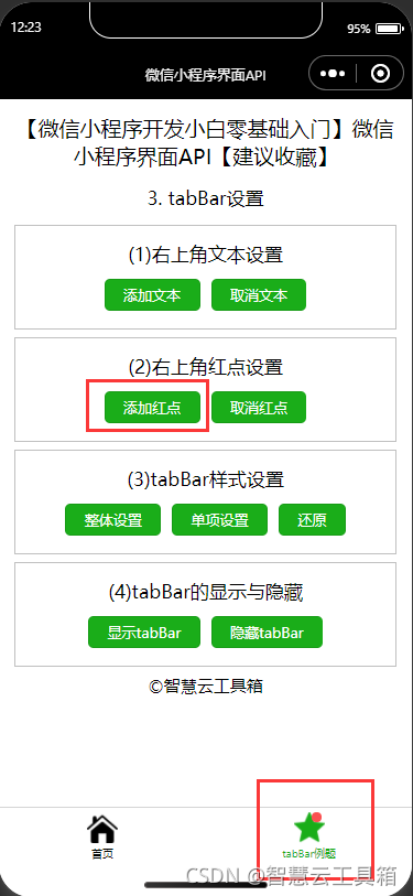
3.2.1 显示tabBar红点
小程序使用wx.showTabBarRedDot(OBJECT)显示tabBar某一项的右上角的红点,该接口从基础库 1.9.0 开始支持,低版本需做兼容处理。
其OBJECT 参数说明如表所示。
| 参数 | 类型 | 必填 | 说明 |
|---|---|---|---|
| index | Number | 是 | tabBar的哪—项,从左边算起,从0开始计数 |
| success | Function | 否 | 接口调用成功的回调函数 |
| fail | Function | 否 | 接口调用失败的回调函数 |
| complete | Function | 否 | 接口调用结束的回调函数((调用成功与否都执行) |
js文件
  //显示红点
  showRedDot: function () {


    wx.showTabBarRedDot({


      index: 1,
    })
  },
json文件
{

    "navigationBarTitleText": "智慧云工具箱-微信小程序界面API"

}
wxml文件
    <view class='demo-box'>
      <view class='title'>右上角红点设置</view>
      <button type="primary" size='mini' bindtap="showRedDot">添加红点</button>
    </view>
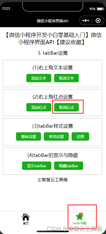
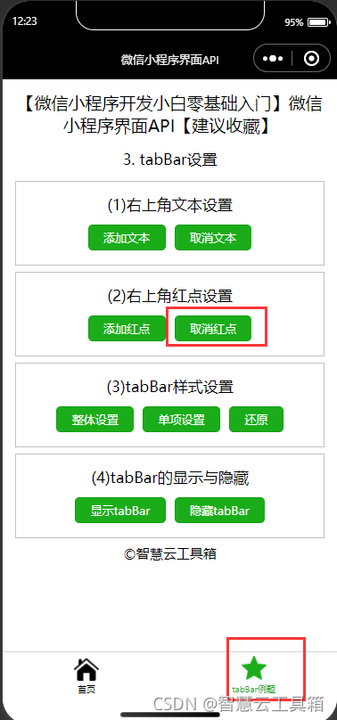
3.2.2 隐藏tabBar红点
小程序使用wx.hideTabBarRedDot(OBJECT)隐藏tabBar某一项的右上角的红点,该接口从基础库 1.9.0 开始支持,低版本需做兼容处理。 其OBJECT 参数说明如表所示。| 参数 | 类型 | 必填 | 说明 |
|---|---|---|---|
| index | Number | 是 | tabBar的哪—项,从左边算起,从0开始计数 |
| success | Function | 否 | 接口调用成功的回调函数 |
| fail | Function | 否 | 接口调用失败的回调函数 |
| complete | Function | 否 | 接口调用结束的回调函数((调用成功与否都执行) |
js文件
  //隐藏红点
  hideRedDot: function () {


    wx.hideTabBarRedDot({


      index: 1,
    })
  },
json文件
{

    "navigationBarTitleText": "智慧云工具箱-微信小程序界面API"

}
wxml文件
    <view class='demo-box'>
      <view class='title'>右上角红点设置</view>
      <button type="primary" size='mini' bindtap="hideRedDot">取消红点</button>
    </view>
3.3 onTabItemTap
在小程序中,点击 tabBar中的任一tab时会触发onTabItemTap(item),该函数从基础库1.9.0开始支持,低版本需做兼容处理3.4 设置tabBar样式
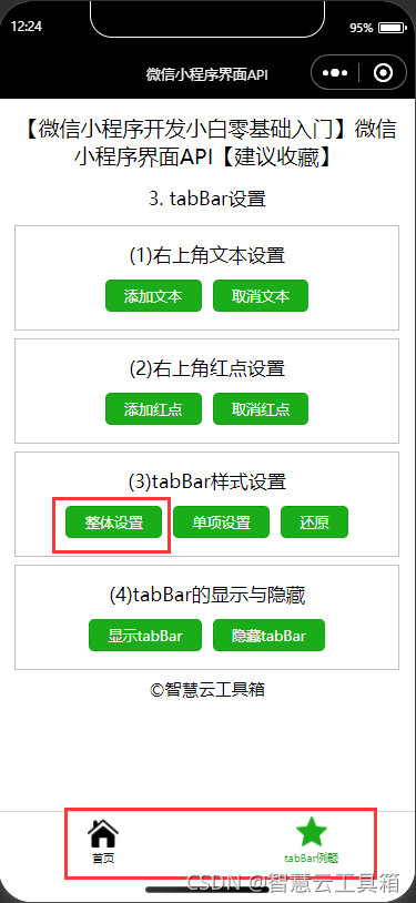
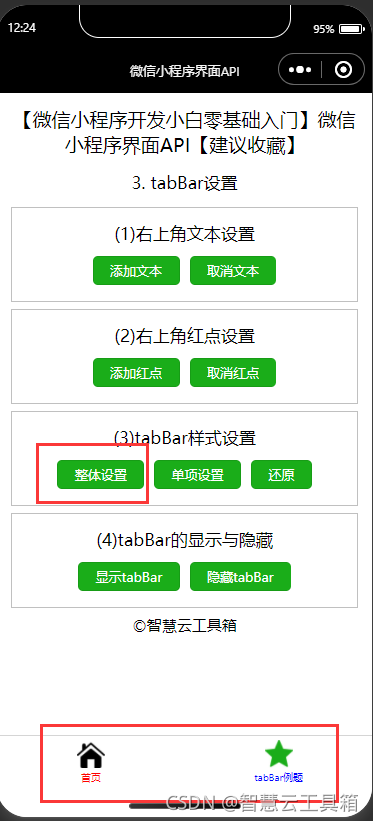
3.4.1 设置tabBar整体样式
小程序使用wx.setTabBarStyle(OBJECT)动态设置tabBar的整体样式,该接口从基础库 1.9.0 开始支持,低版本需做兼容处理。 其OBJECT 参数说明如表所示。| 参数 | 类型 | 说明 |
|---|---|---|
| color | HexColor | tab上的文字默认颜色 |
| selectedcolor | Hexcolor | tab上的文字选中时的颜色 |
| backgroundColor | HexColor | tab的背景色 |
| borderstyle | String | tabbar上边框的颜色,仅支持black/white |
| success | Function | 接口调用成功的回调函数 |
| fail | Function | 接口调用失败的回调函数 |
| complete | Function | 接口调用结束的回调函数(调用成功与否都执行) |
js文件
  //设置tabBar整体样式
  setBarStyle: function () {


    wx.setTabBarStyle({


      color: '#FF0000',
      selectedColor: '#0000FF'
    })
  },
json文件
{

    "navigationBarTitleText": "智慧云工具箱-微信小程序界面API"

}
wxml文件
    <view class='demo-box'>
      <view class='title'>tabBar样式设置</view>
      <button type="primary" size='mini' bindtap="setBarStyle">整体设置</button>
      <button type="primary" size='mini' bindtap="resetBarStyle">还原</button>
    </view>
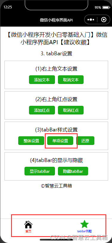
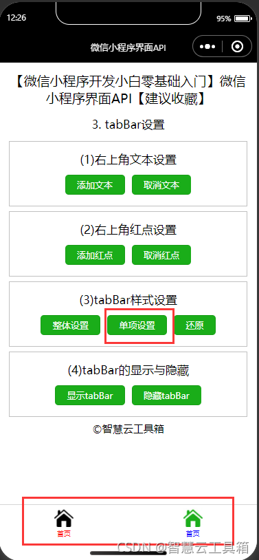
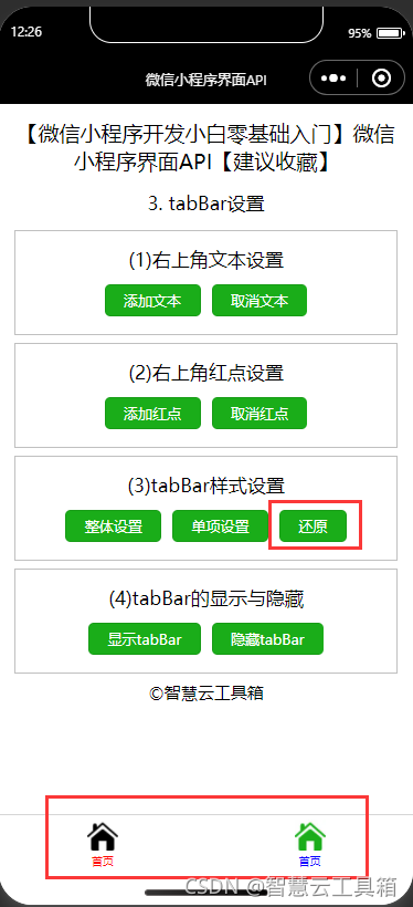
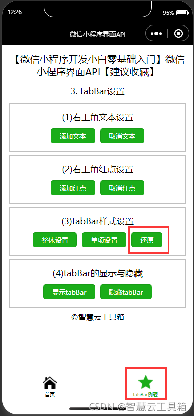
3.4.2 设置tabBar单项样式
小程序使用wx.setTabBarItem(OBJECT)动态设置tabBar某一项的内容,该接口从基础库 1.9.0 开始支持,低版本需做兼容处理。 其OBJECT 参数说明如表所示。| 参数 | 类型 | 必填 | 说明 |
|---|---|---|---|
| index | Number | 是 | tabBar的哪一项,从左边算起 |
| text | String | 否 | tab 上按钮文字 |
| iconPath | String | 否 | 图片路径,icon大小限制为40kb,建议尺寸为81px * 81px,当postion为top时,此参数无效,不支持网络图片 |
| selectedlconPath | String | 否 | 选中时的图片路径,icon大小限制为40kb,建议尺寸为81px * 81px,当postion为top 时,此参数无效 |
| success | Function | 否 | 接口调用成功的回调函数 |
| fail | Function | 否 | 接口调用失败的回调函数 |
| complete | Function | 否 | 接口调用结束的回调函数(调用成功与否都执行) |
js文件
  //设置tabBar单项样式
  setBarItemStyle: function () {


    wx.setTabBarItem({


      index: 1,
      text: '首页',
      iconPath: 'http://inews.gtimg.com/newsapp_ls/0/14103180726/0',
      selectedIconPath: 'http://inews.gtimg.com/newsapp_ls/0/14103181160/0'
    })
  },
    //还原tabBar样式
  resetBarStyle: function () {


    wx.setTabBarItem({


      index: 1,
      text: 'tabBar例题',
      iconPath: 'http://inews.gtimg.com/newsapp_ls/0/14103182831/0',
      selectedIconPath: 'http://inews.gtimg.com/newsapp_ls/0/14103183127/0'
    })

    wx.setTabBarStyle({


      color: '#000000',
      selectedColor: '#1AAD19'
    })
  },
json文件
{

    "navigationBarTitleText": "智慧云工具箱-微信小程序界面API"

}
wxml文件
    <view class='demo-box'>
      <view class='title'>tabBar样式设置</view>
      <button type="primary" size='mini' bindtap="setBarItemStyle">单项设置</button>
      <button type="primary" size='mini' bindtap="resetBarStyle">还原</button>
    </view>
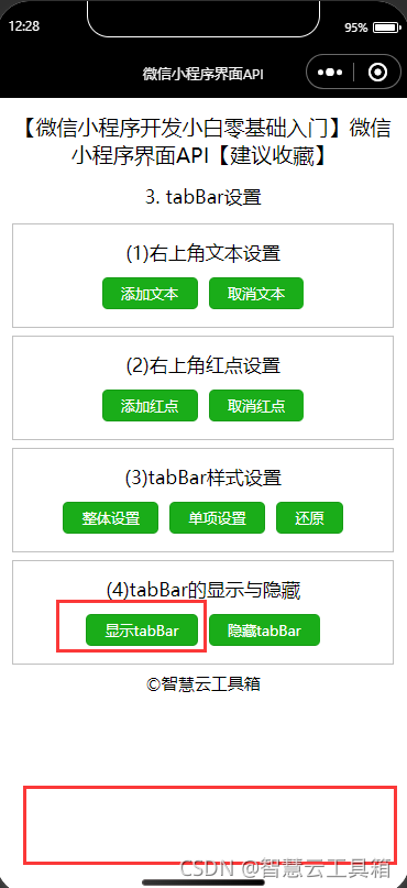
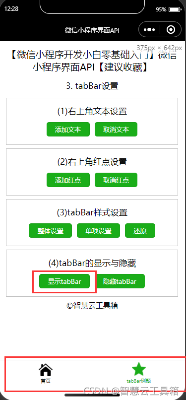
3.5 tabBar
3.5.1 显示tabBar
小程序使用wx.showTabBar(OBJECT)显示 tabBar,该接口从基础库 1.9.0 开始支持,低版本需做兼容处理。其OBJECT 参数说明如表所示。| 参数 | 类型 | 必填 | 说明 |
|---|---|---|---|
| animation | Boolean | 否 | |
| success | Function | 否 | 接口调用成功的回调函数 |
| fail | Function | 否 | 接口调用失败的回调函数 |
| complete | Function | 否 | 接口调用结束的回调函数〔调用成功与否都执行) |
js文件
  //显示tabBar
  showTabBar: function () {


    wx.showTabBar({

    })

  },
json文件
{

    "navigationBarTitleText": "智慧云工具箱-微信小程序界面API"

}
wxml文件
    <view class='title'>tabBar的显示与隐藏</view>
      <button type="primary" size='mini' bindtap="showTabBar">显示tabBar</button>
    </view>
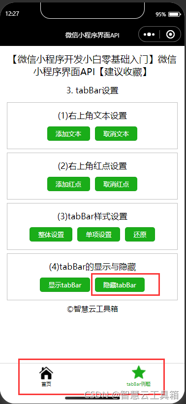
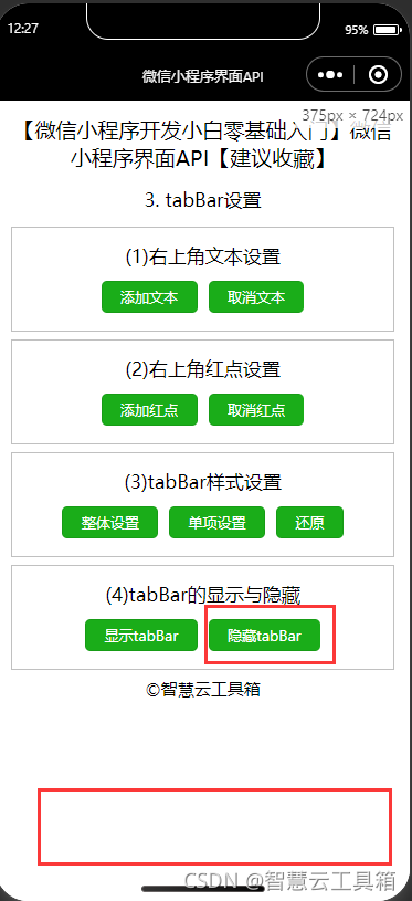
3.5.2 隐藏tabBar
小程序使用wx.hideTabBar(OBJECT)隐藏 tabBar,该接口从基础库1.9.0 开始支持,低版本需做兼容处理。其OBJECT 参数说明如表所示。| 参数 | 类型 | 必填 | 说明 |
|---|---|---|---|
| animation | Boolean | 否 | |
| success | Function | 否 | 接口调用成功的回调函数 |
| fail | Function | 否 | 接口调用失败的回调函数 |
| complete | Function | 否 | 接口调用结束的回调函数〔调用成功与否都执行) |
js文件
  //隐藏tabBar
  hideTabBar: function () {


    wx.hideTabBar({

    })
  },
json文件
{

    "navigationBarTitleText": "智慧云工具箱-微信小程序界面API"

}
wxml文件
     <view class='title'>tabBar的显示与隐藏</view>
         <button type="primary" size='mini' bindtap="hideTabBar">隐藏tabBar</button>
    </view>
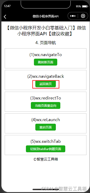
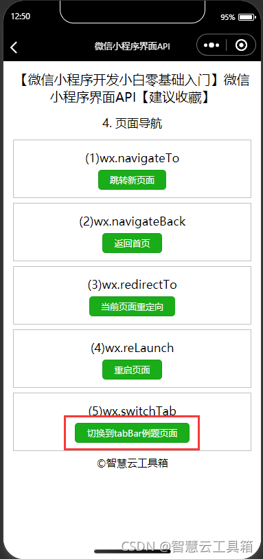
四、 页面导航
4.1 跳转新页面
小程序使用wx.navigateTo(OBJECT)保留当前页面,并在当前页面上方打开应用内指定的新页面。这种打开方式可以点击新页面左上角的返回按钮或使用wx.navigateBack接口返回到原页面。其OBJECT参数说明如表所示。| 参数 | 类型 | 必填 | 说明 |
|---|---|---|---|
| url | String | 是 | 需要跳转的应用内非 tabBar的页面的路径,路径后可以带参数。参数与路径之间使用?分隔,参数键与参数值用=相连,多个参数用&分隔;如’path?key=value&key2=value2&…keyN=valueN’ |
| success | Function | 否 | 接口调用成功的回调函数 |
| fail | Function | 否 | 接口调用失败的回调函数 |
| complete | Function | 否 | 接口调用结束的回调函数(调用成功与否都会执行) |
js文件
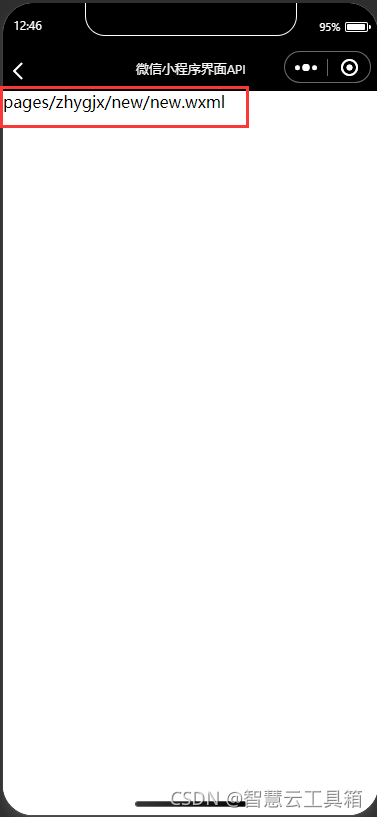
navigateTo: function () {


    wx.navigateTo({


      url: '/pages/zhygjx/new/new',
    })
  },
json文件
{

    "navigationBarTitleText": "智慧云工具箱-微信小程序界面API"

}
wxml文件
    <view class='demo-box'>
      <view class='title'>(1)wx.navigateTo</view>
      <button type="primary" size='mini' bindtap="navigateTo">跳转新页面</button>
    </view>
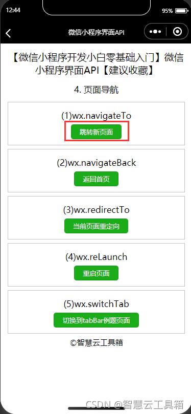
4.2 返回指定页面
小程序使用wx.navigateBack(OBJECT)关闭当前页面,返回上一页面或多级页面。 OBJECT 参数说明如表所示。| 参数 | 类型 | 必填 | 说明 |
|---|---|---|---|
| delta | Number | 1 | 返回的页面数,如果delta大于现有页面数,则返回到首页 |
js文件
  navigateBack:function() {


    wx.navigateBack({

    })
  },
json文件
{

    "navigationBarTitleText": "智慧云工具箱-微信小程序界面API"

}
wxml文件
    <view class='demo-box'>
      <view class='title'>(2)wx.navigateBack</view>
      <button type="primary" size='mini' bindtap="navigateBack">返回首页</button>
    </view>
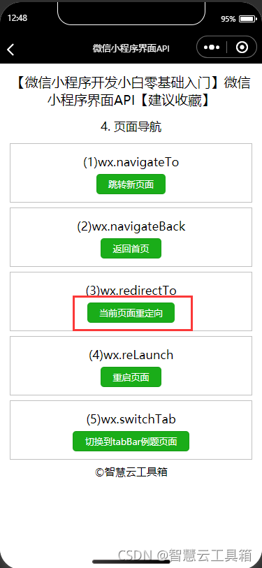
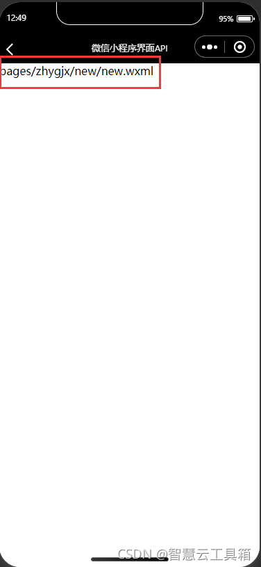
4.3 当前页面重定向
小程序使用wx.redirectTo(OBJECT)关闭当前页面内容,重定向到应用内的某个页面。 OBJECT 参数说明如表所示。| 参数 | 类型 | 必填 | 说明 |
|---|---|---|---|
| url | String | 是 | 需要跳转的应用内非tabBar的页面的路径,路径后可以带参数。参数与路径之间使用?分隔,参数键与参数值用=相连,不同参数用&分隔;如 ‘path?key=value&key2=value2’ |
| success | Function | 否 | 接口调用成功的回调函数 |
| fail | Function | 否 | 接口调用失败的回调函数 |
| complete | Function | 否 | 接口调用结束的回调函数(调用成功与否都执行) |
js文件
  redirectTo: function () {


    wx.redirectTo({


      url: '/pages/zhygjx/new/new',
    })
  },
json文件
{

    "navigationBarTitleText": "智慧云工具箱-微信小程序界面API"

}
wxml文件
    <view class='demo-box'>
      <view class='title'>(3)wx.redirectTo</view>
      <button type="primary" size='mini' bindtap="redirectTo">当前页面重定向</button>
    </view>
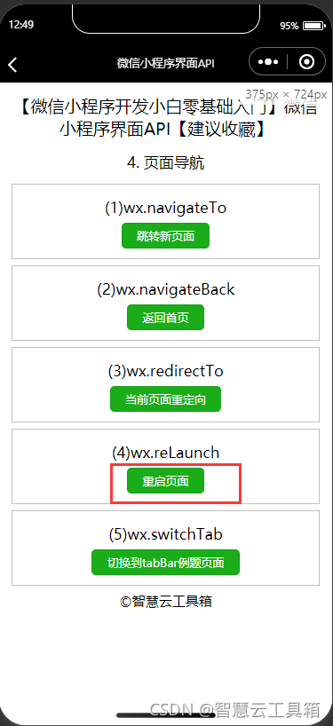
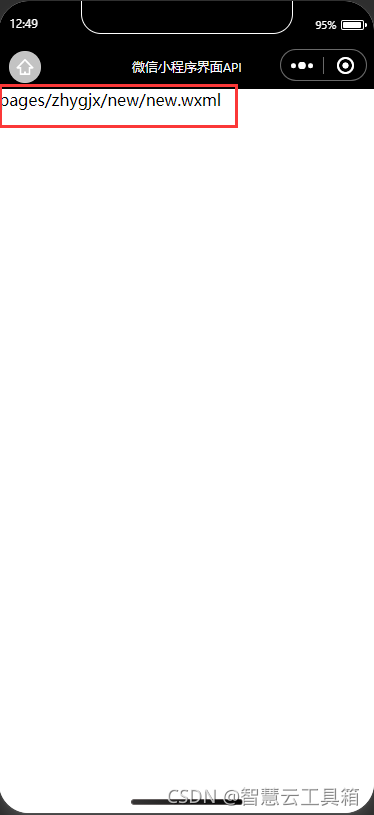
4.4 重启页面
小程序使用wx.reLaunch(OBJECT)关闭所有页面,重新打开到应用内的某个页面。该接口从基础库 1.1.0 开始支持,低版本需做兼容处理。 其OBJECT 参数说明如表所示。| 参数 | 类型 | 必填 | 说明 |
|---|---|---|---|
| url | String | 是 | ―需要跳转的应用内页面路径,路径后可以带参数。参数与路径之间使用?分隔,参数键与参数值用=相连,不同参数用&分隔;如’path?key=value&key2=value2’,如果跳转的页面路径是tabBar页面则不能带参数 |
| success | Function | 否 | 接口调用成功的回调函数 |
| fail | Function | 否 | 接口调用失败的回调函数 |
| complete | Function | 否 | 接口调用结束的回调函数(调用成功与否都执行) |
js文件
  reLaunch:function(){


    wx.reLaunch({


      url: '/pages/zhygjx/new/new',
    })
  },
json文件
{

    "navigationBarTitleText": "智慧云工具箱-微信小程序界面API"

}
wxml文件
    <view class='demo-box'>
      <view class='title'>(4)wx.reLaunch</view>
      <button type="primary" size='mini' bindtap="reLaunch">重启页面</button>
    </view>
4.5 切换tabBar页面
小程序使用wx.switchTab(OBJECT)跳转到指定的tabBar页面,并关闭其他页面。 其OBJECT 参数说明如表所示。| 参数 | 类型 | 必填 | 说明 |
|---|---|---|---|
| url | String | 是 | 需要跳转的tabBar页面的路径(需在app.,json的tabBar字段定义的页面),路径后不能带参数 |
| success | Function | 否 | 接调用成功的回调函数 |
| fail | Function | 否 | 接口调用失败的回调函数 |
| complete | Function | 否 | 接口调用结束的回调函数(调用成功与否都执行) |
js文件
  switchTab: function () {


    wx.switchTab({


      url: '/pages/zhygjx/tabBar/tabBar',
    })
  },
json文件
{

    "navigationBarTitleText": "智慧云工具箱-微信小程序界面API"

}
wxml文件
    <view class='demo-box'>
      <view class='title'>(5)wx.switchTab</view>
      <button type="primary" size='mini' bindtap="switchTab">切换到tabBar例题页面</button>
    </view>
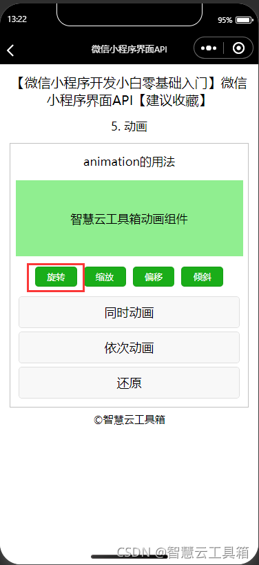
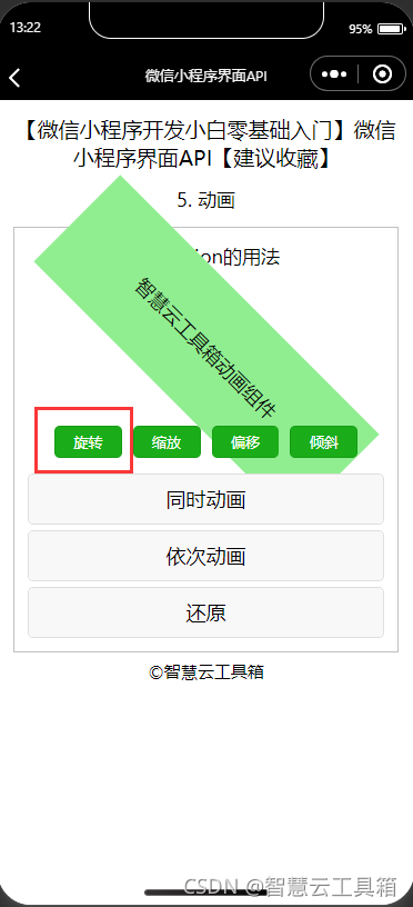
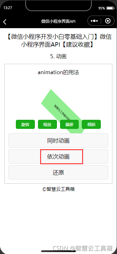
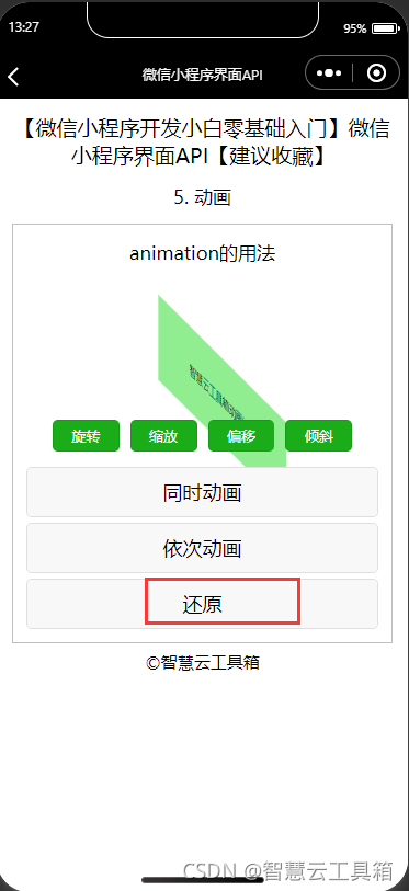
五、 动画
 小程序组件拥有animation属性来显示动画,其动画效果实现需要三个步骤:
 (1)创建动画实例;
 (2)通过调用实例的方法来描述动画;
 (3)通过动画实例的export方法导出动画数据传递给组件的animation属性。
5.1 动画实例
小程序使用wx.createAnimation(OBJECT)可以创建一个动画实例animation。 其OBJECT参数说明如表所示。| 参数 | 类型 | 必填 | 默认值 | 说明 |
|---|---|---|---|---|
| duration | lnteger | 否 | 400 | 动画持续时间,单位ms |
| timingFunetion | String | 否 | “linear” | 定义动画的效果 |
| delay | lnteger | 否 | 0 | 动画延迟时间,单位ms |
| transformOrigin | string | 否 | "50%50%0 | 设置transform-origin |
1、linear:动画从头到尾的速度是相同的;
2、ease:动画以低速开始,然后加快,在结束前变慢;
3、ease-in:动画以低速开始;
4、ease-in-out:动画以低速开始和结束;
5、ease-out:动画以低速结束;
6、step-start:动画第一帧就跳至结束状态直到结束;
7、step-end:动画一直保持开始状态,最后一帧跳到结束状态。
5.2 动画描述
动画实例可以调用animation对象的相关方法来描述动画,调用结束后会返回自身。animation对象的方法可以分为6类,分别用于控制组件的:
1、样式
2、旋转
3、缩放
4、偏移
5、倾斜
6、矩阵变形
5.2.1 控制组件样式的方法
控制组件样式的方法说明如下表所示。| 方法 | 参数 | 说明 |
|---|---|---|
| opacity | value | 透明庶,参数范围0~1 |
| backgroundcolor | color | 颜色值 |
| width | length | 长度值,如果传入Number则默认使用px,可传入其他自定义单位的长度值 |
| height | length | 长度值,如果传入 Number则默认使用px,可传入其他自定义单位的长度值 |
| top | length | 长度值,如果传入Number则默认使用px。可传入其他自定义单位的长度值 |
| left | length | 长度值,如果传入Number则默认使用px,可传入其他自定义单位的长度值 |
| bottom | length | 长度值,如果传入Number则默认使用px,可传入其他自定义单位的长度值 |
| right | length | 长度值,如果传入Number则默认使用px。可传入其他自定义单位的长度值 |
5.2.2 控制组件旋转的方法
控制组件旋转的方法说明如下表所示。| 方法 | 参数 | 说明 |
|---|---|---|
| rotate | deg | deg的范围-180~180,从原点顺时针旋转一个deg角度 |
| rotatex | deg | deg的范围-180~180,在X轴旋转一个deg角度 |
| rotateY | deg | deg的范围-180~180,在Y轴旋转一个deg角度 |
| rotatez | deg | deg的范围-180~180,在Z轴旋转一个deg角度 |
| rotatesd | (xy,z,deg) | 同transform-function rotate3d |
js文件
  //旋转
  rotate: function () {


    this.animation.rotate(45).step()
    this.setData({

     animation: this.animation.export() })
  },
json文件
{

    "navigationBarTitleText": "智慧云工具箱-微信小程序界面API"

}
wxml文件
<button type="primary" size='mini' bindtap="rotate">旋转</button>
wxss文件
.animation-view{


  width: 660rpx;
  height: 220rpx;
  background-color: lightgreen;
  margin: 20rpx auto;
  line-height: 220rpx;
}

button{


  margin: 10rpx;
}
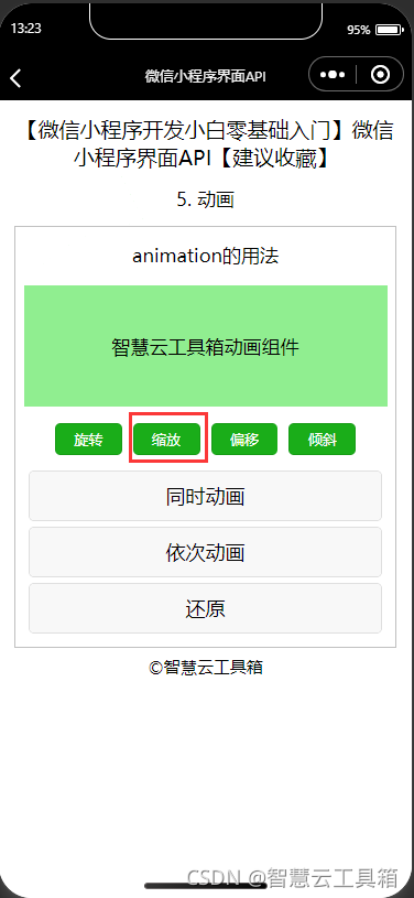
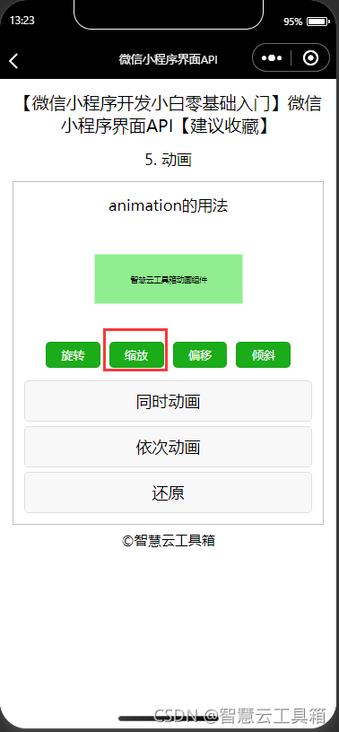
5.2.3 控制组件缩放的方法
控制组件缩放的方法说明如下表所示。| 方法 | 参数 | 说明 |
|---|---|---|
| scale | sx.[sy] | 一个参数时,表示在X轴、Y轴同时缩放sx倍数;两个参数时表示在X轴缩放sx倍数,在Y轴缩放sy倍数 |
| scalex | sx | 在X轴缩放sx倍数 |
| scaleY | sy | 在Y轴缩放sy倍数 |
| scalez | sz | 在Z轴缩放sy倍数 |
| scale3d | (sx,sy,sz) | 在X轴缩放sx倍数,在Y轴缩放sx倍数,在Z轴缩放sz倍数 |
js文件
  //缩放
  scale: function () {


    this.animation.scale(0.5).step()
    this.setData({

     animation: this.animation.export() })
  },
json文件
{

    "navigationBarTitleText": "智慧云工具箱-微信小程序界面API"

}
wxml文件
<button type="primary" size='mini' bindtap="scale">缩放</button>
wxss文件
.animation-view{


  width: 660rpx;
  height: 220rpx;
  background-color: lightgreen;
  margin: 20rpx auto;
  line-height: 220rpx;
}

button{


  margin: 10rpx;
}
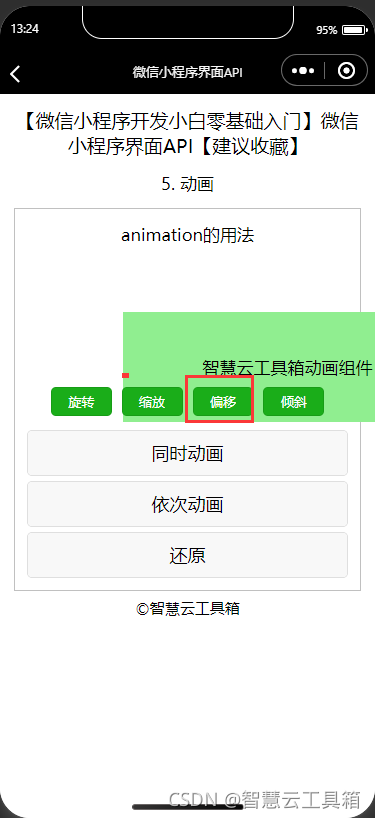
5.2.4 控制组件偏移的方法
控制组件偏移的方法说明如下表所示。| 方法 | 参数 | 说明 |
|---|---|---|
| translate | tx.[sy] | 一个参数时,表示在X轴、Y轴同时缩放tx倍数;两个参数时表示在X轴缩放tx倍数,在Y轴缩放sy倍数 |
| translateX | tx | 在X轴缩放tx倍数 |
| translateY | ty | 在Y轴缩放ty倍数 |
| translateZ | tz | 在Z轴缩放ty倍数 |
| translatesd | (tx,ty,tz) | 在X轴缩放sx倍数,在Y轴缩放tx倍数,在Z轴缩放tz倍数 |
js文件
  //偏移
  translate: function () {


    this.animation.translate(100, 50).step()
    this.setData({

     animation: this.animation.export() })
  },
json文件
{

    "navigationBarTitleText": "智慧云工具箱-微信小程序界面API"

}
wxml文件
<button type="primary" size='mini' bindtap="translate">偏移</button>
wxss文件
.animation-view{


  width: 660rpx;
  height: 220rpx;
  background-color: lightgreen;
  margin: 20rpx auto;
  line-height: 220rpx;
}

button{


  margin: 10rpx;
}

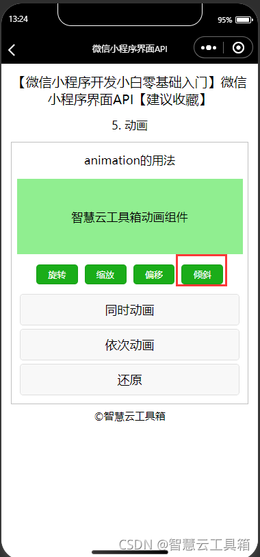
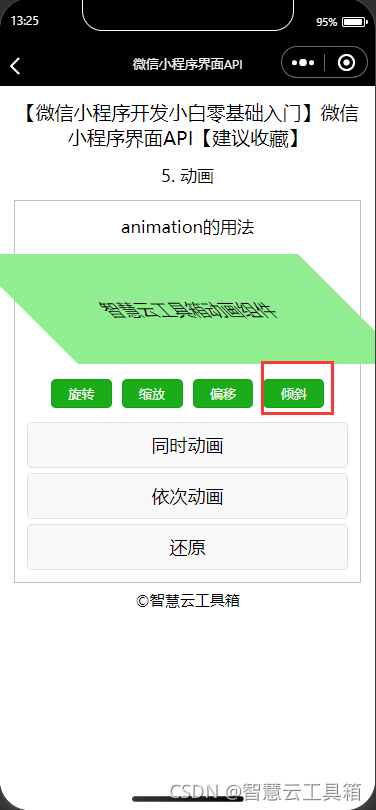
5.2.5 控制组件倾斜的方法
控制组件倾斜的方法说明如下表所示。| 方法 | 参数 | 说明 |
|---|---|---|
| skew | ax,[ay] | 参数范围-180~180;一个参数时,Y轴坐标不变,X轴坐标延顺时针倾斜ax度;两个参数时,分别在X轴倾斜ax度,在Y轴倾斜ay度 |
| skewx | ax | 参数范围-180~180;Y轴坐标不变,X轴坐标延顺时针倾斜ax度 |
| skewY | ay | 参数范围-180~180;X轴坐标不变,Y轴坐标延顺时针倾斜ay度 |
js文件
  //倾斜
  skew: function () {


    this.animation.skewX(45).step()
    this.setData({

     animation: this.animation.export() })
  },
json文件
{

    "navigationBarTitleText": "智慧云工具箱-微信小程序界面API"

}
wxml文件
<button type="primary" size='mini' bindtap="skew">倾斜</button>
wxss文件
.animation-view{


  width: 660rpx;
  height: 220rpx;
  background-color: lightgreen;
  margin: 20rpx auto;
  line-height: 220rpx;
}

button{


  margin: 10rpx;
}
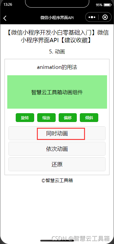
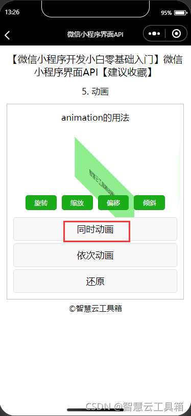
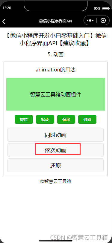
5.2.6 控制组件矩阵变形的方法
控制组件矩阵变形的方法说明如下表所示。| 方法 | 参数 | 说明 |
|---|---|---|
| matrix | (a,b,c,d,tx,ty) | 同transform-function matrix |
| matrix3d | 同transform-function matrix3d |
js文件
  //同时动画
  sync: function () {


    this.animation.rotate(45).scale(0.5).translate(100, 50).skewX(45).step()
    this.setData({

     animation: this.animation.export() })
  },
  //依次动画
  queue: function () {


    this.animation.rotate(45).step().scale(0.5).step().translate(100, 50).step().skewX(45).step()
    this.setData({

     animation: this.animation.export() })
  },
  //还原
  reset: function () {


    this.animation.rotate(0).scale(1).translate(0, 0).skewX(0).step()
    this.setData({

     animation: this.animation.export() })
  },
json文件
{

    "navigationBarTitleText": "智慧云工具箱-微信小程序界面API"

}
wxml文件
      <button bindtap="sync">同时动画</button>
      <button bindtap="queue">依次动画</button>
      <button bindtap="reset">还原</button>
wxss文件
.animation-view{


  width: 660rpx;
  height: 220rpx;
  background-color: lightgreen;
  margin: 20rpx auto;
  line-height: 220rpx;
}

button{


  margin: 10rpx;
}
5.3 动画导出
在声明完animation对象并描述了动画方法后,还需要使用export()将该对象导出到组件的animation属性中,方可使得组件进行动画效果。js文件
//1. 创建animation对象
var animation = wx.createAnimation()
//2. 描述第一个动画
animation.scale(2).step()
//3.导出至组件的动画属性
this.setData({

    animationData:animation.export()})
//4. 描述第二个动画
animation.rotate(180).step()
//5.导出至组件的动画属性
this.setData({

    animationData:animation.export()})
json文件
{

    "navigationBarTitleText": "智慧云工具箱-微信小程序界面API"

}
wxml文件
<view animation="{

    {animationData}}"></view>

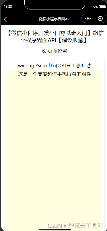
六、 页面位置
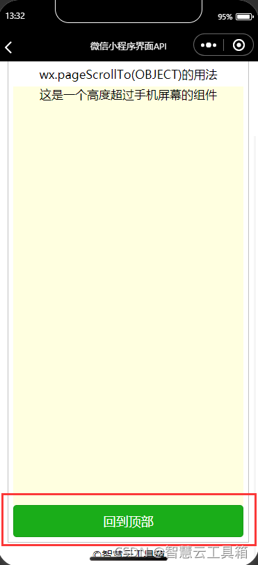
小程序使用wx.pageScrollTo(OBJECT)将页面滚动到目标位置,该接口从基础库 1.4.0 开始支持,低版本需做兼容处理。其OBJECT参数说明如表所示。| 参数 | 类型 | 必填 | 说明 |
|---|---|---|---|
| serollTop | Number | 是 | 滚动到页面的目标位置(单位px) |
| duration | Number | 否 | 滚动动画的时长。默认30oms,单位ms |
js文件
  //回到顶部
  backToTop:function(){


    wx.pageScrollTo({


      scrollTop: 0,
      duration:2000
    })
  },
json文件
{

    "navigationBarTitleText": "智慧云工具箱-微信小程序界面API"

}
wxml文件
    <view class='demo-box'>
      <view class='title'>wx.pageScrollTo(OBJECT)的用法</view>
      <view class='test'>这是一个高度超过手机屏幕的组件</view>
      <button type="primary" bindtap="backToTop">回到顶部</button>
    </view>
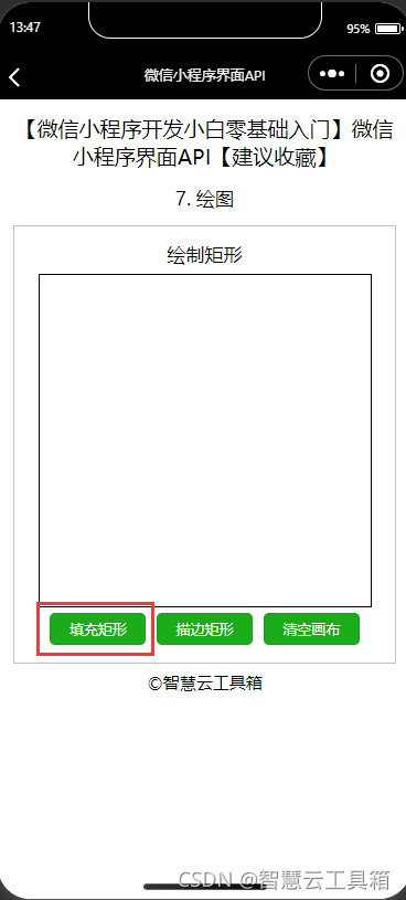
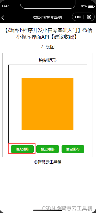
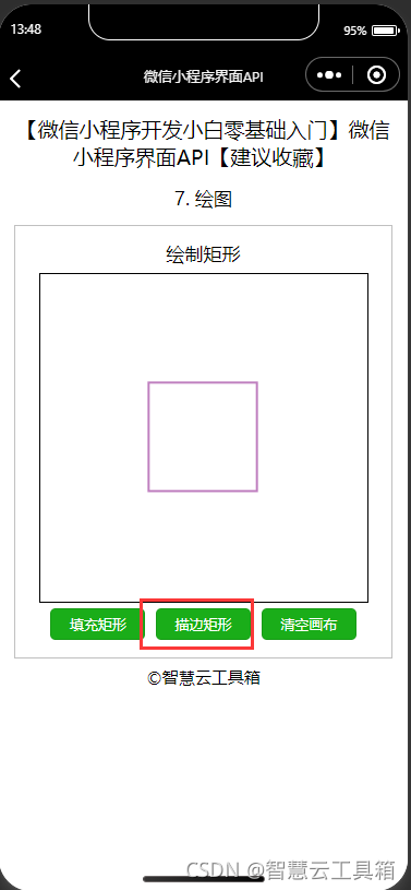
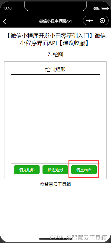
七、 绘图
7.1 绘制矩形
1. 创建矩形 小程序使用画布对象的rect方法创建矩形,然后使用fill()或stroke()方法在画布上填充实心矩形或描边空心矩形。参数解释如下:
x:Number类型,矩形左上角点的x坐标;
y:Number类型,矩形左上角点的y坐标;
width:Number类型,矩形的宽度;
height:Number类型,矩形的高度。
js文件
 fillRect:function(){


    let ctx = this.ctx;
    ctx.rect(50, 50, 200, 200)
    ctx.setFillStyle('orange')
    ctx.fill()
    ctx.draw()
  },
  strokeRect: function () {


    let ctx = this.ctx;
    ctx.rect(100, 100, 100, 100)
    ctx.setStrokeStyle('purple')
    ctx.stroke()
    ctx.draw()
  },
  clearRect: function () {


    let ctx = this.ctx;
    ctx.clearRect(0, 0, 300, 300)
    ctx.draw()
  },
  /**
   * 生命周期函数--监听页面加载
   */
  onLoad: function (options) {


    //创建画布上下文
    this.ctx = wx.createCanvasContext('myCanvas')
  },
json文件
{

    "navigationBarTitleText": "智慧云工具箱-微信小程序界面API"

}
wxml文件
<view class='demo-box'>
      <view class='title'>绘制矩形</view>
      <canvas canvas-id='myCanvas' style='border:1rpx solid'></canvas>
      <button type='primary' size='mini' bindtap='fillRect'>填充矩形</button>
      <button type='primary' size='mini' bindtap='strokeRect'>描边矩形</button>
      <button type='primary' size='mini' bindtap='clearRect'>清空画布</button>
    </view>
wxss文件
button{


  margin: 10rpx;
}
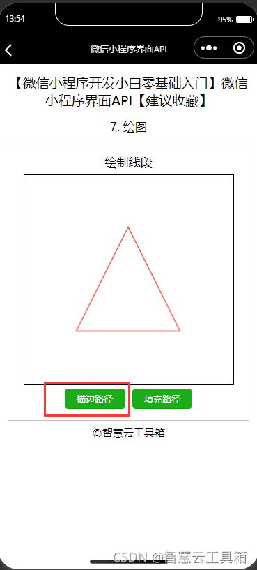
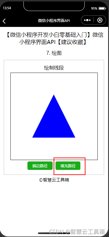
7.2 绘制路径
路径(Path)是绘制图形轮廓时画笔留下的轨迹,也可以理解为画笔画出的像素点组成的线条。多个点形成线段或曲线,不同的线段或曲线相连接又形成了各种形状效果。 绘制路径主要有以下4种方法: 1、beginPath():用于新建一条路径,也是图形绘制的起点。每次调用该方法都会清空之前的绘图轨迹记录,重新开始绘制新的图形。 2、closePath():该方法用于闭合路径。当执行该方法时会从画笔的当前坐标位置绘制一条线段到初始坐标位置来闭合图形。此方法不是必需的,若画笔的当前坐标位置就是初始坐标位置,则该方法可以省略不写。 3、stroke():在图形轮廓勾勒完毕后需要执行该方法才能正式将路径渲染到画布上。 4、fill():可以使用该方法为图形填充颜色,生成实心图形。若并未执行closePath()方法来闭合图形,则在此方法被调用时会自动生成线段连接画笔当前坐标位置和初始坐标位置,形成闭合图形然后再进行填充颜色。
绘制线段
js文件
 //绘制基本图形
  drawSample: function () {


    let ctx = this.ctx
    //绘制三角形
    ctx.beginPath()
    ctx.moveTo(150, 75)
    ctx.lineTo(225, 225)
    ctx.lineTo(75, 225)
    ctx.closePath()
  },
  //描边路径
  strokePath:function(){


    let ctx = this.ctx
    this.drawSample()
    ctx.setStrokeStyle('red')
    ctx.stroke()
    ctx.draw()
  },
  //填充路径
  fillPath: function () {


    let ctx = this.ctx
    this.drawSample()
    ctx.setFillStyle('blue')
    ctx.fill()
    ctx.draw()
  },
json文件
{

    "navigationBarTitleText": "智慧云工具箱-微信小程序界面API"

}
wxml文件
 <view class='demo-box'>
      <view class='title'>绘制线段</view>
      <canvas canvas-id='myCanvas' style='border:1rpx solid'></canvas>
      <button type='primary' size='mini' bindtap='strokePath'>描边路径</button>
      <button type='primary' size='mini' bindtap='fillPath'>填充路径</button>
    </view>
wxss文件
button{


  margin: 10rpx;
}
绘制圆弧
【微信小程序开发小白零基础入门】微信小程序框架【建议收藏】
js文件
 onLoad: function (options) {


    //创建画布上下文
    const ctx = wx.createCanvasContext('myCanvas')

    //设置填充颜色为黄色
    ctx.setFillStyle('yellow')

    //绘制圆形的脸,并填充为黄色
    ctx.beginPath()
    ctx.arc(150, 150, 80, 0, Math.PI * 2, true)
    ctx.stroke()
    //如果不需要勾勒脸的轮廓,此句可省略
    ctx.fill()

    //设置填充颜色为黑色
    ctx.setFillStyle('black')

    //填充黑色的左眼
    ctx.beginPath()
    ctx.arc(190, 130, 10, 0, Math.PI * 2, true)
    ctx.fill()

    //填充黑色的右眼
    ctx.beginPath()
    ctx.arc(110, 130, 10, 0, Math.PI * 2, true)
    ctx.fill()

    //绘制带有弧度的笑容
    ctx.beginPath()
    ctx.arc(150, 160, 50, 0, Math.PI, false)
    ctx.stroke()

    //全部绘制到画布上
    ctx.draw()
  },
json文件
{

    "navigationBarTitleText": "智慧云工具箱-微信小程序界面API"

}
wxml文件
<view class='demo-box'>
      <view class='title'>绘制圆弧</view>
      <canvas canvas-id='myCanvas' style='border:1rpx solid'></canvas>
    </view>

绘制曲线
【微信小程序开发小白零基础入门】微信小程序框架【建议收藏】
js文件
 onLoad: function (options) {


    //创建画布上下文
    const ctx = wx.createCanvasContext('myCanvas')

    //设置填充颜色为红色
    ctx.setFillStyle('red');

    //三次曲线
    ctx.beginPath();
    ctx.moveTo(90, 55);
    ctx.bezierCurveTo(90, 52, 85, 40, 65, 40);
    ctx.bezierCurveTo(35, 40, 35, 77.5, 35, 77.5);
    ctx.bezierCurveTo(35, 95, 55, 117, 90, 135);
    ctx.bezierCurveTo(125, 117, 145, 95, 145, 77.5);
    ctx.bezierCurveTo(145, 77.5, 145, 40, 115, 40);
    ctx.bezierCurveTo(100, 40, 90, 52, 90, 55);
    ctx.fill();

    //绘制到画布上
    ctx.draw()
  },
json文件
{

    "navigationBarTitleText": "智慧云工具箱-微信小程序界面API"

}
wxml文件
 <view class='demo-box'>
      <view class='title'>使用三次贝塞尔曲线绘制爱心</view>
      <canvas canvas-id='myCanvas' style='border:1rpx solid'></canvas>
    </view>

7.3 绘制文本
1、填充文本
2、设置字体大小
3、设置文本基准线
4、设置文本对齐方式
5、设置字体风格
【微信小程序开发小白零基础入门】微信小程序框架【建议收藏】
js文件
onLoad: function (options) {


    const ctx = wx.createCanvasContext('myCanvas')
    //设置字号
    ctx.setFontSize(40)

    //设置文本水平基准线
    ctx.setTextBaseline('bottom')
    //填充文字
    ctx.fillText('你好', 30, 150)

    //设置填充颜色
    ctx.setFillStyle('green')
    //设置文本水平基准线
    ctx.setTextBaseline('top')
    //填充文字
    ctx.fillText('智慧云工具箱', 60, 150)
    ctx.draw()
  },
json文件
{

    "navigationBarTitleText": "智慧云工具箱-微信小程序界面API"

}
wxml文件
 <view class='demo-box'>
      <view class='title'>绘制文本</view>
      <canvas canvas-id='myCanvas' style='border:1rpx solid'></canvas>
    </view>

八、 下拉刷新
8.1 监听下拉刷新
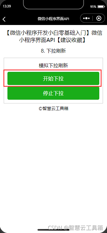
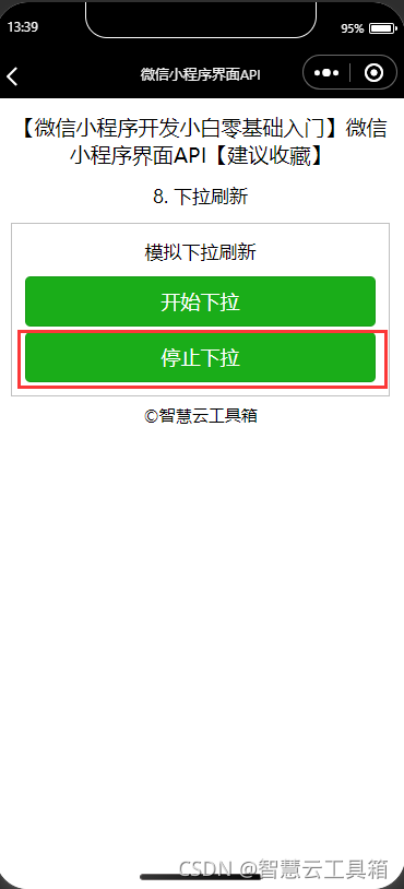
小程序在Page中定义了onPullDownRefresh处理函数,用于监听当前页面用户下拉刷新事件。8.2 开始下拉刷新
小程序使用wx.startPullDownRefresh(OBJECT)触发下拉刷新动画,效果与用户手动下拉刷新一致。该接口从基础库 1.5.0 开始支持,低版本需做兼容处理。 其OBJECT参数说明如表所示。| 参数 | 类型 | 必填 | 说明 |
|---|---|---|---|
| success | Function | 否 | 接口调用成功的回调函数。返回String类型参数errMsg表示调用结果 |
| fail | Function | 否 | 接口调用失败的回调函数 |
| complete | Function | 否 | 接口调用结束的回调函数(调用成功与否都执行) |
8.3 停止下拉刷新
小程序使用wx.stopPullDownRefresh()停止当前页面下拉刷新。
js文件
 //开始下拉刷新
  startPullDown:function(){


    wx.startPullDownRefresh({


      success: function (res) {


        console.log(res.errMsg)
      }
    })

  },
  //停止下拉刷新
  stopPullDown: function () {


    wx.stopPullDownRefresh()
  },
json文件
{

    "navigationBarTitleText": "智慧云工具箱-微信小程序界面API"

}
wxml文件
 <view class='demo-box'>
      <view class='title'>模拟下拉刷新</view>
      <button type='primary' bindtap='startPullDown'>开始下拉</button>
      <button type='primary' bindtap='stopPullDown'>停止下拉</button>
    </view>
wxss文件
button{


  margin: 10rpx;
}
九、 推荐小程序(欢迎各位大佬指导)
