写在前面
首先祝大家新年快乐,开工大吉。
最新刚换了工作,大部分精力还是放到新工作上面,所以这次还是先给大家带来一个小而实用的库:Silhouette。另外,考虑到Kotlin越来越普及,作者在开发过程中也切实感受到Kotlin相较于Java带来的便利,后续的IM系列文章及项目考虑用Kotlin重写,而且考虑到由于工作业务需求过多可能出现断更的情况,所以打算一次性写完再放出来,避免大家学习不方便。
废话不多说,直接开始吧。
Silhouette是什么?
Silhouette意为“剪影”,取名并没有特别的含义,只是单纯地觉得意境较美。例如上一篇文章Shine——更简单的Android网络请求库封装的网络请求库:Shine即意为“闪耀”,也没有特别的含义,只是作者认为开源库起名较难,特意找一些比较优美的单词。
Silhouette是一系列基于GradientDrawable及StateListDrawable封装的组件集合,主要用于实现在Android Layout XML中直接支持Shape/Selector等功能。
我们都知道在Android开发中,不同的TextView及Button各种样式(形状、背景色、描边、圆角、渐变等)的传统实现方式是在drawable文件夹中编写各种shape/selector等文件,这种方式至少会存在以下几种弊端:
- shape/selector文件过多,项目体积增大;
- shape/selector文件命名困难,命名规范时往往会存在功能重复的文件;
- 功能存在局限性:例如gradient渐变色。传统shape方式只支持三种颜色过渡(startColor/centerColor/endColor),如果设计稿存在四种以上颜色渐变,shape gradient无能为力。再比如TextView在常态和按下态需要同时改变背景色及文字颜色时,传统方式只能在代码中动态设置等。
- 开发效率低;
- 难以维护等;
综上所述,我们迫切需要一个库来解决以上问题,Silhouette正具备这些能力。接下来,我们来具体看看Silhouette能做什么吧。
Silhouette能做什么?
上面说到Silhouette是一系列组件集合,具体包含以下组件:
-
SleTextButton
基于AppCompatTextView封装;
具备定义各种样式(形状、背景色、描边、圆角、渐变等)的能力 ;
具备不同状态(常态、按下态、不可点击态)下文字颜色指定等。 -
SleImageButton
基于ShapeableImageView封装;
通过指定sle_ib_type属性使ImageView支持按下态遮罩层、透明度改变、自定义图片,同时支持CheckBox功能;
通过指定sle_ib_style属性使ImageView支持Normal、圆角、圆形等形状。 -
SleConstraintLayout
基于ConstraintLayout封装;
具备定义各种样式(形状、背景色、描边、圆角、渐变等)的功能。 -
SleRelativeLayout
基于RelativeLayout封装;
具备定义各种样式(形状、背景色、描边、圆角、渐变等)的功能。 -
SleLinearLayout
基于LinearLayout封装;
具备定义各种样式(形状、背景色、描边、圆角、渐变等)的功能。 -
SleFrameLayout
基于FrameLayout封装;
具备定义各种样式(形状、背景色、描边、圆角、渐变等)的功能。
设计、封装思路及原理
-
项目结构
com.freddy.silhouette- config(配置相关,存放全局注解及公共常量、默认值等)
- ext(kotlin扩展相关,可选择用或不用)
- utils(工具类相关,可选择用或不用)
- widget(控件相关)
- button
- layout
由此可见,项目结构非常简单,所以Silhouette也是一个比较轻量级的库。
-
封装思路及原理
由于该库非常简单,实际上就是根据Shape/Selector进行自定义属性,从而利用GradientDrawable及StateListDrawable提供的API进行封装,不存在什么难度,在此就不展开讲了。下面贴一下代码片段,基本上几个组件的实现原理都大同小异,都是利用GradientDrawable及StateListDrawable实现组件的Shape及Selector功能:
private fun init() {
    val normalDrawable =
        getDrawable(normalBackgroundColor, normalStrokeColor, normalGradientColors)
    var pressedDrawable: GradientDrawable? = null
    var disabledDrawable: GradientDrawable? = null
    var selectedDrawable: GradientDrawable? = null
    when (type) {
        TYPE_MASK -> {
            pressedDrawable = getDrawable(
                normalBackgroundColor,
                normalStrokeColor,
                normalGradientColors
            ).apply {
                colorFilter =
                    PorterDuffColorFilter(maskBackgroundColor, PorterDuff.Mode.SRC_ATOP)
            }
            disabledDrawable =
                getDrawable(disabledBackgroundColor, disabledBackgroundColor)
        }
        TYPE_SELECTOR -> {
            pressedDrawable =
                getDrawable(pressedBackgroundColor, pressedStrokeColor, pressedGradientColors)
            disabledDrawable = getDrawable(
                disabledBackgroundColor,
                disabledStrokeColor,
                disabledGradientColors
            )
        }
    }
    selectedDrawable = getDrawable(
        selectedBackgroundColor,
        selectedStrokeColor,
        selectedGradientColors
    )
    setTextColor(normalTextColor)
    background = StateListDrawable().apply {
        if (type != TYPE_NONE) {
            addState(intArrayOf(android.R.attr.state_pressed), pressedDrawable)
        }
        addState(intArrayOf(-android.R.attr.state_enabled), disabledDrawable)
        addState(intArrayOf(android.R.attr.state_selected), selectedDrawable)
        addState(intArrayOf(), normalDrawable)
    }

    setOnTouchListener(this)
}

private fun getDrawable(
    backgroundColor: Int,
    strokeColor: Int,
    gradientColors: IntArray? = null
): GradientDrawable {
    // 背景色相关
    val drawable = GradientDrawable()
    setupColor(drawable, backgroundColor)

    // 形状相关
    (drawable.mutate() as GradientDrawable).shape = shape
    if (Build.VERSION.SDK_INT >= Build.VERSION_CODES.Q) {
        drawable.innerRadius = innerRadius
        if (innerRadiusRatio > 0f) {
            drawable.innerRadiusRatio = innerRadiusRatio
        }
        drawable.thickness = thickness
        if (thicknessRatio > 0f) {
            drawable.thicknessRatio = thicknessRatio
        }
    }

    // 描边相关
    if (strokeColor != 0) {
        (drawable.mutate() as GradientDrawable).setStroke(
            strokeWidth,
            strokeColor,
            dashWidth,
            dashGap
        )
    }

    // 圆角相关
    setupCornersRadius(
        drawable,
        cornersRadius,
        cornersTopLeftRadius,
        cornersTopRightRadius,
        cornersBottomRightRadius,
        cornersBottomLeftRadius
    )

    // 渐变相关
    (drawable.mutate() as GradientDrawable).gradientType = gradientType
    if (gradientCenterX != 0.0f || gradientCenterY != 0.0f) {
        (drawable.mutate() as GradientDrawable).setGradientCenter(
            gradientCenterX,
            gradientCenterY
        )
    }
    gradientColors?.let { colors ->
        (drawable.mutate() as GradientDrawable).colors = colors
    }
    var orientation: GradientDrawable.Orientation? = null
    when (gradientOrientation) {
        GRADIENT_ORIENTATION_TOP_BOTTOM -> {
            orientation = GradientDrawable.Orientation.TOP_BOTTOM
        }
        GRADIENT_ORIENTATION_TR_BL -> {
            orientation = GradientDrawable.Orientation.TR_BL
        }
        GRADIENT_ORIENTATION_RIGHT_LEFT -> {
            orientation = GradientDrawable.Orientation.RIGHT_LEFT
        }
        GRADIENT_ORIENTATION_BR_TL -> {
            orientation = GradientDrawable.Orientation.BR_TL
        }
        GRADIENT_ORIENTATION_BOTTOM_TOP -> {
            orientation = GradientDrawable.Orientation.BOTTOM_TOP
        }
        GRADIENT_ORIENTATION_BL_TR -> {
            orientation = GradientDrawable.Orientation.BL_TR
        }
        GRADIENT_ORIENTATION_LEFT_RIGHT -> {
            orientation = GradientDrawable.Orientation.LEFT_RIGHT
        }
        GRADIENT_ORIENTATION_TL_BR -> {
            drawable.orientation = GradientDrawable.Orientation.TL_BR
        }
    }
    orientation?.apply {
        (drawable.mutate() as GradientDrawable).orientation = this
    }
    return drawable
}
复制代码感兴趣的同学可以到官方文档了解GradientDrawable及StateListDrawable的原理。
自定义属性列表
自定义属性分为通用属性和特有属性。
-
通用属性
- 类型
属性名称 类型 说明 备注 sle_type enum 类型
mask:遮罩
selector:自定义样式
none:无默认值:mask
默认的mask为90%透明度黑色,可通过sle_maskBackgroundColors属性设置
若不指定为selector,则自定义样式无效- 形状相关
属性名称 类型 说明 备注 sle_shape enum 形状
rectangle:矩形
oval:椭圆形
line:线性形状
ring:环形默认值:rectangle sle_innerRadius dimension|reference 尺寸,内环的半径 shape="ring"可用 sle_innerRadiusRatio float 以环的宽度比率来表示内环的半径 shape="ring"可用 sle_thickness dimension|reference 尺寸,环的厚度 shape="ring"可用 sle_thicknessRatio float 以环的宽度比率来表示环的厚度 shape="ring"可用 - 背景色相关
属性名称 类型 说明 备注 sle_normalBackgroundColor color|reference 常态背景颜色 / sle_pressedBackgroundColor color|reference 按下态背景颜色 / sle_disabledBackgroundColor color|reference 不可点击态背景颜色 默认值:#CCCCCC sle_selectedBackgroundColor color|reference 选中态背景颜色 / - 描边相关
属性名称 类型 说明 备注 sle_normalStrokeColor color|reference 常态描边颜色 / sle_pressedStrokeColor color|reference 按下态描边颜色 / sle_disabledStrokeColor color|reference 不可点击态描边颜色 / sle_selectedStrokeColor color|reference 选中态描边颜色 / sle_strokeWidth dimension|reference 描边宽度 / sle_dashWidth dimension|reference 虚线宽度 / sle_dashGap dimension|reference 虚线间隔 / - 圆角相关
属性名称 类型 说明 备注 sle_cornersRadius dimension|reference 总圆角半径 / sle_cornersTopLeftRadius dimension|reference 左上角圆角半径 / sle_cornersTopRightRadius dimension|reference 右上角圆角半径 / sle_cornersBottomLeftRadius dimension|reference 左下角圆角半径 / sle_cornersBottomRightRadius dimension|reference 右下角圆角半径 / - 渐变相关
属性名称 类型 说明 备注 sle_normalGradientColors reference 常态渐变背景色 支持在res/array下定义数组实现多个颜色渐变 sle_pressedGradientColors reference 按下态渐变背景色 支持在res/array下定义数组实现多个颜色渐变 sle_disabledGradientColors reference 不可点击态渐变背景色 支持在res/array下定义数组实现多个颜色渐变 sle_selectedGradientColors reference 选中态渐变背景色 支持在res/array下定义数组实现多个颜色渐变 sle_gradientOrientation enum 渐变方向
TOP_BOTTOM:从上到下
TR_BL:从右上到左下
RIGHT_LEFT:从右到左
BR_TL:从右下到左上
BOTTOM_TOP:从下到上
BL_TR:从左下到右上
LEFT_RIGHT:从左到右
TL_BR:从左上到右下/ sle_gradientType enum 渐变类型
linear:线性渐变
radial:圆形渐变,起始颜色从gradientCenterX、gradientCenterY点开始
sweep:A sweeping line gradient/ sle_gradientCenterX float 渐变中心放射点x坐标 注意,这里的坐标是整个背景的百分比的点,并不是确切点,0.2就是20%的点 sle_gradientCenterY float 渐变中心放射点y坐标 注意,这里的坐标是整个背景的百分比的点,并不是确切点,0.2就是20%的点 sle_gradientRadius dimension|reference 渐变半径 需要配合gradientType=radial使用,如果设置gradientType=radial而没有设置gradientRadius,将会报错 - 其它
属性名称 类型 说明 备注 sle_maskBackgroundColor color|reference 当sle_type=mask时,按钮按下状态的遮罩颜色 默认值:90%透明度黑色(#1A000000) sle_cancelOffset dimension|reference 用于解决手指移出控件区域判断为cancel的偏移量 默认值:8dp -
特有属性
- SleConstraintLayout/SleRelativeLayout/SleFrameLayout/SleLinearLayout
属性名称 类型 说明 备注 sle_interceptType enum 事件拦截类型
intercept_super:return super
intercept_true:return true
intercept_false:return falseLayout组件设置此值,可实现是否拦截事件,如果设置为intercept_true,事件将不传递到子控件,在某些场景比较实用 - SleTextButton
属性名称 类型 说明 备注 sle_normalTextColor color|reference 常态文字颜色 / sle_pressedTextColor color|reference 按下态文字颜色 / sle_disabledTextColor color|reference 不可点击态文字颜色 / sle_selectedTextColor color|reference 选中态文字颜色 / - SleImageButton
属性名称 类型 说明 备注 sle_ib_type enum 类型
mask:图片遮罩
alpha:图片透明度改变
selector:自定义图片
checkBox:CheckBox场景
none:无1.指定为mask时,自定义图片资源无效;
2.指定为alpha时,sle_pressedAlpha/sle_disabledAlpha生效;
3.指定为selector时,sle_normalResId/sle_pressedResId/sle_disabledResId生效;
4.指定为checkBox时,sle_checkedResId/sle_uncheckedResId/sle_isChecked生效;
5.指定为none时,图片资源均不生效,圆角相关配置有效sle_ib_style enum ImageView形状
normal:普通形状
rounded:圆角
oval:圆形默认值:normal sle_normalResId color|reference 常态图片资源 / sle_pressedResId color|reference 按下态图片资源 / sle_disabledResId color|reference 不可点击态图片资源 / sle_checkedResId color|reference 选中态checkBox图片资源 / sle_uncheckedResId color|reference 非选中态checkBox图片资源 / sle_isChecked boolean CheckBox是否选中 默认值:false sle_pressedAlpha float 按下态图片透明度 默认值:70% sle_disabledAlpha float 不可点击态图片透明度 默认值:30%
使用方式
- 添加依赖
implementation "io.github.freddychen:silhouette:$lastest_version"
复制代码Note:最新版本可在maven central silhouette中找到。
- 使用
由于自定义属性太多,在此就不一一列举了。下面给出几种常见的场景示例,大家可以根据自定义属性表自行编写:
- 常态
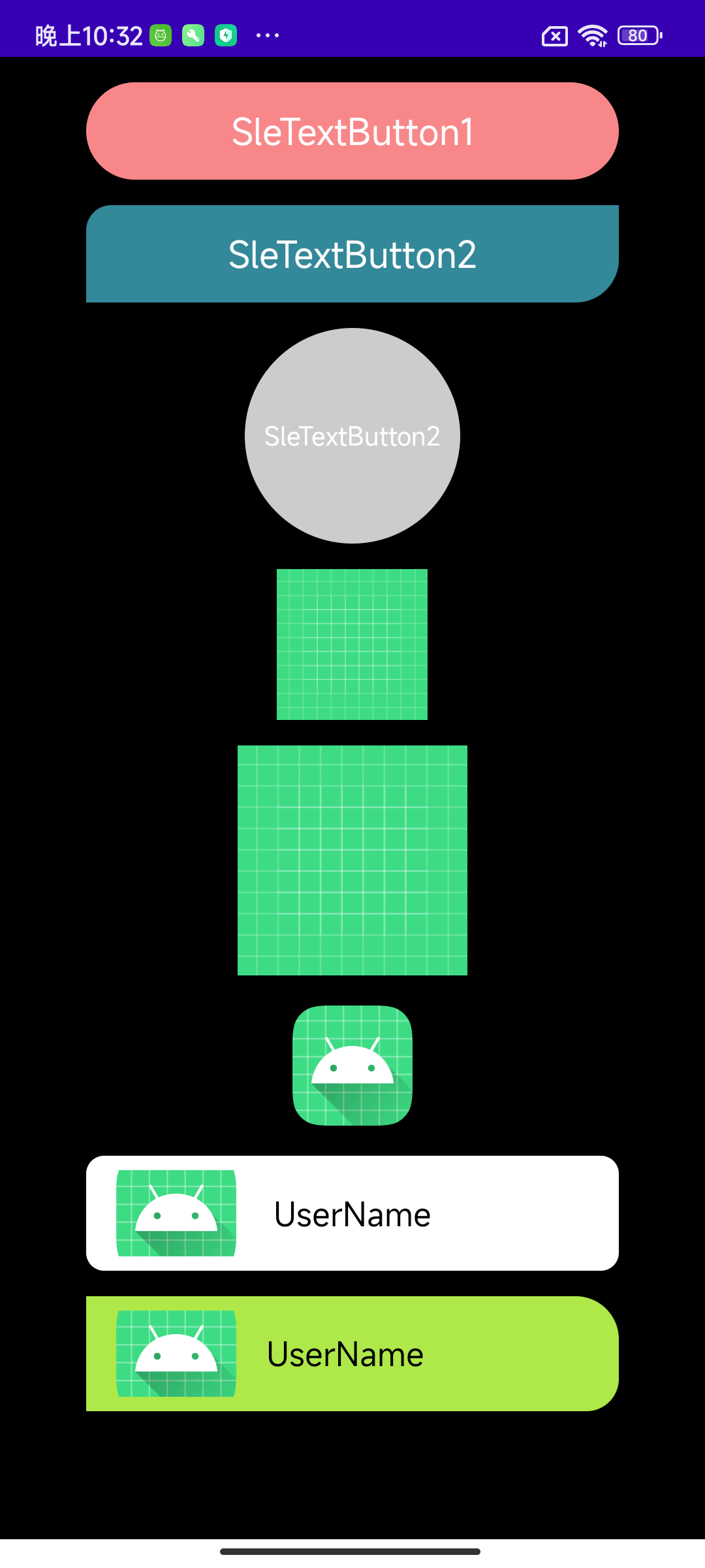
- 按下态
以上布局代码为:
<?xml version="1.0" encoding="utf-8"?>
<LinearLayout xmlns:android="http://schemas.android.com/apk/res/android"
    xmlns:app="http://schemas.android.com/apk/res-auto"
    android:layout_width="match_parent"
    android:layout_height="match_parent"
    android:background="@color/black"
    android:gravity="center_horizontal"
    android:orientation="vertical">

    <com.freddy.silhouette.widget.button.SleTextButton
        android:id="@+id/stb_1"
        android:layout_width="match_parent"
        android:layout_height="54dp"
        android:layout_marginHorizontal="48dp"
        android:layout_marginTop="14dp"
        android:gravity="center"
        android:text="SleTextButton1"
        android:textSize="20sp"
        app:sle_cornersRadius="28dp"
        app:sle_normalBackgroundColor="#f88789"
        app:sle_normalTextColor="@color/white"
        app:sle_type="mask" />

    <com.freddy.silhouette.widget.button.SleTextButton
        android:id="@+id/stb_2"
        android:layout_width="match_parent"
        android:layout_height="54dp"
        android:layout_marginHorizontal="48dp"
        android:layout_marginTop="14dp"
        android:gravity="center"
        android:text="SleTextButton2"
        android:textSize="20sp"
        app:sle_cornersBottomRightRadius="24dp"
        app:sle_cornersTopLeftRadius="14dp"
        app:sle_normalBackgroundColor="#338899"
        app:sle_normalTextColor="@color/white"
        app:sle_pressedBackgroundColor="#aeeacd"
        app:sle_type="selector" />

    <com.freddy.silhouette.widget.button.SleTextButton
        android:id="@+id/stb_3"
        android:layout_width="120dp"
        android:layout_height="120dp"
        android:layout_marginHorizontal="48dp"
        android:layout_marginTop="14dp"
        android:enabled="false"
        android:gravity="center"
        android:text="SleTextButton2"
        android:textSize="14sp"
        app:sle_cornersBottomRightRadius="24dp"
        app:sle_cornersTopLeftRadius="14dp"
        app:sle_normalBackgroundColor="#cc688e"
        app:sle_normalTextColor="@color/white"
        app:sle_pressedBackgroundColor="#34eeac"
        app:sle_shape="oval"
        app:sle_type="selector" />

    <com.freddy.silhouette.widget.button.SleImageButton
        android:id="@+id/sib_1"
        android:layout_width="84dp"
        android:layout_height="84dp"
        android:layout_marginTop="14dp"
        app:sle_ib_type="mask"
        app:sle_normalResId="@drawable/ic_launcher_background" />

    <com.freddy.silhouette.widget.button.SleImageButton
        android:id="@+id/sib_2"
        android:layout_width="128dp"
        android:layout_height="128dp"
        android:layout_marginTop="14dp"
        app:sle_ib_type="alpha"
        app:sle_normalResId="@drawable/ic_launcher_background" />

    <com.freddy.silhouette.widget.button.SleImageButton
        android:id="@+id/sib_3"
        android:layout_width="72dp"
        android:layout_height="72dp"
        android:layout_marginTop="14dp"
        app:sle_ib_type="selector"
        app:sle_normalResId="@mipmap/ic_launcher"
        app:sle_pressedResId="@drawable/ic_launcher_foreground" />

    <com.freddy.silhouette.widget.layout.SleConstraintLayout
        android:id="@+id/scl_1"
        android:layout_width="match_parent"
        android:layout_height="wrap_content"
        android:layout_marginHorizontal="48dp"
        android:layout_marginTop="14dp"
        android:paddingHorizontal="14dp"
        android:paddingVertical="8dp"
        app:sle_cornersRadius="10dp"
        app:sle_interceptType="intercept_super"
        app:sle_normalBackgroundColor="@color/white">

        <ImageView
            android:layout_width="72dp"
            android:layout_height="48dp"
            android:scaleType="centerCrop"
            android:src="@mipmap/ic_launcher_round" />

        <TextView
            android:layout_width="wrap_content"
            android:layout_height="wrap_content"
            android:text="UserName"
            android:textColor="@color/black"
            android:textSize="18sp"
            app:layout_constraintBottom_toBottomOf="parent"
            app:layout_constraintEnd_toEndOf="parent"
            app:layout_constraintStart_toStartOf="parent"
            app:layout_constraintTop_toTopOf="parent" />
    </com.freddy.silhouette.widget.layout.SleConstraintLayout>

    <com.freddy.silhouette.widget.layout.SleLinearLayout
        android:id="@+id/sll_1"
        android:layout_width="match_parent"
        android:layout_height="wrap_content"
        android:layout_marginHorizontal="48dp"
        android:layout_marginTop="14dp"
        android:gravity="center_vertical"
        android:paddingHorizontal="14dp"
        app:sle_type="selector"
        android:paddingVertical="8dp"
        app:sle_cornersTopRightRadius="24dp"
        app:sle_cornersBottomRightRadius="18dp"
        app:sle_interceptType="intercept_true"
        app:sle_pressedBackgroundColor="#fe9e87"
        app:sle_normalBackgroundColor="#aee949">

        <ImageView
            android:layout_width="72dp"
            android:layout_height="48dp"
            android:scaleType="centerCrop"
            android:src="@mipmap/ic_launcher_round" />

        <TextView
            android:layout_width="wrap_content"
            android:layout_height="wrap_content"
            android:layout_marginStart="14dp"
            android:text="UserName"
            android:textColor="@color/black"
            android:textSize="18sp"
            app:layout_constraintBottom_toBottomOf="parent"
            app:layout_constraintEnd_toEndOf="parent"
            app:layout_constraintStart_toStartOf="parent"
            app:layout_constraintTop_toTopOf="parent" />
    </com.freddy.silhouette.widget.layout.SleLinearLayout>
</LinearLayout>
复制代码Note:需要给组件设置setOnClickListener才能看到效果。
至于更多的功能,就让大家去试试吧,篇幅有限,就不一一列举了。有任何疑问,欢迎通过QQ群或微信公众号联系我。
版本记录
| 版本号 | 修改时间 | 版本说明 |
|---|---|---|
| 0.0.1 | 2022.02.10 | 首次提交 |
写在最后
终于写完了,Shape/Selector在每个项目中基本都会用到,而且频率还不算低。Silhouette原理虽然简单,但确实能解决很多问题,这些都是平时开发中的积累,希望对大家能有所帮助。欢迎大家star和fork,让我们为Android开发共同贡献一份力量。另外如果有疑问欢迎加入我的QQ群:1015178804,同时也欢迎大家关注我的公众号:FreddyChen,让我们共同进步和成长。