折线图
var option = {
backgroundColor: '#FFF0F5',
title: {
text: '折线图',
subtext: '模拟数据',
x: 'center'
},
legend: {
// orient 设置布局方式,默认水平布局,可选值:'horizontal'(水平) ¦ 'vertical'(垂直)
orient: 'horizontal',
// x 设置水平安放位置,默认全图居中,可选值:'center' ¦ 'left' ¦ 'right' ¦ {number}(x坐标,单位px)
x: 'left',
// y 设置垂直安放位置,默认全图顶端,可选值:'top' ¦ 'bottom' ¦ 'center' ¦ {number}(y坐标,单位px)
y: 'top',
data: ['预期','实际','假设']
},
// 图表距边框的距离,可选值:'百分比'¦ {number}(单位px)
grid: {
top: '16%', // 等价于 y: '16%'
left: '3%',
right: '8%',
bottom: '3%',
containLabel: true
},
// 提示框
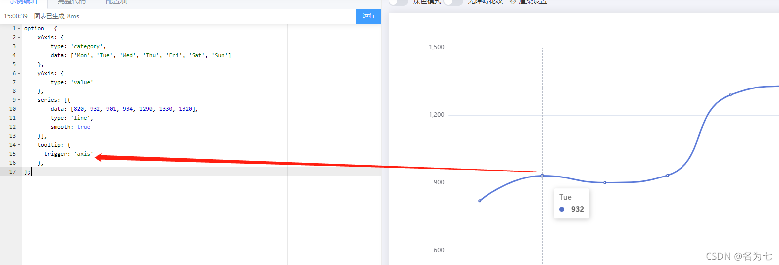
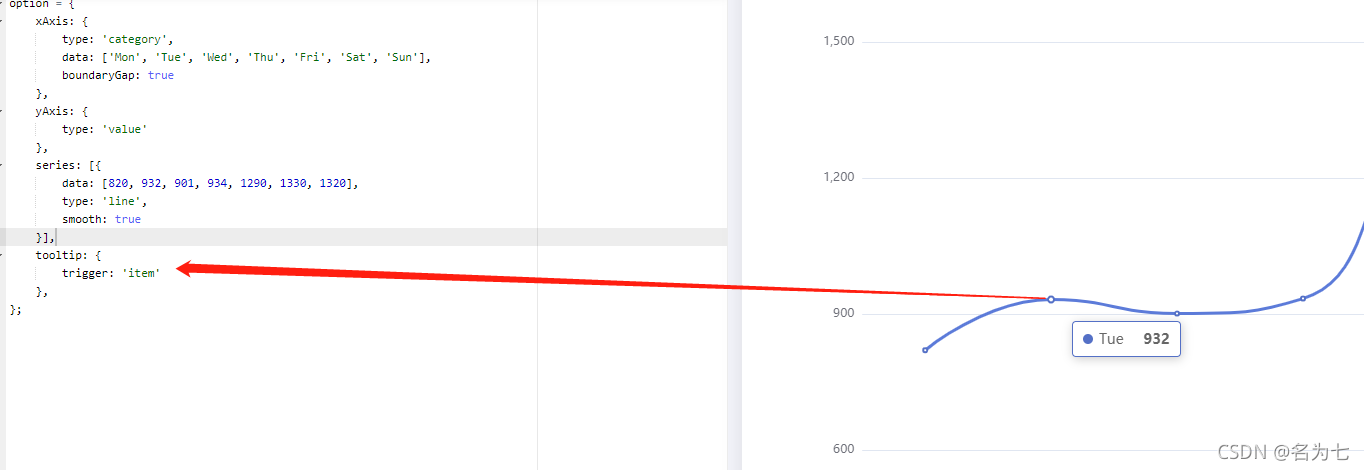
tooltip: {
trigger: 'axis'
},
//工具框,可以选择
toolbox: {
feature: {
saveAsImage: {
} //下载工具
}
},
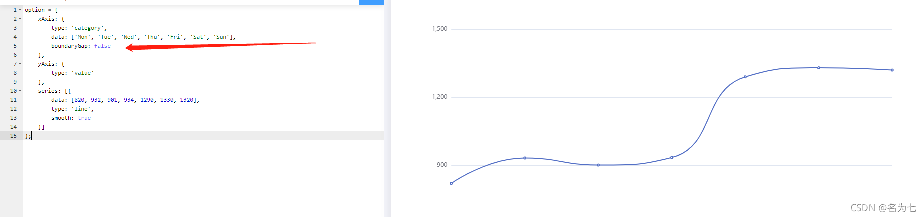
xAxis: {
name: '周几',
type: 'category',
axisLine: {
lineStyle: {
// 设置x轴颜色
color: '#912CEE'
}
},
// 设置X轴数据旋转倾斜
axisLabel: {
rotate: 30, // 旋转角度
interval: 0 //设置X轴数据间隔几个显示一个,为0表示都显示
},
// boundaryGap值为false的时候,折线第一个点在y轴上
boundaryGap: false,
data: ['Mon', 'Tue', 'Wed', 'Thu', 'Fri', 'Sat', 'Sun']
},
yAxis: {
name: '数值',
type: 'value',
min:0, // 设置y轴刻度的最小值
max:1800, // 设置y轴刻度的最大值
splitNumber:9, // 设置y轴刻度间隔个数
axisLine: {
lineStyle: {
// 设置y轴颜色
color: '#87CEFA'
}
},
},
series: [
{
name: '预期',
data: [820, 932, 301, 1434, 1290, 1330, 1320],
type: 'line',
// 设置小圆点消失
// 注意:设置symbol: 'none'以后,拐点不存在了,设置拐点上显示数值无效
symbol: 'none',
// 设置折线弧度,取值:0-1之间
smooth: 0.5,
},
{
name: '实际',
data: [620, 732, 941, 834, 1690, 1030, 920],
type: 'line',
// 设置折线上圆点大小
symbolSize:8,
itemStyle:{
normal:{
// 拐点上显示数值
label : {
show: true
},
borderColor:'red', // 拐点边框颜色
lineStyle:{
width:5, // 设置线宽
type:'dotted' //'dotted'虚线 'solid'实线
}
}
}
},
{
name: '假设',
data: [120, 232, 541, 134, 290, 130, 120],
type: 'line',
// 设置折线上圆点大小
symbolSize:10,
// 设置拐点为实心圆
symbol:'circle',
itemStyle: {
normal: {
// 拐点上显示数值
label : {
show: true
},
lineStyle:{
// 使用rgba设置折线透明度为0,可以视觉上隐藏折线
color: 'rgba(0,0,0,0)'
}
}
}
}
],
color: ['#00EE00', '#FF9F7F','#FFD700']
};
x轴属性:boundaryGap(默认为true)
注意:区别是折线起始拐点位置不同

提示框
trigger: ‘axis’
设置:trigger: 'axis'

坐标轴触发,主要在柱状图,折线图等会使用类目轴的图表中使用。

axis是轴、轴线的意思,此刻提示框显示的是所有折线同一横坐标的拐点信息
trigger: ‘item’
设置:trigger: 'item'

数据项图形触发,主要在散点图,饼图等无类目轴的图表中使用。

用在有类目轴的折线图表中:鼠标放哪个拐点上,就只显示当前拐点的信息,设置symbol: 'none',的没有拐点,不显示提示框
在七八条线的时候 堆线图的时候怎么默认展示一个
legend里面增加 selected:{

    '预期': true, '实际': false, '假设': false}
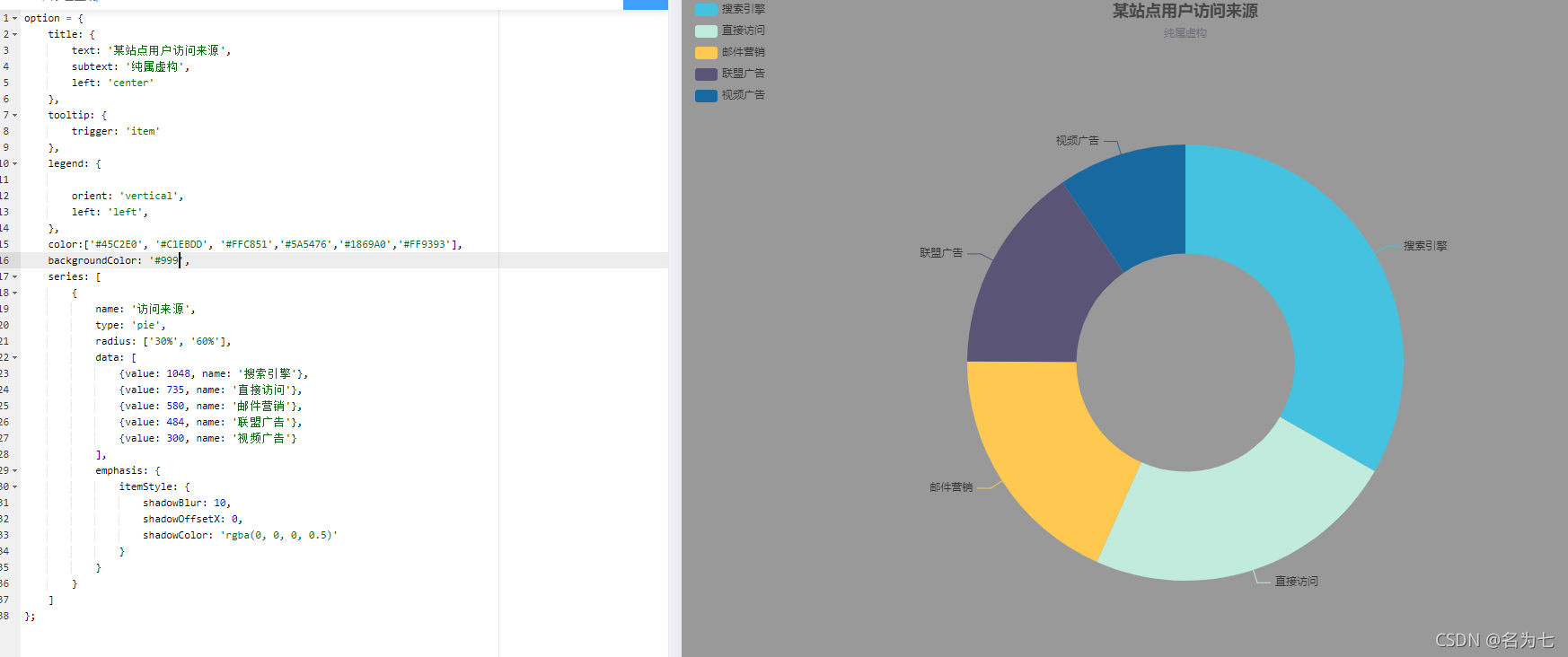
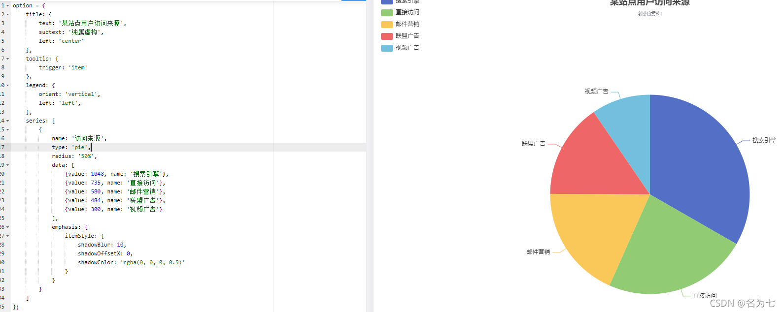
饼图
标题设置
title: {


            text: '某站点用户访问来源',
            subtext: '纯属虚构',
            // x 设置水平安放位置,默认左对齐,可选值:'center' ¦ 'left' ¦ 'right' ¦ {number}(x坐标,单位px)
            x: 'center',
            // y 设置垂直安放位置,默认全图顶端,可选值:'top' ¦ 'bottom' ¦ 'center' ¦ {number}(y坐标,单位px)
            y: 'top',
            // itemGap设置主副标题纵向间隔,单位px,默认为10,
            itemGap: 30,
            backgroundColor: '#EEE',
            // 主标题文本样式设置
            textStyle: {


              fontSize: 26,
              fontWeight: 'bolder',
              color: '#000080'
            },
            // 副标题文本样式设置
            subtextStyle: {


              fontSize: 18,
              color: '#8B2323'
            }
          }
图例设置
legend: {


            // orient 设置布局方式,默认水平布局,可选值:'horizontal'(水平) ¦ 'vertical'(垂直)
            orient: 'vertical',
            // x 设置水平安放位置,默认全图居中,可选值:'center' ¦ 'left' ¦ 'right' ¦ {number}(x坐标,单位px)
            x: 'left',
            // y 设置垂直安放位置,默认全图顶端,可选值:'top' ¦ 'bottom' ¦ 'center' ¦ {number}(y坐标,单位px)
            y: 'center',
            itemWidth: 24,   // 设置图例图形的宽
            itemHeight: 18,  // 设置图例图形的高
            textStyle: {


              color: '#666'  // 图例文字颜色
            },
            // itemGap设置各个item之间的间隔,单位px,默认为10,横向布局时为水平间隔,纵向布局时为纵向间隔
            itemGap: 30,
            backgroundColor: '#eee',  // 设置整个图例区域背景颜色
            data: ['北京','上海','广州','深圳','郑州']
          }
值域设置
series: [
{
name: '生源地',
type: 'pie',
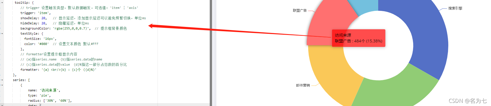
// radius: '50%', // 设置饼状图大小,100%时,最大直径=整个图形的min(宽,高)
radius: ['30%', '60%'], // 设置环形饼状图, 第一个百分数设置内圈大小,第二个百分数设置外圈大小
center: ['50%', '50%'], // 设置饼状图位置,第一个百分数调水平位置,第二个百分数调垂直位置
data: [
{
value:335, name:'北京'},
{
value:310, name:'上海'},
{
value:234, name:'广州'},
{
value:135, name:'深圳'},
{
value:148, name:'郑州'}
],
// itemStyle 设置饼状图扇形区域样式
itemStyle: {
// emphasis:英文意思是 强调;着重;(轮廓、图形等的)鲜明;突出,重读
// emphasis:设置鼠标放到哪一块扇形上面的时候,扇形样式、阴影
emphasis: {
shadowBlur: 10,
shadowOffsetX: 0,
shadowColor: 'rgba(30, 144, 255,0.5)'
}
},
// 设置值域的那指向线
labelLine: {
normal: {
show: false // show设置线是否显示,默认为true,可选值:true ¦ false
}
},
// 设置值域的标签
label: {
normal: {
position: 'inner', // 设置标签位置,默认在饼状图外 可选值:'outer' ¦ 'inner(饼状图上)'
// formatter: '{a} {b} : {c}个 ({d}%)' 设置标签显示内容 ,默认显示{b}
// {a}指series.name {b}指series.data的name
// {c}指series.data的value {d}%指这一部分占总数的百分比
formatter: '{c}'
}
}
}
]
设置空心饼图
radius: ‘50%’, 的时候
radius: [‘30%’, ‘60%’], 的时候

提示框设置
  tooltip: {


            // trigger 设置触发类型,默认数据触发,可选值:'item' ¦ 'axis'
            trigger: 'item',
            showDelay: 20,   // 显示延迟,添加显示延迟可以避免频繁切换,单位ms
            hideDelay: 20,   // 隐藏延迟,单位ms
            backgroundColor: 'rgba(255,0,0,0.7)',  // 提示框背景颜色
            textStyle: {


              fontSize: '16px',
              color: '#000'  // 设置文本颜色 默认#FFF
            },
            // formatter设置提示框显示内容
            // {a}指series.name  {b}指series.data的name
            // {c}指series.data的value  {d}%指这一部分占总数的百分比
            formatter: '{a} <br/>{b} : {c}个 ({d}%)'
          }
默认色板
color:['#45C2E0', '#C1EBDD', '#FFC851','#5A5476','#1869A0','#FF9393'],

图形背景色
backgroundColor: '#000',

或者是直接给Echarts所在的DOM元素设置背景颜色也可以。

如果两种方式都设置,backgroundColor: '#000',生效