方式1:半圆的颜色和主内容的颜色一样
css: 这是小程序的样式,在网页上把rpx换成px
.nav-top{
    text-align: center;
    background: #FFE6E6;
    width:530rpx;
    margin: 0 auto;
    border-radius:  30rpx;
    .btn-nav {
      width: 170rpx;
      text-align: center;
      height: 60rpx;
      border-radius: 30rpx;
      line-height: 60rpx;
      color: #F97777;
      position: relative;
      display: inline-block;
      padding-right: 30rpx;
      padding-left: 30rpx;
      z-index: 100;
    }
    .btn-nav:nth-child(2){
        margin-left: 10rpx;
        margin-right:10rpx;
    }
    .activated{
        border-radius: 30rpx;
        background: linear-gradient(to right,#F83A3A,#F7C18B);
        color:#fff;
         z-index: 1000;
    }
}
html: 把view换成div
 <view class="nav-top">
       <view class="btn-nav" :class="{activated: index==indexBtn}" v-for="(item, index) in btnList"
        :key="index" @click="changeBTn(index)">{

   {item}}</view>
    </view>
js:
data() {
return {
btnList:["粉丝周榜","粉丝月榜","粉丝总榜"],
indexBtn: null,
};
},
methods: {
changeBTn(index){
this.indexBtn = index
}
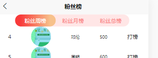
}效果: 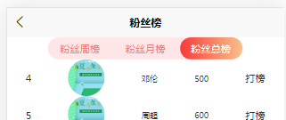
方式2:半圆样式单独写,利用before和after属性
<template>
    <!-- 导航栏 -->
    <view class="nav-top">
       <view class="btn-nav" :class="{activated: index==indexBtn}" v-for="(item, index) in btnList"
        :key="index" @click="changeBTn(index)">{

   {item}}</view>
    </view>

</template>

<script>
export default {
  components: {},
  data() {
    return {

      btnList:["粉丝周榜","粉丝月榜","粉丝总榜"],
      indexBtn: null,
    };
  },
  methods: {
      changeBTn(index){
          this.indexBtn = index
      }
  }
};
</script>

<style lang="scss" scoped>
.nav-top{
    text-align: center;
    background: #FFE6E6;
    width:560rpx;
    margin: 0 auto;
    border-radius:  30rpx;
    .btn-nav {
      width: 150rpx;
      text-align: center;
      height: 60rpx;
      line-height: 60rpx;
      color: #F97777;
      position: relative;
      display: inline-block;
      z-index: 100;
    }
    .btn-nav::before {
      position: absolute;
      content: ""; //必须设置这个值才会看到半圆
      left: -28rpx;
      width: 30rpx;
      height: 60rpx;
      border-radius: 30rpx 0 0 30rpx;  //设置左半圆
      line-height: 60rpx;
    //   background: #666;
    }
    .btn-nav::after {
      position: absolute;
      content: ""; //必须设置这个值才会看到半圆
      right: -28rpx;
      width: 30rpx;
      height: 60rpx;
      border-radius: 0 30rpx 30rpx 0;  //设置右半圆
      line-height: 60rpx;
    }
    .btn-nav:nth-child(2){
        margin-left: 40rpx;
        margin-right:40rpx;
    }
    .activated{
        background: linear-gradient(to right,#F83A3A,#F7C18B);
        color:#fff;
         z-index: 1000;
    }
    .activated::before{
        background: linear-gradient(#F83A3A);  //颜色可以独立设置
         z-index: 1000;
    }
    .activated::after{
        background: linear-gradient(to right,#F7C18B);//颜色可以独立设置
        z-index: 1000;
    }
}

</style>
效果: