一、 clip属性
通过对元素进行剪切来控制元素的可显示区域clip:rect(10px,30px,100px,12px);默认情况下,元素是不进行任何剪切的,但是也有可能剪切区域也显示的设置了clip属性
首先你要注意:clip属性只能在元素设置了“position:absolute”或者“position:fixed”属性起作用。clip无法在设置“position:relative”和“position:static”上工作。
.selector {
    clip: <shape> | auto | inherit
}
shape是一个函数功能,当使用仅使用rect()属性;
auto:这是一个默认值,clip设置auto值和没有进行剪切是一样的效果;
inherit:继承父元素的clip属性值。
很多时候,你可能希望有更多的shape函数功能使用,比如说rect()和circle()等,但是到目前为止仅有rect()函数可使用,不过不用担心,这个功能就可以帮我们制作很多很酷的效果。
Rect()使用
接下来我们来看rect()使用方法。rect()需要设置四个值:top, right, bottom和left。他们之间需要用逗号隔开,而且rect()属性值和margin、padding以及bodrder具有一样的标准,遵循TRBL顺时针旋转的规则。
clip: rect(<top>, <right>, <bottom>, <left>);一、例子
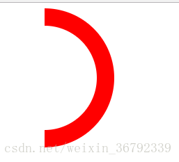
<!DOCTYPE html>
<html lang="en">
    <head>
        <meta charset="utf-8">
        <title>CSS clip</title>
        <style type="text/css">
        .warp{
          width: 200px;
          height: 200px;
          border-radius: 50%;
          background-color: red;
          position: absolute; /* 必须设置 apsolute或者fixed*/
          clip: rect(auto,auto,auto,100px);
        }

        .circular{
            width: 150px;
            height: 150px;
            border-radius: 50%;
            left: 25px;
            top:25px;
            position: absolute;
            background-color: #fff;
            clip: rect(auto,auto,auto,75px);
        }

        </style>
    </head>
    <body>
        <div class="warp">
            <div class="circular">
            </div>
        </div>

    </body>
</html>