闲来无事,用CSS简单实现 iPhone XR 低仿图
source-code底部自取;
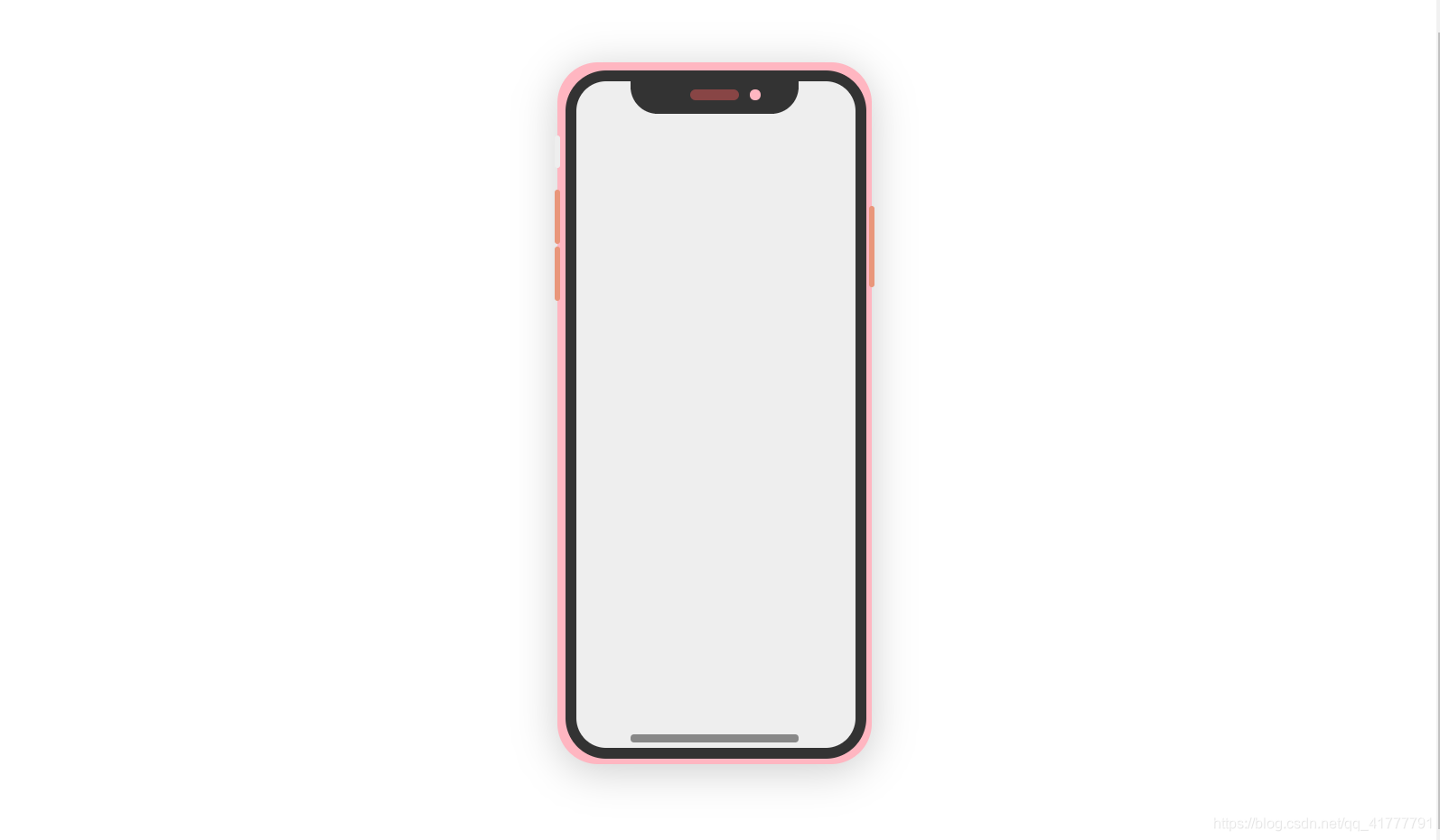
效果图如下:
<!DOCTYPE html>
<html lang="en">

<head>
    <meta charset="UTF-8">
    <meta name="viewport" content="width=device-width, initial-scale=1.0">
    <title>iPhone</title>
    <style>
        body {


            display: flex;
            justify-content: center;
            align-items: center;
            height: 100vh
        }

        html {


            margin: 0;
            padding: 0
        }

        .box {


            /* flex:1 */
            width: 82.8px;
            height: 197.2px;
            background-color: #eee;
            border: 3px solid #333;
            margin: 1px;
            position: relative;
            border-radius: 12px;
        }

        .border {


            display: flex;
            justify-content: center;
            border: 1px solid lightpink;
            background-color: lightpink;
            border-radius: 12px;
            /* overflow: hidden; */
            height: fit-content;
            width: fit-content;
            transform: scale(3);
            box-shadow: 0 2px 12px 0 rgba(0, 0, 0, .2);
            position: relative;
        }

        .header {


            background-color: #333;
            height: 10px;
            margin: 0 auto;
            width: 60%;
            border-radius: 0 0 8px 8px;
        }

        .bar {


            width: 60%;
            height: 2px;
            position: absolute;
            left: 20%;
            /* right:50%; */
            bottom: 1.5px;
            border-radius: 1px;
            background-color: #888;
        }

        .hole {


            margin: 0px auto;
            /* margin-top: 10px; */
            position: relative;
            top: 3px;
            background-color: rgb(136, 69, 69);
            height: 3px;
            width: 30%;
            border-radius: 3px;
        }

        .hole::after {


            content: "";
            width: 3px;
            height: 3px;
            position: absolute;
            left: 120%;
            border-radius: 50%;
            background-color: lightpink;
        }

        .power {


            position: absolute;
            left: 100%;
            top: 20%;
            height: 24px;
            width: 2px;
            background-color: darksalmon;
            z-index: 100;
            border-radius: 3px;
        }

        .sound1 {


            position: absolute;
            right: 100%;
            top: 18%;
            height: 16px;
            width: 2px;
            background-color: darksalmon;
            z-index: 100;
            border-radius: 3px;
        }

        .sound2 {


            position: absolute;
            right: 100%;
            top: 26%;
            height: 16px;
            width: 2px;
            background-color: darksalmon;
            z-index: 100;
            border-radius: 3px;
        }
         .mute {


            position: absolute;
            right: 100%;
            top: 10%;
            height: 10px;
            width: 2px;
            background-color:#eee;
            z-index: 100;
            border-radius: 3px;
        }
    </style>
</head>

<body>
    <div class="border">
        <div class="box">
            <div class="header">
                <div class="hole"></div>
            </div>
            <div class="bar"></div>
        </div>
        <div class="power"></div>
        <div class="sound1"></div>
        <div class="sound2"></div>
        <div class="mute"></div>
    </div>

</body>

</html>