四个半圆叠加,过半调整 z-index
<div class="container">
  <div class="fan-1"></div>
  <div class="fan-2"></div>
  <div class="fan-3"></div>
  <div class="fan-4"></div>
</div>
.container {
    width: 200px;
    height: 200px;
    position: relative;
    border-radius: 100%;
}

div {
  width: 50%;
  height: 100%;
  position: absolute;
  left: 0;
  top: 0;
}

.fan-1,
.fan-3 {
  background: #CC9999;
}

.fan-2,
.fan-4 {
  background: white;
}

.fan-1,
.fan-2 {
  border-radius: 100px 0 0 100px;
  transform-origin: 100% 50%;
  z-index: 2;
}

.fan-3,
.fan-4 {
  z-index: 1;
  left: 50%;
  border-radius: 0 100px 100px 0;
  transform-origin: 0% 50%;
}

.fan-4 {
  animation: rotate-2 2s linear both infinite;
}

.fan-2 {
  animation: rotate-1 2s linear both infinite;
}

.fan-3 {
  animation: zIndex 2s linear both infinite;
}

@keyframes zIndex {
  from {
    z-index: 1;
  }

  50% {
    z-index: 1;
  }

  50.000001% {
    z-index: 2;
  }

  to {
    z-index: 2;
  }
}

@keyframes rotate-1 {
  from {
    transform: rotate(0);
  }

  50% {
    transform: rotate(0);
  }

  to {
    transform: rotate(180deg);
  }
}

@keyframes rotate-2 {
  from {
    transform: rotate(0);
  }

  50% {
    transform: rotate(180deg);
  }

  to {
    transform: rotate(180deg);
  }
}
clip-path 切多边形, border-radius 裁剪
<div class="sector"></div>
.sector {
  display: inline-block;
  margin: 20px;
  background: #CC9999;
  width: 100px;
  height: 100px;
  border-radius: 100%;
  animation: sector 4s linear both infinite;
  transform: rotate(45deg);
}

@keyframes sector{
  from {
    clip-path: polygon(50% 50%, 0% 0%, 0% 0%);
  }
  25% {
    clip-path: polygon(50% 50%, 0% 0%, 100% 0%);
  }
  25.000001% {
    clip-path: polygon(50% 50%, 0% 0%, 100% 0%, 100% 0%);
  }
  50%{
    clip-path: polygon(50% 50%, 0% 0%, 100% 0%, 100% 100%);
  }
  50.000001%{
    clip-path: polygon(50% 50%, 0% 0%, 100% 0%, 100% 100%, 100% 100%);
  }
  75%{
    clip-path: polygon(50% 50%, 0% 0%, 100% 0%, 100% 100%, 0% 100%);
  }
  75.000001%{
    clip-path: polygon(50% 50%, 0% 0%, 100% 0%, 100% 100%, 0% 100%, 0% 100%);
  }
  to{
    clip-path: polygon(50% 50%, 0% 0%, 100% 0%, 100% 100%, 0% 100%, 0% 0%);
  }
}
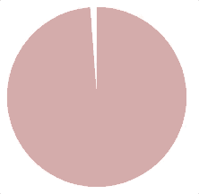
静态:
先画一个圆,外加两个绝对定位的半圆
扇形可以通过两个半圆作为遮罩旋转来露出相应的角度实现
这只能切出180°以内的扇形
超过180°的扇形,就把圆作为底色,两个遮罩作为扇形的组成部分
想获得不同度数的扇形,改变 mask 样式里的度数即可。
<div class="contain">
	<div class="main"></div>
	<div class="mask1 common"></div>
	<div class="mask2 common"></div>
</div>
.contain {
	position: relative;
	width: 200px;
	height: 200px;
}
.main {
	height: 100%;
	background: lightgreen;
	border-radius: 100px;
}
.common {
	position: absolute;
	top: 0;
	width: 50%;
	height: 100%;
}
.mask1 {
	transform: rotate(83deg);
	border-radius: 100px 0 0 100px;
	left: 0;
	transform-origin: right center;
	background: red;
}
.mask2 {
	transform: rotate(-76deg);
	transform-origin: left center;
	left: 100px;
	border-radius: 0 100px 100px 0;
	background: blue;
}
