Content
Columns
-
age: 主要受益人的年龄
-
sex: 保险承包商性别,女性,男性
-
bmi: 体重指数,提供对身体的了解,体重相对于身高相对较高或较低,
体重的客观指数(kg/m2),采用身高与体重的比率,理想情况下为18.5至24.9 -
children: 健康保险覆盖的子女人数/受抚养人人数
-
smoker:吸烟
-
region: 受益人在美国东北部、东南部、西南部、西北部的居住区。
-
charges: 由健康保险支付的个人医疗费用
Introduction
为了实现利润,保险公司必须收取比支付给被保险人的金额更高的保费。因此,保险公司投入大量的时间、精力和金钱来创建能够准确预测医疗成本的模型。为了完成这项任务,我们将首先分析影响医疗负荷的因素,然后尝试建立适当的模型并优化其性能。
探索性数据分析
导入数据
data <- read.csv("insurance.csv")
导入必要的工具
library(tidyverse)
library(caret)
library(purrr)
library(e1071)
library(olsrr)
library(ggplot2)
重写以大写字母开头的列名。
colnames(data) <- c('Age', 'Sex','Bmi','Children','Smoker','Region','Charges')
我们可以将bmi分为4类:(体重不足、正常、超重、肥胖)。根据cdc.gov网站:
18.5以下为体重不足;18.5到24.9之间是正常的;25.0到29.9之间的人超重;体重指数>=30.0属于肥胖
data$Weight_status[data$Bmi < 18.500]<- "Underweight"
data$Weight_status[data$Bmi >= 18.500 & data$Bmi <= 24.900]<- "Normal"
data$Weight_status[data$Bmi > 24.900  & data$Bmi <= 29.900]<- "Overweight"
data$Weight_status[data$Bmi > 29.900]<- "Obese"
快速数据探索性分析
#quick view of 10 first data in dataset
head(data, 10)
#quick glimpse on the dataset
str(data, vec.len = 2, strict.width = 'no', width = 30)
# a summary of selected columns only(interger & numeric)
summary(data[,c(1,3,4,7)])
table(data$Sex)
table(data$Smoker)
table(data$Region)
table(data$Weight_status)
可视化变量之间的相关性
pairs(data[,c(1,3,4,7)], pch=16, col="red", main="Matrix Scatterplot of relationship among varbles")

我们可以注意到,年龄/儿童、体重指数/儿童和儿童/费用不相关。
我们可以绘制每个重量状态的成本分布图
ggplot(data, aes(x = Weight_status, y = Charges)) +
  geom_boxplot() +
  geom_jitter(aes(color = Weight_status)) +
  scale_y_continuous(labels = scales::unit_format(suffix ="$")) +
  labs(title = "Distribution of medical costs per weight status") +
  theme(plot.title = element_text(hjust =0.5))

从图中,我们可以看到肥胖类别的分布比任何其他类别都要高。
基于5个数字的总结。超重类别的分布略高于正常/体重不足类别
我们可以画出每个孩子的成本分布图

options(scipen = 999)
ggplot(data = data, aes(Charges)) +
  geom_density(aes(fill = Smoker),alpha = 0.6) +
  suppressWarnings(facet_wrap(Sex~.)) +
  #scale_x_continuous(labels = scales:: unit_format(suffix = "$")) +
  labs(title = "Distribution of Medicals insurance costs for smokers per number of Children")

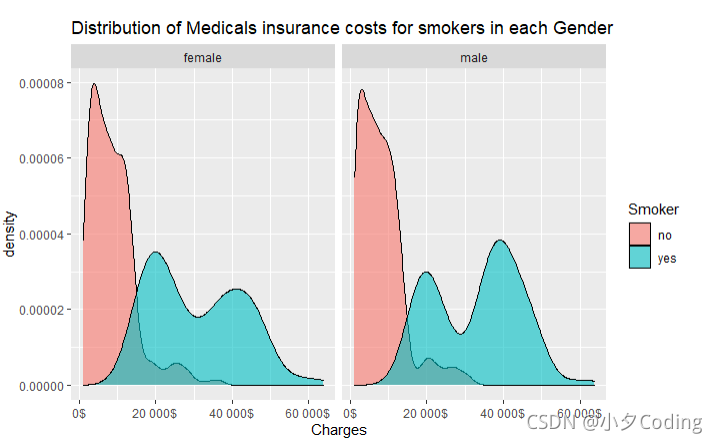
Distribution of Medicals insurance costs for smokers in each Gender
options(scipen = 999)
ggplot(data = data, aes(Charges)) +
  geom_density(aes(fill = Smoker),alpha = 0.6) +
  facet_wrap(Sex~.) +
  scale_x_continuous(labels = scales:: unit_format(suffix = "$")) +
  labs(title = "Distribution of Medicals insurance costs for smokers in each Gender")
Distribution of Number of smokers with Chrildren
options(dplyr.summarise.inform = FALSE)
data1 = data%>% filter(Smoker == 'yes')%>%group_by(Children)%>%summarise(count=length(Smoker))
ggplot(data1, aes(x= Children, y=count)) +
  geom_col(aes(fill = Children)) +
  scale_x_continuous(breaks = seq(0,5))+
  labs(title = "Number of smokers with Children") +
  theme(plot.title = element_text(hjust =0.5)) #center ggplot title
  #scale_y_continuous(breaks = seq(0,30,120))

“Distribution of Medical Costs per Region”
ggplot(data = data,aes(x=Region, y= Charges)) +
  geom_boxplot()+
  scale_y_continuous(labels = scales:: unit_format(suffix = "$")) +
  geom_jitter(aes(color=Region)) +
  labs(title = "Distribution of Medical Costs per Region")+
  theme(plot.title = element_text(hjust =0.5))
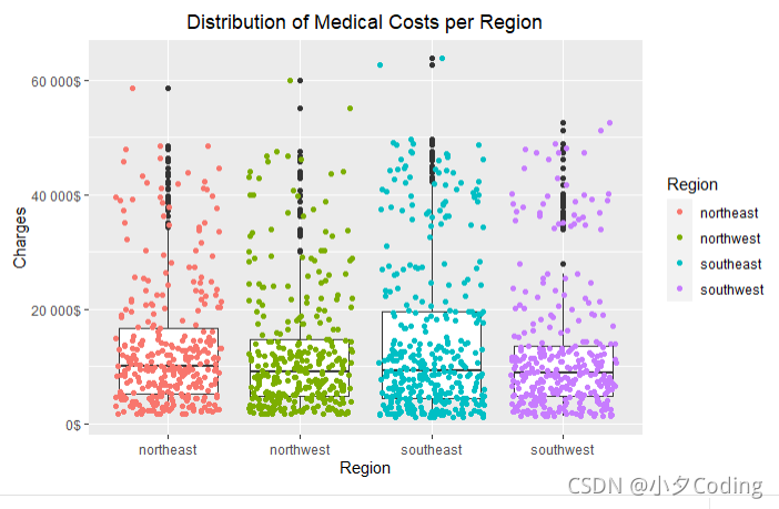
Plots show that region of origin doens’t have much of impact with the amount of medical cost.
Model Building
Splitting the data into training and test dataset
set.seed(100)
data_split <-data$Charges %>%
  createDataPartition(p=0.8,list = FALSE)

data_train <- data[data_split,]
data_test <- data[-data_split,]
model_lm<-stats::step(lm(Charges ~.-Weight_status, data= data_train), direction ='backward',trace = 0)
summary(model_lm)
确定模型的拟合程度:
R_平方(决定系数)-测量因变量中方差的比例
这可以用独立变量来解释。在我们的例子中,
自变量解释的因变量变异性为0.7419或74.19%。
调整后的R平方修正了样本产生的正偏差,其值为0.7411,约为74.1%
我们的模型将是收费=-11815.23+259.41年龄+310.95体重指数+547.99儿童+23916.96吸烟区
如方框图所示,地区对医疗费用没有任何影响。
对于估计的模型系数,它说明了当其他变量保持不变时,医疗费用金额随一个系数变化的程度。
例如,我们可以看到,当患者吸烟时,医疗费用增加了23916.96美元
而医疗费用每增加一年就增加259.41美元。
模型的统计意义
方差分析表中的F比率测试整体回归模型是否适合数据。
F(41067)=776.7,p<22*10^-16。它显示了自变量(年龄、Bmi、儿童和烟民)
统计上显著预测因变量(费用)-回归模型良好。
自变量的统计显著性
我们可以得出结论,所有自变量在统计学上显著不同于0,
因为每个独立变量的每个p都<0.05
采用多元回归法预测年龄/体重指数/儿童/吸烟者/地区的费用。
这些变量在统计上显著预测了电荷,F(41067)=776.7,p<0.05,R_平方=0.7419
所有四个变量在统计学上显著增加了预测,p<0.05
检查模型系数的置信区间
confint(model_lm)
#Assumption Analysis
par(mfrow =c(2,2))
plot(model_lm)
1.Residuals vs fitted -> used to check the linear relationship assumptions.
There are no distinct patterns, therefore, this is an indication for linear relationship
- Normal Q-Q -> used to determine whether the residuals are normally distributed.
We can see that the residuals points dont folow straight line.
Therefore, the residuals are not normally distributed - Scale-location(or spread-location) is homogeneity of variance(homoscedasticity) determination
- Residuals vs Leverage is for identifying influential points, which are points that might impact regression results when included or excluded from the analysis
Further to plots, we can use test check some assumptions
multicollinearity
car::vif(model_lm)
heteroscedasticity
lmtest::bptest(model_lm)
normality test
shapiro.test(model_lm$residuals)
Predicting the dependent variable(Charges)
model_pred <- model_lm %>% predict(data_test)
Model performance
RMSE(model_pred, data_test$Charges) #Root-mean_square error
R2(model_pred, data_test$Charges)
This is just the basic analysis. This model can be improved by non-linear relations and/or removed outliers to be continued