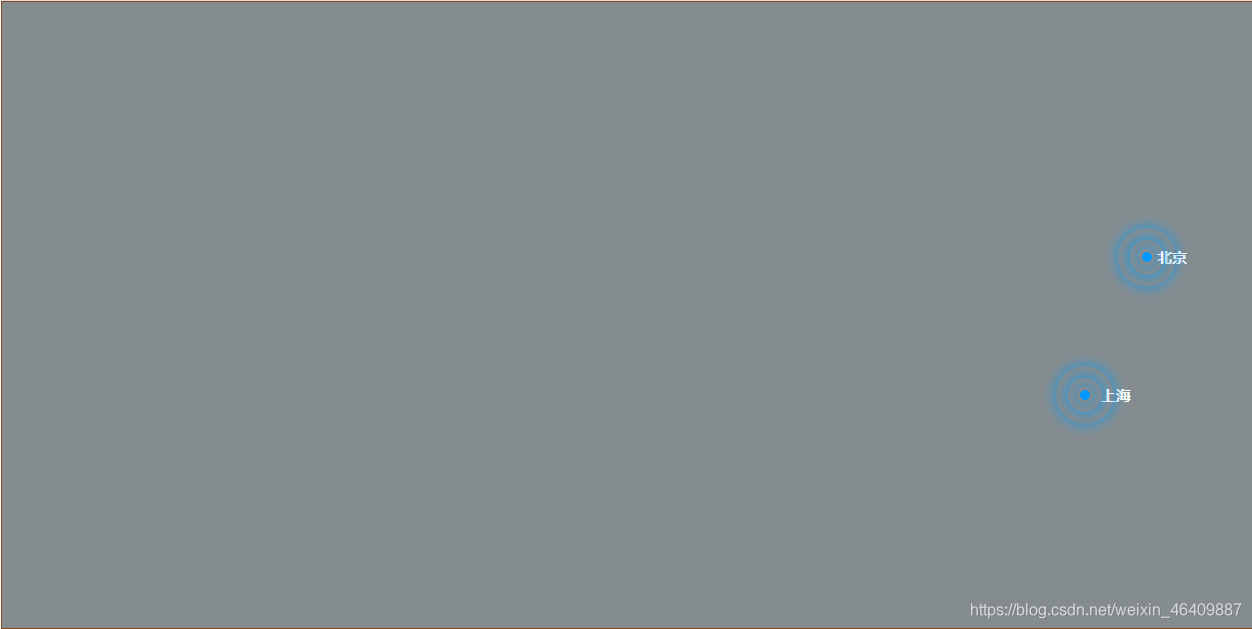
效果图:
代码:
<!DOCTYPE html>
<html lang="en">
<head>
  <meta charset="UTF-8">
  <meta http-equiv="X-UA-Compatible" content="IE=edge">
  <meta name="viewport" content="width=device-width, initial-scale=1.0">
  <title>大数据热点图标</title>
  <style>
    *{
      margin:0;
      padding:0;
    }
    .map{
      width:1000px;
      height: 500px;
      margin:0 auto;
      background-color: rgb(133, 140, 143);
      border:1px saddlebrown solid;
      position: relative;
    }
    .dep{
      position: absolute;
      top:200px;
      right: 80px;
      width:8px;
      height: 8px;
      border-radius: 50%;
      background-color: #09f;
    }
    h6{
      color:white;
      width:27px;
      font-size: 10px;
      position: absolute;
    }
     .d1{
      top: 196px;
      right: 49px;
    }
    .d2{
      top: 306px;
      right: 94px;
    }
    .map div[class^="plus"]{
      position: absolute;
      top:50%;
      left:50%;
      transform: translate(-50%,-50%);
      width:8px;
      height: 8px;
      box-shadow: 0 0 12px #009dfd;
      border-radius: 50%;
      animation: pluse 1.2s linear infinite;/*1.2s  匀速  无限循环*/
    }
    .map div .tb{
      top: 310px;
      right: 130px;
    }
    .map div .plus2{
     animation-delay: 0.4s;
    }
    .map div .plus3{
      animation-delay: 0.8s;
    }
    @keyframes pluse {
      0%{}
      70%{
        width:40px;
        height: 40px;
        opacity: 1;
      }
      100%{
        width: 70px;
        height: 70px;
        opacity: 0;
      }
    }
  </style>
</head>
<body>
  <div class="map">
    <!-- beijing -->
  <div>
    <h6 class="d1">北京</h6>
    <div class="dep">
     <div class="plus1"></div>
     <div class="plus2"></div>
     <div class="plus3"></div>
    </div>
  </div>
    <!-- shanghai -->
   <div>
      <h6 class="d2">上海</h6>
      <div class="dep tb">
       <div class="plus1"></div>
       <div class="plus2"></div>
       <div class="plus3"></div>
      </div>
   </div>
   <!--  -->
  </div>
</body>
</html>
总结:如果要更符合现实,就用地图来当背景图片,效果会更好,这里只是做一个示例。