前面是一个图标的动画,这篇试一试多个图标的动画:
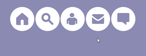
先创建四个图标,
<span class="home icon">Home</span>
<span class="search icon">Search</span>
<span class="user icon">User</span>
<span class="mail icon">Mail</span>
<span class="chat icon">Chat</span>
还是先把最基本的布局弄一下:
    body{
        background: #8b8ab3;
    }
    .icon{
        font-size: 0%;
        cursor: pointer;
        display: inline-block;
        position: relative;
        margin-right: 20px;
        background: #ffffff;
        border-radius: 50%;
        width: 100px;
        height: 100px;
		/*设置图表位置,便于观察动画*/
        margin: auto;
        top: 100px;
        left: 100px;
        right: 100px;
        bottom: 100px;
    }
添加图标并设置图标的属性:
    .icon::before{
        font-family: 'icon-font';
        content: "\e609";
        font-size: 50px;
        color: #8b8ab3;
        text-align: center;
        box-sizing: border-box;
        display: block;
        line-height: 100px;  /*设置图标居中 等于height*/
    }
    .home::before{
        content:"\e62e";
    }
    .search::before{
        content:"\e630";
    }
    .user::before{
        content:"\e631";
    }
    .mail::before{
        content:"\e632";
    }
    .chat::before{
        content:"\e62d";
    }
上面的步骤完成后,可以看到基本的图标,但现在他们还不会动。
然后,我们开始制作动画,还是使用 keyframes:
    @-webkit-keyframes move {
        from {
            opacity:0;
            -webkit-transform: translateY(100%);
        }
        to {
            opacity:1;
            -webkit-transform: translateY(0%);
        }
    }
    @keyframes move {
        from { /*从透明度为 0 ,位置为y轴下100%距离*/
            opacity:0;
            transform: translateY(100%);
        }
        to { /*变为  透明度为1 ,y轴返回原位*/
            opacity:1;
            transform: translateY(0%);
        }
    }
opacity 是设置图标的透明级别:https://www.w3school.com.cn/cssref/pr_opacity.asp
transform是变形的意思,包含几种变形的方式,可参考: https://blog.csdn.net/weixin_42220533/article/details/89476267
以上动画的过程表述为:透明度由 0 变为 1,位置从下面移到上面来。
然后,在 .icon 属性中设置动画的执行:
	-webkit-animation:move 1s linear;
	animation:move 1s linear;
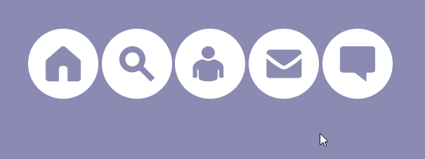
效果图:
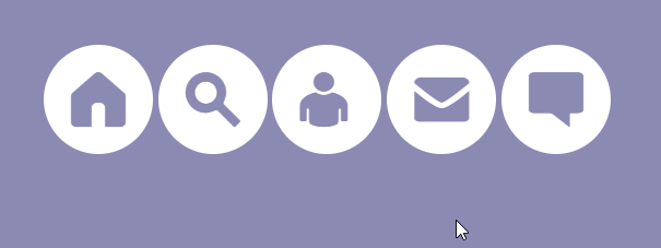
为了弄清楚动画的变化过程和理解代码,我们设置动画执行时间为 4秒:
接着,我们要让动画变得更加好看,让图标一个接着一个的执行动画效果,为每一个图标设置延迟时间:
    .home{
        -webkit-animation-delay:0s;
        animation-delay:0s;
    }
    .search{
        -webkit-animation-delay:.1s;
        animation-delay:.1s;
    }
    .user{
        -webkit-animation-delay:.2s;
        animation-delay:.2s;
    }
    .mail{
        -webkit-animation-delay:.3s;
        animation-delay:.3s;
    }
    .chat{
        -webkit-animation-delay:.4s;
        animation-delay:.4s;
    }
animation-delay 设置动画的延迟时间:https://www.w3school.com.cn/cssref/pr_animation-delay.asp
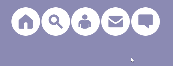
为了动画清楚,实际设置的时间较长一点,效果如下:
到此,动画已经做好了,但是,仔细观看,发现动画还是有一点美中不足。可以看出,后面的图标几乎是“掉”到下面的,这使得动画显的有点不流畅的感觉。原因是,除了第一个图标外,其他的图标我们都设置了延迟,而在动画启动的一瞬间,动画会变成透明的并且向下移,所以,我们会看到图标“一闪而过”。
解决上面的问题,我们使用 animation-fill-mode: both; 这一属性.
https://www.w3school.com.cn/cssref/pr_animation-fill-mode.asp
这一属性规定了元素在动画时间之外的状态是怎样的。

这里设置的是 both,根据定义,理解为,在动画开始之前,图标显示为 from里面的值,即在下面位置,透明度为0;动画完成后,图标显示为 to 里面的动画,即回到原位,透明度为1。
    .icon{
        -webkit-animation-fill-mode: both;
    	animation-fill-mode: both; /*backwards*/
    }
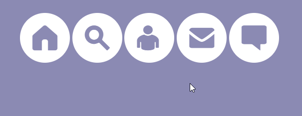
效果如下,可以看到一闪而过的情况没有了。
最后,我们修改一下,动画时间函数。使得图标在返回到最上面时会有反弹效果。
先在:https://cubic-bezier.com/#0,0,1,1 这个网站绘制函数,然后带入到 css 中。
    .icon{
        -webkit-animation:move 1s  cubic-bezier(.62,-0.91,.45,1.97);
	    animation:move 1s cubic-bezier(.62,-0.91,.45,1.97);
        -webkit-animation-fill-mode: both;
    	animation-fill-mode: both; /*backwards*/
    }
修改一下内边距和动画时间,最终变为:

