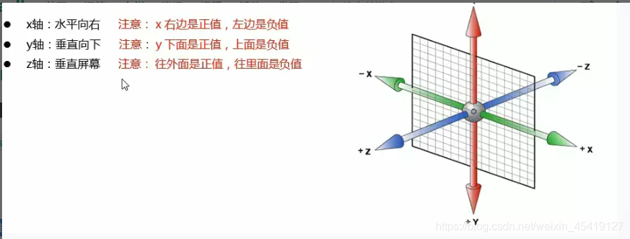
3D
简称3维坐标系 比二维坐标系多一个Z轴
3D位移
3D位移在2D的基础上多一个可移动的Z轴
transform: translate3d(x,y,z);
<!DOCTYPE html>
<html lang="en">

<head>
    <meta charset="UTF-8">
    <meta name="viewport" content="width=device-width, initial-scale=1.0">
    <title>Document</title>
    <style>
        * {
            margin: 0;
            padding: 0;
        }


        .box {
            width: 200px;
            height: 200px;
            background-color: blue;
            /* 位移3D的写法 */
            /* transform: translate3d(200px, 200px, 200px); */
            /* 或者可以这样写 */
            transform: translateX(400px) translateY(400px) translateZ(400px);
        }
    </style>
</head>

<body>
    <div class="box"></div>
</body>

</html>
注意事项
- x轴 y轴一般用px及百分比当做单位
- z轴一般用px当做单位,必须借助透视功能
- z轴向外移动一般是正值,向内移动是负值。
perspective
特点
- 透视是视距,单位为px
- 透视写在被观察元素的父元素上。
- 透视的单位越大,看到的物品就越小,透视的单位越小,看到的物品就越大。
- 在透视固定的情况下,z轴越大,看到的物品就越大,z轴越小,看到的物品就越小。
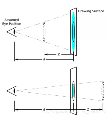
在这张图中,d为透视,位于人的眼睛和被观察物体的中间
<!DOCTYPE html>
<html lang="en">

<head>
    <meta charset="UTF-8">
    <meta name="viewport" content="width=device-width, initial-scale=1.0">
    <title>Document</title>
    <style>
        * {
            margin: 0;
            padding: 0;
        }

        body {
            perspective: 500px;
        }

        .box {
            width: 200px;
            height: 200px;
            margin: 200px auto;
            background-color: blue;
            transform: translateZ(100px);
        }
    </style>
</head>

<body>
    <div class="box"></div>
</body>

</html>

3D旋转
3D 旋转指可以让元素在三维平面内沿着 x 轴、y 轴、z 轴 或者自定义轴进行旋转
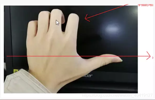
rotateX
左手弯曲的手指方向即为x轴的正方向
<!DOCTYPE html>
<html lang="en">

<head>
    <meta charset="UTF-8">
    <meta name="viewport" content="width=device-width, initial-scale=1.0">
    <title>Document</title>
    <style>
        * {
            margin: 0;
            padding: 0;
        }

        body {
            /* 3D效果的实现,必须依赖于透视 */
            perspective: 500px;
        }

        img {
            display: block;

            /* 设置圆角边框 */
            border-radius: 50%;
            width: 500px;
            /* 使用动画 */
            animation: move 2s linear 0s infinite alternate;
            /* 让元素居中对齐 */
            margin: 200px auto;
        }
        /* 定义动画 */

        @keyframes move {
            form {
                transform: rotateX(0deg);
            }
            to {
                transform: rotateX(360deg);
            }
        }
    </style>
</head>

<body>

    <img src="./img/girl.jpg" alt="">

</body>

</html>

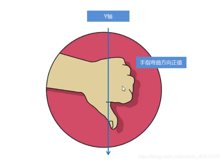
rotateY
左手手指弯曲的方向即为y轴的正方向
<!DOCTYPE html>
<html lang="en">

<head>
    <meta charset="UTF-8">
    <meta name="viewport" content="width=device-width, initial-scale=1.0">
    <title>Document</title>
    <style>
        * {
            margin: 0;
            padding: 0;
        }

        body {
            /* 加此属性是为了更好的使用3d效果 */
            perspective: 500px;
        }

        img {
            /* 转换成块级元素 */
            display: block;
            width: 500px;
            /* 移动的中心位置 */
            margin: 200px auto;
            /* 使用动画 */
            animation: move 2s linear 0s infinite alternate;
        }
        /* 定义动画 */

        @keyframes move {
            0% {
                transform: rotateY(0deg);
            }
            100% {
                transform: rotateY(180deg);
            }
        }
    </style>
</head>

<body>
    <img src="./img/girl.jpg" alt="">
</body>

</html>

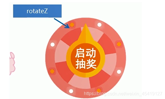
rotateZ
<!DOCTYPE html>
<html lang="en">

<head>
    <meta charset="UTF-8">
    <meta name="viewport" content="width=device-width, initial-scale=1.0">
    <title>Document</title>
    <style>
        * {
            margin: 0;
            padding: 0;
        }

        body {
            /* 添加透视 更好的实现3D效果 */
            perspective: 500px;
        }

        img {
            /* 转换成块级元素 */
            display: block;
            width: 500px;
            margin: 200px auto;
            animation: move 2s linear 0s infinite alternate;
        }
        /* 定义动画 */

        @keyframes move {
            0% {
                transform: rotateZ(0deg);
            }
            100% {
                transform: rotateZ(360deg);
            }
        }
    </style>
</head>

<body>
    <img src="./img/girl.jpg" alt="">
</body>

</html>

transform-style
transform-style;preserve-3d 让子元素保持3d空间环境
<!DOCTYPE html>
<html lang="en">

<head>
    <meta charset="UTF-8">
    <meta name="viewport" content="width=device-width, initial-scale=1.0">
    <title>Document</title>
    <style>
        * {
            margin: 0;
            padding: 0;
        }

        body {
            perspective: 500px;
        }

        .box {
            /* 开启定位 */
            position: relative;
            width: 400px;
            height: 400px;
            margin: 200px auto;
            /* 父元素开启3d环境 */
            transform-style: preserve-3d;
            animation: clinopodium 2s linear 0s infinite alternate;
        }
        /*使用属性选择器设置样式 */

        div[class^=son] {
            position: absolute;
            top: 0;
            left: 0;
            width: 100%;
            height: 100%;
            background-color: pink;
        }
        /* 设置子元素的第二个样式 */

        .box div:nth-of-type(2) {
            background-color: blue;
            transform: rotateX(112deg);
        }

        .box div:nth-of-type(3) {
            background-color: purple;
            transform: rotateX(230deg);
        }
        /* 定义动画 */

        @keyframes clinopodium {
            0% {
                transform: rotatex(0deg);
            }
            100% {
                transform: rotateX(360deg);
            }
        }
    </style>
</head>

<body>
    <div class="box">
        <div class="son1"></div>
        <div class="son2"></div>
        <div class="son3"></div>
    </div>
</body>

</html>

案例之演示
两面翻转的盒子
- 先准备一个大盒子 里面装着两个小盒子
- 让其中的一个盒子翻转180deg
<!DOCTYPE html>
<html lang="en">

<head>
    <meta charset="UTF-8">
    <meta name="viewport" content="width=device-width, initial-scale=1.0">
    <title>Document</title>
    <style>
        body {
            perspective: 400px;
        }

        .box {
            position: relative;
            width: 400px;
            height: 400px;
            margin: 200px auto;
            transition: all 1S linear 0s;
            /* 开启子元素在3d空间的环境 */
            transform-style: preserve-3d;
        }

        .box:hover {
            transform: rotateY(180deg);
        }

        .front,
        .back {
            position: absolute;
            top: 0;
            left: 0;
            width: 100%;
            height: 100%;
            text-align: center;
            line-height: 400px;
            color: #cccccc;
            font-weight: 700;
            border-radius: 50%;
        }

        .front {
            background-color: pink;
            z-index: 1;
        }

        .back {
            background-color: purple;
            /* 像手机一样 背靠背 旋转 */
            transform: rotateY(180deg);
        }
    </style>
</head>

<body>
    <div class="box">
        <div class="front">尧子陌</div>
        <div class="back">临风笑却世间</div>
    </div>
</body>

</html>

3D导航栏案例
<!DOCTYPE html>
<html lang="en">

<head>
    <meta charset="UTF-8">
    <meta name="viewport" content="width=device-width, initial-scale=1.0">
    <title>Document</title>
    <style>
        /* 注意 视距写在li上面 */

        * {
            margin: 0;
            padding: 0;
        }

        ul {
            width: 600px;
            margin: 100px auto;
        }

        li {
            /* 设置定位 子绝父相 */
            float: left;
            width: 100px;
            height: 35px;
            list-style: none;
            perspective: 500px;
        }

        .box {
            position: relative;
            top: 0;
            left: 0;
            width: 100%;
            height: 100%;
            /* 开启子元素的 3d效果 */
            transform-style: preserve-3d;
            /* 使用过渡效果 */
            transition: all 0.4s linear 0s;
        }
        /* 鼠标经过box旋转90deg */

        .box:hover {
            transform: rotateX(90deg);
        }

        .front,
        .bottom {
            position: absolute;
            top: 0;
            left: 0;
            width: 100%;
            height: 100%;
            text-align: center;
            line-height: 35px;
            color: cornsilk;
            font-family: '楷体';
        }

        .front {
            background-color: blue;
            z-index: 1;
            transform: translateZ(17.5px);
        }

        .bottom {
            background-color: brown;
            /* 先向下移动17.5px 再沿X轴旋转90deg */
            transform: translateY(17.5px) rotateX(-90deg);
        }
    </style>
</head>

<body>
    <ul>
        <li>
            <div class="box">
                <div class="front">hello</div>
                <div class="bottom">尧子陌</div>
            </div>
        </li>

        <li>
            <div class="box">
                <div class="front">hello</div>
                <div class="bottom">尧子陌</div>
            </div>
        </li>

    </ul>
</body>

</html>

3D木马
思路
- 分析如下:给body设置透视 给div的父元素设置3d效果
- 把每个盒子摆放到正确的位置 利用动画即可
<!DOCTYPE html>
<html lang="en">

<head>
    <meta charset="UTF-8">
    <meta name="viewport" content="width=device-width, initial-scale=1.0">
    <title>Document</title>
    <style>
        * {
            margin: 0;
            padding: 0;
        }

        body {
            /* 视距 */
            perspective: 1000px;
        }

        section {
            position: relative;
            width: 200px;
            height: 200px;
            margin: 200px auto;
            /* 让子元素显示3d属性 */
            transform-style: preserve-3d;
            /* 使用动画 */
            animation: rotate 2s linear 0s infinite;
        }

        section:hover {
            animation-play-state: paused;
        }

        @keyframes rotate {
            0% {
                transform: rotateY(0deg);
            }
            100% {
                transform: rotateY(360deg);
            }
        }

        section div {
            position: absolute;
            top: 0;
            left: 0;
            overflow: hidden;
            width: 100%;
            height: 100%;
            border-radius: 50px;
        }

        div img {
            width: 200px;
            height: 200px;
        }

        section div:nth-of-type(1) {
            transform: rotateY(0deg) translateZ(300px);
        }

        section div:nth-of-type(2) {
            transform: rotateY(60deg) translateZ(300px);
        }

        section div:nth-of-type(3) {
            transform: rotateY(120deg) translateZ(300px);
        }

        section div:nth-of-type(4) {
            transform: rotateY(180deg) translateZ(300px);
        }

        section div:nth-of-type(5) {
            transform: rotateY(240deg) translateZ(300px);
        }

        section div:nth-of-type(6) {
            transform: rotateY(300deg) translateZ(300px);
        }
    </style>
</head>

<body>
    <section>
        <div><img src="./img/girl.jpg" alt=""></div>
        <div><img src="./img/girl.jpg" alt=""></div>
        <div><img src="./img/girl.jpg" alt=""></div>
        <div><img src="./img/girl.jpg" alt=""></div>
        <div><img src="./img/girl.jpg" alt=""></div>
        <div><img src="./img/girl.jpg" alt=""></div>
    </section>
</body>

</html>

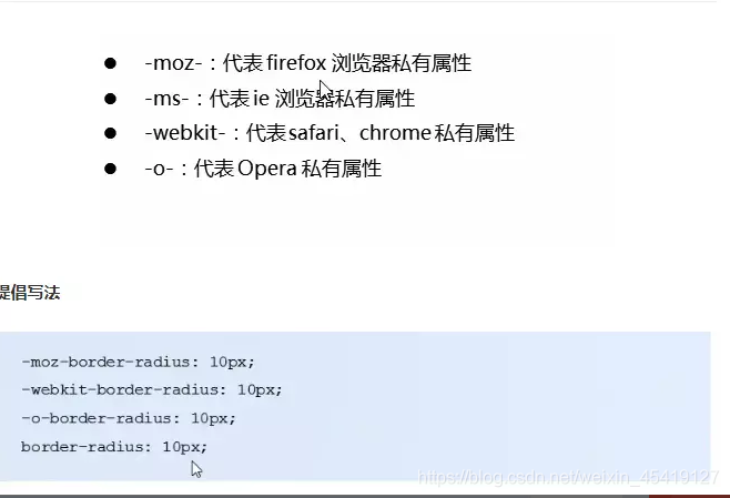
浏览器私有前缀