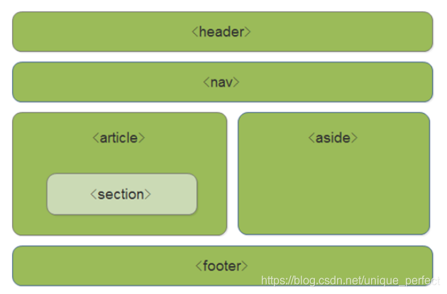
header   ---  头部标签
nav        ---  导航标签
article---   内容标签
section ---   块级标签
aside     ---   侧边栏标签
footer   ---   尾部标签
<!DOCTYPE html>
< htmllang = " en" > < head> < metacharset = " UTF-8" > < metaname = " viewport" content = " width=device-width, initial-scale=1.0" > < metahttp-equiv = " X-UA-Compatible" content = " ie=edge" > < title> </ title> < style>
header,
nav,
section {
display : block;
height : 120px;
background-color : pink;
margin : 10px;
}
</ style> </ head> < body> < header> </ header> < header> </ header> < nav> </ nav> < section> </ section> </ body> </ html> 1. 多媒体标签有两个,分别是
音频 -- audio
视频 -- video
2. audio标签说明
- 可以在不使用标签的情况下,也能够原生的支持音频格式文件的播放,
- 但是:播放格式是有限的
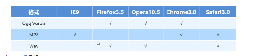
3. audio 支持的音频格式
- audio 目前支持三种格式
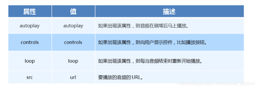
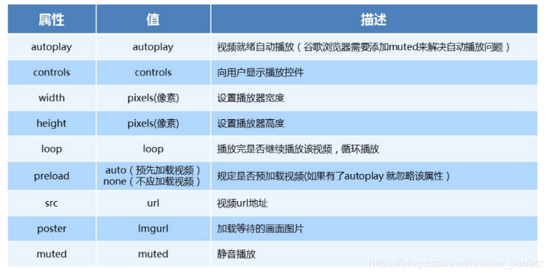
audio 的参数
audio 代码演示
<!DOCTYPE html>
< htmllang = " en" > < head> < metacharset = " UTF-8" > < metaname = " viewport" content = " width=device-width, initial-scale=1.0" > < metahttp-equiv = " X-UA-Compatible" content = " ie=edge" > < title> </ title> </ head> < body> < audiocontrols = " controls" > < sourcesrc = " media/snow.mp3" type = " audio/mpeg" /> < sourcesrc = " media/snow.ogg" type = " audio/ogg" /> </ audio> </ body> </ html> video 视频标签
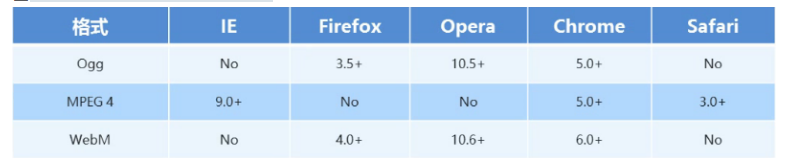
目前支持三种格式
语法格式
< videosrc = " ./media/video.mp4" controls = " controls" > </ video> video 参数
video 代码演示
<!DOCTYPE html>
< htmllang = " en" > < head> < metacharset = " UTF-8" > < metaname = " viewport" content = " width=device-width, initial-scale=1.0" > < metahttp-equiv = " X-UA-Compatible" content = " ie=edge" > < title> </ title> < style>
video {
width : 300px;
}
</ style> </ head> < body> < videomuted = " muted" loop = " loop" poster = " media/pig.jpg" controls > < sourcesrc = " media/video.mp4" type = " video/mp4" /> < sourcesrc = " media/video.ogg" type = " video/ogg" /> </ video> </ body> </ html> 音频标签与视频标签使用基本一致
多媒体标签在不同浏览器下情况不同,存在兼容性问题
谷歌浏览器把音频和视频标签的自动播放都禁止了
谷歌浏览器中视频添加 muted 标签可以自己播放
注意:重点记住使用方法以及自动播放即可,其他属性可以在使用时查找对应的手册
<!DOCTYPE html>
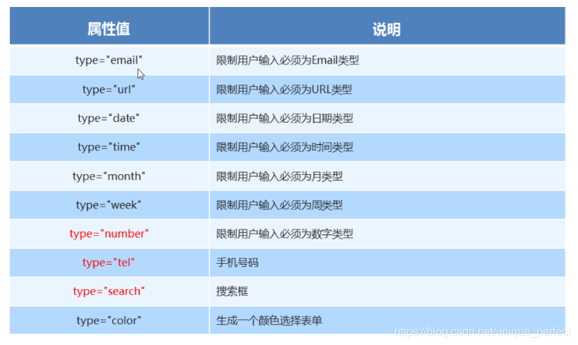
< htmllang = " en" > < head> < metacharset = " UTF-8" > < metaname = " viewport" content = " width=device-width, initial-scale=1.0" > < metahttp-equiv = " X-UA-Compatible" content = " ie=edge" > < title> </ title> </ head> < body> < formaction = " " > < ul> < li> < inputtype = " email" /> </ li> < li> < inputtype = " url" /> </ li> < li> < inputtype = " date" /> </ li> < li> < inputtype = " time" /> </ li> < li> < inputtype = " number" /> </ li> < li> < inputtype = " tel" /> </ li> < li> < inputtype = " search" /> </ li> < li> < inputtype = " color" /> </ li> < li> < inputtype = " submit" value = " 提交" > </ li> </ ul> </ form> </ body> </ html>
<!DOCTYPE html>
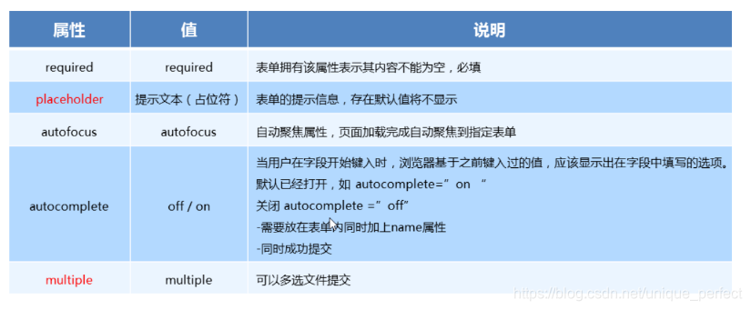
< htmllang = " en" > < head> < metacharset = " UTF-8" > < metaname = " viewport" content = " width=device-width, initial-scale=1.0" > < metahttp-equiv = " X-UA-Compatible" content = " ie=edge" > < title> </ title> </ head> < body> < formaction = " " > < inputtype = " text" required = " required" placeholder = " 请输入用户名" autofocus = " autofocus" name = " username" autocomplete = " off" > < inputtype = " submit" value = " 提交" > < inputtype = " file" name = " " id = " " multiple = " multiple" > </ form> </ body> </ html> 1. 什么是 CSS3
在CSS2 的基础上拓展、新增的样式
2. CSS3发展现状
移动端支持优于 PC 端
CSS3 目前还草案,在不断改进中
CSS3 相对 H5,应用非常广泛
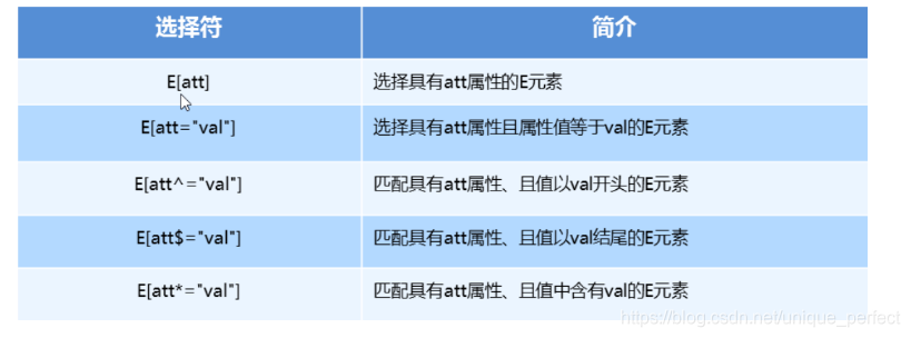
属性选择器列表
属性选择器代码演示
<!DOCTYPE html>
< htmllang = " en" > < head> < metacharset = " UTF-8" > < metaname = " viewport" content = " width=device-width, initial-scale=1.0" > < metahttp-equiv = " X-UA-Compatible" content = " ie=edge" > < title> </ title> < style>
button[disabled] {
cursor : default;
}
button {
cursor : pointer;
}
input[type="search"] {
color : pink;
}
div[class^="icon"] {
color : red;
}
div[class$="icon"] {
color : green;
}
div[class*="icon"] {
color : blue;
}
</ style> </ head> < body> < button> </ button> < button> </ button> < buttondisabled = " disabled" > </ button> < buttondisabled = " disabled" > </ button> < inputtype = " text" name = " " id = " " value = " 文本框" > < inputtype = " text" name = " " id = " " value = " 文本框" > < inputtype = " text" name = " " id = " " value = " 文本框" > < inputtype = " search" name = " " id = " " value = " 搜索框" > < inputtype = " search" name = " " id = " " value = " 搜索框" > < inputtype = " search" name = " " id = " " value = " 搜索框" > < divclass = " icon1" > </ div> < divclass = " icon2" > </ div> < divclass = " icon3" > </ div> < divclass = " iicon3" > </ div> < divclass = " absicon" > </ div> </ body> </ html> 属性列表
<!DOCTYPE html>
< htmllang = " en" > < head> < metacharset = " UTF-8" > < metaname = " viewport" content = " width=device-width, initial-scale=1.0" > < metahttp-equiv = " X-UA-Compatible" content = " ie=edge" > < title> </ title> < style>
ul li:first-child {
background-color : pink;
}
ul li:last-child {
background-color : deeppink;
}
ul li:nth-child(8) {
background-color : lightpink;
}
</ style> </ head> < body> < ul> < li> </ li> < li> </ li> < li> </ li> < li> </ li> < li> </ li> < li> </ li> < li> </ li> < li> </ li> < li> </ li> < li> </ li> </ ul> </ body> </ html> nth-child 参数详解
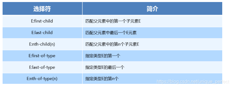
1. nth-child 详解
注意:本质上就是选中第几个子元素
n 可以是数字、关键字、公式
n 如果是数字,就是选中第几个
常见的关键字有 `even` 偶数、`odd` 奇数
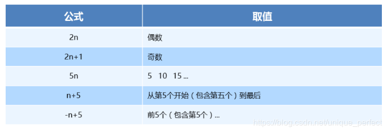
常见的公式如下(如果 n 是公式,则从 0 开始计算)
但是第 0 个元素或者超出了元素的个数会被忽略
nth-child
<!DOCTYPE html>
< htmllang = " en" > < head> < metacharset = " UTF-8" > < metaname = " viewport" content = " width=device-width, initial-scale=1.0" > < metahttp-equiv = " X-UA-Compatible" content = " ie=edge" > < title> </ title> < style>
ul li:nth-child(-n+5) {
background-color : pink;
}
</ style> </ head> < body> < ul> < li> </ li> < li> </ li> < li> </ li> < li> </ li> < li> </ li> < li> </ li> < li> </ li> < li> </ li> < li> </ li> < li> </ li> </ ul> </ body> <!DOCTYPE html>
< htmllang = " en" > < head> < metacharset = " UTF-8" > < metaname = " viewport" content = " width=device-width, initial-scale=1.0" > < metahttp-equiv = " X-UA-Compatible" content = " ie=edge" > < title> </ title> < style>
div span:nth-child(2) {
background-color : pink;
}
div span:first-of-type {
background-color : purple;
}
div span:last-of-type {
background-color : skyblue;
}
div span:nth-of-type(2) {
background-color : red;
}
</ style> </ head> < body> < div> < p> </ p> < span> </ span> < span> </ span> < span> </ span> </ div> < ul> < li> </ li> < li> </ li> < li> </ li> < li> </ li> < li> </ li> < li> </ li> < li> </ li> < li> </ li> < li> </ li> < li> </ li> </ ul> </ body> </ html> nth-child 和 nth-of-type的区别
< style>
div :nth-child(1) {
background-color : lightblue;
}
div :nth-child(2) {
background-color : lightpink;
}
div span:nth-of-type(2) {
background-color : lightseagreen;
}
div span:nth-of-type(3) {
background-color : #fff;
}
</ style> 区别
nth-child 选择父元素里面的第几个子元素,不管是第几个类型
nth-of-type 选择指定类型的元素
伪类选择器注意事项
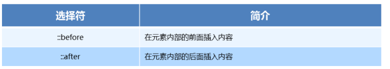
before 和 after必须有 content 属性
before在内容前面,after 在内容后面
before 和 after 创建的是一个元素,但是属于行内元素
创建出来的元素在 Dom中查找不到,所以称为伪元素
伪元素和标签选择器一样,权重为 1
CSS3伪元素选择器
<!DOCTYPE html>
< htmllang = " en" > < head> < metacharset = " UTF-8" > < metaname = " viewport" content = " width=device-width, initial-scale=1.0" > < metahttp-equiv = " X-UA-Compatible" content = " ie=edge" > < title> </ title> < style>
div {
width : 300px;
height : 300px;
border : 1px solid #000;
}
div::before {
content : "我" ;
display : inline-block;
width : 100px;
height : 100px;
background-color : pink;
}
div::after {
content : "小猪佩奇" ;
display : inline-block;
width : 100px;
height : 100px;
background-color : pink;
}
</ style> </ head> < body> < div> </ div> </ body> </ html> <!DOCTYPE html>
< htmllang = " en" > < head> < metacharset = " UTF-8" > < metaname = " viewport" content = " width=device-width, initial-scale=1.0" > < metahttp-equiv = " X-UA-Compatible" content = " ie=edge" > < title> </ title> < style>
@font-face {
font-family : 'icomoon' ;
src : url('fonts/icomoon.eot?cv013x') ;
src : url('fonts/icomoon.eot?cv013x#iefix') format ( 'embedded-opentype' ) , url('fonts/icomoon.ttf?cv013x') format ( 'truetype' ) , url('fonts/icomoon.woff?cv013x') format ( 'woff' ) , url('fonts/icomoon.svg?cv013x#icomoon') format ( 'svg' ) ;
font-weight : normal;
font-style : normal;
}
span {
font-family : 'icomoon' ;
position : absolute;
top : 10px;
right : 10px;
}
div,
p {
position : relative;
width : 249px;
height : 35px;
border : 1px solid red;
}
p::after {
content : '\ea50' ;
position : absolute;
top : 10px;
right : 10px;
font-family : 'icomoon' ;
}
</ style> </ head> < body> < div> < span> </ span> </ div> < p> </ p> </ body> </ html> <!DOCTYPE html>
< htmllang = " en" > < head> < metacharset = " UTF-8" > < metaname = " viewport" content = " width=device-width, initial-scale=1.0" > < metahttp-equiv = " X-UA-Compatible" content = " ie=edge" > < title> </ title> < style>
div {
width : 200px;
height : 200px;
background-color : pink;
}
div:first-child {
transform : translate ( 30px, 30px) ;
}
div:last-child {
background-color : purple;
}
</ style> </ head> < body> < div> </ div> < div> </ div> </ body> </ html> transition: all 0.3s; 这句话的作用就是给变化元素进行过渡
1. 2D转换
2D 转换是改变标签在二维平面上的位置和形状
移动: translate
旋转: rotate
缩放: scale

2. translate 语法
x 就是 x 轴上水平移动
y 就是 y 轴上水平移动

transform: translate(x, y)
transform: translateX(n)
transfrom: translateY(n)

3. 重点知识点
2D的移动主要是指 水平、垂直方向上的移动
translate最大的优点就是不影响其他元素的位置
translate中的100%单位,是相对于本身的宽度和高度来进行计算的
行内标签没有效果
让一个盒子水平垂直居中
<!DOCTYPE html>
< htmllang = " en" > < head> < metacharset = " UTF-8" > < metaname = " viewport" content = " width=device-width, initial-scale=1.0" > < metahttp-equiv = " X-UA-Compatible" content = " ie=edge" > < title> </ title> < style>
div {
position : relative;
width : 500px;
height : 500px;
background-color : pink;
}
p {
position : absolute;
top : 50%;
left : 50%;
width : 200px;
height : 200px;
background-color : purple;
transform : translate ( -50%, -50%) ;
}
span {
transform : translate ( 300px, 300px) ;
}
</ style> </ head> < body> < div> < p> </ p> </ div> < span> </ span> </ body> </ html> 1. rotate 旋转
2D旋转指的是让元素在二维平面内顺时针或者逆时针旋转
2.rotate语法
/* 单位是:deg */
transform: rotate(度数)
3. 重点知识点
rotate 里面跟度数,单位是 `deg`
角度为正时,顺时针,角度为负时,逆时针
默认旋转的中心点是元素的中心点
2D转换之旋转rotate
<!DOCTYPE html>
< htmllang = " en" > < head> < metacharset = " UTF-8" > < metaname = " viewport" content = " width=device-width, initial-scale=1.0" > < metahttp-equiv = " X-UA-Compatible" content = " ie=edge" > < title> </ title> < style>
img {
width : 150px;
border-radius : 50%;
border : 5px solid pink;
transition : all 0.3s;
}
img:hover {
transform : rotate ( 360deg) ;
}
</ style> </ head> < body> < imgsrc = " media/pic.jpg" alt = " " > </ body> </ html> <!DOCTYPE html>
< htmllang = " en" > < head> < metacharset = " UTF-8" > < metaname = " viewport" content = " width=device-width, initial-scale=1.0" > < metahttp-equiv = " X-UA-Compatible" content = " ie=edge" > < title> </ title> < style>
div {
position : relative;
width : 249px;
height : 35px;
border : 1px solid #000;
}
div::after {
content : "" ;
position : absolute;
top : 8px;
right : 15px;
width : 10px;
height : 10px;
border-right : 1px solid #000;
border-bottom : 1px solid #000;
transform : rotate ( 45deg) ;
transition : all 0.2s;
}
div:hover::after {
transform : rotate ( 225deg) ;
}
</ style> </ head> < body> < div> </ div> </ body> </ html> <!DOCTYPE html>
< htmllang = " en" > < head> < metacharset = " UTF-8" > < metaname = " viewport" content = " width=device-width, initial-scale=1.0" > < metahttp-equiv = " X-UA-Compatible" content = " ie=edge" > < title> </ title> < style>
div {
width : 200px;
height : 200px;
background-color : pink;
margin : 100px auto;
transition : all 1s;
transform-origin : 50px 50px;
}
div:hover {
transform : rotate ( 360deg) ;
}
</ style> </ head> < body> < div> </ div> </ body> </ html> <!DOCTYPE html>
< htmllang = " en" > < head> < metacharset = " UTF-8" > < metaname = " viewport" content = " width=device-width, initial-scale=1.0" > < metahttp-equiv = " X-UA-Compatible" content = " ie=edge" > < title> </ title> < style>
div {
overflow : hidden;
width : 200px;
height : 200px;
border : 1px solid pink;
margin : 10px;
float : left;
}
div::before {
content : "黑马" ;
display : block;
width : 100%;
height : 100%;
background-color : hotpink;
transform : rotate ( 180deg) ;
transform-origin : left bottom;
transition : all 0.4s;
}
div:hover::before {
transform : rotate ( 0deg) ;
}
</ style> </ head> < body> < div> </ div> < div> </ div> < div> </ div> </ body> </ html> 2D转换之旋转rotate
<!DOCTYPE html>
< htmllang = " en" > < head> < metacharset = " UTF-8" > < metaname = " viewport" content = " width=device-width, initial-scale=1.0" > < metahttp-equiv = " X-UA-Compatible" content = " ie=edge" > < title> </ title> < style>
div {
width : 200px;
height : 200px;
background-color : pink;
margin : 100px auto;
}
div:hover {
transform : scale ( 2) ;
}
</ style> </ head> < body> < div> </ div> </ body> </ html> <!DOCTYPE html>
< htmllang = " en" > < head> < metacharset = " UTF-8" > < metaname = " viewport" content = " width=device-width, initial-scale=1.0" > < metahttp-equiv = " X-UA-Compatible" content = " ie=edge" > < title> </ title> < style>
div {
overflow : hidden;
float : left;
margin : 10px;
}
div img {
transition : all .4s;
}
div img:hover {
transform : scale ( 1.1) ;
}
</ style> </ head> < body> < div> < ahref = " #" > < imgsrc = " media/scale.jpg" alt = " " > </ a> </ div> < div> < ahref = " #" > < imgsrc = " media/scale.jpg" alt = " " > </ a> </ div> < div> < ahref = " #" > < imgsrc = " media/scale.jpg" alt = " " > </ a> </ div> </ body> </ html> <!DOCTYPE html>
< htmllang = " en" > < head> < metacharset = " UTF-8" > < metaname = " viewport" content = " width=device-width, initial-scale=1.0" > < metahttp-equiv = " X-UA-Compatible" content = " ie=edge" > < title> </ title> < style>
li {
float : left;
width : 30px;
height : 30px;
border : 1px solid pink;
margin : 10px;
text-align : center;
line-height : 30px;
list-style : none;
border-radius : 50%;
cursor : pointer;
transition : all .4s;
}
li:hover {
transform : scale ( 1.2) ;
}
</ style> </ head> < body> < ul> < li> </ li> < li> </ li> < li> </ li> < li> </ li> < li> </ li> < li> </ li> < li> </ li> </ ul> </ body> </ html> <!DOCTYPE html>
< htmllang = " en" > < head> < metacharset = " UTF-8" > < metaname = " viewport" content = " width=device-width, initial-scale=1.0" > < metahttp-equiv = " X-UA-Compatible" content = " ie=edge" > < title> </ title> < style>
div {
width : 200px;
height : 200px;
background-color : pink;
transition : all .5s;
}
div:hover {
transform : translate ( 150px, 50px) rotate ( 180deg) scale ( 1.2) ;
}
</ style> </ head> < body> < div> </ div> </ body> </ html> <!DOCTYPE html>
< htmllang = " en" > < head> < metacharset = " UTF-8" > < metaname = " viewport" content = " width=device-width, initial-scale=1.0" > < metahttp-equiv = " X-UA-Compatible" content = " ie=edge" > < title> </ title> < style>
@keyframes move{
0% {
transform : translateX ( 0px) ;
}
100% {
transform : translateX ( 1000px) ;
}
}
div {
width : 200px;
height : 200px;
background-color : pink;
animation-name : move;
animation-duration : 2s;
}
</ style> </ head> < body> < div> </ div> </ body> </ html> <!DOCTYPE html>
< htmllang = " en" > < head> < metacharset = " UTF-8" > < metaname = " viewport" content = " width=device-width, initial-scale=1.0" > < metahttp-equiv = " X-UA-Compatible" content = " ie=edge" > < title> </ title> < style>
@keyframes move{
0% {
transform : translate ( 0, 0) ;
}
25% {
transform : translate ( 1000px, 0)
}
50% {
transform : translate ( 1000px, 500px) ;
}
75% {
transform : translate ( 0, 500px) ;
}
100% {
transform : translate ( 0, 0) ;
}
}
div {
width : 100px;
height : 100px;
background-color : pink;
animation-name : move;
animation-duration : 10s;
}
</ style> </ head> < body> < div> </ div> </ body> </ html>
<!DOCTYPE html>
< htmllang = " en" > < head> < metacharset = " UTF-8" > < metaname = " viewport" content = " width=device-width, initial-scale=1.0" > < metahttp-equiv = " X-UA-Compatible" content = " ie=edge" > < title> </ title> < style>
@keyframes move{
0% {
transform : translate ( 0, 0) ;
}
100% {
transform : translate ( 1000px, 0) ;
}
}
div {
width : 100px;
height : 100px;
background-color : pink;
animation-name : move;
animation-delay : 1s;
}
div:hover {
animation-play-state : paused;
}
</ style> </ head> < body> < div> </ div> </ body> </ html> <!DOCTYPE html>
< htmllang = " en" > < head> < metacharset = " UTF-8" > < metaname = " viewport" content = " width=device-width, initial-scale=1.0" > < metahttp-equiv = " X-UA-Compatible" content = " ie=edge" > < title> </ title> < style>
body {
background-color : #333;
}
.map {
position : relative;
width : 747px;
height : 616px;
background : url(media/map.png) no-repeat;
margin : 0 auto;
}
.city {
position : absolute;
top : 227px;
right : 193px;
color : #fff;
}
.tb {
top : 500px;
right : 80px;
}
.dotted {
width : 8px;
height : 8px;
background-color : #09f;
border-radius : 50%;
}
.city div[class^="pulse"] {
position : absolute;
top : 50%;
left : 50%;
transform : translate ( -50%, -50%) ;
width : 8px;
height : 8px;
box-shadow : 0 0 12px #009dfd;
border-radius : 50%;
animation : pulse 1.2s linear infinite;
}
.city div.pulse2 {
animation-delay : 0.4s;
}
.city div.pulse3 {
animation-delay : 0.8s;
}
@keyframes pulse{
0% {
}
70% {
width : 40px;
height : 40px;
opacity : 1;
}
100% {
width : 70px;
height : 70px;
opacity : 0;
}
}
</ style> </ head> < body> < divclass = " map" > < divclass = " city" > < divclass = " dotted" > </ div> < divclass = " pulse1" > </ div> < divclass = " pulse2" > </ div> < divclass = " pulse3" > </ div> </ div> < divclass = " city tb" > < divclass = " dotted" > </ div> < divclass = " pulse1" > </ div> < divclass = " pulse2" > </ div> < divclass = " pulse3" > </ div> </ div> </ div> </ body> </ html> 速度曲线细节
animation-timing-function: 规定动画的速度曲线,默认是ease
<!DOCTYPE html>
< htmllang = " en" > < head> < metacharset = " UTF-8" > < metaname = " viewport" content = " width=device-width, initial-scale=1.0" > < metahttp-equiv = " X-UA-Compatible" content = " ie=edge" > < title> </ title> < style>
div {
overflow : hidden;
font-size : 20px;
width : 0;
height : 30px;
background-color : pink;
white-space : nowrap;
animation : w 4s steps ( 10) forwards;
}
@keyframes w{
0% {
width : 0;
}
100% {
width : 200px;
}
}
</ style> </ head> < body> < div> </ div> </ body> </ html> <!DOCTYPE html>
< htmllang = " en" > < head> < metacharset = " UTF-8" > < metaname = " viewport" content = " width=device-width, initial-scale=1.0" > < metahttp-equiv = " X-UA-Compatible" content = " ie=edge" > < title> </ title> < style>
body {
background-color : #ccc;
}
div {
position : absolute;
width : 200px;
height : 100px;
background : url(media/bear.png) no-repeat;
animation : bear .4s steps ( 8) infinite, move 3s forwards;
}
@keyframes bear{
0% {
background-position : 0 0;
}
100% {
background-position : -1600px 0;
}
}
@keyframes move{
0% {
left : 0;
}
100% {
left : 50%;
transform : translateX ( -50%) ;
}
}
</ style> </ head> < body> < div> </ div> </ body> </ html> transition实现过渡的效果。
transform实现转化的效果。比如旋转、平移、缩放
perspective实现近大远小的效果。给父盒子添加
transform-style: preserve-3d;开启3D效果,给父盒子添加,父盒子跟子盒子都有3D效果
3D 转换知识要点
3D位移:translate3d(x, y, z)
3D旋转:rotate3d(x, y, z)
透视:perspctive
3D呈现 transfrom-style
3D 移动 translate3d
transform: translateX(100px):仅仅是在 x 轴上移动
transform: translateY(100px):仅仅是在 y 轴上移动
transform: translateZ(100px):仅仅是在 z 轴上移动
transform: translate3d(x, y, z):其中x、y、z 分别指要移动的轴的方向的距离
注意:x, y, z 对应的值不能省略,不需要填写用 0 进行填充
语法
transform: translate3d(x, y, z)
代码演示
transform: translate3d(100px, 100px, 100px)
/* 注意:x, y, z 对应的值不能省略,不需要填写用 0 进行填充 */
transform: translate3d(100px, 100px, 0)
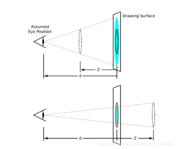
透视 perspective
透视需要写在被视察元素的父盒子上面
注意下方图片
d:就是视距,视距就是指人的眼睛到屏幕的距离
z:就是 z 轴,z 轴越大(正值),我们看到的物体就越大
<!DOCTYPE html>
< htmllang = " en" > < head> < metacharset = " UTF-8" > < metaname = " viewport" content = " width=device-width, initial-scale=1.0" > < metahttp-equiv = " X-UA-Compatible" content = " ie=edge" > < title> </ title> < style>
body {
perspective : 200px;
}
div {
width : 200px;
height : 200px;
background-color : pink;
transform : translate3d ( 400px, 100px, 100px) ;
}
</ style> </ head> < body> < div> </ div> </ body> </ html> translateZ
translateZ 与 perspecitve 的区别
perspecitve给父级进行设置,translateZ给 子元素进行设置不同的大小
<!DOCTYPE html>
< htmllang = " en" > < head> < metacharset = " UTF-8" > < metaname = " viewport" content = " width=device-width, initial-scale=1.0" > < metahttp-equiv = " X-UA-Compatible" content = " ie=edge" > < title> </ title> < style>
body {
perspective : 500px;
}
div {
width : 200px;
height : 200px;
background-color : pink;
margin : 100px auto;
transform : translateZ ( 0) ;
}
</ style> </ head> < body> < div> </ div> < div> </ div> < div> </ div> </ body> </ html> 语法
transform: rotateX(45deg) -- 沿着 x 轴正方向旋转 45 度
transform: rotateY(45deg) -- 沿着 y 轴正方向旋转 45 度
transform: rotateZ(45deg) -- 沿着 z 轴正方向旋转 45 度
transform: rotate3d(x, y, z, 45deg) -- 沿着自定义轴旋转 45 deg 为角度
transform: rotate3d(x, y, z, deg) -- 沿着自定义轴旋转 deg 为角度
x, y, z 表示旋转轴的矢量,是标识你是否希望沿着该轴进行旋转,最后一个标旋转的角度
transform: rotate3d(1, 1, 0, 180deg) -- 沿着对角线旋转 45deg
transform: rotate3d(1, 0, 0, 180deg) -- 沿着 x 轴旋转 45deg
rotateX
<!DOCTYPE html>
< htmllang = " en" > < head> < metacharset = " UTF-8" > < metaname = " viewport" content = " width=device-width, initial-scale=1.0" > < metahttp-equiv = " X-UA-Compatible" content = " ie=edge" > < title> </ title> < style>
body {
perspective : 300px;
}
img {
display : block;
margin : 100px auto;
transition : all 1s;
}
img:hover {
transform : rotateX ( 45deg) ;
}
</ style> </ head> < body> < imgsrc = " media/pig.jpg" alt = " " > </ body> </ html> <!DOCTYPE html>
< htmllang = " en" > < head> < metacharset = " UTF-8" > < metaname = " viewport" content = " width=device-width, initial-scale=1.0" > < metahttp-equiv = " X-UA-Compatible" content = " ie=edge" > < title> </ title> < style>
body {
perspective : 500px;
}
img {
display : block;
margin : 100px auto;
transition : all 1s;
}
img:hover {
transform : rotateY ( 45deg) ;
}
</ style> </ head> < body> < imgsrc = " media/pig.jpg" alt = " " > </ body> </ html> <!DOCTYPE html>
< htmllang = " en" > < head> < metacharset = " UTF-8" > < metaname = " viewport" content = " width=device-width, initial-scale=1.0" > < metahttp-equiv = " X-UA-Compatible" content = " ie=edge" > < title> </ title> < style>
body {
perspective : 500px;
}
img {
display : block;
margin : 100px auto;
transition : all 1s;
}
img:hover {
transform : rotate3d ( 1, 1, 0, 45deg) ;
}
</ style> </ head> < body> < imgsrc = " media/pig.jpg" alt = " " > </ body> </ html> transform-style
控制子元素是否开启三维立体环境
transform-style: flat 代表子元素不开启 3D立体空间,默认的
transform-style: preserve-3d子元素开启立体空间
代码写给父级,但是影响的是子盒子
<!DOCTYPE html>
< htmllang = " en" > < head> < metacharset = " UTF-8" > < metaname = " viewport" content = " width=device-width, initial-scale=1.0" > < metahttp-equiv = " X-UA-Compatible" content = " ie=edge" > < title> </ title> < style>
body {
perspective : 500px;
}
.box {
position : relative;
width : 200px;
height : 200px;
margin : 100px auto;
transition : all 2s;
transform-style : preserve-3d;
}
.box:hover {
transform : rotateY ( 60deg) ;
}
.box div {
position : absolute;
top : 0;
left : 0;
width : 100%;
height : 100%;
background-color : pink;
}
.box div:last-child {
background-color : purple;
transform : rotateX ( 60deg) ;
}
</ style> </ head> < body> < divclass = " box" > < div> </ div> < div> </ div> </ div> </ body> </ html> <!DOCTYPE html>
< htmllang = " en" > < head> < metacharset = " UTF-8" > < metaname = " viewport" content = " width=device-width, initial-scale=1.0" > < metahttp-equiv = " X-UA-Compatible" content = " ie=edge" > < title> </ title> < style>
body {
perspective : 400px;
}
.box {
position : relative;
width : 300px;
height : 300px;
margin : 100px auto;
transition : all .4s;
transform-style : preserve-3d;
}
.box:hover {
transform : rotateY ( 180deg) ;
}
.front,
.back {
position : absolute;
top : 0;
left : 0;
width : 100%;
height : 100%;
border-radius : 50%;
font-size : 30px;
color : #fff;
text-align : center;
line-height : 300px;
}
.front {
background-color : pink;
z-index : 1;
}
.back {
background-color : purple;
transform : rotateY ( 180deg) ;
}
</ style> </ head> < body> < divclass = " box" > < divclass = " front" > </ div> < divclass = " back" > </ div> </ div> </ body> </ html> <!DOCTYPE html>
< htmllang = " en" > < head> < metacharset = " UTF-8" > < metaname = " viewport" content = " width=device-width, initial-scale=1.0" > < metahttp-equiv = " X-UA-Compatible" content = " ie=edge" > < title> </ title> < style>
* {
margin : 0;
padding : 0;
}
ul {
margin : 100px;
}
ul li {
float : left;
margin : 0 5px;
width : 120px;
height : 35px;
list-style : none;
perspective : 500px;
}
.box {
position : relative;
width : 100%;
height : 100%;
transform-style : preserve-3d;
transition : all .4s;
}
.box:hover {
transform : rotateX ( 90deg) ;
}
.front,
.bottom {
position : absolute;
left : 0;
top : 0;
width : 100%;
height : 100%;
}
.front {
background-color : pink;
z-index : 1;
transform : translateZ ( 17.5px) ;
}
.bottom {
background-color : purple;
transform : translateY ( 17.5px) rotateX ( -90deg) ;
}
</ style> </ head> < body> < ul> < li> < divclass = " box" > < divclass = " front" > </ div> < divclass = " bottom" > </ div> </ div> </ li> < li> < divclass = " box" > < divclass = " front" > </ div> < divclass = " bottom" > </ div> </ div> </ li> < li> < divclass = " box" > < divclass = " front" > </ div> < divclass = " bottom" > </ div> </ div> </ li> < li> < divclass = " box" > < divclass = " front" > </ div> < divclass = " bottom" > </ div> </ div> </ li> < li> < divclass = " box" > < divclass = " front" > </ div> < divclass = " bottom" > </ div> </ div> </ li> < li> < divclass = " box" > < divclass = " front" > </ div> < divclass = " bottom" > </ div> </ div> </ li> </ ul> </ body> </ html> <!DOCTYPE html>
< htmllang = " en" > < head> < metacharset = " UTF-8" > < metaname = " viewport" content = " width=device-width, initial-scale=1.0" > < metahttp-equiv = " X-UA-Compatible" content = " ie=edge" > < title> </ title> < style>
body {
perspective : 1000px;
}
section {
position : relative;
width : 300px;
height : 200px;
margin : 150px auto;
transform-style : preserve-3d;
animation : rotate 10s linear infinite;
background : url(media/pig.jpg) no-repeat;
}
section:hover {
animation-play-state : paused;
}
@keyframes rotate{
0% {
transform : rotateY ( 0) ;
}
100% {
transform : rotateY ( 360deg) ;
}
}
section div {
position : absolute;
top : 0;
left : 0;
width : 100%;
height : 100%;
background : url(media/dog.jpg) no-repeat;
}
section div:nth-child(1) {
transform : rotateY ( 0) translateZ ( 300px) ;
}
section div:nth-child(2) {
transform : rotateY ( 60deg) translateZ ( 300px) ;
}
section div:nth-child(3) {
transform : rotateY ( 120deg) translateZ ( 300px) ;
}
section div:nth-child(4) {
transform : rotateY ( 180deg) translateZ ( 300px) ;
}
section div:nth-child(5) {
transform : rotateY ( 240deg) translateZ ( 300px) ;
}
section div:nth-child(6) {
transform : rotateY ( 300deg) translateZ ( 300px) ;
}
</ style> </ head> < body> < section> < div> </ div> < div> </ div> < div> </ div> < div> </ div> < div> </ div> < div> </ div> </ section> </ body> </ html> <!DOCTYPE html>
< htmllang = " en" > < head> < metacharset = " UTF-8" > < title> </ title> < style>
* {
padding : 0;
margin : 0;
}
body {
padding : 200px 300px;
}
ul {
position : relative;
list-style : none;
width : 300px;
height : 300px;
transform : rotate3d ( 1, 1, 0, -45deg) ;
transform-style : preserve-3d;
}
ul > li {
position : absolute;
top : 0;
left : 0;
width : 300px;
height : 300px;
line-height : 300px;
text-align : center;
font-size : 40px;
}
ul > li:nth-of-type(1) {
background-color : #ccc;
transform : translateZ ( 150px) ;
}
ul > li:nth-of-type(2) {
background-color : skyblue;
transform : translateZ ( -150px) rotateY ( 180deg) ;
}
ul > li:nth-of-type(3) {
background-color : greenyellow;
transform : translateX ( -150px) rotateY ( -90deg) ;
}
ul > li:nth-of-type(4) {
background-color : deeppink;
transform : translateX ( 150px) rotateY ( 90deg) ;
}
ul > li:nth-of-type(5) {
background-color : rebeccapurple;
transform : translateY ( -150px) rotateX ( 90deg) ;
}
ul > li:nth-of-type(6) {
background-color : saddlebrown;
transform : translateY ( 150px) rotateX ( -90deg) ;
}
</ style> </ head> < body> < ul> < li> </ li> < li> </ li> < li> </ li> < li> </ li> < li> </ li> < li> </ li> </ ul> </ body> </ html>