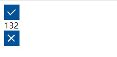
css实现勾 √
.right {


  width: 28px;
  height: 28px;
  line-height: 26px;
  border: 1px solid #025299;
  background-color: #025299;
  position: relative;
  cursor: pointer;
}

.right::before {


  position: absolute;
  content: " ";
  width: 7px;
  height: 13px;
  transform: rotate(45deg);
  border-right: 2px solid #fff;
  border-bottom: 2px solid #fff;
  top: 4px;
  left: 9px;
}
css实现叉 x
.error {


  width: 28px;
  height: 28px;
  line-height: 26px;
  border: 1px solid #025299;
  background-color: #025299;
  position: relative;
  cursor: pointer;
}

.error::before,
.error::after {


  content: "";
  position: absolute;
  height: 18px;
  width: 2px;
  top: 5px;
  left: 12px;
  background: #fff;
}
.error::before {


  transform: rotate(45deg);
}
.error::after {


  transform: rotate(-45deg);
}
效果展示