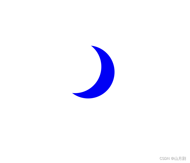
效果图:
<!doctype html>
<html lang="en">
<head>
    <meta charset="UTF-8">
    <title>Verb</title>
    <style>
        .center {
            position: absolute;
            margin: auto;
            top: 0;
            right: 0;
            bottom: 0;
            left: 0;
            width: 100px;
            height: 100px;
            background-color: transparent;
            border-radius: 50%;
            box-shadow: 25px 10px 0px 0px blue;
        }
    </style>
</head>
<body>
        <div class="center"></div>
</body>
</html>

<!doctype html>
<html lang="en">
<head>
    <meta charset="UTF-8">
    <title>Verb</title>
    <style>
        .heart {
            position: absolute;
            margin: auto;
            top: 0;
            right: 0;
            bottom: 0;
            left: 0;
            background-color: pink;
            height: 50px;
            width: 50px;
            transform: rotate(-45deg);
        }
        .heart::after {
            background-color: pink;
            content: "";
            border-radius: 50%;
            position: absolute;
            width: 50px;
            height: 50px;
            top: 0px;
            left: 25px;
        }
        .heart::before {
            background-color: pink;
            border-radius: 50%;
            position: absolute;
            width: 50px;
            height: 50px;
            top: -25px;
            left: 0px;
            content: '';
        }
    </style>
</head>
<body>
<div class="heart"></div>
</body>
</html>