<!DOCTYPE html>
<html lang="en">

<head>
    <meta charset="UTF-8">
    <title>:after :before</title>
    <style>
    li {
        list-style-type: none;
        position: relative;
        margin: 2px;
        padding: 0.5em 0.5em 0.5em 2em;
        background: lightgrey;
        font-family: sans-serif;
    }

    li.done {
        background: #CCFF99;
    }

    li.done::before {
        content: '';
        position: absolute;
        border-color: #009933;
        border-style: solid;
        border-width: 0 0.3em 0.25em 0;
        height: 1em;
        top: 1.3em;
        left: 0.6em;
        margin-top: -1em;
        transform: rotate(45deg);
        width: 0.5em;
    }
    </style>
</head>

<body>
    <ul>
        <li>Buy milk</li>
        <li>Take the dog for a walk</li>
        <li>Exercise</li>
        <li>Write code</li>
        <li>Play music</li>
        <li>Relax</li>
    </ul>
</body>
<script>
var list = document.querySelector('ul');
list.addEventListener('click', function(ev) {
    if (ev.target.tagName === 'LI') {
        ev.target.classList.toggle('done');
    }
}, false);
</script>

</html>
效果如下:
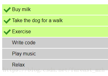
关键的css:
li.done::before {
    content: '';
    position: absolute;
    border-color: #009933;
    border-style: solid;
    border-width: 0 0.3em 0.25em 0;
    height: 1em;
    top: 1.3em;
    left: 0.6em;
    margin-top: -1em;
    transform: rotate(45deg);
    width: 0.5em;
}
* bootstrap 向下的三角形 用于下拉菜单
.caret {
    border-left: 4px solid transparent;
    border-right: 4px solid transparent;
    border-top: 4px dashed;
    display: inline-block;
    height: 0;
    margin-left: 2px;
    vertical-align: middle;
    width: 0;
}