本文共有七个相册效果,都十分好看,照片可以替换成女朋友照片。
使用方法: 桌面新建一个文本文档,把代码复制进去,保存后把后缀改为html,双击即可打开页面。有些需要加照片,注意一下命名和文件夹位置即可。
代码1、3、7都是可以直接用的,其他代码css或者js文件没有给出,所以打开可能是空白的,可以去我的资源下载所有代码。html相册代码大全
代码1:
<!DOCTYPE html>
<html lang="en">
<head>
	<meta charset="UTF-8">
	<title>致青春</title>
	<style>
		*{

     margin: 0;padding: 0;}
		html,body{

     height: 100%;}
		body{


			overflow: hidden;
			display: flex;
			background: #000;
			perspective: 1000px;
			transform-style: preserve-3d;
		}
		#box{


			position: relative;
			display: flex;
			width: 130px;
			height: 200px;
			margin: auto;
			transform-style: preserve-3d;
			transform: rotateX(-10deg);
		}
		#box > div{


			transform-style: preserve-3d;
			position: absolute;
			left: 0;
			top: 0;
			width: 100%;
			height: 100%;
			line-height: 200px;
			font-size: 50px;
			text-align: center;
			box-shadow:0 0 10px #fff;
			-webkit-box-reflect:below 10px -webkit-linear-gradient(top,rgba(0,0,0,0) 40%,rgba(0,0,0,.8) 100%);
		}
		/*  #box > div:nth-child(1){
					background: skyblue;
					transform: translate3d(0,0,300px) rotateY(45deg);
				}
				#box > div:nth-child(2){
					background: pink;
					transform: rotateY(0deg);
				}
				#box > div:nth-child(3){
					background: purple;
					transform: translate3d(0,0,300px) rotateY(-45deg);
				}
		*/
		#box p{


			position: absolute;
			left: 0;
			top: 0;
			bottom: 0;
			right: 0;
			margin: auto;
			width: 1200px;
			height: 1200px;
			background: -webkit-radial-gradient(center center,600px 600px,rgba(50,50,50,1),rgba(0,0,0,0));
			border-radius: 50%;
			transform: rotateX(90deg) translate3d(-600px,0,-105px);
		}
	</style>
</head>
<body>
<div id="box">
	<div></div>
	<div></div>
	<div></div>
	<div></div>
	<div></div>
	<div></div>
	<div></div>
	<div></div>
	<div></div>
	<div></div>
	<p></p>
</div>
<script>
setTimeout(init,100);
function init(){


	var obox = document.getElementById('box'),
		aDiv = obox.getElementsByTagName('div');

		for (var i = 0; i < aDiv.length; i++) {


			aDiv[i].style.background = "url(images/"+(i+1)+".jpg) center/cover";
			aDiv[i].style.transform = "rotateY("+(i*36)+"deg) translate3d(0,0,350px)";
			aDiv[i].style.transition = "transform 1s "+(aDiv.length-i)*0.2+"s";
		}
	var sX,
		sY,
		nX,
		nY,
		desX = 0,
		desY = 0,
		tX = 0,
		tY = 10,
		index = 0;//滚轮初始值
	document.onmousedown = function(e){


		clearInterval(obox.timer);
		e = e || window.event;
		var sX = e.clientX,
			sY = e.clientY;
			this.onmousemove = function(e){


				e = e || window.event;
				var nX = e.clientX,
					nY = e.clientY;
					 // 当前点的坐标和前一点的坐标差值
					desX = nX - sX;
					desY = nY - sY;
                    tX += desX*0.1;
                    tY += desY*0.1;

					obox.style.transform = "rotateX("+(-tY)+"deg) rotateY("+tX+"deg)";
					sX = nX;
					sY = nY;
			}
			this.onmouseup = function(){


				this.onmousemove = this.onmouseup = null;
				obox.timer = setInterval(function(){


					desX *= 0.95;
					desY *= 0.95;
					tX += desX*0.1;
					tY += desY*0.1;
					obox.style.transform = "rotateX("+(-tY)+"deg) rotateY("+tX+"deg)";
					if (Math.abs(desX)<0.5 && Math.abs(desY)<0.5) {


						clearInterval(obox.timer);
					}
				},13);
			}
		return false;
	}
	//滚轮放大缩小
	mousewheel(document,function(e){


		e = e || window.event;
		var d = e.wheelDelta/120 || -e.detail/3;
			if (d>0) {


				index-=20;
			}else{


				index+=30;
			}
			(index<(-1050)&&(index=(-1050)));
		document.body.style.perspective = 1000 + index + "px";
	})
	function mousewheel(obj,fn){


		document.onmousewheel===null?obj.onmousewheel=fn:addEvent(obj,"DOMMouseScroll",fn)
	}
	function addEvent(obj,eName,fn){


		obj.attachEvent?obj.attachEvent("on"+eName,fn):obj.addEventListener(eName,fn);
	}
}
</script>
</body>
</html>
代码1说明:
需要自己建一个images文件夹存放图片。(和html文件放在一个文件夹下,里面的图片命名为1.jpg、2.jpg等,一共10张)
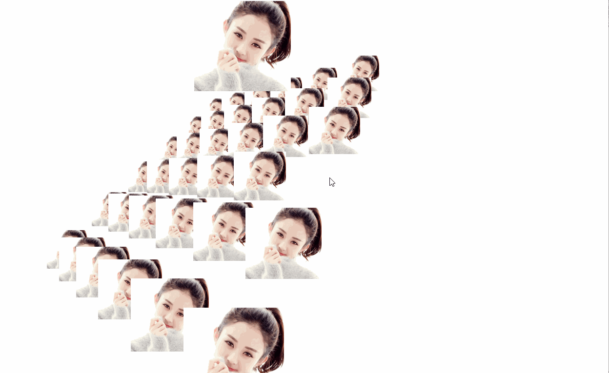
代码1效果:

代码2:
<!DOCTYPE html>
<html lang="en">
<head>
<meta charset="UTF-8">
<title>相册</title>
<script src="js/jquery.min.js"></script>
<script src="js/snow.js"></script>
<link type="text/css" href="css/style.css" rel="stylesheet">
</head>
<body>
<div class="snow-container">
  <div class="ziti">
       <span>
       </span>
  </div>
<div class="dongtai">
<ul>
<li><img src="image/1.jpg" alt=""></li>
<li><img src="image/2.jpg" alt=""></li>
<li><img src="image/3.jpg" alt=""></li>
<li><img src="image/4.jpg" alt=""></li>
<li><img src="image/5.jpg" alt=""></li>
<li><img src="image/6.jpg" alt=""></li>
</ul>
</div>
</div>
</body>
</html>
代码2说明:
css文件和js文件没有给出来,可以去我的资源下载。
代码2效果:

代码3:
<!DOCTYPE HTML PUBLIC "-//W3C//DTD HTML 4.01//EN" "http://www.w3.org/TR/html4/strict.dtd">
<html>
<head>
<title>照片墙</title>
<meta http-equiv="imagetoolbar" content="no">
<style type="text/css">
html {


overflow: hidden;
}
body {


position: absolute;
margin: 0px;
padding: 0px;
background: #fff;
width: 100%;
height: 100%;
}
#screen {


position: absolute;
left: 10%;
top: 10%;
width: 80%;
height: 80%;
background: #fff;
}
#screen img {


position: absolute;
cursor: pointer;
width: 0px;
height: 0px;
-ms-interpolation-mode:nearest-neighbor;
}
#bankImages {


visibility: hidden;
}
#FPS {


position: absolute;
right: 5px;
bottom: 5px;
font-size: 10px;
color: #666;
font-family: verdana;
}

</style>

<script type="text/javascript">
/* ==== Easing function ==== */
var Library = {

     };
Library.ease = function () {


this.target = 0;
this.position = 0;
this.move = function (target, speed) {


this.position += (target - this.position) * speed;
}
}

var tv = {


/* ==== variables ==== */
O : [],
fps : 0,
screen : {

     },
angle : {


x : new Library.ease(),
y : new Library.ease()
},
camera : {


x : new Library.ease(),
y : new Library.ease()
},
create3DHTML : function (i, x, y, z, sw, sh) {


/* ==== create HTML image element ==== */
var o = document.createElement('img');
o.src = i.src;
tv.screen.obj.appendChild(o);
/* ==== 3D coordinates ==== */
o.point3D = {


x : x,
y : y,
z : new Library.ease(),
sw : sw,
sh : sh,
w : i.width,
h : i.height
};
o.point3D.z.target = z;
/* ==== push object ==== */
o.point2D = {

     };
tv.O.push(o);

/* ==== on mouse over event ==== */
o.onmouseover = function () {


if (this != tv.o) {


this.point3D.z.target = tv.mouseZ;
tv.camera.x.target = this.point3D.x;
tv.camera.y.target = this.point3D.y;
if (tv.o) tv.o.point3D.z.target = 0;
tv.o = this;
}
return false;
}

/* ==== on mousedown event ==== */
o.onmousedown = function () {


if (this == tv.o) {


if (this.point3D.z.target == tv.mouseZ) this.point3D.z.target = 0;
else {


tv.o = false;
this.onmouseover();
}
}
}

/* ==== main 3D function ==== */
o.animate = function () {


/* ==== 3D coordinates ==== */
var x = this.point3D.x - tv.camera.x.position;
var y = this.point3D.y - tv.camera.y.position;
this.point3D.z.move(this.point3D.z.target, this.point3D.z.target ? .15 : .08);
/* ==== rotations ==== */
var xy = tv.angle.cx * y - tv.angle.sx * this.point3D.z.position;
var xz = tv.angle.sx * y + tv.angle.cx * this.point3D.z.position;
var yz = tv.angle.cy * xz - tv.angle.sy * x;
var yx = tv.angle.sy * xz + tv.angle.cy * x;
/* ==== 2D transform ==== */
var scale = tv.camera.focalLength / (tv.camera.focalLength + yz);
x = yx * scale;
y = xy * scale;
var w = Math.round(Math.max(0, this.point3D.w * scale * this.point3D.sw));
var h = Math.round(Math.max(0, this.point3D.h * scale * this.point3D.sh));
/* ==== HTML rendering ==== */
var o = this.style;
o.left = Math.round(x + tv.screen.w - w * .5) + 'px';
o.top = Math.round(y + tv.screen.h - h * .5) + 'px';
o.width = w + 'px';
o.height = h + 'px';
o.zIndex = 10000 + Math.round(scale * 1000);
}
},

/* ==== init script ==== */
init : function (structure, FL, mouseZ, rx, ry) {


this.screen.obj = document.getElementById('screen');
this.screen.obj.onselectstart = function () {

      return false; }
this.screen.obj.ondrag = function () {

      return false; }
this.mouseZ = mouseZ;
this.camera.focalLength = FL;
this.angle.rx = rx;
this.angle.ry = ry;
/* ==== create objects ==== */
var i = 0, o;
while( o = structure[i++] )
this.create3DHTML(o.img, o.x, o.y, o.z, o.sw, o.sh);
/* ==== start script ==== */
this.resize();
mouse.y = this.screen.y + this.screen.h;
mouse.x = this.screen.x + this.screen.w;
/* ==== loop ==== */
setInterval(tv.run, 16);
setInterval(tv.dFPS, 1000);
},

/* ==== resize window ==== */
resize : function () {


var o = tv.screen.obj;
if (o) {


tv.screen.w = o.offsetWidth / 2;
tv.screen.h = o.offsetHeight / 2;
for (tv.screen.x = 0, tv.screen.y = 0; o != null; o = o.offsetParent) {


tv.screen.x += o.offsetLeft;
tv.screen.y += o.offsetTop;
}
}
},

/* ==== main loop ==== */
run : function () {


tv.fps++;
/* ==== motion ease ==== */
tv.angle.x.move(-(mouse.y - tv.screen.h - tv.screen.y) * tv.angle.rx, .1);
tv.angle.y.move( (mouse.x - tv.screen.w - tv.screen.x) * tv.angle.ry, .1);
tv.camera.x.move(tv.camera.x.target, .025);
tv.camera.y.move(tv.camera.y.target, .025);
/* ==== angles sin and cos ==== */
tv.angle.cx = Math.cos(tv.angle.x.position);
tv.angle.sx = Math.sin(tv.angle.x.position);
tv.angle.cy = Math.cos(tv.angle.y.position);
tv.angle.sy = Math.sin(tv.angle.y.position);
/* ==== loop through images ==== */
var i = 0, o;
while( o = tv.O[i++] ) o.animate();
},

/* ==== trace frames per seconds ==== */
dFPS : function () {


document.getElementById('FPS').innerHTML = tv.fps + ' FPS';
tv.fps = 0;
}
}

/* ==== global mouse position ==== */
var mouse = {


x : 0,
y : 0
}
document.onmousemove = function(e) {


if (window.event) e = window.event;
mouse.x = e.clientX;
mouse.y = e.clientY;
return false;
}

/* ==== starting script ==== */
onload = function() {


onresize = tv.resize;
/* ==== build grid ==== */
var img = document.getElementById('bankImages').getElementsByTagName('img');
var structure = [];
for (var i = -300; i <= 300; i += 120)
for (var j = -300; j <= 300; j += 120)
structure.push({

      img:img[0], x:i, y:j, z:0, sw:.5, sh:.5 });
/* ==== let's go ==== */
tv.init(structure, 350, -200, .005, .0025);
}

</script>
</head>

<body>

<div id="screen"></div>

<div id="bankImages">
<img alt="" src="1.png">
</div>
<div id="FPS"></div>

</body>
</html>
代码3说明:
只需要一张图片命名为1.png就可以了。
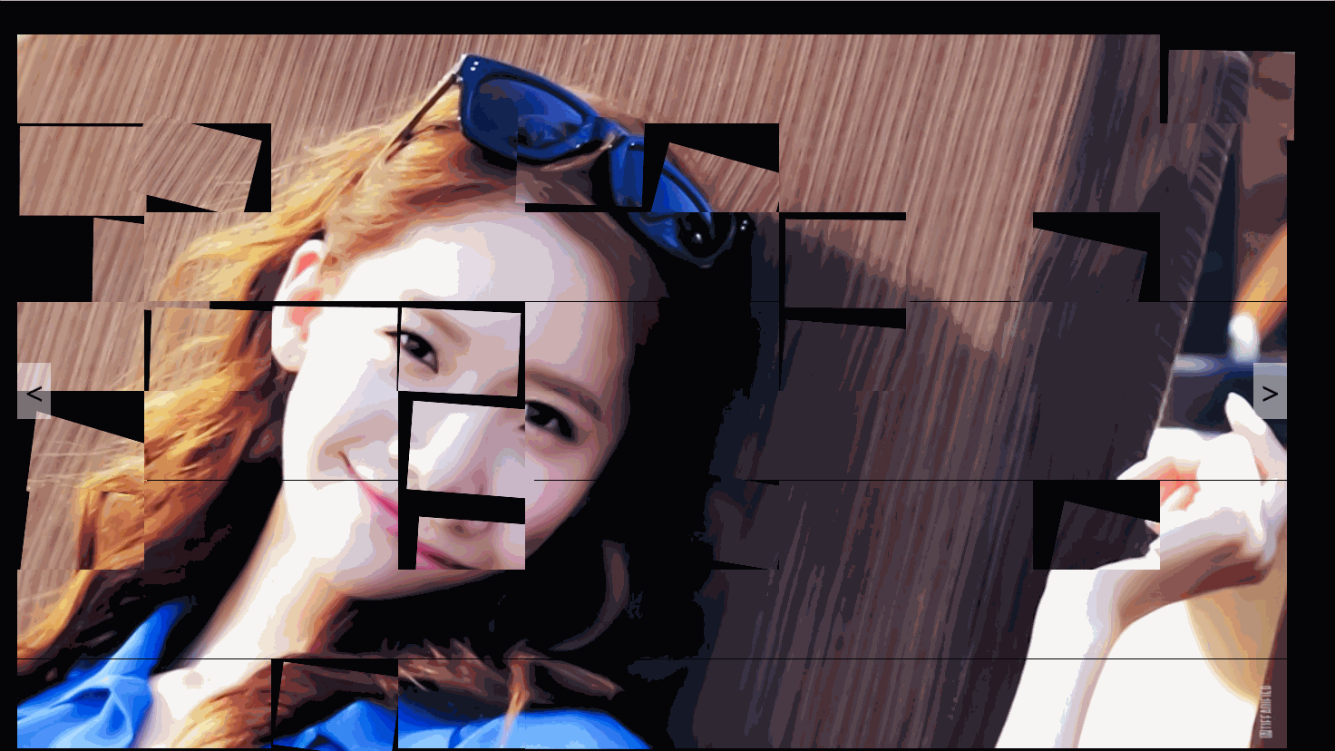
代码3效果:
代码4:
<!DOCTYPE html>
<html lang="en">
<head>
<meta charset="UTF-8">
<meta name="viewport" content="width=device-width, initial-scale=1.0">
<meta http-equiv="X-UA-Compatible" content="ie=edge">
<title>Document</title>
<style>
*{
margin:0;padding:0;}
body{
overflow: hidden;
background-color: #000;
}
ul{
list-style-type: none;}
.wrap{
perspective: 800px;
width: 1120px;
height: 630px;
margin:50px auto;
}
.con{
position:relative;
width: 100%;
height: 100%;
}
.con > li{
transform-style: preserve-3d;
}
.wrap > button{
position: absolute;
z-index:1;
width: 30px;
height: 50px;
top:50%;
background-color: rgba(250,250,250,.5);
border:none;
font-size: 25px;
color:#000;
cursor: pointer;
transform: translateY(-50%);
outline:none;
}
.left{
left:0;
}
.right{
right:0;
}
</style>
</head>
<body>
<div class="wrap">
<button class="left"><</button>
<ul class="con"></ul>
<button class="right">></button>
</div>
<script src="js/animation.js"></script>
</body>
</html>
代码4说明:
js文件没有给出,可以去我的资源下载。
代码4效果:
代码5:
<!DOCTYPE html>
<html lang="en">
<head>
<meta charset="utf-8">
<link rel="stylesheet" href="css/style.css">
</head>
<body>
<div id="midground" class="wall"></div>
<div id="foreground" class="wall"></div>
<div class="wrap">

	<img src="images/1.jpg" alt="" class="box">
	<img src="images/2.jpg" alt="" class="box">
	<img src="images/3.jpg" alt="" class="box">
	<img src="images/4.jpg" alt="" class="box">
	<img src="images/5.jpg" alt="" class="box">
	<img src="images/6.jpg" alt="" class="box">

	<img src="images/7.jpg" alt="" class="square ">
	<img src="images/8.jpg" alt="" class="square ">
	<img src="images/9.jpg" alt="" class="square ">
	<img src="images/10.jpg" alt="" class="square ">
	<img src="images/11.jpg" alt="" class="square ">
	<img src="images/12.jpg" alt="" class="square ">

</div>

</body>
</html>
代码5说明:
css文件没有给出,可以去我的资源下载。
代码5效果:

代码6:
<!DOCTYPE html>
<html>
	<head>
		<title>three.js css3d - periodic table</title>
		<meta charset="utf-8">
		<meta name="viewport" content="width=device-width, user-scalable=no, minimum-scale=1.0, maximum-scale=1.0">
		<style>
			html, body {


				height: 100%;
			}

			body {


				background-color: #000000;
				margin: 0;
				font-family: Helvetica, sans-serif;;
				overflow: hidden;
			}

			a {


				color: #ffffff;
			}

			#info {


				position: absolute;
				width: 100%;
				color: #ffffff;
				padding: 5px;
				font-family: Monospace;
				font-size: 13px;
				font-weight: bold;
				text-align: center;
				z-index: 1;
			}

			#menu {


				position: absolute;
				bottom: 20px;
				width: 100%;
				text-align: center;
			}

			.element {


				width: 100px;/* 120 160 */
				height: 100px;
				box-shadow: 0px 0px 12px rgba(0,255,255,0.5);
				border: 1px solid rgba(127,255,255,0.25);
				text-align: center;
				cursor: default;
			}

			.element:hover {


				box-shadow: 0px 0px 12px rgba(0,255,255,0.75);
				border: 1px solid rgba(127,255,255,0.75);
			}
				.element img{


					width:100px;
					height:100px;
				}

				.element .number {


					position: absolute;
					top: 20px;
					right: 20px;
					font-size: 12px;
					color: rgba(127,255,255,0.75);
				}

				.element .symbol {


					position: absolute;
					top: 40px;
					left: 0px;
					right: 0px;
					font-size: 60px;
					font-weight: bold;
					color: rgba(255,255,255,0.75);
					text-shadow: 0 0 10px rgba(0,255,255,0.95);
				}

				.element .details {


					position: absolute;
					bottom: 15px;
					left: 0px;
					right: 0px;
					font-size: 12px;
					color: rgba(127,255,255,0.75);
				}

			button {


				color: rgba(127,255,255,0.75);
				background: transparent;
				outline: 1px solid rgba(127,255,255,0.75);
				border: 0px;
				padding: 5px 10px;
				cursor: pointer;
			}
			button:hover {


				background-color: rgba(0,255,255,0.5);
			}
			button:active {


				color: #000000;
				background-color: rgba(0,255,255,0.75);
			}
			.show_info{

     position:fixed;background-color:rgba(0,0,0,.6);padding:10px;width:300px;margin:0 auto;left: 0;right:0;border-radius: 5px;box-shadow: 0 0 10px 0 #fff;top:30%;}
			.show_info img{

     display:block;margin:auto;border-radius: 5px;box-shadow: 0 0 10px 0 #888;}
			.show_info .intro{

     color:#fff;text-indent:20px;margin-top:10px;height:65px;overflow:hidden;display: -webkit-box;-webkit-line-clamp: 3;-webkit-box-orient: vertical;}
			.show_info .info_my{

     text-align: center;}
			.show_info .info_my > *{

     display:inline-block !important;vertical-align: middle;}
			.show_info .info_my .info_mem{

     color:#fff;max-width:120px;}
			.show_info .info_my .info_mem > div{

     text-align: left;}
			.show_info .info_my .info_mem > div.nickname{

     max-width: 120px;text-overflow: ellipsis;overflow: hidden;white-space: nowrap;}
		</style>
		<link rel="stylesheet" href="css/animate.min.css">
	</head>
	<body>
		<script src="js/jquery.min.js"></script>
		<script src="js/three.js"></script>
		<script src="js/tween.min.js"></script>
		<script src="js/TrackballControls.js"></script>
		<script src="js/CSS3DRenderer.js"></script>

		<div id="container"></div>
		<div id="info">允儿照片墙</div>
		<div id="menu">
			<button id="table">表格</button>
			<button id="sphere">球球</button>
			<button id="helix">螺旋</button>
			<button id="grid">格子</button>
		</div>

		<div class="show_info animated" style="display:none;">
			<div class="info_my">
				<img src="img/c.jpg" />
				<div class="info_mem">
					<div class="nickname">林允儿</div>
					<div class="id">ID:兮夜女朋友</div>
					<div class="vote">性别:女</div>
				</div>
			</div>
			<div class="intro">想成为一个可以承担起责任的人</div>
		</div>

		<script>
			var personArray = new Array;
    		var CurPersonNum = 0;
    		// animate
    		var _in = ['bounceIn','bounceInDown','bounceInLeft','bounceInRight','bounceInUp','fadeIn','fadeInDown','fadeInDownBig','fadeInLeft','fadeInLeftBig','fadeInRight','fadeInRightBig','fadeInUp','fadeInUpBig','rotateIn','rotateInDownLeft','rotateInDownRight','rotateInUpLeft','rotateInUpRight','slideInDown','slideInLeft','slideInRight'];
    		var _out = ['bounceOut','bounceOutDown','bounceOutLeft','bounceOutRight','bounceOutUp','fadeOut','fadeOutDown','fadeOutDownBig','fadeOutLeft','fadeOutLeftBig','fadeOutRight','fadeOutRightBig','fadeOutUp','fadeOutUpBig','rotateOut','rotateOutDownLeft','rotateOutDownRight','rotateOutUpLeft','rotateOutUpRight','slideOutDown','slideOutLeft','slideOutRight'];

    		// 模拟推送数据
			var s = setInterval(function(){


				// get animate
				var rand_in = parseInt(Math.random() * _in.length,10);
    			var rand_out = parseInt(Math.random() * _out.length,10);
				if(CurPersonNum >= personArray.length){


					CurPersonNum = 0;
				}
				$('.show_info').show();
				$('.show_info').addClass(_in[rand_in]);
				setTimeout(function(){


					$('.show_info').removeClass(_in[rand_in]);
					// 更改展示的图片
					var img = document.getElementsByClassName('element')[CurPersonNum].getElementsByTagName('img')[0];
					img.setAttribute('src','img/a.jpg');
					++CurPersonNum;
					setTimeout(function(){


						$('.show_info').addClass(_out[rand_out]);
						setTimeout(function(){


							$('.show_info').removeClass(_out[rand_out]);
							$('.show_info').hide();
						},1000);
					},1500);
				},1000);
			},4500);

			// 生成虚拟数据
	        for(var i=0;i<199;i++){


				personArray.push({


		            image: "img/a.jpg"
		        });
	        }

	        var table = new Array;
		    for (var i = 0; i < personArray.length; i++) {


		        table[i] = new Object();
		        if (i < personArray.length) {


		            table[i] = personArray[i];
		            table[i].src = personArray[i].thumb_image;
		        }
		        table[i].p_x = i % 20 + 1;
		        table[i].p_y = Math.floor(i / 20) + 1;
		    }


		    /*var table = [
				"H", "Hydrogen", "1.00794", 1, 1,
				"He", "Helium", "4.002602", 18, 1,
				"Li", "Lithium", "6.941", 1, 2,
				"Be", "Beryllium", "9.012182", 2, 2,
				"B", "Boron", "10.811", 13, 2,
				"C", "Carbon", "12.0107", 14, 2,
				"N", "Nitrogen", "14.0067", 15, 2,
				"O", "Oxygen", "15.9994", 16, 2,
				"F", "Fluorine", "18.9984032", 17, 2,
				"Ne", "Neon", "20.1797", 18, 2,
				"Na", "Sodium", "22.98976...", 1, 3,
				"Mg", "Magnesium", "24.305", 2, 3,
				"Al", "Aluminium", "26.9815386", 13, 3,
				"Si", "Silicon", "28.0855", 14, 3,
				"P", "Phosphorus", "30.973762", 15, 3,
				"S", "Sulfur", "32.065", 16, 3,
				"Cl", "Chlorine", "35.453", 17, 3,
				"Ar", "Argon", "39.948", 18, 3,
				"K", "Potassium", "39.948", 1, 4,
				"Ca", "Calcium", "40.078", 2, 4,
				"Sc", "Scandium", "44.955912", 3, 4,
				"Ti", "Titanium", "47.867", 4, 4,
				"V", "Vanadium", "50.9415", 5, 4,
				"Cr", "Chromium", "51.9961", 6, 4,
				"Mn", "Manganese", "54.938045", 7, 4,
				"Fe", "Iron", "55.845", 8, 4,
				"Co", "Cobalt", "58.933195", 9, 4,
				"Ni", "Nickel", "58.6934", 10, 4,
				"Cu", "Copper", "63.546", 11, 4,
				"Zn", "Zinc", "65.38", 12, 4,
				"Ga", "Gallium", "69.723", 13, 4,
				"Ge", "Germanium", "72.63", 14, 4,
				"As", "Arsenic", "74.9216", 15, 4,
				"Se", "Selenium", "78.96", 16, 4,
				"Br", "Bromine", "79.904", 17, 4,
				"Kr", "Krypton", "83.798", 18, 4,
				"Rb", "Rubidium", "85.4678", 1, 5,
				"Sr", "Strontium", "87.62", 2, 5,
				"Y", "Yttrium", "88.90585", 3, 5,
				"Zr", "Zirconium", "91.224", 4, 5,
				"Nb", "Niobium", "92.90628", 5, 5,
				"Mo", "Molybdenum", "95.96", 6, 5,
				"Tc", "Technetium", "(98)", 7, 5,
				"Ru", "Ruthenium", "101.07", 8, 5,
				"Rh", "Rhodium", "102.9055", 9, 5,
				"Pd", "Palladium", "106.42", 10, 5,
				"Ag", "Silver", "107.8682", 11, 5,
				"Cd", "Cadmium", "112.411", 12, 5,
				"In", "Indium", "114.818", 13, 5,
				"Sn", "Tin", "118.71", 14, 5,
				"Sb", "Antimony", "121.76", 15, 5,
				"Te", "Tellurium", "127.6", 16, 5,
				"I", "Iodine", "126.90447", 17, 5,
				"Xe", "Xenon", "131.293", 18, 5,
				"Cs", "Caesium", "132.9054", 1, 6,
				"Ba", "Barium", "132.9054", 2, 6,
				"La", "Lanthanum", "138.90547", 4, 9,
				"Ce", "Cerium", "140.116", 5, 9,
				"Pr", "Praseodymium", "140.90765", 6, 9,
				"Nd", "Neodymium", "144.242", 7, 9,
				"Pm", "Promethium", "(145)", 8, 9,
				"Sm", "Samarium", "150.36", 9, 9,
				"Eu", "Europium", "151.964", 10, 9,
				"Gd", "Gadolinium", "157.25", 11, 9,
				"Tb", "Terbium", "158.92535", 12, 9,
				"Dy", "Dysprosium", "162.5", 13, 9,
				"Ho", "Holmium", "164.93032", 14, 9,
				"Er", "Erbium", "167.259", 15, 9,
				"Tm", "Thulium", "168.93421", 16, 9,
				"Yb", "Ytterbium", "173.054", 17, 9,
				"Lu", "Lutetium", "174.9668", 18, 9,
				"Hf", "Hafnium", "178.49", 4, 6,
				"Ta", "Tantalum", "180.94788", 5, 6,
				"W", "Tungsten", "183.84", 6, 6,
				"Re", "Rhenium", "186.207", 7, 6,
				"Os", "Osmium", "190.23", 8, 6,
				"Ir", "Iridium", "192.217", 9, 6,
				"Pt", "Platinum", "195.084", 10, 6,
				"Au", "Gold", "196.966569", 11, 6,
				"Hg", "Mercury", "200.59", 12, 6,
				"Tl", "Thallium", "204.3833", 13, 6,
				"Pb", "Lead", "207.2", 14, 6,
				"Bi", "Bismuth", "208.9804", 15, 6,
				"Po", "Polonium", "(209)", 16, 6,
				"At", "Astatine", "(210)", 17, 6,
				"Rn", "Radon", "(222)", 18, 6,
				"Fr", "Francium", "(223)", 1, 7,
				"Ra", "Radium", "(226)", 2, 7,
				"Ac", "Actinium", "(227)", 4, 10,
				"Th", "Thorium", "232.03806", 5, 10,
				"Pa", "Protactinium", "231.0588", 6, 10,
				"U", "Uranium", "238.02891", 7, 10,
				"Np", "Neptunium", "(237)", 8, 10,
				"Pu", "Plutonium", "(244)", 9, 10,
				"Am", "Americium", "(243)", 10, 10,
				"Cm", "Curium", "(247)", 11, 10,
				"Bk", "Berkelium", "(247)", 12, 10,
				"Cf", "Californium", "(251)", 13, 10,
				"Es", "Einstenium", "(252)", 14, 10,
				"Fm", "Fermium", "(257)", 15, 10,
				"Md", "Mendelevium", "(258)", 16, 10,
				"No", "Nobelium", "(259)", 17, 10,
				"Lr", "Lawrencium", "(262)", 18, 10,
				"Rf", "Rutherfordium", "(267)", 4, 7,
				"Db", "Dubnium", "(268)", 5, 7,
				"Sg", "Seaborgium", "(271)", 6, 7,
				"Bh", "Bohrium", "(272)", 7, 7,
				"Hs", "Hassium", "(270)", 8, 7,
				"Mt", "Meitnerium", "(276)", 9, 7,
				"Ds", "Darmstadium", "(281)", 10, 7,
				"Rg", "Roentgenium", "(280)", 11, 7,
				"Cn", "Copernicium", "(285)", 12, 7,
				"Uut", "Unutrium", "(284)", 13, 7,
				"Fl", "Flerovium", "(289)", 14, 7,
				"Uup", "Ununpentium", "(288)", 15, 7,
				"Lv", "Livermorium", "(293)", 16, 7,
				"Uus", "Ununseptium", "(294)", 17, 7,
				"Uuo", "Ununoctium", "(294)", 18, 7
			];*/

			var camera, scene, renderer;
			var controls;

			var objects = [];
			var targets = {

      table: [], sphere: [], helix: [], grid: [] };

			init();
			animate();

			function init() {


				camera = new THREE.PerspectiveCamera( 40, window.innerWidth / window.innerHeight, 1, 10000 );
				camera.position.z = 3000;

				scene = new THREE.Scene();

				// table

				for ( var i = 0; i < table.length; i ++ ) {


					var element = document.createElement( 'div' );
					element.className = 'element';
					element.style.backgroundColor = 'rgba(0,127,127,' + ( Math.random() * 0.5 + 0.25 ) + ')';

					var img = document.createElement('img');
					img.src = table[ i ].image;
					element.appendChild( img );


					/*var number = document.createElement( 'div' );
					number.className = 'number';
					number.textContent = (i/5) + 1;
					element.appendChild( number );

					var symbol = document.createElement( 'div' );
					symbol.className = 'symbol';
					symbol.textContent = table[ i ];
					element.appendChild( symbol );

					var details = document.createElement( 'div' );
					details.className = 'details';
					details.innerHTML = table[ i + 1 ] + '<br>' + table[ i + 2 ];
					element.appendChild( details );*/

					var object = new THREE.CSS3DObject( element );
					object.position.x = Math.random() * 4000 - 2000;
					object.position.y = Math.random() * 4000 - 2000;
					object.position.z = Math.random() * 4000 - 2000;
					scene.add( object );

					objects.push( object );

					// 表格需要坐标进行排序的
					var object = new THREE.Object3D();
					// object.position.x = ( table[ i + 3 ] * 140 ) - 1330;
					// object.position.y = - ( table[ i + 4 ] * 180 ) + 990;
					object.position.x = ( table[ i ].p_x * 140 ) - 1330;
					object.position.y = - ( table[ i ].p_y * 180 ) + 990;

					targets.table.push( object );

				}

				// sphere

				var vector = new THREE.Vector3();
				var spherical = new THREE.Spherical();

				for ( var i = 0, l = objects.length; i < l; i ++ ) {


					var phi = Math.acos( -1 + ( 2 * i ) / l );
					var theta = Math.sqrt( l * Math.PI ) * phi;

					var object = new THREE.Object3D();

					spherical.set( 800, phi, theta );

					object.position.setFromSpherical( spherical );

					vector.copy( object.position ).multiplyScalar( 2 );

					object.lookAt( vector );

					targets.sphere.push( object );

				}

				// helix

				var vector = new THREE.Vector3();
				var cylindrical = new THREE.Cylindrical();

				for ( var i = 0, l = objects.length; i < l; i ++ ) {


					var theta = i * 0.175 + Math.PI;
					var y = - ( i * 5 ) + 450;

					var object = new THREE.Object3D();

					// 参数一 圈的大小 参数二 左右间距 参数三 上下间距
					cylindrical.set( 900, theta, y );

					object.position.setFromCylindrical( cylindrical );

					vector.x = object.position.x * 2;
					vector.y = object.position.y;
					vector.z = object.position.z * 2;

					object.lookAt( vector );

					targets.helix.push( object );

				}

				// grid

				for ( var i = 0; i < objects.length; i ++ ) {


					var object = new THREE.Object3D();

					object.position.x = ( ( i % 5 ) * 400 ) - 800; // 400 图片的左右间距  800 x轴中心店
					object.position.y = ( - ( Math.floor( i / 5 ) % 5 ) * 300 ) + 500;  // 500 y轴中心店
					object.position.z = ( Math.floor( i / 25 ) ) * 200 - 800;// 300调整 片间距 800z轴中心店

					targets.grid.push( object );

				}

				//渲染
				renderer = new THREE.CSS3DRenderer();
				renderer.setSize( window.innerWidth, window.innerHeight );
				renderer.domElement.style.position = 'absolute';
				document.getElementById( 'container' ).appendChild( renderer.domElement );

				// 鼠标控制
				controls = new THREE.TrackballControls( camera, renderer.domElement );
				controls.rotateSpeed = 0.5;
				controls.minDistance = 500;
				controls.maxDistance = 6000;
				controls.addEventListener( 'change', render );

				// 自动更换
				var ini = 0;
				setInterval(function(){


					ini = ini >= 3 ? 0 : ini;
					++ini;
					switch(ini){


						case 1:
							transform( targets.sphere, 1000 );
						break;
						case 2:
							transform( targets.helix, 1000 );
						break;
						case 3:
							transform( targets.grid, 1000 );
						break;
					}
				},8000);

				var button = document.getElementById( 'table' );
				button.addEventListener( 'click', function ( event ) {


					transform( targets.table, 1000 );
				}, false );

				var button = document.getElementById( 'sphere' );
				button.addEventListener( 'click', function ( event ) {


					transform( targets.sphere, 2000 );
				}, false );

				var button = document.getElementById( 'helix' );
				button.addEventListener( 'click', function ( event ) {


					transform( targets.helix, 2000 );
				}, false );

				var button = document.getElementById( 'grid' );
				button.addEventListener( 'click', function ( event ) {


					transform( targets.grid, 2000 );
				}, false );

				transform( targets.table, 2000 );

				//

				window.addEventListener( 'resize', onWindowResize, false );

			}

			function transform( targets, duration ) {


				TWEEN.removeAll();

				for ( var i = 0; i < objects.length; i ++ ) {


					var object = objects[ i ];
					var target = targets[ i ];

					new TWEEN.Tween( object.position )
						.to( {

      x: target.position.x, y: target.position.y, z: target.position.z }, Math.random() * duration + duration )
						.easing( TWEEN.Easing.Exponential.InOut )
						.start();

					new TWEEN.Tween( object.rotation )
						.to( {

      x: target.rotation.x, y: target.rotation.y, z: target.rotation.z }, Math.random() * duration + duration )
						.easing( TWEEN.Easing.Exponential.InOut )
						.start();

				}

				new TWEEN.Tween( this )
					.to( {

     }, duration * 2 )
					.onUpdate( render )
					.start();

			}

			function onWindowResize() {


				camera.aspect = window.innerWidth / window.innerHeight;
				camera.updateProjectionMatrix();

				renderer.setSize( window.innerWidth, window.innerHeight );

				render();

			}

			function animate() {


				// 让场景通过x轴或者y轴旋转  & z
				// scene.rotation.x += 0.011;
				scene.rotation.y += 0.008;

				requestAnimationFrame( animate );

				TWEEN.update();

				controls.update();

				// 渲染循环
				render();

			}

			function render() {


				renderer.render( scene, camera );

			}

		</script>

	</body>
</html>
代码6说明:
css和js文件没有给出,可以去我的资源下载。
代码6效果:

代码7:
<!DOCTYPE html>
<html>
	<head>
		<meta charset="UTF-8">
		<title></title>
		<style>
			*{


				padding: 0;
				margin: 0;
			}
			img{


				width:200px;
				height: 300px;
			}
			body{

      background-color: #313131; }
			@keyframes fn{


				0% {

     transform:rotateX(-15deg) rotateY(0deg);}
			    100%{

     transform:rotateX(-15deg) rotateY(360deg);}

			}
			@-moz-keyframes fn{


				0% {

     transform:rotateX(-15deg) rotateY(0deg);}
			    100%{

     transform:rotateX(-15deg) rotateY(360deg);}
			}
			@-ms-keyframes fn{


				0% {

     transform:rotateX(-15deg) rotateY(0deg);}
			    100%{

     transform:rotateX(-15deg) rotateY(360deg);}
			}
			@-webkit-keyframes fn{


				0% {

     transform:rotateX(-15deg) rotateY(0deg);}
			    100%{

     transform:rotateX(-15deg) rotateY(360deg);}
			}
			.box{


		    	width:200px;
            	height:300px;
            	position:relative;
            	margin:auto;
            	margin-top:150px;
            	transform-style:preserve-3d;
            	transform:rotateX(-10deg);
            	animation: fn 10s;
            	animation-iteration-count: infinite;
		    	animation-timing-function: linear;
		    	position: relative
			}
			.box:hover{


				animation-play-state: paused;
			}
			.box>div{


				width:200px;
				height:300px;
				position: absolute;
				left:0;
				top:0;

			}
		</style>
	</head>
	<body>
		<div class="box">
			<div style="transform: rotateY(0deg) translateZ(275px);">
				<img src="img/1.jpg" >
			</div>
			<div style="transform: rotateY(40deg) translateZ(275px);">
				<img src="img/2.jpg">
			</div>
			<div style="transform: rotateY(80deg) translateZ(275px);">
				<img src="img/3.jpg">
			</div>
			<div style="transform: rotateY(120deg) translateZ(275px);">
				<img src="img/4.jpg">
			</div>
			<div style="transform: rotateY(160deg) translateZ(275px);">
				<img src="img/5.jpg">
			</div>
			<div style="transform: rotateY(200deg) translateZ(275px);">
				<img src="img/6.jpg">
			</div>
			<div style="transform: rotateY(240deg) translateZ(275px);">
				<img src="img/7.jpg">
			</div>
			<div style="transform: rotateY(280deg) translateZ(275px);">
				<img src="img/8.jpg">
			</div>
			<div style="transform: rotateY(320deg) translateZ(275px);">
				<img src="img/9.jpg" >
			</div>
		</div>
	</body>
</html>
代码7说明:
需要自己建一个img文件夹存放图片。(和html文件放在一个文件夹下,里面的图片命名为1.jpg、2.jpg等,一共9张)
代码7效果:

期待大家的一键三连哦!!