效果:
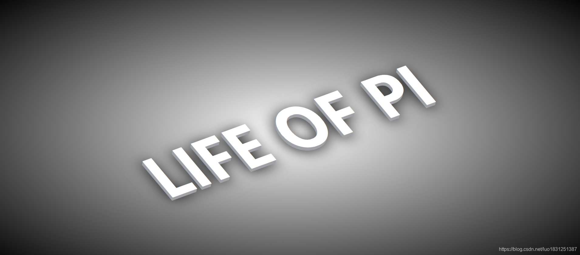
看似2.5d立体,<( ̄︶ ̄)> 其实是阴影的叠加~写完后你放大再放大看就一目了然了。
实现:
1.定义标签放字体:
 <div>
        <p>LIFE OF PI</p>
    </div>
2.css实现效果:
 div{


            font-size: 8em;
            font-weight: bold;
            color: rgb(255, 255, 255);
            transform: rotate(-20deg) skew(20deg);
            text-shadow:
            -1px 1px 0 rgb(161, 162, 167),
            -2px 2px 0 rgb(161, 162, 167),
            -3px 3px 0 rgb(161, 162, 167),
            -4px 4px 0 rgb(161, 162, 167),
            -5px 5px 0 rgb(161, 162, 167),
            -6px 6px 0 rgb(161, 162, 167);
        }
transform: rotate(-20deg) skew(20deg);先旋转再倾斜;
text-shadow:
-1px 1px 0 rgb(161, 162, 167),
-2px 2px 0 rgb(161, 162, 167),
-3px 3px 0 rgb(161, 162, 167),
-4px 4px 0 rgb(161, 162, 167),
-5px 5px 0 rgb(161, 162, 167),
-6px 6px 0 rgb(161, 162, 167);
这就是一层一层的叠加阴影,定义越多那么字体越高,越立体。要多的话可以用js写for循环的加,我这就不写了~
3.真阴影,这是字体最下面的那层模糊的阴影:
 div::after{


            content: 'LIFE OF PI';
            position: absolute;
            top: 6px;
            left: -6px;
            color: #000;
            filter: blur(15px);
            z-index: -1;
        }
filter: blur(15px);模糊
完整代码:
<!DOCTYPE html>
<html lang="zh-CN">
<head>
    <meta charset="UTF-8">
    <meta name="viewport" content="width=device-width, initial-scale=1.0">
    <title>Document</title>
    <style>
        *{


            margin: 0;
            padding: 0;
            box-sizing: border-box;
        }
        body{


            height: 100vh;
            display: flex;
            justify-content: center;
            align-items: center;
            background-image: radial-gradient(white,black);
        }
        div{


            font-size: 8em;
            font-weight: bold;
            color: rgb(255, 255, 255);
            transform: rotate(-20deg) skew(20deg);
            text-shadow:
            -1px 1px 0 rgb(161, 162, 167),
            -2px 2px 0 rgb(161, 162, 167),
            -3px 3px 0 rgb(161, 162, 167),
            -4px 4px 0 rgb(161, 162, 167),
            -5px 5px 0 rgb(161, 162, 167),
            -6px 6px 0 rgb(161, 162, 167);
        }
        div::after{


            content: 'LIFE OF PI';
            position: absolute;
            top: 6px;
            left: -6px;
            color: #000;
            filter: blur(15px);
            z-index: -1;
        }
    </style>
</head>
<body>
    <div>
        <p>LIFE OF PI</p>
    </div>
</body>
</html>
总结:
冬至快乐呀~
