Seaborn绘图
全部代码:https://github.com/lawlite19/Blog-Back-Up/blob/master/code/seaborn_study.py
个人博客地址:http://lawlite.me/2017/06/14/Seaborn%E7%BB%98%E5%9B%BE/
一、介绍与安装
1、介绍
官网:http://seaborn.pydata.org/index.html
Github: https://github.com/mwaskom/seaborn
Seaborn 其实是在matplotlib的基础上进行了更高级的 API 封装,从而使得作图更加容易
在大多数情况下使用seaborn就能做出很具有吸引力的图,而使用matplotlib就能制作具有更多特色的图。应该把Seaborn视为matplotlib的补充
2、安装
直接 pip3 install seaborn即可
二、分布图
1、distplot
导入包
#-*- coding: utf-8 -*-
import numpy as np
import pandas as pd
import matplotlib as mpl
import matplotlib.pyplot as plt
import seaborn as sns
#%matplotlib inline  # 为了在jupyter notebook里作图,需要用到这个命令
加载 seaborn中的数据集:tips = sns.load_dataset('tips')
分布图
kde是高斯分布密度图,绘图在0-1之间
hist是否画直方图
rug在X轴上画一些分布线
fit可以制定某个分布进行拟合
label legend时的值
axlabel制定横轴的说明
sns.distplot(tips['total_bill'], bins=None, hist=True, kde=False, rug=True, fit=None,
            hist_kws=None, kde_kws=None, rug_kws=None,
            fit_kws=None, color=None, vertical=False,
            norm_hist=False, axlabel=None, label=None, ax=None)
sns.plt.show()
拟合分布
这里使用了gamma分布拟合
from scipy import stats
sns.distplot(tips.total_bill, fit=stats.gamma, kde=False)
sns.plt.show()

2、kdeplot
高斯概率密度图
data2可以是二维的分布
shade是否填充
kernel核函数,还有很多核函数,比如cos, biw等
cumulative累积的作图,最后的值应该是接近1
gridsize多少个点估计
    ax = sns.kdeplot(tips['total_bill'], data2=tips.tip, shade=False, vertical=False,
                    kernel="gau", bw="scott",
                    gridsize=100, cut=3, clip=None,
                    legend=True, cumulative=False,
                    shade_lowest=True, ax=None)
    sns.plt.show()

二、pairplot
1、两两作图
iris 为例
data: DataFrame格式的数据
hue: label类别对应的column name
vars: 指定feature的列名
kind: 作图的方式,可以是reg或scatter
diag_kind: 对角线作图的方式,可以是hist或kde
    iris = sns.load_dataset('iris')
    g = sns.pairplot(iris, hue='species', hue_order=None, palette=None,
                     vars=list(iris.columns[0:-1]),
                     x_vars=None, y_vars=None,
                     kind="reg", diag_kind="hist",
                     markers=['o','s','D'], size=1.5, aspect=1,
                     dropna=True, plot_kws=None,
                     diag_kws=None, grid_kws=None)
    sns.plt.show()
三、stripplot和swarmplot
1、stripplot
tips为例,查看每天的数据信息
x: X轴数据
y: Y轴数据
hue: 区分不同种类数据的column name
data: DataFrame类型数据
jitter: 将数据分开点,防止重叠
    tips = sns.load_dataset('tips')
    ax = sns.stripplot(x='day', y='total_bill', hue=None, data=tips, order=None,
                      hue_order=None, jitter=True,
                      split=False, orient=None,
                      color=None, palette=None, size=5,
                      edgecolor="gray", linewidth=0,
                      ax=None)
查看关于性别消费的信息
    ax = sns.stripplot(x='sex', y='total_bill', hue='day', data=tips, order=None,
                      hue_order=None, jitter=True,
                      split=False, orient=None,
                      color=None, palette=None, size=5,
                      edgecolor="gray", linewidth=0,
                      ax=None)
2、swarmplot
与stripplot类似,只是数据点不会重叠 (适合小数据量)
    tips = sns.load_dataset('tips')
    ax = sns.swarmplot(x='sex', y='total_bill', hue='day', data=tips)
    sns.plt.show()
四、boxplot
1、boxplot示意图

函数
x, y:指定X轴,Y轴的columns name值
hue: 指定要区分的类别
    tips = sns.load_dataset('tips')
    ax = sns.boxplot(x='day', y='total_bill', hue=None, data=tips, order=None,
                    hue_order=None, orient=None,
                    color=None, palette=None,
                    saturation=.75, width=.8,
                    fliersize=5, linewidth=None,
                    whis=1.5, notch=False, ax=None)
    sns.plt.show()
- 可以和上面的stripplot一起用
    tips = sns.load_dataset('tips')
    ax = sns.boxplot(x='day', y='total_bill', hue=None, data=tips, order=None,
                    hue_order=None, orient=None,
                    color=None, palette=None,
                    saturation=.75, width=.8,
                    fliersize=5, linewidth=None,
                    whis=1.5, notch=False, ax=None)
    sns.stripplot(x='day', y='total_bill', hue=None, data=tips, order=None,
                 hue_order=None, jitter=True, split=False,
                 orient=None, color=None, palette=None,
                 size=5, edgecolor="gray", linewidth=0,
                 ax=None)
    sns.plt.show()
五、jointplot
1、jointplot
联合作图
kind: 有scatter” | “reg” | “resid” | “kde” | “hex
    tips = sns.load_dataset('tips')
    from scipy import stats
    g = sns.jointplot(x='total_bill', y='tip',
                      data=tips, kind="reg",
                      stat_func=stats.pearsonr,
                      color=None, size=6, ratio=5,
                      space=.2, dropna=True, xlim=None,
                      ylim=None, joint_kws=None,
                      marginal_kws=None, annot_kws=None)
    sns.plt.show()
可以在基础上再作图
plot_joint就是在联合分布上作图
plot_marginals就是在边缘分布上再作图
g = (sns.jointplot(x='total_bill', y='tip',data=tips).plot_joint(sns.kdeplot))
六、violinplot
1、小提琴图,和boxplot很像
对称的kde图
中间的白点是中位数,黑色粗线对应分位数

inner: 指定图里面用什么划分,有"box", "quartile", "point", "stick", None
quartile为四分位数划分
stick很像rug,就是可以看出密度情况
scale: 缩放每个图对应的area, 取值有 "area", "count", "width"
area指定每个有相同的area
count会按数量缩放(数量少的就比较窄扁)
    tips = sns.load_dataset('tips')
    ax = sns.violinplot(x='day', y='total_bill',
                        hue='smoker', data=tips, order=None,
                        hue_order=None, bw="scott",
                        cut=2, scale="area",
                        scale_hue=True, gridsize=100,
                        width=.8, inner="quartile",
                        split=False, orient=None,
                        linewidth=None, color=None,
                        palette='muted', saturation=.75,
                        ax=None)
    sns.plt.show()
七、pointplot, bar
1、pointplot
点图
estimator:点的取值是,默认是np.mean
    tips = sns.load_dataset('tips')
    sns.pointplot(x='time', y='total_bill', hue='smoker', data=tips, order=None,
                 hue_order=None, estimator=np.mean, ci=95,
                 n_boot=1000, units=None, markers="o",
                 linestyles="-", dodge=False, join=True,
                 scale=1, orient=None, color=None,
                 palette=None, ax=None, errwidth=None,
                 capsize=None)
    sns.plt.show()
2、barplot
条形图
y轴是mean value,和点图其实差不多
    tips = sns.load_dataset('tips')
    sns.barplot(x='day', y='total_bill', hue='sex', data=tips, order=None,
               hue_order=None, estimator=np.mean, ci=95,
               n_boot=1000, units=None, orient=None,
               color=None, palette=None, saturation=.75,
               errcolor=".26", errwidth=None, capsize=None,
               ax=None)
    sns.plt.show()
3、countplot
    tips = sns.load_dataset('tips')
    sns.countplot(x='day', hue='sex', data=tips)
sns.plt.show() 
八、factorplot
1、可以通过这个函数绘制以上几种图
指定kind即可,有point, bar, count, box, violin, strip
row和col指定绘制的行数和列数,给出一个种类类型的列名即可
    titanic = sns.load_dataset('titanic')
    sns.factorplot(x='age', y='embark_town',
                   hue='sex', data=titanic,
                   row='class', col='sex',
                   col_wrap=None, estimator=np.mean, ci=95,
                   n_boot=1000, units=None, order=None,
                   hue_order=None, row_order=None,
                   col_order=None, kind="box", size=4,
                   aspect=1, orient=None, color=None,
                   palette=None, legend=True,
                   legend_out=True, sharex=True,
                   sharey=True, margin_titles=False,
                   facet_kws=None)
    sns.plt.show()
九、heatmap
1、heatmap
   flight = sns.load_dataset('flights')
    flights = flight.pivot('month','year','passengers')
    sns.heatmap(flights, annot=True, fmt='d')
    sns.plt.show()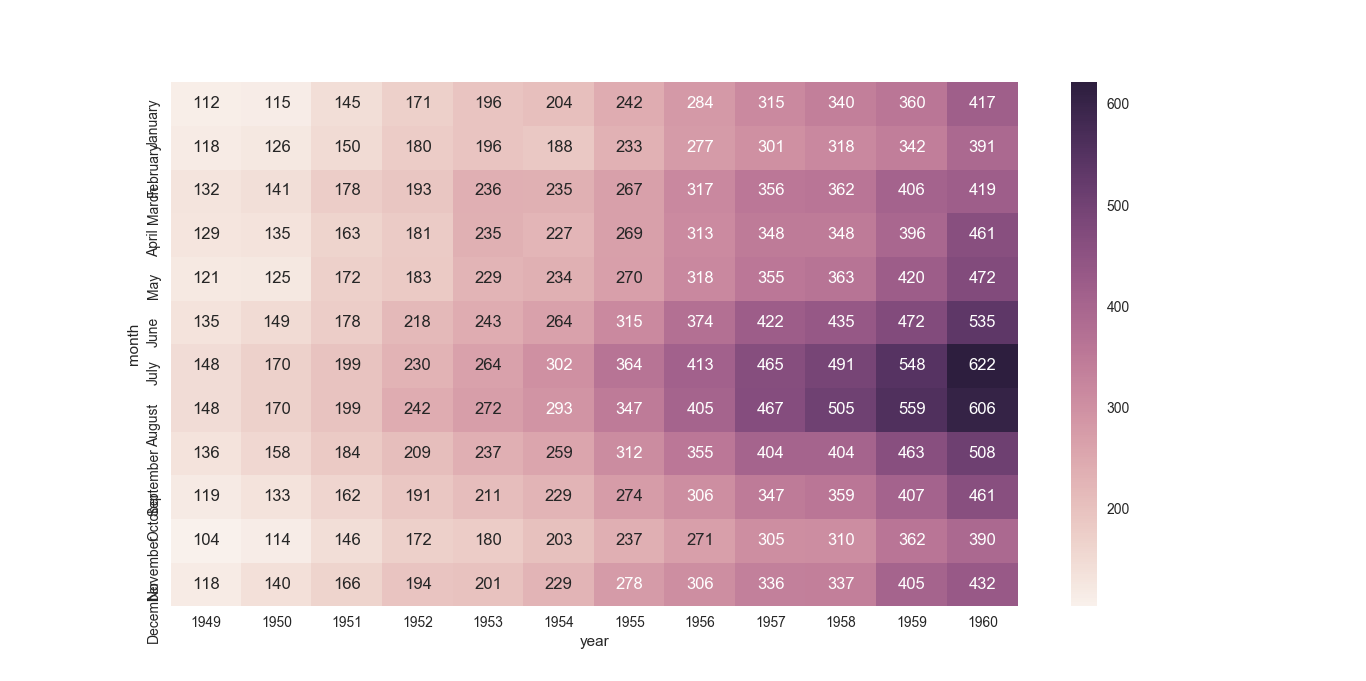
十、时序绘图
1、tsplot
condition: 和hue差不多,指定类别
estimator: 默认为np.mean
    gammas = sns.load_dataset('gammas')
    sns.tsplot(data=gammas, time='timepoint', unit='subject',
               condition='ROI', value='BOLD signal',
               err_style="ci_band", ci=68, interpolate=True,
               color=None, estimator=np.mean, n_boot=5000,
               err_palette=None, err_kws=None, legend=True,
               ax=None)
    sns.plt.show()
Reference
Youtube: https://www.youtube.com/playlist?list=PLgJhDSE2ZLxYlhQx0UfVlnF1F7OWF-9rp
Github: https://github.com/knathanieltucker/seaborn-weird-parts