3d立方体特效代码
transforn:变形属性
在2d中的平面空间进行位置移动
transform:translate(参数1.参数2)参数1:在x轴移动距离 参数2:在y轴移动的距离
在2d空间进行旋转:
transform:rotate()
在2d空间进行缩放,倾斜:
缩放:transform:scale()
倾斜:transform:skew()
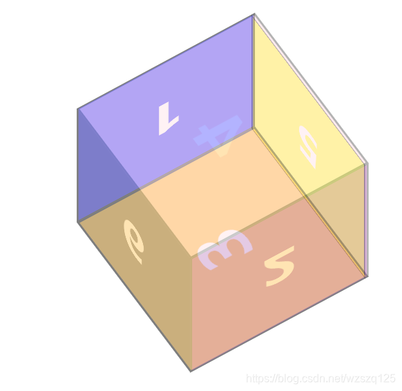
先创建一个div盒子设置好宽高背景颜色然后在写div中的6个子元素,然后给子元素添加宽高字体样式。
例如: <style>
*{
margin: 0;
padding: 0;
}
.box{
width: 400px;
height: 400px;
background: red;
position: fixed;
right: 0;left: 0;
bottom: 0;top: 0;
margin: auto;
}
.box div{
width: 400px;
height: 400px;
text-align: center;
line-height: 300px;
font-size: 100px;
font-weight: bolder;
color: #fff;
position: absolute;
left: 0;top: 0;
}
</style>
1
2
3
4
5
6
      .con2{
          background: purple;
          transform-origin: left center;
          transform:rotatey(-90deg)
      }
      .con3{
          background: orange;
          transform-origin: center top;
          transform:rotatex(90deg);

      }
      .con4{
          background: pink;
          transform-origin: center bottom;
          transform: rotatex(-90deg);
      }
      .con5{
          background: yellow;
          transform:translateZ(300px)
      }
      .con6{
          background: black;
          transform:rotatey(180deg)
      }
   @keyframes boxRotate{
    0%{
        transform: rotatex(0) rotatey(0);
    }
    25%{
        transform: rotatex(180deg) rotatey(180deg);
    }
    50%{
        transform: rotatex(0deg) rotatey(360deg);
    }
    75%{
        transform: rotatex(-180deg) rotatey(540deg);
    }
    100%{
        transform: rotatex(0) rotatey(720deg);
    }
   }
   在继续给父元素添加3d元素进去,
    transform-style: preserve-3d;
      transition: 1s;
      animation: boxRotate 10s linear infinite;
      在给子元素添加透明度方便观察
       opacity: 0.3;
       然后形成一个3d旋转立体方块。