目录
一、基本图的绘制
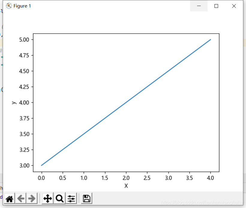
1.1直线的绘制
# coding=utf-8

import matplotlib.pyplot as plt

# 连接(0,3) (4,5)两个点
plt.plot([0, 4], [3, 5])

# 显示x轴 y轴
plt.ylabel("y")
plt.xlabel("X")

# 保存路径
plt.savefig("F:/Z/Python/project/project2/matl/直线.jpg")
# 显示图
plt.show()
运行效果
1.2折线的绘制
# coding=utf-8

import matplotlib.pyplot as plt
from mpl_toolkits.mplot3d import Axes3D

# 创建 X Y Z坐标

X = [1, 5, 7, 9, 5]
Y = [9, 6, 7, 3, 6]
Z = [5, 6, 9, 3, 4]

# 生成画布对象
figure = plt.figure()

# 创建一个Axes3D的子图放到figure画布里面
ax = Axes3D(figure)
ax.plot_trisurf(X, Y, Z)

plt.show()
运行效果
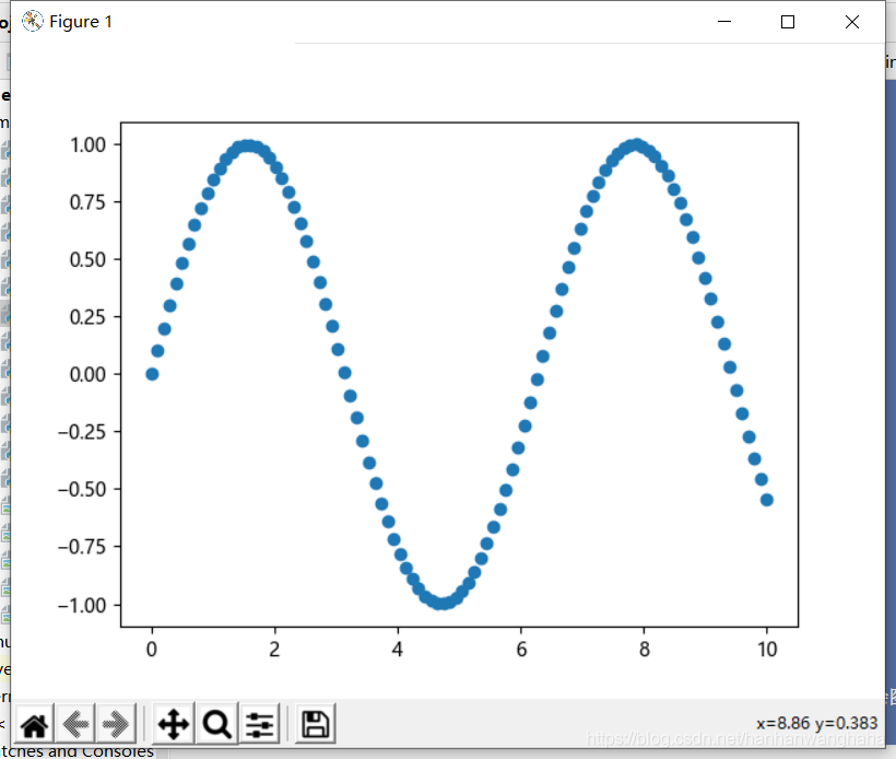
1.3散点图的绘制
# coding=utf-8

import matplotlib.pyplot as plt
import numpy as np

# 生成0-10之间(0开始 10结束) 100个等差数
x = np.linspace(0, 10, 100)

sin_y = np.sin(x)
# 进行绘制正弦曲线
# plt.plot(x,sin_y)

# 绘制散点图
plt.scatter(x, sin_y)
# plt.plot(x,sin_y,"o")


plt.show()

"""
注意:由上可知,使用plot绘制和使用scatter绘制出来的图形是一样的
     但是,如果画一堆点,点的形式没有差别就建议使用plot,因为plot的绘图速度优于scatter
     如果点的形式有差别(点的大小和颜色不同),就必须使用scatter
"""
运行效果
1.4绘制不同颜色的散点图
# coding=utf-8

import matplotlib.pyplot as plt
import numpy as np

# 绘制10种大小,10种颜色的散点图
# 执行多次获取的随机数都是一样的
np.random.seed(0)
x = np.random.rand(100)
y = np.random.rand(100)

# 生成10种大小
size = np.random.rand(100)*1000
# print(size)
# 生成10中颜色
color = np.random.rand(100)

# 绘制散点图   size:颜色   color:颜色    alpha:透明度
plt.scatter(x, y, s=[size], c=color,alpha=0.9)

plt.show()

"""
注意:
大小、颜色的个数和x,y的个数应该保持一致 要不然会出现类似下面的报错
'c' argument has 10 elements, which is inconsistent with 'x' and 'y' with size 100.
 s must be a scalar, or the same size as x and y

"""
运行效果

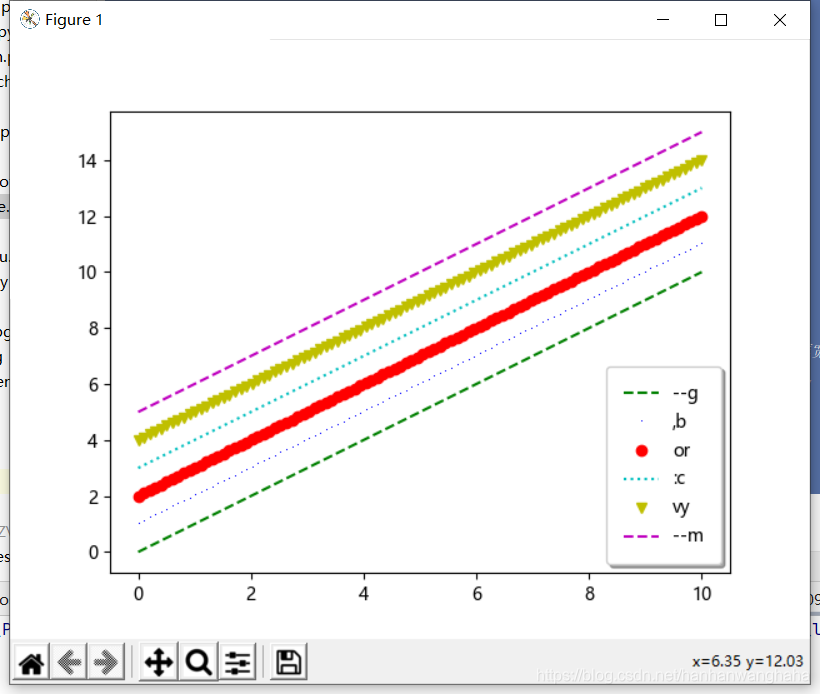
1.5绘制不同颜色的线
# coding=utf-8

import matplotlib.pyplot as plt
import numpy as np

# 创建x
x = np.linspace(0, 10, 100)
# 使用legend()方法添加图例,给plot方法添加参数
plt.plot(x, x + 0, "--g", label="--g")
plt.plot(x, x + 1, ",b", label=",b")
plt.plot(x, x + 2, "or", label="or")
plt.plot(x, x + 3, ":c", label=":c")
plt.plot(x, x + 4, "vy", label="vy")
plt.plot(x, x + 5, "--m", label="--m")

# 默认的图例位置在左上角upper left  可以通过loc进行修改   ,边框,透明度,阴影,边框宽度
plt.legend(loc="lower right", fancybox=True, framealpha=1, shadow=True, borderpad=1)

# plot的颜色字符、风格字符、标记字符: https://www.jianshu.com/p/ed3f31fc6a41

plt.show()
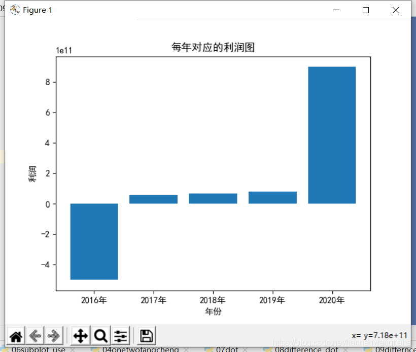
1.6柱状图
# coding=utf-8

import matplotlib.pyplot as plt

# 创建x:年份  y:利润
x = [2016, 2017, 2018, 2019, 2020]
x_label = ["2016年", "2017年", "2018年", "2019年", "2020年"]
y = [-500000000000, 60000000000, 70000000000, 80000000000, 900000000000]

# 解决柱状图中无法显示负号的问题
plt.rcParams['axes.unicode_minus'] = False

# 调用bar函数绘制柱状图
# width修改柱的宽度
plt.bar(x, y, width=0.8)

# 解决中文乱码问题
plt.rcParams['font.sans-serif'] = ['SimHei']

# 修改x坐标的值
plt.xticks(x, x_label)

# 显示x轴 y轴名称
plt.ylabel("利润")
plt.xlabel("年份")

# 增加标题
plt.title("每年对应的利润图")
plt.show()
运行效果
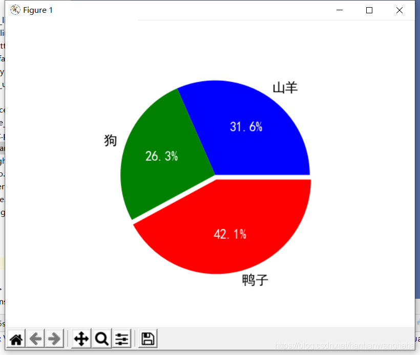
1.7饼状图
# coding=utf-8

import matplotlib.pyplot as plt

# 山羊、狗和鸭子的数量
sheep = 666
dogs = 555
ducks = 888
# 山羊、狗和鸭子的比例
sheep_percent = sheep/(sheep+ducks+dogs)
dogs_percent = dogs/(sheep+ducks+dogs)
ducks_percent = ducks/(sheep+ducks+dogs)

# 添加名称
labels =["山羊","狗","鸭子"]

# 可自选颜色
colors = ["blue","green","red"]

# 解决中文乱码问题
plt.rcParams['font.sans-serif'] = ['SimHei']

# 绘制饼状图
paches,texts,autotexts=plt.pie([sheep_percent,dogs_percent,ducks_percent],labels=labels,colors=colors,explode=(0,0,0.05),autopct="%0.1f%%")

# 设置饼状图字体颜色
for text in autotexts:
    text.set_color("white")

# 设置字体大小
for text in texts+autotexts:
    text.set_fontsize(15)

plt.show()
运行效果
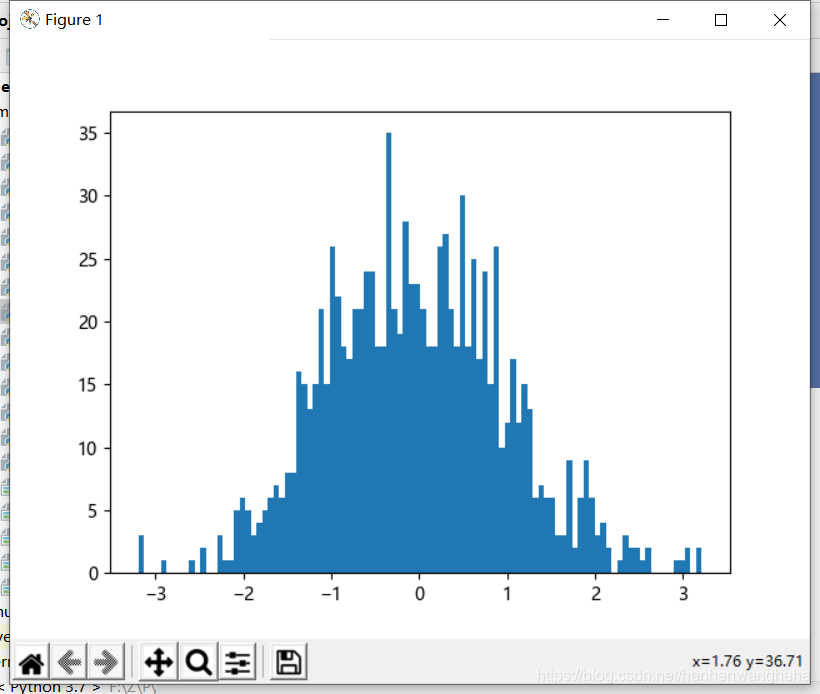
1.8直方图
# coding=utf-8

import matplotlib.pyplot as plt
import numpy as np

# 生成1000个正态分布随机数
x = np.random.randn(1000)

# plt.hist(x)
# 修改柱的宽度  bins
plt.hist(x, bins=100)
plt.show()
运行效果
1.9三维图
# coding=utf-8

import matplotlib.pyplot as plt
from mpl_toolkits.mplot3d import Axes3D

# 创建 X Y Z坐标

X = [1, 5, 7, 9, 5]
Y = [9, 6, 7, 3, 6]
Z = [5, 6, 9, 3, 4]

# 生成画布对象
figure = plt.figure()

# 创建一个Axes3D的子图放到figure画布里面
ax = Axes3D(figure)
ax.plot_trisurf(X, Y, Z)

plt.show()
运行效果
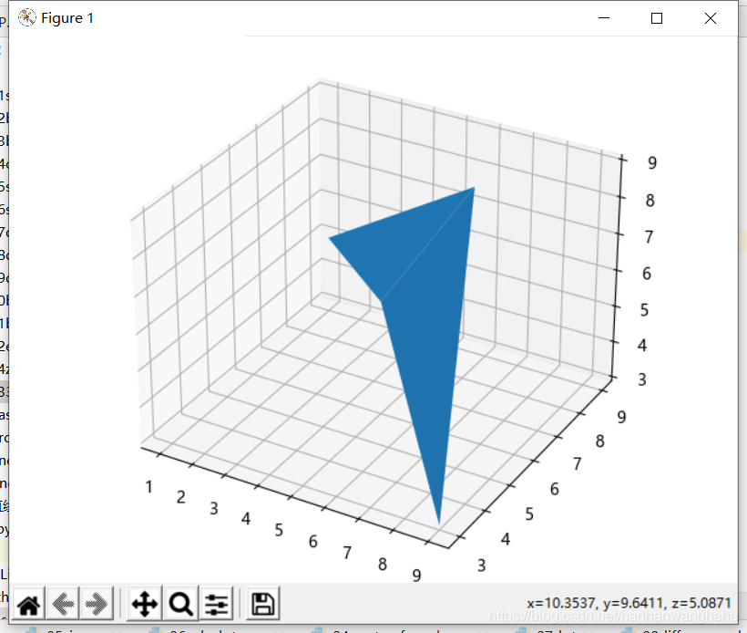
注:鼠标点住图,可使其旋转
如果不能的解决办法:
- 在pycharm中点击“File—>setting”,打开设置窗口。
- 找到最后一个工具选项tools.
- 找到“Python Scientific”,去除Show plots in toolwindow框中的勾号
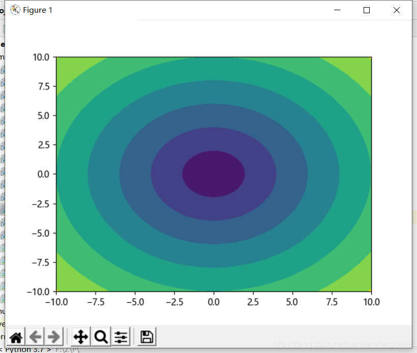
1.10等高线图
# coding=utf-8

import matplotlib.pyplot as plt
import numpy as np

# 创建x,y,生成100个随机的x,y
x = np.linspace(-10, 10, 100)
y = np.linspace(-10, 10, 100)

# 计算x,y相交的点X,Y
X, Y = np.meshgrid(x, y)

# 计算Z
Z = np.sqrt(X ** 2 + Y ** 2)
plt.contourf(X, Y, Z)

plt.show()
运行效果
二、样式
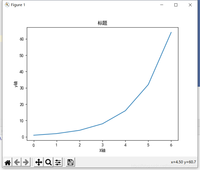
2.1基本样式
# coding=utf-8

import matplotlib.pyplot as plt

# 准备绘制的点
x = [0, 1, 2, 3, 4, 5, 6]
y = [1, 2, 4, 8, 16, 32, 64]

# 显示x轴 y轴名称
plt.ylabel("y轴")
plt.xlabel("X轴")

# 解决中文乱码问题
plt.rcParams['font.sans-serif'] = ['SimHei']

# 调用绘制方法
plt.plot(x, y)

# 给图添加标题
plt.title("标题")

# 保存路径
plt.savefig("F:/Z/Python/project/project2/matl/base_pattern.jpg")

# 显示图
plt.show()
运行效果
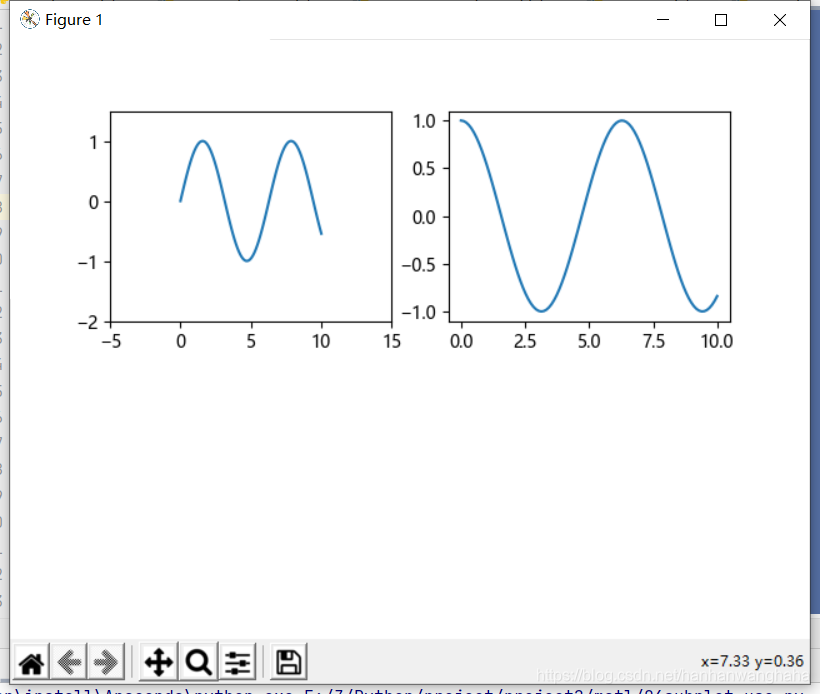
2.2画布分区的使用
# coding=utf-8

import matplotlib.pyplot as plt
import numpy as np

# 生成0-10之间(0开始 10结束) 100个等差数
x = np.linspace(0, 10, 100)

# 正弦
sin_y = np.sin(x)
# 对画布进行分区 将画布分为2行2列 划分到1区(这里几区呢相当于数学当中的象限)
plt.subplot(2,2,1)
# 修改x,y的坐标范围
plt.xlim(-5,15)
plt.ylim(-2,1.5)
# 进行绘制正弦曲线
plt.plot(x,sin_y)

# 对画布进行分区 将画布分为2行2列 划分到2区(这里几区呢相当于数学当中的象限)
plt.subplot(2,2,2)
plt.plot(x,np.cos(x))

plt.show()
运行效果
三、函数
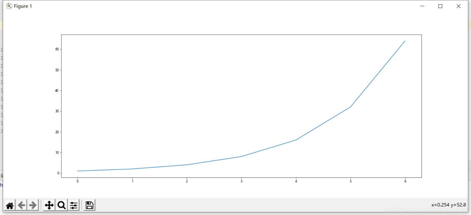
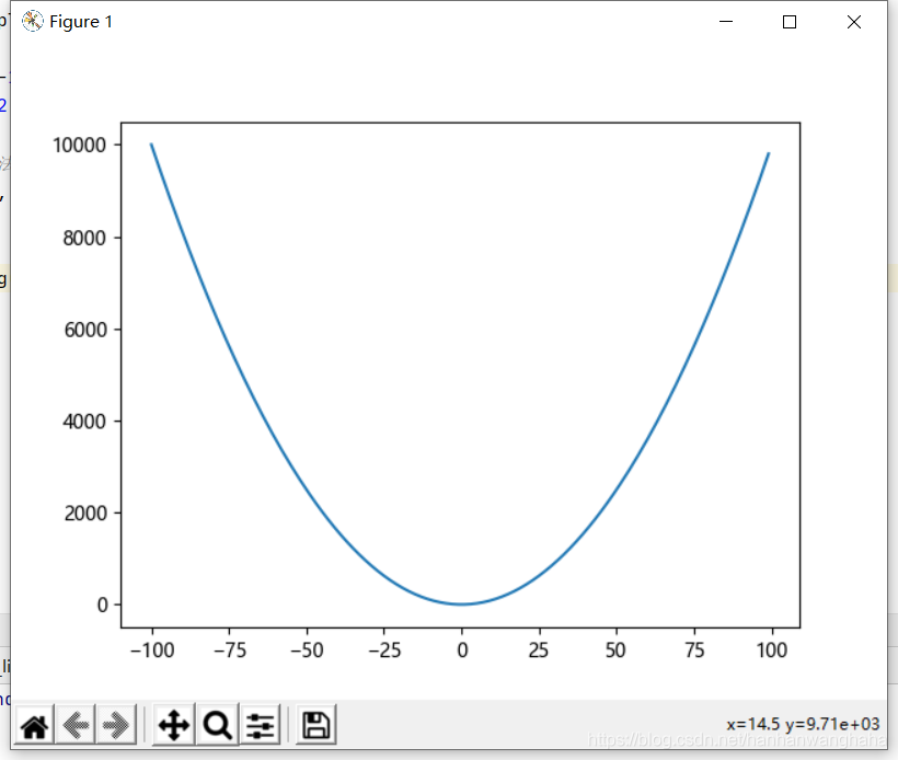
3.1简单的一元二次方程
# coding=utf-8

import matplotlib.pyplot as plt

x = range(-100, 100)
y = [i ** 2 for i in x]

# 调用绘制方法
plt.plot(x, y)

# 保存
plt.savefig("onetwofangcheng.jpg")

# 显示图
plt.show()
运行结果
3.2三角函数
# coding=utf-8

import matplotlib.pyplot as plt
import numpy as np

# 生成0-10之间(0开始 10结束) 100个等差数
x = np.linspace(0, 10, 100)

# 正弦
sin_y = np.sin(x)
# 进行绘制正弦曲线
plt.plot(x, sin_y)

# 进行绘制余弦曲线
cos_y = np.cos(x)
plt.plot(x, cos_y)

# 保存
plt.savefig("sincos.jpg")
plt.show()
运行效果
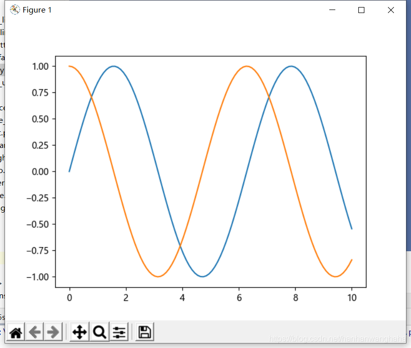
注意:cos类似