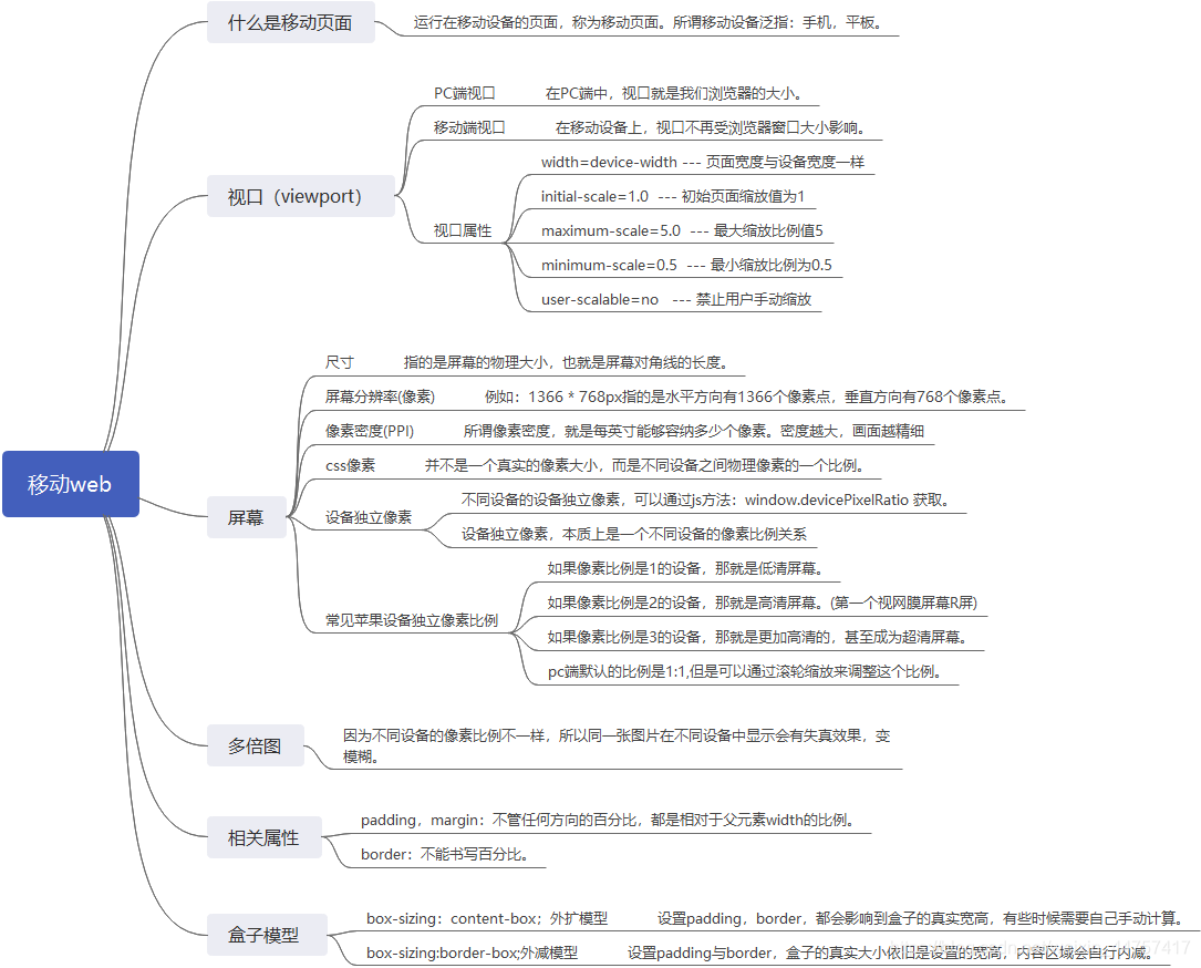
移动web
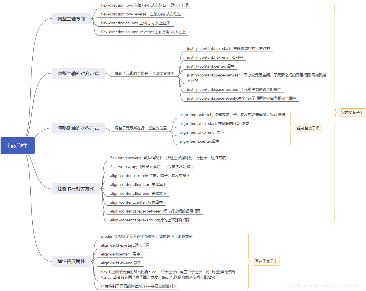
flex弹性
案例
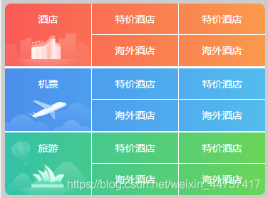
弹性携程首页
效果: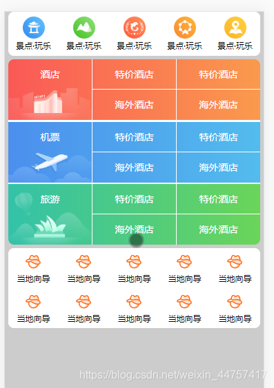
.base.css
body,
div,
span,
p,
ul,
li,
a,
img,
input,
h1,
h2,
h3,
h4,
i {
	margin: 0;
	padding: 0;
	box-sizing: border-box;
}

img {
	vertical-align: middle;
	border: none;
}

input {
	border: none;
	outline: none;
}

a {
	text-decoration: none;
	color: #000;
}

i {
	font-style: normal;
}

li {
	list-style: none;
}

body {
	font-size: 12px;
	line-height: 1;
	background-color: #ccc;
}

.clearfix::after {
	content: ".";
	clear: both;
	display: block;
	height: 0;
	visibility: hidden;
}

.clearfix {
	*zoom: 1;
}
- index.html
<!DOCTYPE html>
<html lang="zh-CN">
<head>
<meta charset="UTF-8">
<meta name="viewport"
content="width=device-width, initial-scale=1.0, maximum-scale=1.0, minimum-scale=1.0,user-scalable=no">
<meta http-equiv="X-UA-Compatible" content="ie=edge">
<title>Document</title>
<link rel="stylesheet" href="./css/base.css">
<link rel="stylesheet" href="./css/index.css">
</head>
<body>
<div class="container">
<div class="nav">
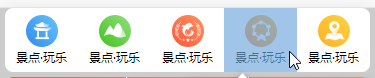
<ul>
<li>
<a href="#">
<i class="icon"></i>
景点·玩乐
</a>
</li>
<li>
<a href="#">
<i class="icon"></i>
景点·玩乐
</a>
</li>
<li>
<a href="#">
<i class="icon"></i>
景点·玩乐
</a>
</li>
<li>
<a href="#">
<i class="icon"></i>
景点·玩乐
</a>
</li>
<li>
<a href="#">
<i class="icon"></i>
景点·玩乐
</a>
</li>
</ul>
</div>
<div class="main">
<div class="items hotel">
<div class="title">
<a href="#">酒店</a>
</div>
<div class="option">
<a href="#">特价酒店</a>
<a href="#">海外酒店</a>
</div>
<div class="option">
<a href="#">特价酒店</a>
<a href="#">海外酒店</a>
</div>
</div>
<div class="items flight">
<div class="title">
<a href="#">机票</a>
</div>
<div class="option">
<a href="#">特价酒店</a>
<a href="#">海外酒店</a>
</div>
<div class="option">
<a href="#">特价酒店</a>
<a href="#">海外酒店</a>
</div>
</div>
<div class="items travel">
<div class="title">
<a href="#">旅游</a>
</div>
<div class="option">
<a href="#">特价酒店</a>
<a href="#">海外酒店</a>
</div>
<div class="option">
<a href="#">特价酒店</a>
<a href="#">海外酒店</a>
</div>
</div>
</div>
<div class="links">
<ul>
<li>
<a href="#">
<i class="icon"></i>
当地向导
</a>
</li>
<li>
<a href="#">
<i class="icon"></i>
当地向导
</a>
</li>
<li>
<a href="#">
<i class="icon"></i>
当地向导
</a>
</li>
<li>
<a href="#">
<i class="icon"></i>
当地向导
</a>
</li>
<li>
<a href="#">
<i class="icon"></i>
当地向导
</a>
</li>
<li>
<a href="#">
<i class="icon"></i>
当地向导
</a>
</li>
<li>
<a href="#">
<i class="icon"></i>
当地向导
</a>
</li>
<li>
<a href="#">
<i class="icon"></i>
当地向导
</a>
</li>
<li>
<a href="#">
<i class="icon"></i>
当地向导
</a>
</li>
<li>
<a href="#">
<i class="icon"></i>
当地向导
</a>
</li>
</ul>
</div>
</div>
</body>
</html>
- index.css
.container {
    padding: 0 5px;
}

.nav {
    width: 100%;
    height: 64px;
    background-color: #fff;
    border-radius: 8px;
}

.nav ul {
    display: flex;
}

.nav ul li {
    /* 所有li所占空间为1:1:1:1:1 */
    flex: 1;
    height: 64px;
}

.nav li a {
    display: block;
    width: 100%;
    height: 100%;
    overflow: hidden;
    text-align: center;
}

.nav li .icon {
    display: block;
    width: 32px;
    height: 32px;
    background: url("../img/sprite.png");
    background-size: 32px;
    margin: 7px auto 4px;

}

.nav li:nth-child(2) .icon {
    background-position-y: -32px;
}

.nav li:nth-child(3) .icon {
    background-position-y: -64px;
}

.nav li:nth-child(4) .icon {
    background-position-y: -96px;
}

.nav li:nth-child(5) .icon {
    background-position-y: bottom;
}

.main {
    width: 100%;
    height: 269px;
    background-color: #fff;
    border-radius: 8px;
    margin-top: 5px;
    display: flex;
    /* 改变主轴方向为从上往下 */
    flex-direction: column;
    /* 因为主轴方向为从上往下所以这里用justify-content:space-between */
    justify-content: space-between;
    overflow: hidden;
}

.main .items {
    width: 100%;
    height: 88px;
    display: flex;
}
.main .hotel{
    background: linear-gradient(to right,#fa5956,#fa9a4d);
}
.main .flight{
    background: linear-gradient(to right,#4b8fed,#53bced);
}
.main .travel{
    background: linear-gradient(to right,#33c2a9,#6bd559);
}
.main .items>div{
    height: 100%;
    flex: 1;
}
.main .items .option{
    border-left: 1px solid #fff;
}
.main .items a{
    display: block;
    width: 100%;
    height: 100%;
    font-size: 14px;
    text-align: center;
    line-height: 43px;
    color: #fff;
}
.main .items .title{
    background: url("../img/hotel.png") no-repeat bottom;
    background-size: 100%;
}
.main  .items .option a{
    height: 50%;
}
.main .items .option a:first-child{
    border-bottom: 1px solid #fff;
}
.main .flight .title{
    background-image: url("../img/flight.png") ;

}
.main .travel .title{
    background-image: url("../img/travel.png");
}
.links{
    width: 100%;
    height: 116px;
    background-color: #fff;
    border-radius: 8px;
    margin-top: 5px;
}
.links ul{
    display: flex;
    flex-wrap: wrap;
}
.links li{
    height: 58px;
    width: 20%;
}
.links li a{
    display: block;
    width: 100%;
    height: 100%;
    text-align: center;
    overflow: hidden;
}
.links li .icon{
    display: block;
    width: 23px;
    height: 21px;
    background: url("../img/subnav.png")0 -86px;
    background-size: 24px;
    margin: 10px auto 7px;
}
总结
- 模块一:
有五个栏目给弹性,li给flex=1;他们的比例为1:1:1:1:1。
.nav ul {
    display: flex;
}

.nav ul li {
    /* 所有li所占空间为 */
    flex: 1;
    height: 64px;
}
- 模块二
这里给父盒子flex,分三个模块,也就是三个盒子,通过改变主轴的方向进行布局。
.main {
    width: 100%;
    height: 269px;
    background-color: #fff;
    border-radius: 8px;
    margin-top: 5px;
    display: flex;
    /* 改变主轴方向为从上往下 */
    flex-direction: column;
    /* 因为主轴方向为从上往下所以这里用justify-content:space-between */
    justify-content: space-between;
    overflow: hidden;
}
模块布局类似,布局时注意代码父用性